1.2 2.3 Least-Squares Regression
Correlation measures the direction and strength of the straight-line (linear) relationship between two quantitative variables. If a scatterplot shows a linear relationship, we would like to summarize this overall pattern by drawing a line on the scatterplot. A regression line summarizes the relationship between two variables, but only in a specific setting: when one of the variables helps explain or predict the other. That is, regression describes a relationship between an explanatory variable and a response variable.
Regression Line
A regression line is a straight line that describes how a response variable y changes as an explanatory variable x changes. We often use a regression line to predict the value of y for a given value of x.
81
EXAMPLE 2.9: World Financial Markets

The World Economic Forum studies data on many variables related to financial development in the countries of the world. They rank countries on their financial development based on a collection of factors related to economic growth.9 Two of the variables studied are gross domestic product per capita and net assets per capita. Here are the data for 15 countries that ranked high on financial development:
| Country | GDP | Assets | Country | GDP | Assets | Country | GDP | Assets |
|---|---|---|---|---|---|---|---|---|
| United Kingdom | 43.8 | 199 | Switzerland | 67.4 | 358 | Germany | 44.7 | 145 |
| Australia | 47.4 | 166 | Netherlands | 52.0 | 242 | Belgium | 47.1 | 167 |
| United States | 47.9 | 191 | Japan | 38.6 | 176 | Sweden | 52.8 | 169 |
| Singapore | 40.0 | 168 | Denmark | 62.6 | 224 | Spain | 35.3 | 152 |
| Canada | 45.4 | 170 | France | 46.0 | 149 | Ireland | 61.8 | 214 |
In this table, GDP is gross domestic product per capita in thousands of dollars and assets is net assets per capita in thousands of dollars. Figure 2.9 is a scatterplot of the data. The correlation is r = 0.76. The scatterplot includes a regression line drawn through the points.
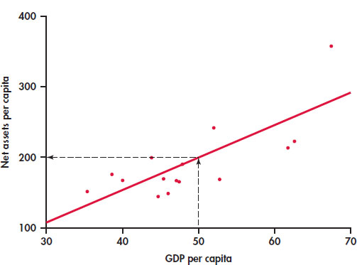
Suppose we want to use this relationship between GDP per capita and net assets per capita to predict the net assets per capita for a country that has a GDP per capita of $50,000. To predict the net assets per capita (in thousands of dollars), first locate 50 on the x axis. Then go “up and over” as in Figure 2.9 to find the GDP per capita y that corresponds to x = 50. We predict that a country with a GDP per capita of $50,000 will have net assets per capita of about $200,000.
prediction
The least-squares regression line
Different people might draw different lines by eye on a scatterplot. We need a way to draw a regression line that doesn’t depend on our guess as to where the line should be. We will use the line to predict y from x, so the prediction errors we make are errors in y, the vertical direction in the scatterplot. If we predict net assets per capita of 177 and the actual net assets per capita are 170, our prediction error is
82
The error is −$7,000.
APPLY YOUR KNOWLEDGE
Question 1.44 Find a prediction error
2.44 Use Figure 2.9 to estimate the net assets per capita for a country that has a GDP per capita of $40,000. If the actual net assets per capita are $170,000, find the prediction error.
Question 1.45 Positive and negative prediction errors
Examine Figure 2.9 carefully. How many of the prediction errors are positive? How many are negative?
No line will pass exactly through all the points in the scatterplot. We want the vertical distances of the points from the line to be as small as possible.
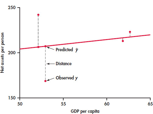
EXAMPLE 2.10: The Least-Squares Idea
Figure 2.10 illustrates the idea. This plot shows the data, along with a line. The vertical distances of the data points from the line appear as vertical line segments.
There are several ways to make the collection of vertical distances “as small as possible.” The most common is the least-squares method.
Least-Squares Regression Line
The least-squares regression line of y on x is the line that makes the sum of the squares of the vertical distances of the data points from the line as small as possible.
One reason for the popularity of the least-squares regression line is that the problem of finding the line has a simple solution. We can give the recipe for the least-squares line in terms of the means and standard deviations of the two variables and their correlation.
83
Equation of the Least-Squares Regression Line
We have data on an explanatory variable x and a response variable y for n cases. From the data, calculate the means and and the standard deviations sx and sy of the two variables and their correlation r. The least-squares regression line is the line
with slope
and intercept
We write (read “y hat”) in the equation of the regression line to emphasize that the line gives a predicted response for any x. Because of the scatter of points about the line, the predicted response will usually not be exactly the same as the actually observed response y. In practice, you don’t need to calculate the means, standard deviations, and correlation first. Statistical software or your calculator will give the slope b1 and intercept b0 of the least-squares line from keyed-in values of the variables x and y. You can then concentrate on understanding and using the regression line. Be warned—different software packages and calculators label the slope and intercept differently in their output, so remember that the slope is the value that multiplies x in the equation.
EXAMPLE 2.11: The Equation for Predicting Net Assets
The line in Figure 2.9 is in fact the least-squares regression line for predicting net assets per capita from GDP per capita. The equation of this line is
The slope of a regression line is almost always important for interpreting the data. The slope is the rate of change, the amount of change in when x increases by 1. The slope b1 = 4.5 in this example says that each additional $1000 of GDP per capita is associated with an additional $4500 in net assets per capita.
slope
The intercept of the regression line is the value of when x = 0. Although we need the value of the intercept to draw the line, it is statistically meaningful only when x can actually take values close to zero. In our example, x = 0 occurs when a country has zero GDP. Such a situation would be very unusual, and we would not include it within the framework of our analysis.
intercept
EXAMPLE 2.12: Predict Net Assets
The equation of the regression line makes prediction easy. Just substitute a value of x into the equation. To predict the net assets per capita for a country that has a GDP per capita of $50,000, we use x = 50:
The predicted net assets per capita is $198,000.
prediction
84

To plot the line on the scatterplot, you can use the equation to find for two values of x, one near each end of the range of x in the data. Plot each above its x, and draw the line through the two points. As a check, it is a good idea to compute for a third value of x and verify that this point is on your line.
plot the line
APPLY YOUR KNOWLEDGE
Question 1.46 A regression line
A regression equation is y = 15 + 30x.
- What is the slope of the regression line?
- What is the intercept of the regression line?
- Find the predicted values of y for x = 10, for x = 20, and for x = 30.
- Plot the regression line for values of x between 0 and 50.
EXAMPLE 2.13: GDP and Assets Results Using Software
Figure 2.11 displays the selected regression output for the world financial markets data from JMP, Minitab, and Excel. The complete outputs contain many other items that we will study in Chapter 10.

Let’s look at the Minitab output first. A table gives the regression intercept and slope under the heading “Coefficients.” Coefficient is a generic term that refers to the quantities that define a regression equation. Note that the intercept is labeled “Constant,” and the slope is labeled with the name of the explanatory variable. In the table, Minitab reports the intercept as −27.2 and the slope as 4.50 followed by the regression equation.
Coefficient
85
86
Excel provides the same information in a slightly different format. Here the intercept is reported as −27.16823305, and the slope is reported as 4.4998956. Check the JMP output to see how the regression coefficients are reported there.
How many digits should we keep in reporting the results of statistical calculations? The answer depends on how the results will be used. For example, if we are giving a description of the equation, then rounding the coefficients and reporting the equation as y = −27 + 4.5x would be fine. If we will use the equation to calculate predicted values, we should keep a few more digits and then round the resulting calculation as we did in Example 2.12.
APPLY YOUR KNOWLEDGE
Question 1.47 Predicted values for GDP and assets
Refer to the world financial markets data in Example 2.9.
- Use software to compute the coefficients of the regression equation. Indicate where to find the slope and the intercept on the output, and report these values.
- Make a scatterplot of the data with the least-squares line.
- Find the predicted value of assets for each country.
- Find the difference between the actual value and the predicted value for each country.
Facts about least-squares regression
Regression as a way to describe the relationship between a response variable and an explanatory variable is one of the most common statistical methods, and least squares is the most common technique for fitting a regression line to data. Here are some facts about least-squares regression lines.
Fact 1. There is a close connection between correlation and the slope of the least-squares line. The slope is
This equation says that along the regression line, a change of one standard deviation in x corresponds to a change of r standard deviations in y. When the variables are perfectly correlated (r = 1 or r = −1), the change in the predicted response is the same (in standard deviation units) as the change in x. Otherwise, because −1 ≤ r ≤ 1, the change in is less than the change in x. As the correlation grows less strong, the prediction moves less in response to changes in x.
Fact 2. The least-squares regression line always passes through the point on the graph of y against x. So the least-squares regression line of y on x is the line with slope rsy/sx that passes through the point . We can describe regression entirely in terms of the basic descriptive measures , and r.
Fact 3. The distinction between explanatory and response variables is essential in regression. Least-squares regression looks at the distances of the data points from the line only in the y direction. If we reverse the roles of the two variables, we get a different least-squares regression line.
87
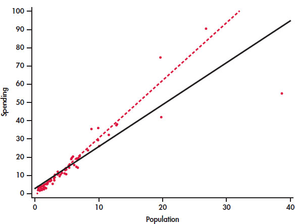
EXAMPLE 2.14: Education Spending and Population

CASE 2.1 Figure 2.12 is a scatterplot of the education spending data described in Case 2.1 (page 65). There is a positive linear relationship.
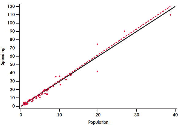
The two lines on the plot are the two least-squares regression lines. The regression line for using population to predict education spending is solid. The regression line for using education spending to predict population is dashed. The two regressions give different lines. In the regression setting, you must choose one variable to be explanatory.
Interpretation of r^2
The square of the correlation r describes the strength of a straight-line relationship. Here is the basic idea. Think about trying to predict a new value of y. With no other information than our sample of values of y, a reasonable choice is .
Now consider how your prediction would change if you had an explanatory variable. If we use the regression equation for the prediction, we would use . This prediction takes into account the value of the explanatory variable x.
Let’s compare our two choices for predicting y. With the explanatory variable x, we use ; without this information, we use , the sample of the response variable. How can we compare these two choices? When we use to predict, our prediction error is . If, instead, we use , our prediction error is . The use of x in our prediction changes our prediction error from is to . The difference is . Our comparison uses the sums of squares of these differences and . The ratio of these two quantities is the square of the correlation:
The numerator represents the variation in y that is explained by x, and the denominator represents the total variation in y.
88
Percent of Variation Explained by the Least-Squares Equation
To find the percent of variation explained by the least-squares equation, square the value of the correlation and express the result as a percent.
EXAMPLE 2.15: Using r^2
The correlation between GDP per capita and net assets per capita in Example 2.12 (pages 83–84) is r = 0.76312, so r2 = 0.58234. GDP per capita explains about 58% of the variability in net assets per capita.
When you report a regression, give r2 as a measure of how successful the regression was in explaining the response. The software outputs in Figure 2.11 include r2, either in decimal form or as a percent. When you see a correlation (often listed as R or Multiple R in outputs), square it to get a better feel for the strength of the association.
APPLY YOUR KNOWLEDGE
Question 1.48 The “January effect.”
Some people think that the behavior of the stock market in January predicts its behavior for the rest of the year. Take the explanatory variable x to be the percent change in a stock market index in January and the response variable y to be the change in the index for the entire year. We expect a positive correlation between x and y because the change during January contributes to the full year’s change. Calculation based on 38 years of data gives
- What percent of the observed variation in yearly changes in the index is explained by a straight-line relationship with the change during January?
- What is the equation of the least-squares line for predicting the full-year change from the January change?
- The mean change in January is . Use your regression line to predict the change in the index in a year in which the index rises 1.75% in January. Why could you have given this result (up to roundoff error) without doing the calculation?
Question 1.49 Is regression useful?

In Exercise 2.39 (pages 79–80), you used the Correlation and Regression applet to create three scatterplots having correlation about r = 0.7 between the horizontal variable x and the vertical variable y. Create three similar scatterplots again, after clicking the “Show least-squares line” box to display the regression line.Correlation r = 0.7 is considered reasonably strong in many areas of work. Because there is a reasonably strong correlation, wemight use a regression line to predict y from x. In which of your three scatterplots does it make sense to use a straightline for prediction?
89
Residuals
A regression line is a mathematical model for the overall pattern of a linear relationship between an explanatory variable and a response variable. Deviations from the overall pattern are also important. In the regression setting, we see deviations by looking at the scatter of the data points about the regression line. The vertical distances from the points to the least-squares regression line are as small as possible in the sense that they have the smallest possible sum of squares. Because they represent “leftover” variation in the response after fitting the regression line, these distances are called residuals.
Residuals
A residual is the difference between an observed value of the response variable and the value predicted by the regression line. That is,
EXAMPLE 2.16: Education Spending and Population
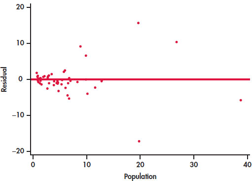
CASE 2.1 Figure 2.13 is a scatterplot showing education spending versus the population for the 50 states that we studied in Case 2.1 (page 65). Included on the scatterplot is the least-squares line. The points for the states with large values for both variables—California, Texas, Florida, and New York—are marked individually.
The equation of the least-squares line is where represents education spending and x represents the population of the state.
Let’s look carefully at the data for California, y = 110.1 and x = 38.7. The predicted education spending for a state with 38.7 million people is
The residual for California is the difference between the observed spending (y) and this predicted value.
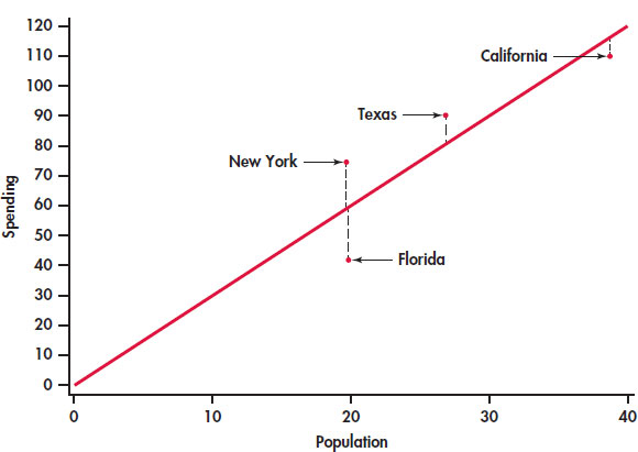
California spends $5.73 million less on education than the least-squares regression line predicts. On the scatterplot, the residual for California is shown as a dashed vertical line between the actual spending and the least-squares line.
90
APPLY YOUR KNOWLEDGE
Question 1.50 Residual for Texas
Refer to Example 2.16 (page 89). Texas spent $90.5 million on education and has a population of 26.8 million people.
- Find the predicted education spending for Texas.
- Find the residual for Texas.
- Which state, California or Texas, has a greater deviation from the regression line?
There is a residual for each data point. Finding the residuals with a calculator is a bit unpleasant, because you must first find the predicted response for every x. Statistical software gives you the residuals all at once.
Because the residuals show how far the data fall from our regression line, examining the residuals helps us assess how well the line describes the data. Although residuals can be calculated from any model fitted to data, the residuals from the least-squares line have a special property: the mean of the least-squares residuals is always zero.
APPLY YOUR KNOWLEDGE
Question 1.51 Sum the education spending residuals
The residuals in the EDSPEND data file have been rounded to two places afterthe decimal. Find the sum of these residuals. Is the sum exactly zero? If not, explain why.
As usual, when we perform statistical calculations, we prefer to display the results graphically. We can do this for the residuals.
Residual Plots
A residual plot is a scatterplot of the regression residuals against the explanatory variable. Residual plots help us assess the fit of a regression line.
EXAMPLE 2.17: Residual Plot for Education Spending
CASE 2.1 Figure 2.14 gives the residual plot for the education spending data. The horizontal line at zero in the plot helps orient us.
91
APPLY YOUR KNOWLEDGE
Question 1.52 Identify the four states
In Figure 2.13, four states are identified by name: California, Texas, Florida, and NewYork. The dashed lines in the plot represent the residuals.
- Sketch a version of Figure 2.14 or generate your own plot using the EDSPEND data file. Write in the names of the states California,Texas, Florida, and New York on your plot.
- Explain how you were able to identify these four points on your sketch.
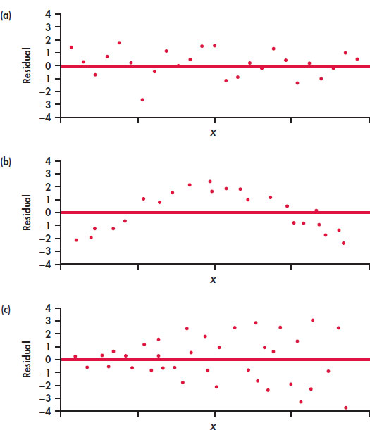
If the regression line captures the overall relationship between x and y, the residuals should have no systematic pattern. The residual plot will look something like the pattern in Figure 2.15(a). That plot shows a scatter of points about the fitted line, with no unusual individual observations or systematic change as x increases. Here are some things to look for when you examine a residual plot:
- A curved pattern, which shows that the relationship is not linear. Figure 2.15(b) is a simplified example. A straight line is not a good summary for such data.
- Increasing or decreasing spread about the line as x increases. Figure 2.15(c) is a simplified example. Prediction of y will be less accurate for larger x in that example.
- Individual points with large residuals, which are outliers in the vertical (y) direction because they lie far from the line that describes the overall pattern.
- Individual points that are extreme in the x direction, like California in Figures 2.13 and 2.14. Such points may or may not have large residuals, but they can be very important. We address such points next.
The distribution of the residuals
When we compute the residuals, we are creating a new quantitative variable for our data set. Each case has a value for this variable. It is natural to ask about the distribution of this variable. We already know that the mean is zero. We can use the methods we learned in Chapter 1 to examine other characteristics of the distribution. We will see in Chapter 10 that a question of interest with respect to residuals is whether or not they are approximately Normal. Recall that we used Normal quantile plots to address this issue.
REMINDER
Normal quantile plots, p. 51
EXAMPLE 2.18: Are the Residuals Approximately Normal?
CASE 2.1 Figure 2.16 gives the Normal quantile plot for the residuals in our education spending example. The distribution of the residuals is not Normal. Most of the points are close to a line in the center of the plot, but there appear to be five outliers—one with a negative residual and four with positive residuals.
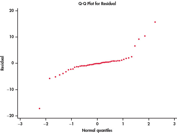
Take a look at the plot of the data with the least-squares line in Figure 2.2 (page 67). Note that you can see the same four points in this plot. If we eliminated these states from our data set, the remaining residuals would be approximately Normal. On the other hand, there is nothing wrong with the data for these four states. A complete analysis of the data should include a statement that they are somewhat extreme relative to the distribution of the other states.
Influential observations
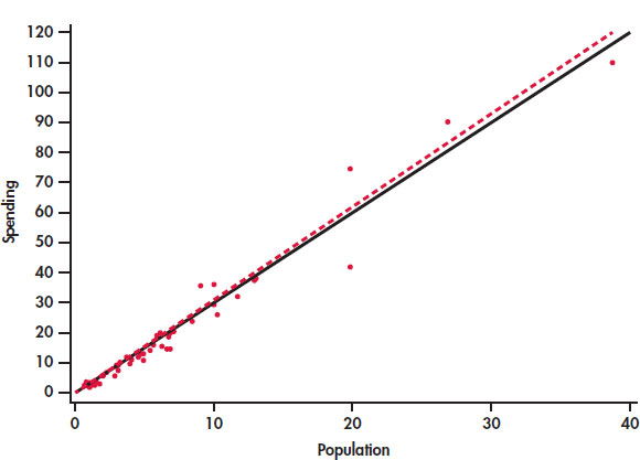
In the scatterplot of spending on education versus population in Figure 2.12 (page 87) California, Texas, Florida, and New York have somewhat higher values for both variables than the other 46 states. This could be of concern if these cases distort the least-squares regression line. A case that has a big effect on a numerical summary is called influential.
influential
EXAMPLE 2.19: Is California Influential?
CASE 2.1 To answer this question, we compare the regression lines with and without California. The result is in Figure 2.17. The two lines are very close, so we conclude that California is not influential with respect to the least-squares slope and intercept.
93
Let’s think about a situation in which California would be influential on the least-squares regression line. California’s spending on education is $110.1 million. This case is close to both least-squares regression lines in Figure 2.17. Suppose California’s spending was much less than $110.1 million. Would this case then become influential?
EXAMPLE 2.20: Suppose California Spent Half as Much?
CASE 2.1 What would happen if California spent about half of what was actually spent, say, $55 million. Figure 2.18 shows the two regression lines, with and without California. Here we see that the regression line changes substantially when California is removed. Therefore, in this setting we would conclude that California is very influential.
94
Outliers and Influential Cases in Regression
An outlier is an observation that lies outside the overall pattern of the other observations. Points that are outliers in the y direction of a scatterplot have large regression residuals, but other outliers need not have large residuals.
A case is influential for a statistical calculation if removing it would markedly change the result of the calculation. Points that are extreme in the x direction of a scatterplot are often influential for the least-squares regression line.
APPLY YOUR KNOWLEDGE
Question 1.53 The influence of Texas
CASE 2.1 Make a plot similar to Figure 2.16 giving regression lines with and without Texas. Summarizewhat this plot describes.
California, Texas, Florida, and New York are somewhat unusual and might be considered outliers. However, these cases are not influential with respect to the least-squares regression line.
Influential cases may have small residuals because they pull the regression line toward themselves. That is, you can’t always rely on residuals to point out influential observations. Influential observations can change the interpretation of data. For a linear regression, we compute a slope, an intercept, and a correlation. An individual observation can be influential for one of more of these quantities.
EXAMPLE 2.21: Effects on the Correlation
CASE 2.1 The correlation between the spending on education and population for the 50 states is r = 0.98. If we drop California, it decreases to 0.97. We conclude that California is not influential on the correlation.
![]()
The best way to grasp the important idea of influence is to use an interactive animation that allows you to move points on a scatterplot and observe how correlation and regression respond. The Correlation and Regression applet on the text website allows you to do this. Exercises 2.73 and 2.74 later in the chapter guide the use of this applet.
SECTION 2.3 Summary
- A regression line is a straight line that describes how a response variable y changes as an explanatory variable x changes.
- The most common method of fitting a line to a scatterplot is least squares. The least-squares regression line is the straight line that minimizes the sum of the squares of the vertical distances of the observed points from the line.
- You can use a regression line to predict the value of y for any value of x by substituting this x into the equation of the line.
- The slope b1 of a regression line is the rate at which the predicted response ŷ changes along the line as the explanatory variable x changes. Specifically, b1 is the change in ŷ when x increases by 1.
- The intercept b0 of a regression line is the predicted response ŷ when the explanatory variable x = 0. This prediction is of no statistical use unless x can actually take values near 0.
- The least-squares regression line of y on x is the line with slope and intercept . This line always passes through the point .
- Correlation and regression are closely connected. The correlation r is the slope of the least-squares regression line when we measure both x and y in standardized units. The square of the correlation r2 is the fraction of the variability of the response variable that is explained by the explanatory variable using least-squares regression.
- You can examine the fit of a regression line by studying the residuals, which are the differences between the observed and predicted values of y. Be on the lookout for outlying points with unusually large residuals and also for nonlinear patterns and uneven variation about the line.
- Also look for influential observations, individual points that substantially change the regression line. Influential observations are often outliers in the x direction, but they need not have large residuals.
SECTION 2.3 Exercises
For Exercises 2.44 and 2.45, see page 82; for 2.46, see page 84; for 2.47, see page 86; for 2.48 and 2.49, see page 88; for 2.50, see page 90; for 2.51, see page 90; for 2.52, see page 91; and for 2.53, see page 94.
Question 1.54 What is the equation for the selling price?
You buy items at a cost of x and sell them for y. Assume that your selling price includes a profit of 12% plus a fixed cost of $25.00. Give an equation that can be used to determine y from x.
Question 1.55 Production costs for cell phone batteries
A company manufactures batteries for cell phones. The overhead expenses of keeping the factory operational for a month—even if no batteries are made—total $500,000. Batteries are manufactured in lots (1000 batteries per lot) costing $7000 to make. In this scenario, $500,000 is the fixed cost associated with producing cell phone batteries and $7000 is the marginal (or variable) cost of producing each lot of batteries. The total monthly cost y of producing x lots of cell phone batteries is given by the equation
- Draw a graph of this equation. (Choose two values of x, such as 0 and 20, to draw the line and a third for a check. Compute the corresponding values of y from the equation. Plot these two points on graph paper and draw the straight line joining them.)
- What will it cost to produce 15 lots of batteries (15,000 batteries)?
- If each lot cost $10,000 instead of $7000 to produce, what is the equation that describes total monthly cost for x lots produced?
Question 1.56 Inventory of Blu-Ray players
A local consumer electronics store sells exactly eight Blu-Ray players of a particular model each week. The store expects no more shipments of this particular model, and they have 96 such units in their current inventory.
- Give an equation for the number of Blu-Ray players of this particular model in inventory after x weeks. What is the slope of this line?
- Draw a graph of this line between now (Week 0) and Week 10.
- Would you be willing to use this line to predict the inventory after 25 weeks? Do the prediction and think about the reasonableness of the result.
Question 1.57 Compare the cell phone payment plans
A cellular telephone company offers two plans. Plan A charges $30 a month for up to 120 minutes of airtime and $0.55 per minute above 120 minutes. Plan B charges $35 a month for up to 200 minutes and $0.50 per minute above 200 minutes.
- Draw a graph of the Plan A charge against minutes used from 0 to 250 minutes.
- How many minutes a month must the user talk in order for Plan B to be less expensive than Plan A?
Question 1.58 Companies of the world
Refer to Exercise 1.118 (page 61), where we examined data collected by the World Bank on the numbers of companies that are incorporated and listed on their country’s stock exchange at the end of the year. In Exercise 2.10, you examined the relationship between these numbers for 2012 and 2002, and in Exercise 2.27, you found the correlation between these two variables. 
- Find the least-squares regression equation for predicting the 2012 numbers using the 2002 numbers.
- Sweden had 332 companies in 2012 and 278 companies in 2002. Use the least-squares regression equation to find the predicted number of companies in 2012 for Sweden.
- Find the residual for Sweden.
96
Question 1.59 Companies of the world
Refer to the previous exercise and to Exercise 2.11 (page 72). Answer parts (a), (b), and (c) of the previous exercise for 2012 and 1992. Compare the results you found in the previous exercise with the ones you found in this exercise. Explain your findings in a short paragraph.
Question 1.60 A product for lab experiments
In Exercise 2.17 (page 73), you described the relationship between time and count for an experiment examining the decay of barium. In Exercise 2.29 (page 78), you found the correlation between these two variables. 
- Find the least-squares regression equation for predicting count from time.
- Use the equation to predict the count at one, three, five, and seven minutes.
- Find the residuals for one, three, five, and seven minutes.
- Plot the residuals versus time.
- What does this plot tell you about the model you used to describe this relationship?
Question 1.61 Use a log for the radioactive decay
Refer to the previous exercise. Also see Exercise 2.18 (page 73), where you transformed the counts with a logarithm, and Exercise 2.30 (pages 78–79), where you found the correlation between time and the log of the counts. Answer parts (a) to (e) of the previous exercise for the transformed counts and compare the results with those you found in the previous exercise.
Question 1.62 Fuel efficiency and CO_2 emissions
In Exercise 2.37 (page 79), you examined the relationship between highway MPG and city MPG for 1067 vehicles for the model year 2014. 
- Use the city MPG to predict the highway MPG. Give the equation of the least-squares regression line.
- The Lexus 350h AWD gets 42 MPG for city driving and 38 MPG for highway driving. Use your equation to find the predicted highway MPG for this vehicle.
- Find the residual.
Question 1.63 Fuel efficiency and CO_2 emissions
Refer to the previous exercise.
- Make a scatterplot of the data with highway MPG as the response variable and city MPG as the explanatory variable. Include the least-squares regression line on the plot. There is an unusual pattern for the vehicles with high city MPG. Describe it.
- Make a plot of the residuals versus city MPG. Describe the major features of this plot. How does the unusual pattern noted in part (a) appear in this plot?
- The Lexus 350h AWD that you examined in parts (b) and (c) of the previous exercise is in the group of unusual cases mentioned in parts (a) and (b) of this exercise. It is a hybrid vehicle that uses a conventional engine and a electric motor that is powered by a battery that can recharge when the vehicle is driven. The conventional engine also turns off when the vehicle is stopped in traffic. As a result of these features, hybrid vehicles are unusually efficient for city driving, but they do not have a similar advantage when driven at higher speeds on the highway. How do these facts explain the residual for this vehicle?
- Several Toyota vehicles are also hybrids. Use the residuals to suggest which vehicles are in this category.
Question 1.64 Consider the fuel type
Refer to the previous two exercises and to Figure 2.6 (page 71), where different colors are used to distinguish four different types of fuels used by these vehicles. In Exercise 2.38, you examined the relationship between Highway MPG and City MPG for each of the four different fuel types used by these vehicles. Using the previous two exercises as a guide, analyze these data separately for each of the four fuel types. Write a summary of your findings.
Question 1.65 Predict one characteristic of a product using another characteristic
In Exercise 2.12 (page 72), you used a scatterplot to examine the relationship between calories per 12 ounces and percent alcohol in 175 domestic brands of beer. In Exercise 2.31 (page 79), you calculated the correlation between these two variables. 
- Find the equation of the least-squares regression line for these data.
- Make a scatterplot of the data with the least-squares regression line.
Question 1.66 Predicted values and residuals
Refer to the previous exercise.
- New Belgium Fat Tire is 5.2 percent alcohol and has 160 calories per 12 ounces. Find the predicted calories for New Belgium Fat Tire.
- Find the residual for New Belgium Fat Tire.
97
Question 1.67 Predicted values and residuals
Refer to the previous two exercises.
- Make a plot of the residuals versus percent alcohol.
- Interpret the plot. Is there any systematic pattern? Explain your answer.
- Examine the plot carefully and determine the approximate location of New Belgium Fat Tire. Is there anything unusual about this case? Explain why or why not.
Question 1.68 Carbohydrates and alcohol in beer revisited
Refer to Exercise 2.65. The data that you used to compute the least-squares regression line includes a beer with a very low alcohol content that might be considered to be an outlier.
- Remove this case and recompute the least-squares regression line.
- Make a graph of the regression lines with and without this case.
- Do you think that this case is influential? Explain your answer.
Question 1.69 Monitoring the water quality near a manufacturing plant
Manufacturing companies (and the Environmental Protection Agency) monitor the quality of the water near manufacturing plants. Measurements of pollutants in water are indirect—a typical analysis involves forming a dye by a chemical reaction with the dissolved pollutant, then passing light through the solution and measuring its “absorbance.” To calibrate such measurements, the laboratory measures known standard solutions and uses regression to relate absorbance to pollutant concentration. This is usually done every day. Here is one series of data on the absorbance for different levels of nitrates. Nitrates are measured in milligrams per liter of water.10 
| Nitrates | Absorbance | Nitrates | Absorbance |
|---|---|---|---|
| 50 | 7.0 | 800 | 93.0 |
| 50 | 7.5 | 1200 | 138.0 |
| 100 | 12.8 | 1600 | 183.0 |
| 200 | 24.0 | 2000 | 230.0 |
| 400 | 47.0 | 2000 | 226.0 |
- Chemical theory says that these data should lie on a straight line. If the correlation is not at least 0.997, something went wrong and the calibration procedure is repeated. Plot the data and find the correlation. Must the calibration be done again?
- What is the equation of the least-squares line for predicting absorbance from concentration? If the lab analyzed a specimen with 500 milligrams of nitrates per liter, what do you expect the absorbance to be? Based on your plot and the correlation, do you expect your predicted absorbance to be very accurate?
Question 1.70 Data generated by software
The following 20 observations on y and x were generated by a computer program. 
| y | x | y | x |
|---|---|---|---|
| 34.38 | 22.06 | 27.07 | 17.75 |
| 30.38 | 19.88 | 31.17 | 19.96 |
| 26.13 | 18.83 | 27.74 | 17.87 |
| 31.85 | 22.09 | 30.01 | 20.20 |
| 26.77 | 17.19 | 29.61 | 20.65 |
| 29.00 | 20.72 | 31.78 | 20.32 |
| 28.92 | 18.10 | 32.93 | 21.37 |
| 26.30 | 18.01 | 30.29 | 17.31 |
| 29.49 | 18.69 | 28.57 | 23.50 |
| 31.36 | 18.05 | 29.80 | 22.02 |
- Make a scatterplot and describe the relationship between y and x.
- Find the equation of the least-squares regression line and add the line to your plot.
- Plot the residuals versus x.
- What percent of the variability in y is explained by x?
- Summarize your analysis of these data in a short paragraph.
Question 1.71 Add an outlier
Refer to the previous exercise. Add an additional case with y = 60 and x = 32 to the data set. Repeat the analysis that you performed in the previous exercise and summarize your results, paying particular attention to the effect of this outlier. 
Question 1.72 Add a different outlier
Refer to the previous two exercises. Add an additional case with y = 60 and x = 18 to the original data set. 
- Repeat the analysis that you performed in the first exercise and summarize your results, paying particular attention to the effect of this outlier.
- In this exercise and in the previous one, you added an outlier to the original data set and reanalyzed the data. Write a short summary of the changes in correlations that can result from different kinds of outliers.
Question 1.73 Influence on correlation
![]() The Correlation and Regression applet at the text website allows you to create a scatterplot and to move points by dragging with the mouse. Click to create a group of 12 points in the lower-left corner of the scatterplot with a strong straight-line pattern (correlation about 0.9).
The Correlation and Regression applet at the text website allows you to create a scatterplot and to move points by dragging with the mouse. Click to create a group of 12 points in the lower-left corner of the scatterplot with a strong straight-line pattern (correlation about 0.9).
98
- Add one point at the upper right that is in line with the first 12. How does the correlation change?
- Drag this last point down until it is opposite the group of 12 points. How small can you make the correlation? Can you make the correlation negative? You see that a single outlier can greatly strengthen or weaken a correlation. Always plot your data to check for outlying points.
Question 1.74 Influence in regression
![]() As in the previous exercise, create a group of 12 points in the lower-left corner of the scatterplot with a strong straight-line pattern (correlation at least 0.9). Click the “Show least-squares line” box to display the regression line.
As in the previous exercise, create a group of 12 points in the lower-left corner of the scatterplot with a strong straight-line pattern (correlation at least 0.9). Click the “Show least-squares line” box to display the regression line.
- Add one point at the upper right that is far from the other 12 points but exactly on the regression line. Why does this outlier have no effect on the line even though it changes the correlation?
- Now drag this last point down until it is opposite the group of 12 points. You see that one end of the least-squares line chases this single point, while the other end remains near the middle of the original group of 12. What about the last point makes it so influential?
Question 1.75 Employee absenteeism and raises
Data on number of days of work missed and annual salary increase for a company’s employees show that, in general, employees who missed more days of work during the year received smaller raises than those who missed fewer days. Number of days missed explained 49% of the variation in salary increases. What is the numerical value of the correlation between number of days missed and salary increase?
Question 1.76 Always plot your data!
Four sets of data prepared by the statistician Frank Anscombe illustrate the dangers of calculating without first plotting the data.11 
- Without making scatterplots, find the correlation and the least-squares regression line for all four data sets. What do you notice? Use the regression line to predict y for x = 10.
- Make a scatterplot for each of the data sets, and add the regression line to each plot.
- In which of the four cases would you be willing to use the regression line to describe the dependence of y on x? Explain your answer in each case.