Chapter 1.

144
108
145
109
Chapter 3 Describing Data Numerically
3.1 Measures of Center
Chapter 3 Describing Data Numerically
3
Describing Data Numerically
Introduction
In Chapter 3, students develop numerical summaries to help them discover important characteristics about a data set. They also become acquainted with some powerful and widespread methodologies for applying the tools of descriptive statistics.
Section 3.1 introduces measures of center—the mean, the median, and the mode. Section 3.2 introduces measures of variability—the range, the variance, and the standard deviation, as well as their applications: the Empirical Rule and Chebyshev’s Rule. Section 3.3 discusses how to work with grouped data. Section 3.4 introduces us to measures of position, including z-scores, percentiles, percentile ranks, and quartiles, and how to use z-scores to detect outliers. Section 3.5 discusses the five-number summary, boxplots, and how to use the IQR method to detect outliers.
From the Author
The Chapter 3 Case Study (Can the Financial Experts Beat the Darts?) has been extended throughout the chapter.
Section 3.1 Measures of Center
● Stress the notion of the mean representing the “balance point” of the data, so that students may check their calculations throughout the remainder of the course.
● Early in Section 3.1, you may wish to review the definitions of population and sample.
● The What if scenario, page 115. Usually, this feature is structured in such a way that a calculator will not help. Instead, students need to think about how a change in one aspect of the problem will affect other aspects of the situation.
● Construct Your Own Data Sets, page 125 and page 148. This is a good way for students to apply their understanding of the concepts, by making up their own list of numbers that satisfies a particular set of conditions.
Section 3.2 Measures of Variability
● While many (most?) students now learn mean, median, and mode (Section 3.1) in elementary school, not so many learn about the standard deviation or the variance (Section 3.2). So, for most students, most of the material in this section (and subsequent sections) will be new.
● Discovering Statistics stresses what the statistics mean. This can be helpful when checking calculations, such as the standard deviation. If the student understands what a deviation means, and understands that the standard deviation represents a typical deviation, then the student may catch a calculation error.
Section 3.3 Working with Grouped Data
● Some instructors find that they do not have time to cover Section 3.3. If you choose to omit this section, you may wish to cover Objective 1, The Weighted Mean, using the grading policy in your syllabus as an example.
Section 3.4 Measures of Relative Position and Outliers
● Example 21 has been provided to underscore the fact that z-scores do not have to follow a bell-shaped distribution.
● The dance score data set, which was not real, has been replaced by an exports data set, which represents real data. This data is used for several examples in Sections 3.4 and 3.5.
Section 3.5 Five-Number Summary and Boxplots
● We have moved the section on five-number summary and boxplots ahead of the section on the Empirical Rule and Chebyshev’s Rule. This is because the boxplot uses the quartiles and the IQR, which were learned in the previous section.
Teaching Tips
Students may experience a steeper learning curve beginning at Section 3.2. The material in Section 3.1—mean, median, and mode—is often covered in high school or earlier. The material in Section 3.2 on variability is not usually covered in high school and is very important to an understanding of statistics. Stress the concept of spread—how spread out a data set is. The more spread out the data, the larger the measure of spread will be, whether it is the range, variance, standard deviation, or interquartile range.
In-Class Activities
1. Access the data set for Old Faithful at the following Web site: www.stat.cmu.edu/~larry/all-of-statistics/=data/faithful.dat.
The data set consists of 225 values in an Excel file for the variables duration and interruption time. The Yellowstone National Park Web site states that “Old Faithful erupts every 35–120 minutes for 1.5–5 minutes” (www.yellowstone.net/geysers/old-faithful). Use the data to construct appropriate graphs for the duration times and interruption times for Old Faithful. Ask students, “What can you say about the distribution of these variables?” Ask them to compute numerical summaries for these two variables. Ask which data set has more variability.
Measures of Center
2. What is your guess of the typical height of all students in your class?
3. Make a dotplot of the heights of the students in your class.
4. Discuss where to place the center of this distribution of student heights. Without crunching any numbers, form a consensus on the location of the center.
5. Calculate the mean, median, and mode of the student heights.
6. Which measure (mean, median, or mode) comes closest to the consensus of where the center is located in (4)?
7. What is the relation between these measures and your guess of the typical height in (2)?
8. Which measure (mean, median, mode, class consensus, your guess) do you think is the best measure of the center of student heights?
Measures of Spread
9. Do you think that the distribution of the heights of all students in your class is more spread out or less spread out than the distribution of the heights of only the females in your class?
10. Would the values of our measures of spread (range, standard deviation) be larger for the entire class or for only the females?
11. Make a dotplot of the heights of only the females in the class. Make sure it uses the same scale as the dotplot for the heights of all the students in the class.
12. Use the two dotplots to assess which group has greater variability.
13. Back up your intuition by calculating and comparing our measures of spread (range, standard deviation) for the two groups.
Supplements
● StatTutor 2.1–2.10
● EESEE case studies for describing data numerically
● Weighing Trucks in Motion (Question 2 on mean, median, and standard deviation)
● Acorn Size and Oak Tree Range (Question 7 on boxplots, Question 2 on mean and standard deviation, Question 3 on range and standard deviation)
● Faculty Salary Comparison (Question 1 on boxplots, Question 3 on weighted averages, Question 4 on ranking and means)
Applets
The Mean and Median applet is referenced in Chapter 3 to compute values for the mean and median and for Exercises 104 and 105 in Section 3.1.
Activities and applets that relate to measures of center, spread, and boxplots can be found at http://mathforum.org/mathtools/tool/12489/.
The site Online Statistics: An Interactive Multimedia Course of Study has numerous applets and activities: http://onlinestatbook.com/index.html.
Videos
● Against All Odds: Inside Statistics: www.learner.org/resources/series65.html
● Program 3: Histograms
Web Sites
● CAUSEweb provides resources for statistics education: https://www.causeweb.org/resources/.
● The following Web site has a collection of 20 class projects: www.amstat.org/publications/jse/v6n3/smith.html.
● This Texas Instruments Web site has a host of TI-83/84 statistics activities: http://education.ti.com/educationportal/sites/US/nonProductSingle/activitybook_83_statistics.html.
● This Web site has a host of activities, simulations, and so on, which relate to elementary statistics: http://davidmlane.com/hyperstat/ch2_contents.html.
● This Web site lists other sites that do statistical calculations: http://statpages.org/.

3
Describing Data Numerically
OVERVIEW
3.1 Measures of Center
3.2 Measures of Variability
3.3 Working with Grouped Data
3.4 Measures of Relative Position and Outliers
3.5 Five-Number Summary and Boxplots
Chapter 3 Formulas and Vocabulary
Chapter 3 Review Exercises
Chapter 3 Quiz
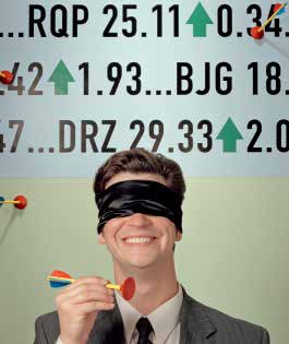
Mark Hooper/Getty Images
Can the Financial Experts Beat the Darts?
Have you ever wondered whether a bunch of monkeys throwing darts to choose stocks could select a portfolio that performed as well as the stocks carefully chosen by Wall Street experts? The Wall Street Journal (www.wsj.com) apparently believed that the comparison was worth a look. The Journal ran a contest between stocks chosen randomly by Journal staff members (instead of monkeys) throwing darts at the Journal stock pages (mounted on a board) and stocks chosen by a team of four professional financial experts. At the end of six months, the Journal compared the percentage change in the price of the experts’ stocks and the dartboard’s stocks and compared both to the Dow Jones Industrial Average as well. So, who do you think did better? Did the six-figure-salary financial experts put the random dart selections to shame?
●●
In Section 3.1, we do some graphical exploration with the data, comparing the balance points (means) of each group using comparative dotplots. We then determine whether the student’s intuition of the location of the means is confirmed by the statistics.
●●
In Section 3.2, we compare the variability of the three groups and find that different measures of spread can disagree about which data set has more variability.
●●
In the Section 3.2 exercises, we calculate the coefficient of skewness for each group.
●●
In the Section 3.3 exercises, we examine how close the estimated mean, variance, and standard deviation for grouped data are to their true values.
●●
In the Section 3.4 exercises, we use the case study data to examine measures of relative position such as z-scores and percentiles.
●●
Finally, in the Section 3.5 exercises, we construct boxplots and identify outliers for each group in the case study data set.
THE BIG PICTURE
Where we are coming from and where we are headed . . .
●●
Chapter 2 showed us graphical and tabular summaries of data.
●●
Here, in Chapter 3, we “crunch the numbers,” that is, we develop numerical summaries of data. We examine measures of center, measures of variability, and measures of relative position.
●●
In Chapter 4, we will learn how to summarize the relationship between two quantitative variables.
The Mean
The most well-known and widely used measure of center is the mean. In everyday usage, the word average is often used to denote the mean.
The Web site CNET.com provides reviews and prices for gadgets and electronics, including cell phones. In Table 1, you will find all eight of the cell phones in CNET’s “Editors’ Picks” for June 27, 2014. Recall from Chapter 1 that a population is the collection of all elements of interest in a particular study. Thus, the data in Table 1 represents a population. Find the mean price of all the cell phones.
Solution
To find the mean, we add up the prices of all eight cell phones and divide by the number of phones:
The population mean price for all eight cell phones is $343.75.
Table 2 contains the number of tropical storms reported by the National Oceanic and Atmospheric Administration for 2006–2013. All years in this period are represented, so this can be considered a population. Find the population mean number of tropical storms.
(The solution is shown in Appendix A.)
Before we proceed, we need to learn some notation.
Notation
Statisticians like to use specialized notation. It is worth learning because it saves a lot of writing, and certain concepts can best be understood by using this special notation.
● The population size, the number of observations in your population, is always denoted as N. We have a population with eight observations in Example 1, so N 8.
● The sample size, which refers to how many observations you have in your sample data set, is always denoted as n.
● The shorthand notation for “the sum of all the data” is x, where x refers to the data, and (capital sigma), which is the Greek letter for “S,” stands for “Summation.” Note in Example 1 that we added up the prices of all the cell phones. This summing is denoted as x.
● The population mean is denoted as m (pronounced “mew”), which is the Greek letter for m. As we saw in Example 1, to calculate the population mean, we add up all the data and divide by the population size, N. Thus, the formula for the population mean is:
● For Example 1, we therefore have:
● The sample mean is denoted as x_ (pronounced “x-bar”). You should try to commit this to long-term memory because x_ may be the most important symbol used in this book and will return again and again in nearly every chapter. The sample mean is calculated just like the population mean, except that we divide by the sample size n instead of the population size N. Thus, the formula for the sample mean is:
Suppose the cell phones in Table 3 represent a random sample of size four from the population in Table 1. Calculate the sample mean price of this sample of cell phones.
Solution
The sample mean price of this sample of four cell phones is calculated like this:
The sample mean cell phone price for this particular sample is $337.50. Of course, a different sample would have yielded a different value for x_.
Suppose we took a sample of size three instead and obtained the same sample as in Table 3, except that the Sony Xperia Z2 was not included.
a. Would you expect that the sample mean price would be higher or lower than $337.50? Explain.
b. Calculate the sample mean price for the sample of three cell phones. Was your intuition in (a) confirmed?
(The solutions are shown in Appendix A.)
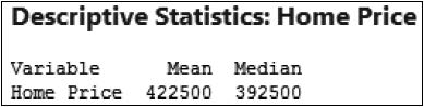
Table 4 contains a sample of six home sales prices for Broward County, Florida, for June 27, 2014. We want to get an idea of the typical home sales price in Broward County.
a. Find the mean sales price of the homes in Table 4.
b. Suppose we add a seventh home in Hillsborough Beach, selling for $6 million. Calculate the mean sales price of all seven homes. Comment on how the extreme value affected the mean sales price.
Solution
a. The mean sales price of the homes in Table 4 is:
5 $422,500
b. Now, suppose that we append a seventh home to our sample: a home in Hillsborough Beach listed for $6 million, which is much more expensive than any of the other homes in the sample. Recalculating the mean, we get
Note that the mean sales price nearly tripled from $422,500 to $1,220,000 when we added this extreme value. Also, this new mean is much higher than every price in the original sample. Thus, it is highly unlikely that this new mean of about $1.2 million is representative of the typical sales price of homes in Broward County. This example shows how the mean is sensitive to the presence of extreme values. For situations like this, we prefer a measure of center that is not so sensitive to extreme values. Fortunately, the median is just such a measure.
The Median
Recall that the median strip on a highway is the slice of land in the middle of the two lanes of the highway. In statistics, the median of a data set is the middle data value when the data are put into ascending order. There are two cases, depending on whether the sample size is odd or even.
The case when the sample size is even is clear if you hold up four fingers on one hand. Notice that there is no unique finger in the middle. No middle value exists when the sample size is even, so we take the two data values in the middle and split the difference.
EXAMPLE 4 Median is not sensitive to extreme values
Show that the median is not sensitive to extreme values by doing the following:
a. Find the median sales price of the homes in Table 4.
b. Add the seventh home in Hillsborough Beach, selling for $6 million. Calculate the median sales price of all seven homes.
Solution
a. Fortunately, the data are already presented in ascending order in the table. Because n = 6 is even, the median is the mean of the two data values that lie on either side of the 5 3.5th position. That is, the median is the mean of the 3rd and 4th data values, $360,000 and $425,000. Splitting the difference between these two, we get
We note that, in Table 4, there are exactly as many homes with prices lower than $392,500 as homes with prices higher than $392,500.
b. Now, what happens to the median when we add in the $6 million home from Hillsborough Beach? Because n = 7 is odd, the median is the unique 5 4th observation, given by the home in Miramar for $425,000. The extreme value increased the median only from $392,500 to $425,000. In Example 3, we showed that the value of the mean price nearly tripled when the expensive home was added. Thus, the median home sales price is a better measure of center because it more accurately reflects the typical sales prices of homes in Broward County.
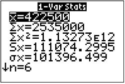
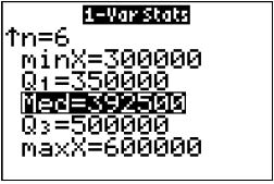
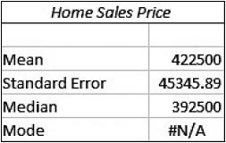
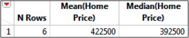
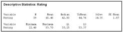
EXAMPLE 5 Using technology to find the mean and median
Find the mean and median of the home sales prices in Table 4, using (a) the TI-83/84, (b) Excel, (c) Minitab, and (d) JMP.
Solution
Using the instructions in the Step-by-Step Technology Guide on page 117, we get the following output:
a. The first TI-83/84 screen shows x 5 422,500 and n 5 6. The second screen shows the median, Med 5 392,500.
b. The mean and median are shown in the Excel output.
c. The mean and median are shown in the Minitab output.
d. The mean and median are shown in the JMP output.
3
The Mode
Sometimes the mode does not indicate the center of a data set. For example, suppose we have the following set of biology lab scores: 60, 80, 100, 100. The mode is 100, but it is not near the center of the data.
A third measure of center is called the mode. French speakers will recognize that the term mode in French refers to fashion. The popularity of clothing, cosmetics, music, and even basketball shoes often depends on just which style is in fashion. In a data set, the value that is most “in fashion” is the value that occurs the most.
The mode of a data set is the data value that occurs with the greatest frequency.
EXAMPLE 6 Finding the mean, median, and mode: Music videos
The Web site MTV.com contains music videos for many performers. Table 5 provides the number of music videos available for download for four performers, as of May 21, 2012. Find the (a) mean, (b) median, and (c) mode number of music videos.
|
Table 5 Music videos for four performers |
|
|
Performer |
Music Videos |
|
Michael Jackson |
31 |
|
Taylor Swift |
26 |
|
Usher |
26 |
|
Katy Perry |
15 |
Solution
a. The sample mean number of music videos is
The mean number of music videos is 24.5.
b. Because n 5 4 is even, the median is the mean of the two middle data values:
Median 5 5 26 music videos.
c. The mode is the data value that occurs with the greatest frequency. Two performers have 26 music videos: Taylor Swift and Usher. No other data value occurs more than once. Therefore, the mode is 26 music videos, as shown in Figure 3.
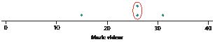
FIGURE 3 Dotplot of music videos, showing 26 as the mode.
One of the strengths of the mode is that it can also be used with categorical, or qualitative, data. Suppose you asked your friends to name their favorite flower. Six of them answered “rose,” three answered “lily,” and one answered “daffodil.” Note that these data are categorical, not numerical. The most frequently occurring flower is “rose”; therefore, the rose represents the mode of the variable favorite flower. Unfortunately, we cannot use arithmetic with categorical variables, and thus the mean or median for this variable cannot be found.
It may happen that no value occurs more than once, in which case we say there is no mode. On the other hand, more than one data value could occur with the greatest frequency, in which case we would say there is more than one mode. Data sets with one mode are unimodal; data sets with more than one mode are multimodal.

What If Scenario
Consider Example 6 once again. Now imagine: what if there was an incorrect data entry, such as a typo, and the number of Michael Jackson’s videos was greater than 31 by some unspecified amount?
Describe how and why this change would have affected the following, if at all:
a. The mean number of music videos
b. The median number of music videos
c. The mode number of music videos
Solution
a. Consider Figure 4, a dotplot of the number of music videos, with the triangle indicating the mean, or balance point, at 24.5. Recall that this represents the balance point of the data. As the number of Michael Jackson’s videos increases (arrow), the point at which the data balance (the mean) also moves somewhat to the right. Thus, the mean number of followers will increase.
b. Recall from Example 6 that the median is the mean of the middle two data values. In other words, the mean ignores most of the data values, including the largest value, which is the only one that has increased. Therefore, the median will remain unchanged.
c. The mode also remains unchanged, because the only data value that occurs more than once is the original mode—26 music videos—and this remains unchanged.
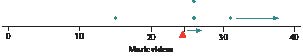
FIGURE 4 As the number of Michael Jackson’s videos increases, so does the mean, but not the median or mode.
4
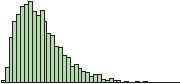
Skewness and Measures of Center
The skewness of a distribution can often tell us something about the relative values of the mean, median, and mode (see Figure 5).
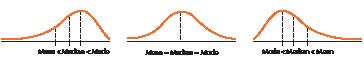
FIGURE 5 How skewness affects the mean and median.
EXAMPLE 7 Mean, median, and skewness
The histogram of the average size of households in the 50 states and the District of Columbia from Example 21 of Chapter 2 (page 74) is reproduced here as Figure 6.
a. Based on the skewness of the distribution, state the relative values of the mean, median, and mode.
b. Use Minitab to verify your claim in (a).
Solution
a. The distribution of average household size is somewhat right-skewed. Thus, from Figure 6, we would expect the mean to be greater than the median, which is greater than the mode.
b. The Minitab descriptive statistics are shown here. Note that the mean is greater than the median, which is greater than the mode.
Can the Financial Experts Beat the Darts?
Recall the contest held by the Wall Street Journal to compare the performance of stock portfolios chosen by financial experts and stocks chosen at random by throwing darts at the Journal stock pages. We will examine the results of 100 such contests in various ways, using the methods we have learned thus far, and will return to examine them further as we acquire more analysis tools. Let’s start by reporting the raw result data. The percentage increase or decrease in stock prices was calculated for the portfolios chosen by the professional financial advisers and by the randomly thrown darts, and was compared with the percentage net change in the Dow Jones Industrial Average (DJIA).
Exploratory Data Analysis
Figure 7 shows comparative dotplots of the percentage net change in price for the professionally selected portfolio, the randomly selected darts portfolio, and the DJIA, over the course of the 100 contests. First, estimate the mean of each distribution by choosing the balance point of the data. This balance spot is the mean. For fun, write down your guess for the mean for the professionals so you can see how close you were when we provide the descriptive statistics later. Now compare this with where you would find the balance spot (mean) for the darts dotplot. Which numerical value is larger: the balance spot for the pros or the darts? Just think: you are comparing the mean portfolio performances for the professionals and the darts without using a formula or a calculator. This is exploratory data analysis. You are using graphical methods to compare numerical statistics.
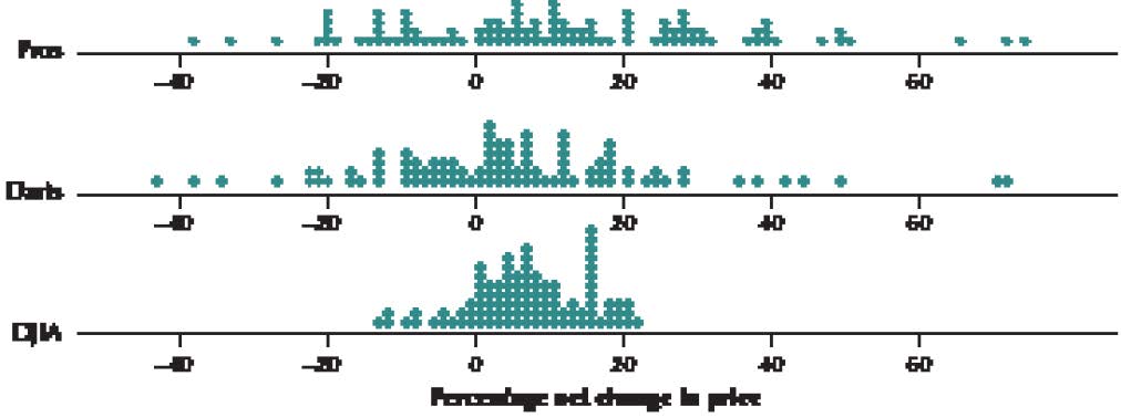
FIGURE 7 Dotplot of the percentage net price change for the professionally selected portfolio, the randomly selected darts portfolio, and the DJIA.
Hopefully, you discovered that the estimated mean for the pros is greater than the estimated mean for the darts. This is not particularly surprising, is it? Next, find the balance point for the DJIA dotplot. Compare the numerical value for the DJIA balance spot with the mean you found for the dotplot for the pros. Write down your estimate of the means for the DJIA and darts dotplots, so you can see how close you were later. Again, hopefully, you found that the estimated professionals’ mean was higher than that of the DJIA. Now, a tougher comparison is to compare the estimated DJIA mean with that of the darts. Which of these two do you think is higher?
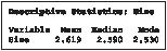
Finally, Minitab provides us with the mean percentage net price changes, as shown in Figure 8. Over the course of 100 contests, the mean price for the portfolios chosen by the professional financial advisers increased by 10.95%, by 6.793% for the DJIA, and by 4.52% for the random darts portfolio.
This is evidence in support of the view that financial experts can consistently outperform the market.
STEP-BY-STEP TECHNOLOGY GUIDE: Descriptive Statistics
TI-83/84
Step 1 Press STAT > 1: Edit. Enter the data in L1 using the instructions found in the Step-by-Step Technology Guide in Section 2.2.
Step 2 Press STAT. Use the right arrow button to move the cursor so that CALC is highlighted.
Step 3 Select 1-Var Stats, and press ENTER.
Step 4 On the home screen, the command 1-Var Statistics is shown. Press 2nd, then L1 (above the 1 key), and press ENTER.
EXCEL
Step 1 Enter the data in column A.
Step 2 Select Data > Data Analysis.
Step 3 Select Descriptive Statistics, and click OK.
Step 4 For the Input Range, click and drag to select the data in column A. If the variable name is at the top of the column, click Labels in the First Row.
Step 5 Check Summary Statistics, and click OK.
MINITAB
Step 1 Enter the data in column C1.
Step 2 Select Stat > Basic Statistics > Display Descriptive Statistics…
Step 3 The variable selection dialog box appears. Select the variable you want to summarize by double-clicking on it until it appears in the Variables box.
Step 4 Click Statistics…
Step 5 Select the desired statistics, and click OK. Then click OK.
SPSS
Step 1 Enter the data in the first column.
Step 2 Click Analyze > Descriptive Statistics > Frequencies…
Step 3 Click the variable name, then click the arrow to move it to the Variable(s) box.
Step 4 Click Statistics… and choose the desired statistics. Click Continue, and then OK.
JMP
Step 1 Click File > New > DataTable. Enter the data in Column 1.
Step 2 Click Tables > Summary.
Step 3 Select the column, and then select the desired statistics from the Statistics drop-down menu one by one. Click OK.
CRUNCHIT!
We will use the data from Example 3 (page 111).
Step 1 Click File, highlight Load from Larose, Discostat3e > Chapter 3, and click on Example 01_03.
Step 2 Click Statistics and select Descriptive Statistics. For Data, select Price, and then click Calculate.
Section 3.1 Summary
1. Measures of center are introduced in Section 3.1. The sample mean (x) represents the sum of the data values in the sample divided by the sample size (n). The population mean (m) represents the sum of the data values in the population divided by the population size (N). The mean is sensitive to the presence of extreme values.
2. The median occupies the middle position when the data are put in ascending order and is not sensitive to extreme values.
3. The mode is the data value that occurs with the greatest frequency. Modes can be applied to categorical data as well as numerical data but are not always reliable as measures of center.
4. The skewness of a distribution can often tell us something about the relative values of the mean and the median.
Section 3.1 Exercises
CLARIFYING THE CONCEPTS
1. Explain what a measure of center is. (p. 108)
2. Which measure may be used as the balance point of the data set? Explain how this works. (p. 110)
3. Explain what we mean when we say that the mean is sensitive to the presence of extreme values. Explain whether the median is sensitive to extreme values. (pp. 111–112)
4. What are the three measures of center that we learned about in this section? (p. 108)
For Exercises 5–12, either state what is being described or provide the notation.
5. The number of observations in your sample data set (p. 109)
6. The number of observations in your population data set (p. 109)
7. Notation denoting “sum all the data” (p. 109)
8. Notation for what we get when we add up all the data values in the population, and divide by how many observations there are in the population (p. 109)
9. Notation for what we get when we add up all the data values in the sample, and divide by how many observations there are in the sample (p. 109)
10.
The middle data value when the data are put in ascending order (p. 112)
11.
The data value that occurs with the greatest frequency (p. 114)
12.
The sample mean (p. 109)
PRACTICING THE TECHNIQUES

CHECK IT OUT!
|
To do |
Check out |
Topic |
|
Exercises 13–18 |
Example 1 |
Population mean |
|
Exercises 19–24 |
Example 2 |
Sample mean |
|
Exercises 25–30 |
Example 3 |
Sensitivity of mean |
|
Exercises 31–36 |
Example 4 |
Median |
|
Exercises 37–40 |
Example 6 |
Mode |
|
Exercises 41–44 |
Example 7 |
Mean, median, and skewness |
For the data in Exercises 13–18:
a. Find the population size N.
b. Calculate the population mean m.
13.
State exports to other countries are shown in the table for the population of all New England states, for the month of June 2014, expressed in billions of dollars.
|
State |
Exports |
State |
Exports |
|
Connecticut |
1.4 |
New Hampshire |
0.4 |
|
Maine |
0.3 |
Rhode Island |
0.2 |
|
Massachusetts |
2.4 |
Vermont |
0.3 |
Source: U.S. Census Bureau.
14.
The number of wins for each baseball team in the population of the American League West division for 2013 is shown in the table.
|
Team |
Wins |
Team |
Wins |
|
Oakland Athletics |
96 |
Seattle Mariners |
71 |
|
Texas Rangers |
91 |
Houston Astros |
51 |
|
Los Angeles Angels |
78 |
Source: MLB.mlb.com.
15.
The table provides the motor vehicle theft rate for the population of the top 10 countries in the world for motor vehicle theft, for 2012. The theft rate equals the number of motor vehicles stolen in 2012 per 100,000 residents.
|
Country |
Theft rate |
Country |
Theft rate |
|
|
Italy |
208.0 |
Greece |
100.2 |
|
|
France |
174.1 |
Norway |
94.1 |
|
|
USA |
167.8 |
Netherlands |
75.2 |
|
|
Sweden |
117.2 |
Spain |
75.1 |
|
|
Belgium |
106.0 |
Cyprus |
66.0 |
Source: United Nations Office on Drugs and Crime.
16.
The National Center for Education Statistics sponsors the Trends in International Mathematics and Science Study (TIMSS). The table contains the mean science scores for the eighth-grade science test for the populations of all Asian-Pacific countries that took the exam.
|
Country |
Science score |
Country |
Science score |
|
Singapore |
578 |
Australia |
527 |
|
Taiwan |
571 |
New Zealand |
520 |
|
South Korea |
558 |
Malaysia |
510 |
|
Hong Kong |
556 |
Indonesia |
420 |
|
Japan |
552 |
Philippines |
377 |
17.
The table contains the number of petit larceny cases for the population of all police precincts in South Manhattan in 2013.
|
Precinct |
Petit larcenies |
Precinct |
Petit larcenies |
|
1 |
2014 |
10 |
995 |
|
5 |
1288 |
13 |
2094 |
|
6 |
1555 |
14 |
4551 |
|
7 |
584 |
17 |
823 |
|
9 |
1607 |
18 |
2071 |
Source: New York City Police Department.
18.
The table contains the number of criminal trespass cases for the population of all police precincts in South Manhattan in 2013.
|
Precinct |
Criminal trespasses |
Precinct |
Criminal trespasses |
|
1 |
108 |
10 |
207 |
|
5 |
105 |
13 |
135 |
|
6 |
113 |
14 |
340 |
|
7 |
233 |
17 |
74 |
|
9 |
219 |
18 |
120 |
Source: New York City Police Department.
For the data in Exercises 19–24:
a. Find the sample size n.
b. Calculate the sample mean x.
19.
A sample of the state export data from Exercise 13 is provided in the table.
|
State |
Exports |
|
Connecticut |
1.4 |
|
Massachusetts |
2.4 |
|
Rhode Island |
0.2 |
20.
A sample from the baseball data in Exercise 14 is shown here.
|
Team |
Wins |
|
Texas Rangers |
91 |
|
Los Angeles Angels |
78 |
|
Seattle Mariners |
71 |
21.
A sample from the motor vehicle theft data in Exercise 15 is as follows.
|
Country |
Theft rate |
|
Italy |
208.0 |
|
USA |
167.8 |
|
Greece |
100.2 |
22.
A sample from the science score data in Exercise 16 is given here.
|
Country |
Science score |
|
South Korea |
558 |
|
Hong Kong |
556 |
|
Japan |
552 |
|
Australia |
527 |
23.
The following sample is taken from the petit larceny data in Exercise 17.
|
Precinct |
Petit larcenies |
|
1 |
2014 |
|
6 |
1555 |
|
9 |
1607 |
|
14 |
4551 |
|
17 |
823 |
24.
A sample taken from the criminal trespass data in Exercise 18 is as follows.
|
Precinct |
Criminal trespasses |
|
1 |
108 |
|
7 |
233 |
|
14 |
340 |
|
18 |
120 |
For Exercises 25–30, use the data from the indicated exercise, along with the indicated extreme, to show that the mean is more sensitive to extreme values. For each exercise, find the sample mean including the extreme value. Compare your answer to the mean calculated without the extreme value from the earlier exercise.
25.
Data from Exercise 19. Extreme value 5 10
26.
Data from Exercise 20. Extreme value 5 20
27.
Data from Exercise 21. Extreme value 5 1000
28.
Data from Exercise 22. Extreme value 5 0
29.
Data from Exercise 23. Extreme value 5 20,000
30.
Data from Exercise 24. Extreme value 5 1500
For Exercises 31–36, use the data from the indicated exercise, along with the indicated extreme, to show that the mean is more sensitive to extreme values than the median is. Do the following:
a. Calculate the median of the data without the extreme value.
b. Find the median of the data including the extreme value. Compare your answers from (a) and (b). Note that the median did not change as much as the mean did in Exercises 25–30.
31.
Data from Exercise 19. Extreme value 5 10
32.
Data from Exercise 20. Extreme value 5 20
33.
Data from Exercise 21. Extreme value 5 1000
34.
Data from Exercise 22. Extreme value 5 0
35.
Data from Exercise 23. Extreme value 5 20,000
36.
Data from Exercise 24. Extreme value 5 1500
For the data in Exercises 37–40, find the mode.
37.
The table contains the number of dangerous weapons cases for four police precincts in Manhattan.
|
Precinct |
Dangerous weapons cases |
|
1 |
19 |
|
5 |
24 |
|
20 |
24 |
|
22 |
9 |
38.
The Recording Industry Association of America (RIAA) awards multi-platinum status for any musical recording that sells more than 2 million copies. The table contains a random sample of 10 of the musical artists with the most multi-platinum singles.
|
Artist |
Multi-platinums |
Artist |
Multi-platinums |
|
Beyoncé |
4 |
Linkin Park |
2 |
|
Bruno Mars |
4 |
The Beatles |
4 |
|
Jay-Z |
4 |
Michael Jackson |
1 |
|
Katy Perry |
8 |
Taylor Swift |
8 |
|
Lady Gaga |
6 |
Tim McGraw |
2 |
Source: RIAA.
39.
The table contains the unemployment rates in August 2014 for 10 countries.
|
Country |
Unemployment rate |
Country |
Unemployment rate |
|
Britain |
6.4 |
Japan |
3.7 |
|
Canada |
7.0 |
Mexico |
4.8 |
|
China |
4.1 |
Pakistan |
6.2 |
|
India |
8.8 |
South Korea |
3.4 |
|
Italy |
12.3 |
United States |
6.2 |
Source: The Economist, www.economist.com/node/21604509.
40.
The table contains the top 10 most downloaded free apps for the IOS platform, as reported by Apple.com, along with the app type, for June 2014. Find the mode of App Type.
|
Rank |
App |
App type |
Rank |
App |
App type |
|
1 |
Two Dots |
Games |
6 |
Snap Chat |
Photo and video |
|
2 |
The Line |
Games |
7 |
|
Photo and video |
|
3 |
Traffic Racer |
Games |
8 |
The Test |
Games |
|
4 |
Rival Knights |
Games |
9 |
Republique |
Games |
|
5 |
Piano Tiles |
Games |
10 |
YouTube |
Photo and video |
For Exercises 41–44, consider the accompanying distributions. What can we say about the values of the mean, median, and mode in relation to one another for the given histograms?
A
B
C
41.
The distribution in A
42.
The distribution in B
43.
The distribution in C
44.
The distribution in D
APPLYING THE CONCEPTS
45.
NFL Football, Southern Style. The table contains the population of all the teams in the National Football Conference South Division, along with the number of wins in the 2013 season.
a. What is the population size, N, where the population is the NFC South Division?
b. What is the population mean number of wins, m?
|
NFC South team |
Wins |
|
Carolina Panthers |
12 |
|
New Orleans Saints |
11 |
|
Atlanta Falcons |
4 |
|
Tampa Bay Buccaneers |
4 |
46.
New England Electoral Votes. The table contains the population of all the New England states, along with their electoral votes.
a. What is the population size, N?
b. Calculate the population mean number of electoral votes, m.
|
Electoral votes |
|
|
Connecticut |
7 |
|
Maine |
4 |
|
Massachusetts |
11 |
|
New Hampshire |
4 |
|
Rhode Island |
4 |
|
Vermont |
3 |
47.
NFL Football, Southern Style. Refer to the population data in Exercise 45. Suppose we take a sample from the population, and we get the Carolina Panthers and the Atlanta Falcons.
a. What is the sample size n?
b. Calculate the sample mean number of wins, x.
48.
New England Electoral Votes. Refer to the population data in Exercise 46. Suppose we take a sample from the population, and get Massachusetts, Rhode Island, and Vermont.
a. What is the sample size n?
b. Calculate the sample mean number of electoral votes, x.
Video Game Sales. The Chapter 1 Case Study looked at video game sales for the top 30 video games. The following table contains the total sales (in game units) and weeks on the top 30 list for a sample of five randomly selected video games. Use this information for Exercises 49 and 50.
|
Video game |
Total sales in millions of units |
Weeks |
|
Super Mario Bros. U for WiiU |
1.7 |
78 |
|
NBA 2K14 for PS4 |
0.6 |
27 |
|
Battlefield 4 for PS3 |
0.9 |
29 |
|
Titanfall for XBoxOne |
1.2 |
10 |
|
Yoshi’s New Island for 3DS |
0.2 |
10 |
Source: www.vgchartz.com.

49.
Find the following measures of center for total sales.
a. Mean
b. Median
50.
Calculate the following measures of center for weeks.
a. Mean
b. Median

Darts and the Dow Jones. The following table contains a random sample of eight days from the Chapter 3 Case Study data set, indicating the stock market gain or loss for the portfolio chosen by the random darts, as well as the Dow Jones Industrial Average gain or loss for that day. Use this information for Exercises 51 and 52.
51.
Find the following measures of center for the darts stock returns.
a. Mean
b. Median
52.
Find the following measures of center for the DJIA.
a. Mean
b. Median
|
Darts |
DJIA |
|
–27.4 |
–12.8 |
|
18.7 |
9.3 |
|
42.2 |
8 |
|
–16.3 |
–8.5 |
|
11.2 |
15.8 |
|
28.5 |
10.6 |
|
1.8 |
11.5 |
|
16.9 |
–5.3 |
Source: Wall Street Journal.

Age and Height. The following table provides a random sample from the Chapter 4 Case Study data set body_females, showing the age and height of the eight women. Use this information for Exercises 53 and 54.
|
Age |
Height |
|
40 |
63.5 |
|
28 |
63 |
|
25 |
64.4 |
|
34 |
63 |
|
26 |
63.8 |
|
21 |
68 |
|
19 |
61.8 |
|
24 |
69 |
Source: Journal of Statistics Education.
53.
Find the following measures of center for the women’s ages.
a. Mean
b. Median
54.
Find the following measures of center for the women’s heights.
a. Mean
b. Median

Saturated Fat and Calories. The table contains the calories and saturated fat in a sample of ten food items. Use this information for Exercises 55 and 56.
55.
Find the following measures of center for calories.
a. Mean
b. Median
56.
Find the following measures of center for the grams of saturated fat.
a. Mean
b. Median

|
Food item |
Calories |
Grams of saturated fat |
|
Chocolate bar (1.45 ounces) |
216 |
7.0 |
|
Meat & veggie pizza (large slice) |
364 |
5.6 |
|
New England clam chowder (1 cup) |
149 |
1.9 |
|
Baked chicken drumstick (no skin, medium size) |
75 |
0.6 |
|
Curly fries, deep-fried (4 ounces) |
276 |
3.2 |
|
Wheat bagel (large) |
375 |
0.3 |
|
Chicken curry (1 cup) |
146 |
1.6 |
|
Cake doughnut hole (one) |
59 |
0.5 |
|
Rye bread (1 slice) |
67 |
0.2 |
|
Raisin bran cereal (1 cup) |
195 |
0.3 |
Source: Food-a-Pedia.
Table 6 contains the trade balance currently maintained by the United States with a sample of 9 countries, for the month of June 2014. Use this data for Exercises 57–60.
TABLE 6 Trade balance
|
Country |
Trade balance ($ billions) |
|
Brazil |
1 |
|
France |
–1.2 |
|
Germany |
–5.6 |
|
India |
–1.3 |
|
Italy |
–2.4 |
|
Japan |
–5.6 |
|
South Korea |
–1.8 |
|
Saudi Arabia |
–1.8 |
|
United Kingdom |
0 |
Source: Foreign Trade Division, U.S. Census Bureau.
57.
Find the sample size, n.
58.
Calculate the sample mean trade balance, x.
59.
Find the median.
60.
Find the modes.
Table 7 contains the number of cylinders, the engine size (in liters), the fuel economy (miles per gallon [mpg], city driving), and the country of manufacture for six 2011 automobiles. Use this information for Exercises 61–65.

TABLE 7 Cylinders, engine size, and fuel economy for six cars
|
Vehicle |
Cylinders |
Engine size |
City mpg |
Country of manufacture |
|
Cadillac CTS |
6 |
3.0 |
18 |
USA |
|
Ford Fusion
Hybrid |
4 |
2.5 |
41 |
USA |
|
Ford Taurus |
6 |
3.5 |
18 |
USA |
|
Honda Civic |
4 |
1.8 |
25 |
Japan |
|
Rolls Royce |
12 |
6.7 |
11 |
UK |
|
Toyota Camry
Hybrid |
4 |
2.4 |
31 |
Japan |
Source: www.fueleconomy.gov.
61.
Find the following for the number of cylinders:
a. Mean b. Median c. Mode
62.
Refer to your work in Exercise 61. Which measure of center do you think is most representative of the typical number of cylinders? Explain.
63.
Find the following for the engine size:
a. Mean b. Median c. Mode
64.
Find the following for the city mpg:
a. Mean b. Median c. Mode
65.
Find the mode for country of manufacture.
Use the information in Table 8 to answer Exercises 66−68, which gives the number of wins for the top 10 NASCAR racing drivers in various categories.

TABLE 8 Top 10 NASCAR winners in the modern era
|
Rank |
Driver |
Total |
Super speedways |
Short tracks |
|
1 |
Darrell Waltrip |
84 |
18 |
47 |
|
2 |
Dale Earnhardt |
76 |
29 |
27 |
|
3 |
Jeff Gordon |
75 |
15 |
15 |
|
4 |
Cale Yarborough |
69 |
15 |
29 |
|
5 |
Richard Petty |
60 |
19 |
23 |
|
6 |
Bobby Allison |
55 |
24 |
12 |
|
7 |
Rusty Wallace |
55 |
5 |
25 |
|
8 |
David Pearson |
45 |
20 |
1 |
|
9 |
Bill Elliott |
44 |
16 |
2 |
|
10 |
Mark Martin |
35 |
5 |
7 |
Source: www.nascar.com.
66.
Refer to the super speedways data. Find the following:
a. Mean b. Median c. Mode
67.
Refer to the short tracks data. Find the following:
a. Mean b. Median c. Mode
68.
Refer to the totals data. Find the following:
a. Mean b. Median c. Mode
For Exercises 69–73, refer to Table 9, which lists the top five mass market paperback fiction books for the week of July 1, 2014, as reported by the New York Times.
TABLE 9 Top five best-sellers in paperback trade fiction
|
Rank |
Title |
Author |
Price |
|
1 |
A Game of Thrones |
George R. R. Martin |
$7.83 |
|
2 |
Takedown Twenty |
Janet Evanovich |
$7.64 |
|
3 |
Inferno |
Dan Brown |
$8.48 |
|
4 |
A Dance with Dragons |
George R. R. Martin |
$6.71 |
|
5 |
The 9th Girl |
Tami Hoag |
$8.47 |
69.
Find the mean, median, and mode for the price of these five books on the best-seller list. Suppose a salesperson claimed that the price of a typical book on the best-seller list is less than $14. How would you use these statistics to respond to this claim?
70.
Linear Transformations. Add $10 to the price of each book.
a. Now find the mean of these new prices.
b. How does this new mean relate to the original mean?
c. Construct a rule to describe this situation in general.
71.
Linear Transformations. Multiply the price of each book by 5.
a. Now find the mean of these new prices.
b. How does this new mean relate to the original mean?
c. Construct a rule to describe this situation in general.
72.
Find the mode for the following variables:
a. Price
b. Author
73.
Explain whether it makes sense to find the mean or median of the variable author.
Mode of Categorical Data. The New York City Police Department tracks the number and type of traffic violations. The table contains a random sample of 12 traffic violations and the borough in which they occurred (Manhattan or Brooklyn). Use the data for Exercises 74–76.
|
Violation type |
Borough |
Violation type |
Borough |
|
Cell phone |
Brooklyn |
Disobey sign |
Manhattan |
|
Safety belt |
Manhattan |
Speeding |
Brooklyn |
|
Cell phone |
Brooklyn |
Safety belt |
Manhattan |
|
Cell phone |
Manhattan |
Disobey sign |
Manhattan |
|
Speeding |
Brooklyn |
Disobey sign |
Brooklyn |
|
Safety belt |
Manhattan |
Cell phone |
Manhattan |
74.
Find the mode for violation type. Does this mean that most violations are of this type?
75.
Calculate the mode for borough.
76.
Does the idea of the mean or median of these two variables make any sense? Explain clearly why not.
Car Model Years. The dotplot in Figure 9 represents the model year for a sample of cars in a used car lot. Refer to the dotplot for Exercises 77−79.
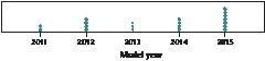
FIGURE 9 Dotplot of model year.
77.
What are the mean, median, and mode of the model year?
78.
Calculate a new statistic “age of the car in 2015” as follows: take the model year and subtract it from 2015.
a. Find the mode of the car ages.
b. Find the mean and median of the car ages.
79.
What will be the mean, median, and mode of the car ages in 2025?
80.
Five friends have just had dinner at the local pizza joint. The total bill came to $30.60. What is the mean cost of each person’s meal?
81.
Lindsay just bought four shirts at the boutique in the mall, costing a total of $84.28. What was the mean cost of each shirt?
Dealing with Missing Data. Exercises 82−85 ask you to calculate measures of center when one of the values is missing.
82.
The mean cost of a sample of five items is $20. The cost of four of the items is as follows: $25, $15, $15, $20. What is the cost of the 5th item?
83.
The mean size of four downloaded music files is 3 Mb (megabytes). The size of three of the files is as follows: 5 Mb, 2 Mb, 3 Mb. What is the length of the 4th music file?
84.
The median number of students in a sample of seven statistics classes is 25. The ordered values are: 20, 22, 24, __, 27, 27, 28. What is the missing value?
85.
The median number of academic credits taken in a sample of six students is 15. The ordered values are: 12, 12, 14, __, 17, 17. What is the missing value?
Nutrition Ratings of Breakfast Cereals. Refer to the following information for Exercises 86−89. (Note that Minitab denotes both the sample size and the population size as N.) The data represent the nutrition rate of 59 cereals based on sugar content, vitamin content, and so on.
86.
Find the following sample statistics.
a. The sample size
b. The sample mean
c. The sample median
d. The highest and lowest ratings in the sample
87.
What do these statistics tell us about the skewness of the distribution?
88.
Linear Transformations. If we take each cereal rating and subtract 5 from it, how would that affect the mean, median, and mode? Would it affect each of the measures equally?
89.
Linear Transformations. If we cut each of the cereals’ ratings in half, how would that affect the mean, median, and mode? Would it affect each of the measures equally?
BRINGING IT ALL TOGETHER
Pulse Rates for Men and Women. To answer Exercises 90−93, refer to Figure 10, which includes comparative dotplots of the pulse rates for males and females.2
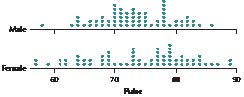
FIGURE 10 Comparative dotplots of pulse rates, by gender.
90.
Examine Figure 10.
a. Without doing any calculations, what is your impression of which gender, if any, has the higher overall pulse rate?
b. Find the mean pulse rate for the males by estimating the location of the balance point.
c. Find the mean pulse rate for the females by estimating the location of the balance point.
d. Based on (b) and (c), which gender has the higher mean pulse rate? Does this agree with your earlier impression?
91. Find the following medians:
a. The median pulse rate for the males
b. The median pulse rate for the females
c. Which gender has the higher median pulse rate? Does this agree with your findings for the mean earlier?
92. Find the following modes:
a. The mode pulse rate for the males
b. The mode pulse rate for the females
c.

Which gender has the higher mode pulse rate? Does this agree with your findings for the mean earlier?
93. What if the fastest pulse rate for the men was a typo and should have been an unspecified lower pulse rate? Describe how and why this change would have affected the following, if at all. Would they increase, decrease, or remain unchanged? Or is there insufficient information to tell what would happen? Explain your answers.
a. The mean men’s pulse rate
b. The median men’s pulse rate
c. The mode men’s pulse rate
94. Trimmed Mean. Because the mean is sensitive to extreme values, the trimmed mean was developed as another measure of center. To find the 10% trimmed mean for a data set, omit the largest 10% of the data values and the smallest 10% of the data values, and calculate the mean of the remaining values. Because the most extreme values are omitted, the trimmed mean is less sensitive, or more robust (resistant), than the mean as a measure of center. For the data in the table, calculate the following:
a. The mean
b. The 10% trimmed mean
c. The 20% trimmed mean
The data represent the number of business establishments in a sample of states.

|
State |
Businesses (1000s) |
State |
Businesses (1000s) |
|
Alabama |
3.8 |
Michigan |
7.5 |
|
Arizona |
7.9 |
Minnesota |
6.1 |
|
Colorado |
8.9 |
Missouri |
5.9 |
|
Connecticut |
3.1 |
Ohio |
9.5 |
|
Georgia |
10.3 |
Oklahoma |
3.8 |
|
Illinois |
11.9 |
Oregon |
5.4 |
|
Indiana |
5.6 |
South Carolina |
4.6 |
|
Iowa |
2.7 |
Tennessee |
5.4 |
|
Maryland |
5.7 |
Virginia |
8.6 |
|
Massachusetts |
6.3 |
Washington |
9.3 |
Source: U.S. Census Bureau.
95. Challenge Exercise. In general, would you expect the trimmed mean to be larger, smaller, or about the same as the mean for data sets with the following shapes?
a. Right-skewed data
b. Left-skewed data
c. Symmetric data
96. Midrange. Another measure of center is the midrange.
Because the midrange is based on the maximum and minimum values in the data set, it is not a robust statistic, but it is sensitive to extreme values. Calculate the midrange for the following data:
a. The price data from Table 9 on page 123.
b. The car model year data from Figure 9 on page 124.
97. Harmonic Mean. The harmonic mean is a measure of center most appropriately used when dealing with rates, such as miles per hour (mph). The harmonic mean is calculated as
where n is the sample size and the x’s represent rates, such as the speeds in mph. Emily walked five miles today, but her walking speed slowed as she walked farther. Her walking speed was 5 mph for the first mile, 4 mph for the second mile, 3 mph for the third mile, 2 mph for the fourth mile, and 1 mph for the fifth mile. Calculate her harmonic mean walking speed over the entire five miles.
98. Challenge Exercise. The (arithmetic) mean for Emily’s five-mile walk in Exercise 97 is 3 mph. Explain clearly why the value you calculated for the harmonic mean in Exercise 97 makes more sense than this arithmetic mean of 3 mph. (Hint: Consider time.)
99. Geometric Mean. The geometric mean is a measure of center used to calculate growth rates. Suppose that we have n positive values; then the geometric mean is the nth root of the product of the n values. Jamal has been saving money in an account that has had 4% growth, 6% growth, and 10% growth over the last three years. Calculate the average growth rate over these three years. (Hint: Find the geometric mean of 1.04, 1.06, and 1.10 and subtract 1.)
CONSTRUCT YOUR OWN DATA SETS
100.
Construct your own data set with n 5 10, where the mean, the median, and the mode are all the same. Yes, just make up your own list of numbers, as long as the mean, median, and mode are all the same. Draw a dotplot. Comment on the skewness of the distribution.
101.
Construct your own data set with n 5 10, where the mean is greater than the median, which is greater than the mode. Draw a dotplot. Comment on the skewness of the distribution.
102.
Construct your own data set with n 5 10, where the mode is greater than the median, which is greater than the mean. Draw a dotplot. Comment on the skewness of the distribution.
103.
Construct your own data set with n 5 3. Let the mean and median be equal. Now, alter the three data values so that the mean of the altered data set has increased, while the median of the altered data set has decreased.
Use the Mean and Median applet for Exercises 104 and 105.
104.
Insert three points on the line by clicking just below it: two near the left side and one near the middle.
a. Click and drag the rightmost point to the right.
b. Describe what happens to the mean when you do this.
c. Describe what happens to the median when you do this.
105.
Explain why each of the measures behaves the way it does in the previous exercise.
WORKING WITH LARGE DATA SETS
Open the VideoGameSales data set from the Chapter 1 Case Study. The data set represents a sample. Use technology to do the following.
106.
Find the mean and median weekly sales.
107.
Suppose we remove the biggest seller for the week, Minecraft for PS3, from the data. Given what you have learned about the sensitivity of the mean to the presence of extreme values, which measure do you expect will change the most, the mean or the median?
108.
Recalculate the mean and the median of weekly sales, this time omitting Minecraft for PS3. Was your intuition in Exercise 107 confirmed?
109.
Compute the mean and median total sales for the 30 games.
110.
Identify the video game with the largest total sales. Omit this video game, and recompute the mean and median total sales. Which measure of center was more sensitive to the removal of the extreme value?
111.
Find the mode for each of the following variables:
a. Platform
b. Studio
c. Game type
112.
Compute the mean, median, and mode for the variable weeks on list.
113. What if we add a certain unknown amount x to each value in the variable weeks on list? Describe what will happen to the following measures of center.
a. Mean
b. Median
c. Mode
1
The Range
In Section 3.1, we learned how to find the center of a data set. Is that all there is to know about a data set? Definitely not! Two data sets can have exactly the same mean, median, and mode and yet be quite different. We need measures that summarize the data set in a different way, namely, the variation or variability of the data. In Section 3.2, we will learn measures of variability that will help us answer the question: “How spread out is the data set?”
Table 10 contains the heights (in inches) of the players on two volleyball teams.
|
Table 10 Women’s volleyball team heights (in inches) |
|
|
Western Massachusetts University |
Northern Connecticut University |
|
60 |
66 |
|
70 |
67 |
|
70 |
70 |
|
70 |
70 |
|
75 |
72 |
a. Describe in words and graphs the variability of the heights of the two teams.
b. Verify that the means, medians, and modes for the two teams are equal.
Solution
a. There are some distinct differences between the teams. The Western Massachusetts (WMU) team has a player who is relatively short (60 inches: 5 feet tall) and a player who is very tall (75 inches: 6 feet, 3 inches tall). The Northern Connecticut (NCU) team has players whose heights are all within 6 inches of each other.
b. But despite the differences in (a), the mean, median, and mode of the heights for the two teams are precisely the same. As illustrated in Figure 11, the mean height (red triangle) for each team is 69 inches, the median height (green triangle) for each team is 70 inches, and the mode height (yellow triangle) for each team is 70 inches.
Clearly, these measures of location do not give us the whole picture. We need measures of variability (or measures of spread or measures of dispersion) that will describe how spread out the data values are. Figure 11 illustrates that the heights of the WMU team are more spread out than the heights of the NCU team.
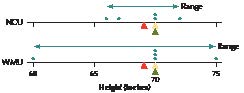
FIGURE 11 Comparative dotplots of the heights of two volleyball teams.
Just as there were several measures of the center of a data set, there are also a variety of ways to measure how spread out a data set is. The simplest measure of variability is the range.
A larger range is an indication of greater variability, or greater spread, in the data set.
Calculate the range of player heights for each of the WMU and NCU teams.
Solution
rangeWMU 5 largest value 2 smallest value 5 75 2 60 5 15 inches
rangeNCU 5 largest value 2 smallest value 5 72 2 66 5 6 inches
As we expected, the range for WMU players is indeed larger than the range for NCU players, reflecting WMU’s players’ greater variability in height.
Table 11 contains a sample from the data set for the Chapter 3 Case Study. The percent increase or decrease in stock portfolio is recorded for the set of stocks chosen by throwing darts at the stock pages, along with the Dow Jones Industrial Average (DJIA) for the same day.
|
Table 11 Sample set of stock market returns |
|
|
Darts |
DJIA |
|
11.2 |
15.8 |
|
72.9 |
16.2 |
|
16.6 |
17.3 |
|
28.7 |
17.7 |
1. Construct a comparison dotplot of the darts returns and the DJIA returns.
2. Using the dotplot, which group would you say has the larger range?
3. Calculate the range for each group. Is your intuition from (2) confirmed?
(The solutions are shown in Appendix A.)
The range is quite simple to calculate; however, it does have its drawbacks. For example, the range is quite sensitive to extreme values, because it is calculated from the difference of the two most extreme values in the data set. It completely ignores all the other data values in the data set. We would prefer our measure of variability to quantify spread with respect to the center, as well as to actually use all the available data values. Two such measures are the variance and the standard deviation.
2
Population Variance and Population Standard Deviation
Before we learn about the variance and the standard deviation, we need to get a firm understanding of what a deviation means, in the statistical sense.
EXAMPLE 10 Calculating deviations
Ashley and Brandon are certified public accountants who work for a large accounting firm, preparing tax returns for small business clients. Because tax returns are often filed close to the deadline, it is important that the returns be prepared in a timely fashion, with not a lot of variability in the length of time it takes to prepare a return. The chief accountant kept careful track of the amount of time (in hours, Table 12) for all the tax returns prepared by Ashley and Brandon during the last week of March.
a. Find the mean preparation time for each accountant.
b. Use comparative dotplots to compare the variability of Ashley and Brandon’s tax preparation times.
c. Calculate the deviations for each of Ashley and Brandon’s tax preparation times.
|
Table 12 Preparation times (in hours) for Ashley and Brandon |
|||||
|
Ashley |
5 |
7 |
8 |
9 |
11 |
|
Brandon |
3 |
5 |
7 |
11 |
14 |
Solution
Because the data represent all the tax returns for the indicated period, they may be considered a population.
a. For Ashley:
For Brandon:
So the two accountants spent the same mean amount of time in tax preparation.
b. Figure 12 contains comparative dotplots of Ashley and Brandon’s tax preparation times. Note that Brandon’s preparation times vary more than Ashley’s. Compared to Ashley, we can say that Brandon’s tax preparation times
● are more spread out,
● show greater variability,
● have more variation, and
● are more dispersed.
The chief accountant probably prefers a more consistent tax preparation time, with less variability.
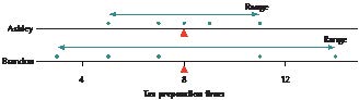
FIGURE 12 Brandon’s tax preparation times are more spread out.
c. Here we find the deviations, x 2 m.
● Ashley’s mean preparation time is m 5 8 hours. Her first tax return took x 5 5 hours, so the deviation for this first tax return is x 2m 5 5 2 8 5 23. Note that, when x , m, the deviation is negative.
● Ashley’s last tax return took 11 hours, so the deviation for this last return is x 2 m 5 11 2 8 5 3. Note that, when x . m, the deviation is positive.
● Continuing in this way, we find the deviations for all of Ashley’s and Brandon’s tax preparation times, as recorded in Table 13.
|
Table 13 Tax preparation times and their deviations |
|||||
|
Ashley’s times |
5 |
7 |
8 |
9 |
11 |
|
Ashley’s deviations |
5 2 8 5 23 |
7 2 8 5 21 |
8 2 8 5 0 |
9 2 8 5 1 |
11 2 8 5 3 |
|
Brandon’s times |
3 |
5 |
7 |
11 |
14 |
|
Brandon’s deviations |
3 2 8 5 25 |
5 2 8 5 23 |
7 2 8 5 21 |
11 2 8 5 3 |
14 2 8 5 6 |
These deviations are used for the most widespread measures of spread: the variance and the standard deviation. However, we cannot use the mean deviation, because the mean deviation always equals zero. For example,
● Ashley’s mean deviation:
● Brandon’s mean deviation:
The mean deviation always equals zero for any data set because the positive and negative deviations cancel each other out. Thus, the mean deviation is not a useful measure of spread. To avoid this problem, we will work with the squared deviations.
Table 14 shows the squared deviations for Ashley and Brandon. Note that Brandon’s squared deviations are, on average, larger than Ashley’s, reflecting the greater spread in Brandon’s preparation times. It is therefore logical to build our measure of spread using the mean squared deviation.
|
Table 14 Squared deviations of tax preparation times |
|||||
|
Ashley’s deviations |
–3 |
–1 |
0 |
1 |
3 |
|
Ashley’s squared deviations |
9 |
1 |
0 |
1 |
9 |
|
Brandon’s deviations |
–5 |
–3 |
–1 |
3 |
6 |
|
Brandon’s squared deviations |
25 |
9 |
1 |
9 |
36 |
The Population Variance, s2
For populations, the mean squared deviation is called the population variance and is symbolized by s2. This is the lowercase Greek letter sigma, not to be confused with the uppercase sigma () used for summation.
Notice that the numerator in s2 is a sum of squares. Squared numbers can never be negative, so a sum of squares also can never be negative. The denominator, N, which is the population size, also can never be negative. Thus, s2 can never be negative. The only time s2 5 0 is when all the population data values are equal.
Calculate the population variances of the tax preparation times for Ashley and Brandon.
Solution
Using the squared deviations from Table 14, we have
for Ashley, and
for Brandon. The population variance of the tax preparation times for Brandon is greater than the variance for Ashley, thus indicating that Brandon’s tax preparation times are more variable than Ashley’s.
Table 15 contains the funding provided by the Centers for Disease Control (CDC) to all the states in New England, in order to fight HIV/AIDS.3 This includes all the states in New England, so we may consider this a population.
1. Find the population mean funding, m.
2. Calculate the population variance of the funding, s2.
(The solution is shown in Appendix A.)
|
Table 15 CDC funding to fight HIV/AIDS for New England states |
|
|
State |
Funding (in millions) |
|
Connecticut |
7.8 |
|
Maine |
1.9 |
|
Massachusetts |
14.9 |
|
New Hampshire |
1.5 |
|
Rhode Island |
2.7 |
|
Vermont |
1.6 |
However, what is the meaning of the values we obtained for s 2, 4, and 16, apart from their comparative value? The problem is that the units of these values represent hours squared, which is not a useful measure. Unfortunately, the intuitive meaning of the population variance is not self-evident.
The Population Standard Deviation, s
In practice, the standard deviation is easier to interpret than the variance. The standard deviation is simply the square root of the variance, and by taking the square root, we return the units of measure back to the original data unit (for example, “hours” instead of “hours squared”). The symbol for the population standard deviation is s. Conveniently,
The population standard deviation, s, is the positive square root of the population variance and is found by
Calculate the population standard deviations of the tax preparation times for Ashley and Brandon.
Solution
Brandon’s population variance of 16 is larger than Ashley’s population variance of 4, so Brandon’s population standard deviation will also be larger because we are simply taking the square root. We have
for Ashley and
for Brandon.
The population standard deviation of Brandon’s tax preparation times is 4 hours, which is larger than Ashley’s 2 hours. As expected, the greater variability in Brandon’s preparation times leads to a larger value for his population standard deviation, s.
Compute the Sample Variance and Sample Standard Deviation
The Sample Variance, s2, and the Sample Standard Deviation s
In the real world, we usually cannot determine the exact value of the population mean or the population standard deviation. Instead, we use the sample mean and sample standard deviation to estimate the population parameters. The sample variance also depends on the concept of the mean squared deviation. If the sample mean is x, and the sample size is n, then we would expect the formula for the sample variance to resemble the formula for the population variance, namely
However, this formula has been found to underestimate the population variance, so that we need to replace the n in the denominator with n 2 1. We therefore have the following.
The sample variance, s2, is approximately the mean of the squared deviations in the sample and is found by
The sample standard deviation is perhaps the second most important statistic you will encounter in this book (after the sample mean, x). It is the most commonly used measure of spread. The sample standard deviation is simply the square root of the sample variance and takes as its symbol the letter s, which is the Roman letter for the Greek s. Again, .
Suppose we obtain a sample of size n 5 3 from Ashley’s population of tax preparation times, as follows: 5 hours, 8 hours, 11 hours, as shown.
|
Ashley’s Population |
5 |
7 |
8 |
9 |
11 |
|

|

|

|
|||
|
Ashley’s Sample |
5 |
8 |
11 |
a. Calculate the sample variance of the tax preparation times.
b. Compute the sample standard deviation of the tax preparation times.
c. Interpret the sample standard deviation.
Solution
a. We first find the sample mean, . It so happens that the value for this sample mean equals the population mean m 5 8, but this is only a coincidence.
Then the sample variance is
The sample variance is s2 5 9 hours squared.
b. Then the sample standard deviation is
c. For this sample of Ashley’s tax returns, the typical difference between a tax preparation time and the mean preparation time is 3 hours.
In the exercises, you will find alternative computational formulas for the variance and standard deviation.
Find the sample standard deviation and the sample variance of the city gas mileage for the 2015 cars shown in the following table. Use (a) the TI-83/84, (b) Excel, (c) Minitab, (d) JMP, and (e) SPSS.
|
Vehicle |
City mpg |
|
Subaru Forester |
22 |
|
Lexus RX 350 |
18 |
|
Ford Taurus |
19 |
|
Mini Cooper |
25 |
|
Cadillac Escalade |
14 |
|
Mazda MX-5 |
21 |
Source: www.fueleconomy.gov.
Solution
Using the instructions in the Step-by-Step Technology Guide on page 117, we obtain the following output:
a. The TI-83/84 output is shown in Figure 13. The sample standard deviation, s, is given as Sx 5 3.763863264. The sample variance is s2 5 (3.763863264)2 5 14.16667.
b. The Excel output is provided in Figure 14. The sample standard deviation and sample variance are highlighted.
c. The Minitab output is provided in Figure 15. Note that Minitab rounds s to two decimal places.
d. The JMP output is shown in Figure 16.
e. The SPSS results are provided in Figure 17.
Next, we turn to methods for applying the standard deviation.
4
The Empirical Rule
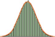
If the data distribution is bell-shaped, we may apply the Empirical Rule to find the approximate percentage of data that lies within k standard deviations of the mean, for k 5 1, 2, or 3.
EXAMPLE 15 Using the Empirical Rule to find percentages
The College Board reports that the population mean Math SAT score for 2014 is m 5 514, with a population standard deviation of s 5 118. Assume the distribution of Math SAT scores is bell-shaped.
a. Find the percentage of Math SAT scores between 396 and 632.
b. Compute the percentage of Math SAT scores that are above 750.
Solution
a. We see that a Math SAT score of 396 represents 1 standard deviation below the mean, because
m – 1s 5 514 2 1(118) 5 396.
Similarly, a Math SAT score of 632 represents 1 standard deviation above the mean, because
m 1 1s 5 514 1 1(118) 5 632.
Thus, “Math SAT scores between 396 and 632” represents between m – 1s and m 11s, that is, within 1 standard deviation of the mean. The data distribution is bell-shaped, so we may use the Empirical Rule. Therefore, about 68% of the Math SAT scores lie between 396 and 632, as shown in Figure 19.
b. We note that a Math SAT score of 750 represents 2 standard deviations above the mean, because
m 1 2s 5 514 1 2(118) 5 750.
We know from the Empirical Rule that about 95% of the Math SAT scores lie within 2 standard deviations of the mean, so that about 95% of the Math SAT scores lie between 278 and 750. The left-over area of about 5% in the two tails in Figure 19 is the percentage of Math SAT scores above 750 or below 278. Because the bell-shaped curve is symmetric, the two tail areas are equal in area, which means that about 2.5% of the Math SAT scores lie above 750 (Figure 19).
5
Chebyshev’s Rule
P. L. Chebyshev (1821–1894, Russia) derived a result, called Chebyshev’s Rule, that can be applied to any continuous data set.
Because of the phrase “at least,” we say that Chebyshev’s Rule provides minimum percentages, instead of the approximate percentages provided by the Empirical Rule. The actual percentage may be much greater than the minimum percentage provided by Chebyshev’s Rule.
EXAMPLE 16 Using Chebyshev’s Rule to find minimum percentages
The College Board reports that the population mean SAT Writing exam score for 2014 is m 5 488, with a population standard deviation of s 5 114. However, assume we do not know the data distribution. Find the minimum percentage of exam scores that is
a. between 260 and 716.
b. between 317 and 659.
c. between 374 and 602.
Solution
The data distribution is unknown, so we cannot apply the Empirical Rule.
a. Because 260 lies 2 standard deviations below the mean
m 2 2s 5 488 2 2(114) 5 260
and 716 lies 2 standard deviations above the mean
m 1 2s 5 488 1 2(114) 5 716,
this question is really asking what is the minimum percentage within k 5 2 standard deviations of the mean. From Chebyshev’s Rule, the minimum percentage is
Thus, at least 75% of the SAT Writing exam scores will lie between 260 and 716.
b. The exam scores 317 and 659 lie k 5 1.5 standard deviations below and above the mean, respectively. Therefore, at least
of the SAT Writing exam scores will lie between 317 and 659.
c. The scores 374 and 602 lie k 5 1 standard deviation below and above the mean, respectively. Unfortunately, Chebyshev’s Rule is restricted to situations where k . 1. Thus, we cannot answer this question.
If a given data set is bell-shaped, either the Empirical Rule or Chebyshev’s Rule may be applied to it.
Section 3.2 Summary
1. The simplest measure of variability, or measure of spread, is the range. The range is simply the difference between the maximum and minimum values in a data set, but the range has drawbacks because it relies on the two most extreme data values.
2. The variance and standard deviation are measures of spread that utilize all available data values. The population variance can be thought of as the mean squared deviation. The standard deviation is the square root of the variance. We interpret the value of the standard deviation as the typical deviation, that is, the typical distance between a data value and the mean.
3. The variance and standard deviation may also be calculated for a sample. Again, we interpret the value of the standard deviation as the typical deviation, that is, the typical distance between a data value and the mean.
4. For bell-shaped distributions, the Empirical Rule may be applied. The Empirical Rule states that, for bell-shaped distributions, about 68%, 95%, and 99.7% of the data values will fall within 1, 2, and 3 standard deviations of the mean, respectively.
5. Chebyshev’s Rule allows us to find the minimum percentage of data values that lie within a certain interval. Chebyshev’s Rule states that the proportion of values from a data set that will fall within k standard deviations of the mean will be at least [1 2 1/(k)2 ]100%, where k . 1.
Section 3.2 Exercises
Unless a data set is identified as a population, you can assume that it is a sample.
CLARIFYING THE CONCEPTS
1. Explain what a deviation is. (p. 128)
2. What is the interpretation of the value of the standard deviation? (p. 132)
3. State one benefit and one drawback of using the range as a measure of spread. (p. 128)
4. True or false: If two data sets have the same mean, median, and mode, then they are identical. (p. 127)
5. What is one benefit of using the standard deviation instead of the range as a measure of spread? What is one drawback? (p. 128)
6. Which measure of spread represents the mean squared deviation for the population? (p. 130)
7. True or false: Chebyshev’s Rule provides exact percentages. (p. 138)
8. When can the sample standard deviation, s, be negative? (p. 133)
9. When does the sample standard deviation, s, equal zero? (p. 133)
10.
When may the Empirical Rule be used? (p. 135)
PRACTICING THE TECHNIQUES

CHECK IT OUT!
|
To do |
Check out |
Topic |
|
Exercises 11a–16a |
Example 9 |
Range |
|
Exercises 11c–16c |
Example 10 |
Calculating deviations |
|
Exercises 11d–16d |
Example 11 |
Population variance |
|
Exercises 11e–16e |
Example 12 |
Population standard deviation |
|
Exercises 17–22 |
Example 13 |
Sample variance and sample standard deviation |
|
Exercises 23–30 |
Example 15 |
Empirical Rule |
|
Exercises 31–38 |
Example 16 |
Chebyshev’s Rule |
For the population data in Exercises 11–16, do the following:
a. Compute the range.
b. Find the population mean, m.
c. Calculate the deviations, x 2 m.
d. Compute the population variance, s2.
e. Find the population standard deviation, s.
11.
State exports to other countries are shown in the table for the population of all New England states, for the month of June 2014, expressed in billions of dollars.
|
State |
Exports |
State |
Exports |
|
Connecticut |
1.4 |
New Hampshire |
0.4 |
|
Maine |
0.3 |
Rhode Island |
0.2 |
|
Massachusetts |
2.4 |
Vermont |
0.3 |
Source: U.S. Census Bureau.
12.
The number of wins for each baseball team in the population of the American League West division for 2013 is shown in the table.
|
Team |
Wins |
Team |
Wins |
|
Oakland Athletics |
96 |
Seattle Mariners |
71 |
|
Texas Rangers |
91 |
Houston Astros |
51 |
|
Los Angeles Angels |
78 |
Source: MLB.mlb.com.
13.
The table provides the motor vehicle theft rate for the population of the top 10 countries in the world for motor vehicle theft, for 2012. The theft rate equals the number of motor vehicles stolen in 2012 per 100,000 residents.
|
Country |
Theft rate |
Country |
Theft rate |
|
Italy |
208.0 |
Greece |
100.2 |
|
France |
174.1 |
Norway |
94.1 |
|
USA |
167.8 |
Netherlands |
75.2 |
|
Sweden |
117.2 |
Spain |
75.1 |
|
Belgium |
106.0 |
Cyprus |
66.0 |
Source: United Nations Office on Drugs and Crime.
14.
The National Center for Education Statistics sponsors the Trends in International Mathematics and Science Study (TIMSS). The table contains the mean science scores for the eighth-grade science test for the population of all Asian-Pacific countries that took the exam.
|
Country |
Science Score |
Country |
Science score |
|
Singapore |
578 |
Australia |
527 |
|
Taiwan |
571 |
New Zealand |
520 |
|
South Korea |
558 |
Malaysia |
510 |
|
Hong Kong |
556 |
Indonesia |
420 |
|
Japan |
552 |
Philippines |
377 |
15.
The table contains the number of petit larceny cases for the population of all police precincts in South Manhattan in 2013.
|
Precinct |
Petit larcenies |
Precinct |
Petit larcenies |
|
1 |
2014 |
10 |
995 |
|
5 |
1288 |
13 |
2094 |
|
6 |
1555 |
14 |
4551 |
|
7 |
584 |
17 |
823 |
|
9 |
1607 |
18 |
2071 |
Source: New York City Police Department.
16.
The table contains the number of criminal trespass cases for the population of all police precincts in South Manhattan in 2013.
|
Precinct |
Criminal trespass |
Precinct |
Criminal trespass |
|
1 |
108 |
10 |
207 |
|
5 |
105 |
13 |
135 |
|
6 |
113 |
14 |
340 |
|
7 |
233 |
17 |
74 |
|
9 |
219 |
18 |
120 |
Source: New York City Police Department.
For the sample data in Exercises 17–22, do the following:
a. Calculate the sample variance.
b. Compute the sample standard deviation.
c. Interpret the sample standard deviation.
17.
A sample of the state export data from Exercise 11 is provided in the table.
|
State |
Exports |
|
Connecticut |
1.4 |
|
Massachusetts |
2.4 |
|
Rhode Island |
0.2 |
18.
A sample from the baseball data in Exercise 12 is shown here.
|
Team |
Wins |
|
Texas Rangers |
91 |
|
Los Angeles Angels |
78 |
|
Seattle Mariners |
71 |
19.
A sample from the motor vehicle theft data in Exercise 13 is as follows.
|
Country |
Theft rate |
|
Italy |
208.0 |
|
USA |
167.8 |
|
Greece |
100.2 |
20.
A sample from the science score data in Exercise 14 is given here.
|
Country |
Science score |
|
South Korea |
558 |
|
Hong Kong |
556 |
|
Japan |
552 |
|
Australia |
527 |
21.
The following sample is taken from the petit larceny data in Exercise 15.
|
Precinct |
Petit larcenies |
|
1 |
2014 |
|
6 |
1555 |
|
9 |
1607 |
|
14 |
4551 |
|
17 |
823 |
22.
A sample taken from the criminal trespass data in Exercise 16 is as follows.
|
Precinct |
Criminal trespass |
|
1 |
108 |
|
7 |
233 |
|
14 |
340 |
|
18 |
120 |
For Exercises 23–26, use the following information. A data distribution is bell-shaped, with a mean of 50 and a standard deviation of 5. Use the Empirical Rule to approximate the percentage of data.
23.
Between 45 and 55
24.
Between 40 and 60
25.
Between 35 and 65
26.
Less than 45
For Exercises 27–30, use the following information. A data distribution is bell-shaped, with a mean of 0 and a standard deviation of 1. Use the Empirical Rule to approximate the percentage of data.
27.
Between –1 and 1
28.
Greater than 2
29.
Less than –2
30.
Between –2 and 2
For Exercises 31–34, use the following information. A data set has an unknown distribution, with a mean of 20 and a standard deviation of 2. Use Chebyshev’s Rule to estimate the minimum possible percentage of data.
31.
Between 16 and 24
32.
Between 14 and 26
33.
Between 12 and 28
34.
Between 13 and 27
For Exercises 35–38, use the following information. A data set has an unknown distribution, with a mean of 20 and a standard deviation of 5. If possible, use Chebyshev’s Rule to estimate the minimum possible percentage of data.
35.
Between 0 and 40
36.
Between 5 and 35
37.
Between 12.5 and 27.5
38.
Between 15 and 25
APPLYING THE CONCEPTS
39.
Match the histograms in (a)–(d) to the statistics in (i)–(iv).
i. Mean 5 75, standard deviation 5 20
ii. Mean 5 75, standard deviation 5 10
iii. Mean 5 50, standard deviation 5 20
iv. Mean 5 50, standard deviation 5 10
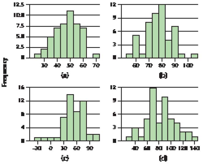
40.
Match the histograms in (a)–(d) to the statistics in (i)–(iv).
i. Mean 5 1, standard deviation 5 1
ii. Mean 5 1, standard deviation 5 0.1
iii. Mean 5 0, standard deviation 5 1
iv. Mean 5 0, standard deviation 5 0.1
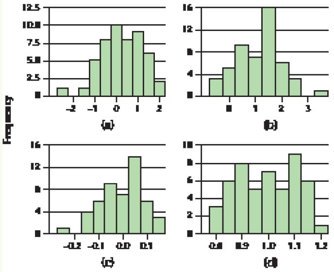
For the following exercises, make sure to state your answers in the proper units, such as “years” or “years squared.”
Video Game Sales. The Chapter 1 Case Study looked at video game sales for the top 30 video games. The following table contains the total sales (in game units) and weeks on the top 30 list for a sample of five randomly selected video games. Use this information for Exercises 41 and 42.
41.
Find the following measures of spread for total sales:
a. Range
b. Sample variance
c. Sample standard deviation
42.
Calculate the following measures of spread for the number of weeks on the top 30 list:
a. Range
b. Sample variance
c. Sample standard deviation
|
Video Game |
Total sales in millions of units |
Weeks on list |
|
Super Mario Bros. U for WiiU |
1.7 |
78 |
|
NBA 2K14 for PS4 |
0.6 |
27 |
|
Battlefield 4 for PS3 |
0.9 |
29 |
|
Titanfall for XboxOne |
1.2 |
10 |
|
Yoshi’s New Island for 3DS |
0.2 |
10 |
Source: www.vgchartz.com.


Darts and the DJIA. The following table contains a random sample of eight days from the Chapter 3 Case Study data set, indicating the stock market gain or loss for the portfolio chosen by the random darts, as well as the DJIA gain or loss for that day. Use this information for Exercises 43 and 44.
43.
Find the following measures of spread for the darts:
a. Range
b. Sample variance
c. Sample standard deviation
44.
Calculate the following measures of spread for the DJIA:
a. Range
b. Sample variance
c. Sample standard deviation

|
Darts |
DJIA |
|
227.4 |
212.8 |
|
18.7 |
9.3 |
|
42.2 |
8 |
|
216.3 |
28.5 |
|
11.2 |
15.8 |
|
28.5 |
10.6 |
|
1.8 |
11.5 |
|
16.9 |
25.3 |
Source: Wall Street Journal.
Age and Height. The following table provides a random sample from the Chapter 4 Case Study data set body_females, showing the age and height of the eight women. Use this information for Exercises 45 and 46.
45.
Find the following measures of spread for age:
a. Range
b. Sample variance
c. Sample standard deviation
46.
Calculate the following measures of spread for height:
a. Range
b. Sample variance
c. Sample standard deviation

|
Age |
Height |
|
40 |
63.5 |
|
28 |
63.0 |
|
25 |
64.4 |
|
34 |
63.0 |
|
26 |
63.8 |
|
21 |
68.0 |
|
19 |
61.8 |
|
24 |
69.0 |
Source: Journal of Statistics Education.
CASE STUDY
107
|
3.1 |
Measures of Center |
|
OBJECTIVES By the end of this section, I will be able to . . .
1
Calculate the mean for a given data set.
2
Find the median, and describe why the median is sometimes preferable to the mean.
3
Find the mode of a data set.
4
Describe how skewness and symmetry affect these measures of center. |
Do you like to make money? Then you might want to stay in school and finish your Bachelor’s degree. The Pew Research Center reports that the median annual earnings among young people ages 25–32 with a Bachelor’s degree was $45,500, compared with $30,000 for those who did not finish their college degree (Source: Pew Research Center: The Rising Cost of Not Going to College1). The $45,500 is a sample median, which was calculated from the sample taken by the researchers. As such, it summarizes the earnings of over 1000 different young people from all over the country. In Chapter 3, we learn how to do this: to summarize an entire dataset with just a few numbers. In Section 3.1, we will learn about three numerical measures that tell us where the center of the data lies: the mean, the median, and the mode.
1
The mean is often called the arithmetic mean.
To find the mean of the values in a data set, simply add up all the numbers and divide by how many numbers you have.
EXAMPLE 1 Calculating the population mean
|
Table 1 Prices for a population of cell phones |
|
|
Samsung Galaxy S5 Standard |
$200 |
|
Samsung Galaxy S5 Active |
$200 |
|
Sony Xperia Z2 |
$600 |
|
Nokia Lumia Icon |
$200 |
|
LG G3 |
$800 |
|
Apple iPhone 5s |
$250 |
|
HTC One M8 |
$200 |
|
Samsung Galaxy Note 3 |
$300 |
Source: www.cnet.com/topics/phones/best-phones.
NOW YOU CAN DO
Exercises 13–18.
YOUR TURN
#1
|
Table 2 Number of tropical storms |
||||||||
|
Year |
2006 |
2007 |
2008 |
2009 |
2010 |
2011 |
2012 |
2013 |
|
Tropical storms |
10 |
15 |
16 |
9 |
19 |
19 |
19 |
14 |
EXAMPLE 2 Calculating the sample mean
|
Table 3 Prices for a sample of cell phones |
|
|
Samsung Galaxy S5 Active |
$200 |
|
Sony Xperia Z2 |
$600 |
|
Apple iPhone 5s |
$250 |
|
Samsung Galaxy Note 3 |
$300 |
NOW YOU CAN DO
Exercises 19–24.
YOUR TURN
#2
The Mean as the Balance Point of the Data
Let’s explore our sample cell phone price data a bit further. Consider the dotplot of the cell phone prices in Figure 1. To find out where the mean price lies on this number line, imagine that the dots are little blocks on a ruler or a seesaw and that you must decide where to place the support (like the triangle in Figure 1) so that the ruler balances perfectly. The place where the data set balances perfectly is the location of the mean. Placing the fulcrum too far to the right or left would create an imbalance. This data set balances precisely at the sample mean, x_ 5 $337.50
What Does This Number Mean?
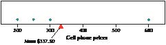
FIGURE 1 The price data balance at the mean.
Checking Your Results Against Experience and Common Sense
When you have found the balance point, you have found the mean. When you calculate the mean, or have a computer or calculator do it for you, don’t just accept whatever value pops out. Make sure the result makes sense. Because the mean always indicates the place where the data values are in balance, the mean is often near the center of the data. If the value you have calculated lies nowhere near the center of the data, then you may want to check your calculations.
For example, suppose we were finding the mean of the cell phone data, and we accidentally entered 6000 instead of 600 for the price of the Sony Xperia Z2. Then, our value for the mean resulting from this incorrect calculation would be
The mean price cannot equal $1687.50 because all the values in the data set are less than $1687.50. The mean can never be larger or smaller than all the values in the data set.
Don’t automatically accept the result you get from a computer or calculator. Remember GIGO: Garbage In Garbage Out. If you enter the wrong data, the calculator or computer will not bail you out. Human error is one reason for the explosion of faulty statistical analyses in the newspapers and on the Internet. Now more than ever, data analysts must use good judgment. When you calculate a mean, always have an idea of what you expect the sample mean to be, that is, at least a ballpark figure.
Developing Your Statistical Sense
For calculating the mean, we will adopt the convention of rounding our final calculation, if necessary, to one more decimal place than that in the original data.
The Mean Is Sensitive to Extreme Values
One drawback of using the mean to measure the center of the data is that the mean is sensitive to the presence of extreme values in the data set. We illustrate this phenomenon with the following example.
EXAMPLE 3 Sensitivity of the mean to extreme values
|
Table 4 Home sales prices in Broward County, Florida |
|
|
Location |
Price |
|
Pembroke Pines |
$300,000 |
|
Weston |
$350,000 |
|
Hallandale |
$360,000 |
|
Miramar |
$425,000 |
|
Davie |
$500,000 |
|
Fort Lauderdale |
$600,000 |
homesales
Source: www.homes.com (prices rounded to nearest $1000).
= $1,220,000
NOW YOU CAN DO
Exercises 25–30.
2
The Median
The median of a data set is the middle data value when the data are put into ascending order. Half of the data values lie below the median, and half lie above.
● If the sample size n is odd, then the median is the middle value and lies at the position when the data are put in ascending order.
● If the sample size n is even, then the median is the mean of the two middle data values that lie on either side of the position.

The Median Is Not Sensitive to Extreme Values
Unlike the mean, the median is not sensitive to extreme values. If the expensive home is included in the sample, the median price should not change much, even though, as we saw in Example 3, the mean sales price nearly tripled. Let’s look at an example of how this would occur.

Phillip Spears/Getty Images
Because the median is not sensitive to extreme values, we say that it is a robust, or resistant, measure of center. The mean is neither robust nor resistant.
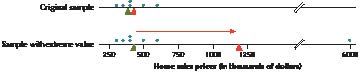
NOW YOU CAN DO
Exercises 31–36.
FIGURE 2 The mean (red triangles) is sensitive to extreme values, but the median (green triangles) is not.

The Mean and Median applet allows you to insert your own data values and see how changes in these values affect both the mean and the median.
Note that the formula gives the position, not the value, of the median. For example, the median home sales price for Table 4 is not 5

CAUTION
!

Theron Kirkman/AP Photo
Taylor Swift.
NOW YOU CAN DO
Exercises 37–40.
Take a sample from Table 2 that consists of the number of tropical storms from the even-numbered years. Find the mean, median, and mode number of tropical storms.
(The solutions are shown in Appendix A.)
YOUR TURN
#3
How Skewness Affects the Mean and Median

For a right-skewed distribution, the mean is larger than the median.

For a left-skewed distribution, the median is larger than the mean.

For a symmetric unimodal distribution, the mean, median, and mode are fairly close to each other.
darts
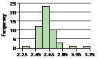
FIGURE 6 Household size is somewhat right-skewed.
NOW YOU CAN DO
Exercises 41–44.

CASE STUDY
Mark Hooper/Getty Images
Remember: It is often helpful to have a “ballpark” estimate of the mean or other statistics as a reality check of your calculations.
Note: In exploratory data analysis, we use graphical methods to compare numerical statistics.
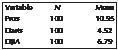
FIGURE 8 Mean percentage net price change for the professionals, darts, and DJIA.
118
Chapter 3 Describing Data Numerically
119
3.1 Measures of Center
120
Chapter 3 Describing Data Numerically
121
3.1 Measures of Center
D
122
Chapter 3 Describing Data Numerically
123
3.1 Measures of Center
124
Chapter 3 Describing Data Numerically
125
3.1 Measures of Center
videogamesales
126
Chapter 3 Describing Data Numerically
WHAT IF
?
|
3.2 |
Measures of Variability |
|
OBJECTIVES By the end of this section, I will be able to . . .
1
Find the range of a data set.
2
Calculate the variance and the standard deviation for a population.
3
Compute the variance and the standard deviation for a sample.
4
Use the Empirical Rule to find approximate percentages for a bell-shaped distribution.
5
Apply Chebyshev’s Rule to find minimum percentages. |
EXAMPLE 8 Different data sets with the same measures of center

Martin Meissner/AP Photo
volleyball
The range of a data set is the difference between the largest value and the smallest value in the data set:
range 5 largest value 2 smallest value 5 maximum 2 minimum
EXAMPLE 9 Range of the volleyball teams’ heights
What Results Might We Expect?
From Figure 11, it is intuitively clear that the heights of the WMU team are more spread out than the heights of the NCU team. Therefore, we would expect the range of the WMU team to be larger than the range of the NCU team, reflecting its greater variability.
NOW YOU CAN DO
Exercises 11a–16a.
YOUR TURN
#4
CASE STUDY
Deviation
A deviation for a given data value x is the difference between the data value and the mean of the data set. For a sample, the deviation equals x 2 x. For a population, the deviation equals x 2m.
● If the data value is larger than the mean, the deviation will be positive.
● If the data value is smaller than the mean, the deviation will be negative.
● If the data value equals the mean, the deviation will be zero.
The deviation can roughly be thought of as the distance between a data value and the mean, except that the deviation can be negative, whereas distance is always positive.

Catherine Yeulet/Getty Images
Ashley and Brandon, certified public accountants.
NOW YOU CAN DO
Exercises 11c–16c.
The population variance, s2, is the mean of the squared deviations in the population and is given by the formula
EXAMPLE 11 Calculating the population variances for Ashley and Brandon
NOW YOU CAN DO
Exercises 11d–16d.
YOUR TURN
#5

Note: s can never be negative.
CAUTION
!
EXAMPLE 12 Calculating the population standard deviations for Ashley and Brandon
NOW YOU CAN DO
Exercises 11e−16e.
Calculate the population standard deviation of the CDC from Table 15.
(The solution is shown in Appendix A.)
YOUR TURN
#6
The Standard Deviation
So how do we interpret these values for s? One quick thumbnail interpretation of the standard deviation is that it represents a “typical” deviation. That is, the value of s represents a distance from the mean that is representative for that data set. For example, the typical distance from the mean for Ashley’s and Brandon’s tax preparation times is 2 hours and 4 hours, respectively.
What Do These Numbers Mean?
Communicating the Results
As you study statistics, keep in mind that during your career you will likely need to explain your results to others who have never taken a statistics course. Therefore, you should always keep in mind how to interpret your results to the general public. Communication and interpretation of your results can be as important as the results themselves.
Developing Your Statistical Sense
3
Note: In this book, we will work with sample statistics unless the data set is identified as a population.
The sample standard deviation, s, is the positive square root of the sample variance s2:
The value of s may be interpreted as the typical distance between a data value and the sample mean, for a given data set.
Neither s2 nor s can ever be negative. Both the variance and standard deviation are equal to zero only when all the data values in the data set are the same.
EXAMPLE 13 Calculating the sample variance and the sample standard deviation
NOW YOU CAN DO
Exercises 17–22.
Suppose we take as our sample from the CDC funding data set in Table 15 the three northernmost (and least populated) New England states: Maine, New Hampshire, and Vermont.
1. Look at the funding values for the sample states. Would you expect our measures of spread to be larger or smaller than those of all the New England states? Why?
2. Find the variance of this sample. Express it in dollars squared.
3. Use your answer from (2) to calculate the standard deviation. Express it in dollars.
4. Interpret the value of the standard deviation.
(The solutions are shown in Appendix A.)
YOUR TURN
#7
Less Variation Is Better
In most real-world applications, consistency is a great advantage. In statistical data analysis, less variation is often better, even though variability is natural and cannot be eliminated. Throughout the text, you will find that smaller variability will lead to
● more precise estimates and
● higher confidence in conclusions.
Developing Your Statistical Sense
EXAMPLE 14 Using technology to find the sample variance and sample standard deviation
gasmileage

For the TI-83/84, do not confuse Sx, the TI’s notation for the sample standard deviation, with sx, which the TI-83/84 uses to label the population standard deviation.
CAUTION
!
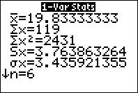
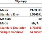
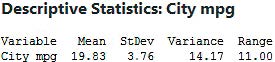
FIGURE 13 TI-83/84 output.
FIGURE 15 Minitab output.
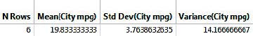
FIGURE 14 Excel output.
FIGURE 16 JMP output.
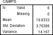
FIGURE 17 SPSS output.
The Empirical Rule
If the data distribution is bell-shaped:
● About 68% of the data values will fall within 1 standard deviation of the mean.
● For a population, about 68% of the data will lie between m 2 1s and m 1 1s.
● For a sample, about 68% of the data will lie between x 2 1s and x 1 1s.
● About 95% of the data values will fall within 2 standard deviations of the mean.
● For a population, about 95% of the data will lie between m 2 2s and m 1 2s.
● For a sample, about 95% of the data will lie between x 2 2s and x 1 2s.
● About 99.7% of the data values will fall within 3 standard deviations of the mean.
● For a population, about 99.7% of the data will lie between m 2 3s and m 1 3s.
● For a sample, about 99.7% of the data will lie between x 2 3s and x 1 3s.
Figure 18 illustrates these approximate percentages.
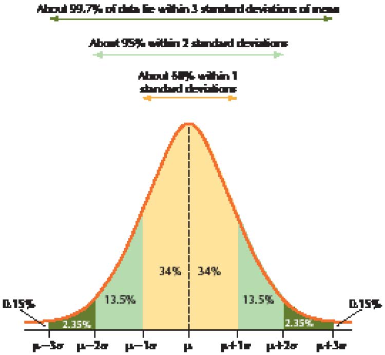

Remember: The Empirical Rule may be applied only if the data distribution is bell-shaped.
CAUTION
!
FIGURE 18 Empirical Rule, with approximate percentages.
Remember: The English word “about” is not optional; it is required. The Empirical Rule is an approximation of normal distribution probabilities that we will examine more closely in Chapter 6.
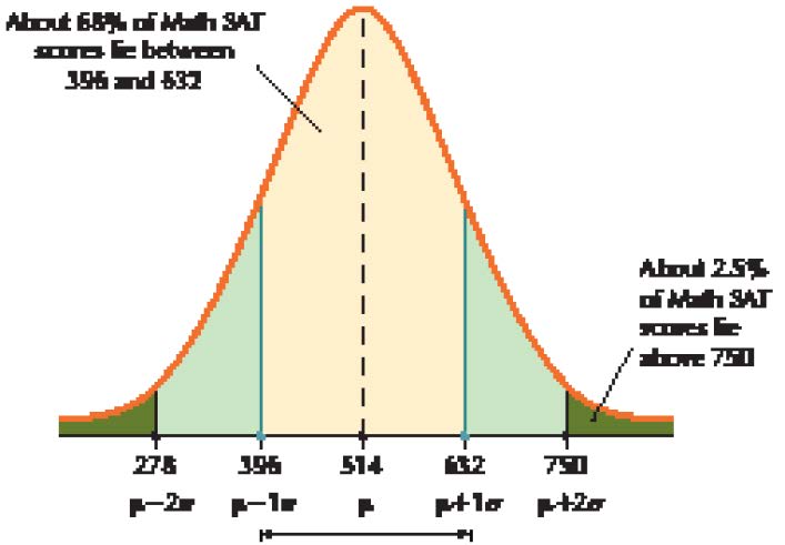
NOW YOU CAN DO
Exercises 23–30.
FIGURE 19 Example of Empirical Rule applied to Math SAT scores.
Suppose vehicle speeds on the local interstate highway are bell-shaped, with a mean of m 5 70 mph and a standard deviation of s 5 5 mph.
1. Find the percentage of vehicle speeds between 65 mph and 75 mph.
2. Compute the percentage of vehicles that are obeying the speed limit of at most 65 mph.
(The solutions are shown in Appendix A.)
YOUR TURN
#8

Chebyshev’s Rule
The proportion of values from a data set that will fall within k standard deviations of the mean will be at least
where k . 1. Chebyshev’s Rule may be applied to either samples or populations. For example:
● When k 5 2, at least 3/4 (or 75%) of the data values will fall within 2 standard deviations of the mean.
● When k 5 3, at least 8/9 (or 88.89%) of the data values will fall within 3 standard deviations of the mean.
State Central Artillery Museum, St. Petersburg, Russia/The Bridgeman Art Library
Portrait of Pafnuty Chebyshev–Yaroslav Sergeyevich (1821–1894).
NOW YOU CAN DO
Exercises 31–38.
Strengths and Weaknesses of the Empirical Rule and Chebyshev’s Rule
Example 16 shows that the lack of knowledge of a bell-shaped distribution can have a cost.
a. For part (a), using the Empirical Rule with k 5 2 would have given us an answer of “about 95%,” which is more precise than “at least 75%.” However, this extra precision comes only if we know the distribution is bell-shaped.
b. For part (b), however, the Empirical Rule does not apply to any values other than 1, 2, or 3, so would have been no help here.
c. Finally, had we been able to apply the Empirical Rule in part (c), then we could have gotten an answer of “about 68%” for k 5 1.
Developing Your Statistical Sense
Suppose systolic blood pressure in a population of senior citizens has a mean of m 5 130 and a standard deviation of s 5 10. Find the minimum percentage of systolic blood pressure readings between 110 and 150.
(The solution is shown in Appendix A.)
YOUR TURN
#9
Can the Financial Experts Beat the Darts?
Recall from the Case Study at the beginning of this chapter, the Wall Street Journal competition between stocks chosen randomly by Journal staff members throwing darts and stocks chosen by a team of four financial experts. Note from Figure 20 that the DJIA exhibits less variability than the other two portfolios. This smaller variability is due to the fact that the DJIA is made up of 30 component stocks, whereas each portfolio is made up of only four stocks. Smaller sample sizes can be associated with increased variability, because an unusual result in one value has a relatively strong effect on the mean when it is not offset by a large sample.
Which of the portfolios, pros or darts, shows greater variability? It is difficult to determine which has the greater standard deviation, just by examining Figure 20. We therefore turn to the Minitab descriptive statistics in Figure 21. The range for the darts, 115.90, is greater than the range for the pros, 112.80. But the standard deviation for the darts (19.39) is less than that of the pros (22.25).
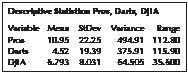
FIGURE 21 Descriptive statistics for the portfolios.
Measures of spread may disagree about which data set has more variability. However, the range takes into account only the two most extreme data values; therefore, the standard deviation is the preferred measure of spread because it uses all the data values. Our conclusion, therefore, is that the returns for the professionals exhibit a greater variability.
Why did the pros have more variability than the darts? After all, in finance, high variability is not necessarily advantageous because it is associated with greater risk. The professionals evidently chose higher-risk stocks with greater potential for high returns—but also greater potential for losing money.
CASE STUDY
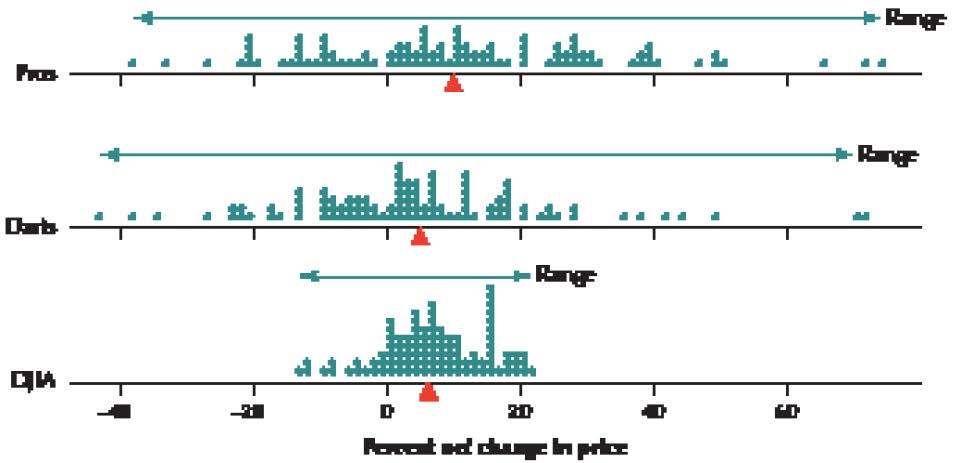
FIGURE 20 Comparative dotplots of the net change in prices.
141
3.2 Measures of Variability
142
Chapter 3 Describing Data Numerically
143
3.2 Measures of Variability
Saturated Fat and Calories. The table contains the calories and saturated fat in a sample of 10 food items. Use this information for Exercises 47 and 48.
47.
Find the following measures of spread for calories:
a. Range
b. Sample variance
c. Sample standard deviation
48.
Calculate the following measures of spread for saturated fat:
a. Range
b. Sample variance
c. Sample standard deviation

|
Food item |
Calories |
Grams of saturated fat |
|
Chocolate bar (1.45 ounces) |
216 |
7.0 |
|
Meat & veggie pizza (large slice) |
364 |
5.6 |
|
New England clam chowder (1 cup) |
149 |
1.9 |
|
Baked chicken drumstick (no skin, medium size) |
75 |
0.6 |
|
Curly fries, deep-fried (4 ounces) |
276 |
3.2 |
|
Wheat bagel (large) |
375 |
0.3 |
|
Chicken curry (1 cup) |
146 |
1.6 |
|
Cake doughnut hole (one) |
59 |
0.5 |
|
Rye bread (1 slice) |
67 |
0.2 |
|
Raisin bran cereal (1 cup) |
195 |
0.3 |
Source: Food-a-Pedia.
Video Game Sales. Refer to the video game sales data in Exercises 41 and 42 for Exercises 49–52.
49.
The sample variance of sales was expressed in “game units squared.” Do you find this concept easy to understand? Which measure do you find to be more easily understood and interpreted for these data, the variance or the standard deviation?
50.
Consider the histogram of total units sold for all the top 30 video games.
a. Is the distribution bell-shaped?
b. Can we apply the Empirical Rule?
c. Can we apply Chebyshev’s Rule?
51.
Use the sample of size five and Chebyshev’s Rule to find the minimum percentage of total sales that are between 0.0048 million and 1.8352 million.
52.
Refer to Table 3 of Chapter 1 on page 8. Calculate the actual proportion of total sales that are between 0.0048 million and 1.8352 million. Does this fit the answer you got using Chebyshev’s Rule?

Darts and the DJIA. Refer to the darts and DJIA data in Exercises 43 and 44 for Exercises 53–56.
53.
Based on your measures of spread in Exercises 43 and 44, which stock market return reflects greater variability, the darts or the DJIA?
54.
The histogram shows the population distribution of the stock market changes for the darts. Can we live with the assumption that the distribution is bell-shaped?
55.
Based on the sample of size 8, use the Empirical Rule to approximate the percentage of darts stock returns that lie between −13.41 and 32.31.
56.
Can the Empirical Rule tell us what approximate percentage of the darts stock returns lie between −1.98 and 20.88? Explain.
Age and Height. Refer to the age and height data in Exercises 45 and 46 for Exercises 57–60.
57.
The histogram shows the population distribution of the women’s ages.
a. Is the distribution bell-shaped?
b. Can we apply the Empirical Rule?
c. Can we apply Chebyshev’s Rule?
58.
Based on the sample of size 8, use Chebyshev’s Rule to find the minimum percentage of the women’s ages that lie between 16.78 and 37.48.
59.
The histogram shows the population distribution of the women’s heights.
a. Though it’s not perfect, can we live with the assumption that the distribution is bell-shaped?
b. Can we apply the Empirical Rule?
c. Can we apply Chebyshev’s Rule?
60.
Based on the sample of size 8, use the Empirical Rule to approximate the percentage of the women’s heights that lie between 59.449 inches and 69.677 inches.
Saturated Fat and Calories. Refer to the food data in Exercises 47 and 48 for Exercises 61 and 62.
61.
The histogram contains the grams of saturated fat for the 10 foods in the sample.
a. Is the distribution bell-shaped?
b. Can we apply the Empirical Rule?
c. Can we apply Chebyshev’s Rule?
62.
Use Chebyshev’s Rule to find the minimum percentage of food items with saturated fat between −1.51 and 5.75. (Note that, because grams of saturated fat cannot be negative, this is the same as between 0 and 5.75.)
Fuel Economy. Refer to Table 7 on page 123 to answer Exercises 63–65. The data represent a sample.
63.
Find the following measures of spread for the number of cylinders:
a. Range
b. Variance
c. Standard deviation
64.
Find the following measures of spread for the engine size:
a. Range
b. Variance
c. Standard deviation
65.
Find the following measures of spread for the fuel economy:
a. Range
b. Variance
c. Standard deviation
Ant Size. Use the following information for Exercises 66 and 67. A study compared the size of ants from different colonies. The masses (in milligrams) of samples of ants from two different colonies are shown in the accompanying table.4
|
Colony A |
Colony B |
||
|
109 |
134 |
148 |
115 |
|
120 |
94 |
110 |
101 |
|
94 |
113 |
110 |
158 |
|
61 |
111 |
97 |
67 |
|
72 |
106 |
136 |
114 |
66.
Calculate the range for each ant colony.
a. Which has the greater range?
b. Which colony has the greater variability according to the range?
67.
Calculate the standard deviation for each colony.
a. Which has the greater standard deviation?
b. Which colony has the greater variability according to the standard deviation? Does this concur with your answer from the previous exercise?
c. Without calculating the variances, say which colony has the greater variance. How do you know this?
68.
Computational Formula for the Population Variance and Standard Deviation: Wins in Baseball. The following table provides the number of wins for all the teams in the American League East Division for the 2013 season, which we can consider to be a population.
|
Team |
Wins |
|
Boston Red Sox |
97 |
|
Tampa Bay Rays |
92 |
|
Baltimore Orioles |
85 |
|
New York Yankees |
85 |
|
Toronto Blue Jays |
74 |
Source: MLB.mlb.com.
An alternative computational formula for the population variance is as follows:
a. Use the computational formula to find the population variance for the number of wins.
b. Use your result from (a) to find the population standard deviation for the number of wins.
Note: x2 means that you square each data value and then add up the squared data values, and (x)2 means that you add up all the data values and then square the sum.
69.
Computational Formula for the Sample Variance and Standard Deviation. Refer to the previous exercise. Suppose a random sample of size n 5 3 from these teams yields the New York Yankees, the Tampa Bay Rays, and the Baltimore Orioles.
An alternative computational formula for the sample variance is as follows:
a. Use the computational formula to find the sample variance for the number of wins.
b. Use your result from (a) to find the sample standard deviation for the number of wins.
c. Interpret your result from (b).
70.
Challenge Exercise. Refer to the table in Exercise 68. Suppose we are taking a sample of size n 5 2.
a. Which sample of two teams will yield the largest sample standard deviation? Explain your reasoning.
b. Which sample of two teams will yield the smallest sample standard deviation? Explain your reasoning.
71.
Empirical Rule: October in Santa Monica. The National Climate Data Center reports that the mean October temperature in Santa Monica, California, is 63 degrees Fahrenheit, with a standard deviation of 3 degrees. Suppose the data distribution is bell-shaped. If possible, estimate the percentage of October days with temperatures within the following ranges. If not possible, explain why.
a. Between 60 and 66 degrees
b. Between 57 and 69 degrees
c. Between 55 and 71 degrees
72.
Empirical Rule: Energy Consumption. The U.S. Department of Energy reports that the mean annual energy consumption per person in the United States is 1400 watts. Assume that the standard deviation is 200 watts and the data distribution is bell-shaped. Estimate the percentage of Americans with energy consumption within the following ranges.
a. Between 1200 and 1600 watts
b. Between 1000 and 1800 watts
c. Above 1000 watts
73.
Chebyshev’s Rule. Refer to Exercise 71. Suppose that we did not know that the October temperature in Santa Monica is bell-shaped. If possible, find minimums for (a)–(c) in Exercise 71.
74.
Chebyshev’s Rule. Refer to Exercise 72. Suppose that we did not know that the annual energy consumption is bell-shaped. If possible, find minimums for (a)–(c) in Exercise 72.
Energy Consumption. Refer to Table 16, which shows the per capita energy consumption (watts per person) for samples of countries on three continents for Exercises 75−78.

TABLE 16 Per capita energy consumption for three samples of countries
|
Asia |
Europe |
North America |
|
China 447 |
Germany 861 |
USA 1402 |
|
Japan 774 |
France 804 |
Canada 1871 |
|
South Korea 1038 |
United Kingdom 622 |
Mexico 131 |
Source: The World Factbook.
75.
Construct dotplots of the energy consumption for each continent. Which continent would you say has the greatest spread (variability)? Why?
76.
Find the range and variance of the per capita energy consumption for each of the continents. Do your findings agree with your judgment from the previous exercise?
77.
Without performing any calculations, use your results from the previous exercise to state which continent has (a) the largest standard deviation, and (b) the smallest standard deviation.
78.
Now suppose we omit Mexico from the data.
a. Without recalculating them, describe how this would affect the values of the measures of spread you found for the North American countries.
b. Now recalculate the three measures of spread for the North American countries. Was your judgment in (a) supported?
Women’s Volleyball Team Heights. Refer to Table 10 on page 126 for Exercises 79−81.
79.
Suppose a new player joins the NCU team. She is 7 feet tall (84 inches) and replaces the 72-inch-tall player.
a. Would you expect the standard deviation to go up or down, and why?
b. Now find the standard deviation for the team including the new player. Was your intuition correct?
80.
Linear Transformations. Add 4 inches to the height of each player on the WMU team.
a. Recalculate the range and standard deviation.
b. Formulate a rule for the behavior of these measures of variability when a constant (such as 4) is added to each member of the data set.
81.
Linear Transformations. Starting with the original data, double the height of each player on the NCU team.
a. Recalculate the range and standard deviation.
b. Formulate a rule for the range and standard deviation when the data values are doubled.
Coefficient of Variation. The coefficient of variation enables analysts to compare the variability of two data sets that are measured on different scales. The coefficient of variation (CV) itself does not have a unit of measure. Larger values of CV indicate greater variability or spread. The coefficient of variation is given as
Use this measure of variability for Exercises 82 and 83.
82.
Coefficient of Variation for Fuel Economy Data. Refer to Table 7 on page 123.
a. Calculate the coefficient of variation for the following variables: cylinders, engine size, and city mpg.
b. According to the coefficient of variation, which variable has the greatest spread? The least variability?
83.
Coefficient of Variation for Energy Consumption. Refer to Table 16 on page 146.
a. Calculate the coefficient of variation for the per capita energy consumption for each continent.
b. According to the coefficient of variation, which continent has the greatest spread? Does this agree with your measures of spread from Exercise 76?
Mean Absolute Deviation. Recall that the variance and standard deviation use squared deviations because the mean deviation for any data set is zero. Another way to avoid negative deviations offsetting positive ones is to use the absolute value of the deviations. The mean absolute deviation (MAD) is a measure of spread that looks at the average of the absolute values of the deviations:
Use this measure of variability for Exercises 84 and 85.
84.
Mean Absolute Deviation for the Fuel Economy Data. Refer to Table 7 on page 123.
a. Find the mean absolute deviation for cylinders, engine size, and city mpg.
b. According to the mean absolute deviation, which variable has the greatest variability? The least variability?
85.
Mean Absolute Deviation for Energy Consumption. Refer to Table 16 on page 146.
a. Calculate the mean absolute deviation for each continent.
b. According to the mean absolute deviation, which continent has the greatest spread? Does this agree with your measures of spread from Exercise 76?
Coefficient of Skewness. The coefficient of skewness quantifies the skewness of a distribution. It is defined as
Most skewness values lie between 23 and 3. Negative values of skewness are associated with left-skewed distributions, whereas positive values are associated with right-skewed distributions. Values close to zero indicate distributions that are nearly symmetric. Use this information for Exercises 86−88.
86.
Coefficient of Skewness. For the following distributions, compute the coefficient of skewness and comment on the skewness of the distribution.
a. Mean 5 0, Median 5 0, Standard deviation 5 1
b. Mean 5 1, Median 5 0, Standard deviation 5 1
c. Mean 5 0, Median 5 1, Standard deviation 5 1
d. Mean 5 75, Median 5 80, Standard deviation 5 10
e. Mean 5 100, Median 5 100, Standard deviation 5 15
f. Mean 5 3.2, Median 53.0, Standard deviation 5 1.0
87.
What is the coefficient of skewness for any distribution where the mean equals the median, regardless of the nonzero value of the standard deviation?
88. Coefficient of Skewness for the Case Study Data. The median price change for the professional analysts is 9.60, the median for the dart throwers is 3.25, and the median for the DJIA is 7.00. Use this information, along with the information in Figure 21 on page 140 to answer the following.
a. Calculate the coefficient of skewness for each of the Pros, the Darts, and the DJIA.
b. Comment on the skewness of each distribution.
BRINGING IT ALL TOGETHER
In Exercises 89 and 90, we bring together all the measures of spread we have learned in the chapter and the new ones we learned in the exercises.
89. Fuel Economy Data. You calculated the range, variance, and standard deviation for this data in Exercises 63−65. You calculated the coefficient of variation in Exercise 82 and the mean absolute deviation in Exercise 84. Use this information to do the following.
a. Construct a table of the five measures of dispersion (range, sample variance, sample standard deviation, coefficient of variation, and mean absolute deviation) for the number of cylinders, the engine size, and the city mpg.
b. Which measures of dispersion suggest that the city mpg is the most dispersed variable? Engine size? Number of cylinders?
90. Energy Consumption Data. You calculated the range and variance for this data in Exercise 76. You calculated the coefficient of variation in Exercise 83 and the mean absolute deviation in Exercise 85. Use this information to do the following:
a. Using the variance, calculate the standard deviation energy consumption for each continent.
b. Construct a table of the five measures of spread (range, sample variance, sample standard deviation, coefficient of variation, and mean absolute deviation) for each continent.
c. Do the measures of spread agree on which distribution has the greatest variability?
d. Bringing together all your statistics about measures of spread, what is your conclusion about the variability in Europe, compared with the other two continents?
CONSTRUCT YOUR OWN DATA SETS
91. Construct two data sets, A and B, that you make up on your own, so that the range of A is greater than the range of B. Verify this.
92. Construct two data sets, A and B, that you make up on your own, so that the standard deviation of A is greater than the range of B. Verify this.
93. Construct two data sets, A and B, that you make up on your own, so that the mean of A is greater than the mean of B, but the standard deviation of B is greater than that of A. Verify this.
94. Construct two data sets, A and B, that you make up on your own, so that the mean of A is greater than the mean of B, and the standard deviation of A is greater than that of B. Verify this.
95. Construct two data sets, A and B, that you make up on your own, so that the range of A is greater than the range of B, but the standard deviation of B is greater than that of A. Verify this. (Hint: Remember the sensitivity of the standard deviation to extreme values.)
WORKING WITH LARGE DATA SETS
The Professionals versus the Darts. We will assess how well the Empirical Rule performs, using the Chapter 3 Case Study data set. Open the Darts data set. Use technology to do the following.

96. Find the mean and standard deviation for each of the Pros, the Darts, and the DJIA.
97. Construct histograms of each of the Pros, the Darts, and the DJIA. Conclude that we can live with the assumption of a bell-shaped distribution for all three groups.
98. For the Pros, do the following:
a. Calculate the following quantities: μ − 1σ, μ + 1σ, μ − 2σ, μ + 2σ, μ − 3σ, and μ + 3σ.
b. State what approximate percentages lie within those intervals, according to the Empirical Rule.
c. Count how many stock returns actually lie within each of those intervals. Divide these counts by the population size 100 to obtain the actual percentages.
d. Compare the approximate percentages estimated by the Empirical Rule with the actual percentages from the population data.
99. Repeat the same comparison (a)–(d) from Exercise 98, but this time for the Darts.
100.
Repeat the same comparison (a)–(d) from Exercise 98, but this time for the DJIA.
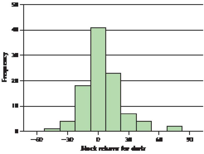
3.2 Measures of Variability
antcolony
WHAT IF
?
3.2 Measures of Variability
CASE STUDY
148
Chapter 3 Describing Data Numerically
CASE STUDY
|
3.3 |
Working with Grouped Data |
|
OBJECTIVES By the end of this section, I will be able to . . .
1
Calculate the weighted mean.
2
Estimate the mean for grouped data.
3
Estimate the variance and standard deviation for grouped data. |
1
The Weighted Mean
Sometimes, not all the data values in a data set are of equal importance. Certain data values may be assigned greater importance or weight than others when calculating the mean. For example, have you ever figured out what your final grade for a course was based on the percentages listed in the syllabus? What you actually found was the weighted mean of your grades.
EXAMPLE 17 Weighted mean of course grades
The syllabus for the Introduction to Management course at a local college specifies that the midterm exam is worth 30%, the term paper is worth 20%, and the final exam is worth 50% of your course grade. Now, say you did not get serious about the course until after Halloween, so that you got a 40 on the midterm. You then began working harder, and got a 70 on the term paper. Finally, you remembered that you had to pay for the course again if you did not pass and had to retake it, so you worked really hard for the last month of the course and got a 90 on the final exam. Calculate your course average, that is, the weighted mean of your grades.
Solution
The data values are 40, 70, and 90. The weights are 0.30, 0.20, and 0.50. Your course weighted mean is then calculated as follows:
Because the final exam had the most weight, you were able to raise your course weighted mean to 71, and you passed the course.
The author’s syllabus for his Business Statistics I course during Summer 2014 stated that the quiz average was worth 50% of the course grade, with the midterm worth 20% and the final exam worth 30%. One of the students had a 90 quiz average, a 70 midterm grade, and an 85 final exam grade. Calculate the student’s course grade.
(The solution is shown in Appendix A.)
2
Estimating the Mean for Grouped Data
Thus far in Chapter 3, we have computed measures of center and spread from a raw data set. However, data are often reported using grouped frequency distributions. Without the original data, we cannot calculate the exact values of the measures of center and spread. The remainder of this section examines methods for approximating the mean, variance, and standard deviation of grouped data—that is, population data summarized using frequency distributions.
For each class in the frequency distribution, we estimate the class mean using the class midpoint. The class midpoint, denoted x, is defined as the mean of two adjoining lower class limits.
The product of the class frequency, f, and class midpoint, x, is used as an estimate of the sum of the data values within that class. Summing these products across all classes and dividing by the size of the data set thus provides us with an estimated mean for data grouped into a frequency distribution.
EXAMPLE 18 Calculating the estimated mean for grouped data
The first two columns of Table 17 contain the frequency distribution of the number of Americans younger than 85 years old who were living in the United States in 2013, by age group, as reported by the U.S. Census Bureau.
a. Find the class midpoints.
b. Calculate the product of each class frequency with its midpoint.
c. Find the sum of the frequencies, f, and the sum of the products, (f ? x).
d. Divide (f ? x) by f to find the estimated mean age of all Americans under the age of 85.
Solution
a. The midpoint for the first class (ages 0–20) is the mean of the lower class limits for this class (0) and the adjoining class (20). That is, the midpoint is (0 + 20)∙2 = 10. Similarly, the midpoint for the second class (ages 20–40) is (20 + 40)∙2 = 30. The remainder of the class midpoints are calculated in the same way and are shown in Table 17.
b. We multiply the frequency for the first age group by its midpoint to get . We do the same for the other age groups, as shown in Table 17.
c. We add up all the frequencies to get f 5 303.3. Also, we add up all the products from (b) to obtain (f ? x) = 11,338.
d. Finally, obtain the estimated mean, as follows:
The estimated mean age of all Americans under 85 is 37.4 years.
|
Table 17 Frequency distribution of Americans, by age group, in millions |
|||
|
Class: age |
Frequency f |
Midpoint x |
Product f · x |
|
0 ≤ age < 20 |
83.3 |
10 |
83.3 · 10 5 833 |
|
20 ≤ age < 40 |
82.8 |
30 |
82.8 · 30 5 2,484 |
|
40 ≤ age < 60 |
85.6 |
50 |
85.6 · 50 5 4,280 |
|
60 ≤ age < 85 |
51.6 |
72.5 |
51.6 · 72.5 5 3,741 |
|
Total |
f 5 303.3 |
( f · x) 5 11,338 |
3
Estimating the Variance and Standard Deviation for Grouped Data
We also use class midpoints and class frequencies to calculate the estimated variance for data grouped into a frequency distribution and the estimated standard deviation for data grouped into a frequency distribution.
Estimated Variance and Standard Deviation for Population Data Grouped into a Frequency Distribution
The estimated variance for data grouped into a frequency distribution is given by
and the estimated standard deviation is given by
where x represents the class midpoints, f represents the class frequencies, and _x is the estimated mean.
You should carry as many decimal places as you can for the value of when calculating s2, and for s2 when calculating s.
EXAMPLE 19 Calculating the estimated variance and standard deviation for grouped data
Calculate the estimated variance and standard deviation of the ages of Americans under age 85 from Table 17.
Solution
Table 18 contains the calculations required for finding . The variance is therefore estimated as
and the standard deviation is estimated as
|
Table 18 Calculating (x 2 x)2 ? f |
|||||
|
Class: age |
Midpoint x |
Frequency f |
_x |
x 2 _x |
(x 2 _x)2 · f |
|
0 # age , 20 |
10.0 |
83.3 |
37.4 |
227.4 |
62,538.31 |
|
20 # age , 40 |
30.0 |
82.8 |
37.4 |
27.4 |
4,534.13 |
|
40 # age , 60 |
50.0 |
85.6 |
37.4 |
12.6 |
13,589.86 |
|
60 # age , 85 |
72.5 |
51.6 |
37.4 |
35.1 |
63,571.72 |
|
S(x 2 _x)2 · f 5 144,234 |
In other words, the age of Americans under 85 typically differs from the mean age of 37.4 years by about 21.8 years.
EXAMPLE 20 Using technology to find the estimated mean, variance, and standard deviation for grouped data
Use the TI-83/84 calculator to find the estimated mean, variance, and standard deviation for the frequency distribution in Table 17.
Solution
Following the instructions in the Step-by-Step Technology Guide, we get the estimated mean, = 37.3821299 (which we round to 37.4), the estimated standard deviation, s (shown in the output as sx) = 21.8070784, and the estimated variance as (21.8070784)2 = 475.5487.
STEP-BY-STEP TECHNOLOGY GUIDE: Estimating the Mean, Variance, and Standard Deviation for Grouped Data
TI-83/84
Step 1 Press STAT and select 1: Edit. Enter the class midpoints in L1 and the frequencies or relative frequencies in L2.
Step 2 Press STAT, select the CALC menu, and choose 1: 1-Var Stats.
Step 3 Press 2nd 1 Comma 2nd 2, so that the following appears on the home screen: 1-Var Stats L1, L2.
Step 4 Press ENTER.
Section 3.3 Summary
1. The weighted mean is the sum of the products of the data points with their respective weights, divided by the sum of the weights.
2. We do not have access to the original raw data, so it is not possible to find exact values for the mean, variance, and standard deviation of data that have been grouped into a frequency distribution. The estimated mean, , in this case is the sum of the products of the class frequencies, f, and class midpoints, x, divided by the sum of the frequencies, f.
3. Class midpoints and class frequencies are also used to find the estimated variance, s2, and estimated standard deviations of grouped data.
Section 3.3 Exercises
CLARIFYING THE CONCEPTS
1. Explain why the formula for the mean of grouped data will provide an estimate only and not the exact value of the mean if the data were not grouped. (p. 149)
2. Describe how the weighted mean is calculated. (p. 149)
3. Suppose we calculate the weighted mean of the following data: 2, 7, 4. Let each of the weights equal 1. To what measure of center from Section 3.1 does this weighted mean simplify when all the weights equal 1? (p. 149)
PRACTICING THE TECHNIQUES
CHECK IT OUT!
|
To do |
Check out |
Topic |
|
Exercises 4–8 |
Example 17 |
Weighted mean |
|
Exercises 9–14 |
Example 18 |
Estimated mean for grouped data |
|
Exercises 15−20 |
Example 19 |
Estimated variance and standard deviation for grouped data |
For Exercises 4–8, the data values and weights are provided. Find the weighted mean.
4. x1 5 60, x2 5 70; x3 5 80; w1 5 0.25, w2 5 0.50, w3 5 0.25.
5. x1 5 100, x2 5 60, x3 5 90; w1 5 0.25, w2 5 0.40, w3 5 0.35.
6. x1 5 10, x2 5 10, x3 5 100; w1 5 10, w2 5 20, w3 5 5.
7. x1 5 2.0, x2 5 3.5, x3 5 2.5, x4 5 3.0, x5 5 2.0; w1 5 w2 5 w3 5 w4 5 3, w5 5 8.
8. x1 5 70, x2 5 80, x3 5 85, x4 5 95; w1 5 0.25, w2 5 0.25, w3 5 0.25, w4 5 0.25.
For Exercises 9–14, the frequency distribution is provided for a particular variable. Do the following:
a. Find the class midpoints.
b. Calculate the product of each class frequency with its midpoint.
c. Find the sum of the frequencies, f, and the sum of the products (f x).
d. Divide (f x) by f to find the estimated mean of the variable, .
9.
ClassFrequency f0 # GPA , 1.0 21.0 # GPA , 2.0102.0 # GPA , 3.0133.0 # GPA , 4.0 5
10.
ClassFrequency f210 # golf score , 25 325 # golf score , 070 # golf score , 575 # golf score , 103
11.
ClassFrequency f0 # score , 2102 # score , 4204 # score , 6306 # score , 8208 # score , 1010
12.
ClassFrequency f0 # grade , 50 550 # grade , 701070 # grade , 801580 # grade , 902090 # grade , 10020
13.
ClassFrequency f0 # cost ,51005 # cost ,1015010 # cost ,1520015 # cost ,2025020 # cost ,3030030 # cost ,5035050 # cost ,100400100 # cost ,200450
14.
ClassFrequency f0 # cash , 101510 # cash , 201020 # cash , 30 530 # cash , 40 440 # cash , 50 450 # cash , 75 275 # cash , 100 1100 # cash , 200 1
For Exercises 15–20, find the estimated variance and standard deviation for the frequency distribution given in the indicated Exercise.
15.
Exercise 9.
16.
Exercise 10.
17.
Exercise 11.
18.
Exercise 12.
19.
Exercise 13.
20.
Exercise 14.
APPLYING THE CONCEPTS
21.
Dupage County Age Groups. The Census Bureau reports the following frequency distribution of population by age group for Dupage County, Illinois, for residents who are less than 65 years old.

|
Class |
Residents |
|
0 # age , 5 |
63,422 |
|
5 # age , 18 |
240,629 |
|
18 # age , 65 |
540,949 |
a. Find the class midpoints.
b. Find the estimated mean age of residents of Dupage County.
c. Find the estimated variance and standard deviation of ages.
22.
Broward County House Values. Table 19 gives the frequency distribution of the dollar value of the owner-occupied housing units in Broward County, Florida.

TABLE 19 Broward County house values
|
Class (1000s) |
Housing units |
|
0 # value , 50 |
5,430 |
|
50 # value , 100 |
90,605 |
|
100 # value , 150 |
90,620 |
|
150 # value , 200 |
54,295 |
|
200 # value , 300 |
34,835 |
|
300 # value , 500 |
15,770 |
|
500 # value , 1000 |
5,595 |
a. Find the class midpoints.
b. Find the estimated mean dollar value for housing units in Broward County.
c. Find the estimated variance and standard deviation of the dollar value.
23.
Lightning Deaths. Table 20 gives the frequency distribution of the number of deaths due to lightning nationwide over a 67-year period. Find the estimated mean and standard deviation of the number of lightning deaths per year.

TABLE 20 Lightning deaths
|
Class |
Years |
|
20 # deaths , 60 |
13 |
|
60 # deaths , 100 |
21 |
|
100 # deaths , 140 |
10 |
|
140 # deaths , 180 |
6 |
|
180 # deaths , 260 |
10 |
|
260 # deaths , 460 |
7 |
Source: National Oceanic and Atmospheric Administration.
24.
Calculating a Course Grade. An introductory statistics syllabus has the following grading system. The weekly quizzes are worth a total of 25% toward the final course grade. The midterm exam is worth 32%; the final exam is worth 33%; and attendance/participation is worth 10% toward the final course grade. Anthony’s weekly quiz average is 70. He got an 80 on the midterm and a 90 on the final exam. He got a 100 for attendance/participation. Calculate Anthony’s final course grade.
25.
Wages for Computer Managers. The U.S. Bureau of Labor Statistics (BLS) publishes wage information for various occupations. For the occupation “computer and information systems management,” Table 21 gives the wages reported by the BLS for the top-paying states. Find the weighted mean wage across all five states, using the employment figures as weights.

|
TABLE 21 Wages for computer managers |
||
|
State |
Employment |
Hourly mean wage |
|
New Jersey |
12,380 |
$60.32 |
|
New York |
18,580 |
$60.25 |
|
Virginia |
9,540 |
$59.39 |
|
California |
35,550 |
$57.98 |
|
Massachusetts |
10,130 |
$55.95 |
26. Salaries of Scientists and Engineers. The National Science Foundation compiles statistics on the annual salaries of full-time employed doctoral scientists and engineers in universities and four-year colleges. The mean annual salary for the fields of science, engineering, and health are $67,000, $82,200, and $70,000, respectively. Suppose we have a sample of 10 professors, 5 of whom are in science, 2 in engineering, and 3 in health, and each of whom is making the mean salary for his or her field. Find the weighted mean salary of these 10 professors.
27. Challenge Exercise. Assign the weights, w, to show that the formula for the sample mean from Section 3.1, , is a special case of the formula for the weighted mean, .
BRINGING IT ALL TOGETHER
Wait Times at Los Angeles Airport. Use the following table for Exercises 28–33. The data represent the number of passengers whose flights were delayed at the Tom Bradley Terminal of Los Angeles Airport (LAX), on July 2, 2014, between 4 p.m. and 5 p.m. Counts are given based on how long their flights were delayed.
|
Delay (minutes) |
Passengers |
|
0 to , 16 |
665 |
|
16 to , 31 |
551 |
|
31 to , 46 |
497 |
|
46 to , 61 |
399 |
|
61 to , 91 |
355 |
|
91 to , 120 |
27 |
Source: U.S. Customs and Border Protection: awt.cbp.gov.
28. Find the delay midpoints.
29. Construct a table similar to Table 17, showing the frequencies, f, the midpoints, x, the products, f ∙ x, the sum of the frequencies, , and the sum of the products, .
30. Use the quantities from Exercise 29 to calculate the estimated mean delay time.
31. Extend your table from Exercise 29 so that it is similar to Table 18, including columns for , x 2 , and . Calculate .
32. Use the statistics from Exercise 31 to compute the estimated variance.
33. Calculate the estimated standard deviation of delay times.
WORKING WITH LARGE DATA SETS
Financial Experts versus the Darts. This set of exercises examines how close the estimated mean, variance, and standard deviation are to their true values. Use the Darts data set from the Chapter 3 Case Study for Exercises 34–37.

34. Use the following classes to construct a frequency distribution for the Professionals, Darts, and the DJIA data sets.
|
Class |
|
–50 # price change < –25 |
|
–25 # price change < 0 |
|
0 # price change < 25 |
|
25 # price change < 50 |
|
50 # price change < 75 |
|
75 # price change < 100 |
35. Use the frequency distribution from Exercise 34 to calculate the estimated mean stock price change for the Professionals, Darts, and the DJIA data sets.
36. Use the information from the two previous exercises to compute the estimated variance and standard deviation for the stock price changes for the Professionals, Darts, and the DJIA data sets.
37. Using technology, find the mean, variance, and standard deviation for the Professionals, Darts, and the DJIA data sets. Calculate the difference between the estimated values and the actual values.
WORKING WITH LARGE DATA SETS
Year-by-year age distribution. Open the Age Distribution 100 data set, and use it for Exercises 38–42. This data set shows the year-by-year age distribution of Americans under age 100, as reported by the U.S. Census Bureau, for 2011. Use technology to answer the following:

38. How many tiny tots have yet to reach their first birthday?
39. Find the mean age of Americans under 100.
40. Calculate the estimated standard deviation of Americans under 100.
41. Use the Empirical Rule (see Section 3.2) to find two age values between which lie about 68% of the ages of all Americans under 100.
42. Compute the actual proportion between the age values found in the previous exercise. Compare the actual number to the estimate in the previous exercise.
Note: Before tackling this section, you may wish to review Section 2.2, “Graphs and Tables for Quantitative Data” (page 60).
Note: The weights, w, do not have to be percentages, nor do they have to add up to 1.
In the special case when all the weights equal 1, the weighted mean equals the sample mean x_ from Section 3.1.
Weighted Mean
To find the weighted mean:
1. Multiply each weight, w, by its corresponding data value, x.
2. Add up the products to get .
3. Divide the result by the sum of the weights, .
NOW YOU CAN DO
Exercises 4–8.
YOUR TURN
#10
Note: Even though we are working with population data, we will notate these values using x_ and s because we are estimating the values of the mean and standard deviation.
Estimated Mean for Data Grouped into a Frequency Distribution
Given a population frequency distribution, the estimated mean for the variable is given by
where x and f represent the class midpoints and class frequencies, respectively.
NOW YOU CAN DO
Exercises 9–14.
NOW YOU CAN DO
Exercises 15–20.
usa-ages
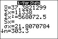
•
153
3.3 Working with Grouped Data
154
Chapter 3 Describing Data Numerically
CASE STUDY
|
3.4 |
Measures of Relative Position and Outliers |
|
OBJECTIVES By the end of this section, I will be able to . . .
1
Calculate z-scores, and explain why we use them.
2
Detect outliers using the z-score method.
3
Find percentiles and percentile ranks for both small and large data sets.
4
Compute quartiles and the interquartile range. |
In this section, we learn about measures of relative position, which tell us the position that a particular data value has relative to the rest of the data set. For example, a prestigious nursing school may grant admission to only the top 10% of applicants. How high a score would you need to enter? This is one type of question we will answer in this section.
Alternatively, we may be given a z-score and asked to find its associated data value, x. To do so, use the following formulas.
EXAMPLE 22 Finding data values given z-scores
Continuing with the credit score data from Example 21, find the credit scores (the x-values) associated with the following z-scores:
a. 21 b. 0 c. 0.5
Solution
We have population data, with µ = 670, σ = 70.
a. For a z-score of 21, we have
A credit score of 600 is associated with a z-score of 21, and therefore lies 1 standard deviation below the mean.
b. For a z-score of 0, we have
As noted earlier, a z-score of zero exactly equals the mean µ = 670.
c. For a z-score of 0.5, we have
A z-score of 0.5 is associated with a credit score of 705.
Brittany’s z-score is 2. What does that mean? It means that Brittany scored 2 standard deviations above the mean of 60. Brittany then found the z-score for Andrew:
Andrew’s z-score was 1, which means that Andrew scored 1 standard deviation above the mean. From Figure 23, we can observe that Andrew’s exam score of 90 lies closer to the mean exam score of 80 for his class. That is, the arrow is shorter for Andrew than for Brittany. Finally, note that 10 of the 100 students who took the exam in his class did better than he did, whereas only two did better than Brittany in her class. So, relative to her class, Brittany did better than Andrew, even though Andrew got a higher score. The z-scores allowed her to compare their grades, even though they were in different classes.
Continuing the online holiday shopping example from Your Turn #11, the IBM Digital Analytics Benchmark also reported that cell phone users spent a mean of an average of $85 per order for their 2013 online holiday shopping. Assume the standard deviation is $40. Gisele is a tablet user, whereas Hong is a cell phone user. They both spent the same amount for an online holiday shopping order: $120. Who spent more, relative to his or her group?
(The solution is shown in Appendix A.)
2
Detecting Outliers Using the z-Score Method
An outlier is a data value that is very much greater than or less than the mean. It may represent a data entry error, or it may be genuine data. One way of identifying an outlier is to determine whether it is farther than 3 standard deviations from the mean, that is, its z-score is less than 23 or greater than 3.
Guidelines for Identifying Outliers
1. A data value whose z-score lies in the following range is considered not unusual:
22 < z-score < 2
2. A data value whose z-score lies in either of the following ranges may be considered moderately unusual:
23 < z-score ≤ 22 or 2 ≤ z-score < 3
3. A data value whose z-score lies in either of the following ranges may be considered an outlier:
z-score ≤ 23 or z-score ≥ 3
EXAMPLE 24 Detecting outliers using the z-score method
For the three loan applicants in Example 21 on page 155, determine whether each of their credit scores represents an outlier.
Solution
● Jasmine’s z-score is 1, which lies in the range, 22 < z-score < 2. Therefore, Jasmine’s credit rating is not considered unusual.
● Jeremy’s z-score is 23.3, which is ≤ 23. Thus, Jeremy’s credit score may be considered an outlier.
● May-Chang’s z-score is 2.1, which lies in the range, 2 ≤ z-score < 3. Thus, May-Chang’s credit score may be considered moderately unusual.
In Section 3.5, we will learn about the IQR method of detecting outliers.
Refer to the z-scores you calculated for Austin, Brian, and Courtney in Your Turn #11 on page 156. Determine whether each of their spending amounts represents an outlier.
(The solutions are shown in Appendix A.)
3
Percentiles and Percentile Ranks
The next measure of relative position we consider is the percentile, which shows the location of a data value relative to the other values in the data set.
EXAMPLE 25 Meaning of a percentile
Jasmine’s credit score of 740 represents the 88th percentile of the 150,000 credit scores. What does “88th percentile” mean?
Solution
To say that 740 is the 88th percentile means that 88% of all credit scores fell at or below Jasmine’s credit score of 740. We call the percentile a measure of relative position because it indicates the position of Jasmine’s credit score relative to all other credit scores. Figure 24 indicates the position of Jasmine’s credit score relative to the rest of the loan applicants.
For large data sets, calculation of the percentiles is best left to computers. However, for small data sets, we can use the following step-by-step method to calculate the related position of any percentile.
EXAMPLE 26 Finding percentiles
Table 22 contains the value of international exports for a sample of 12 states for the month of June 2014, expressed in millions of dollars. Find the 75th percentile of the exports.
Solution
Step 1 Sort the data into ascending order. Fortunately, Table 22 is already presented in ascending order of exports.
Step 2 The particular percentile we wish to calculate is the 75th percentile, so p 5 75. Our data set includes 12 values, so n 5 12. Calculate
So, i 5 9
Step 3 Here, i is an integer, so the 75th percentile is the mean of the data values in positions 9 and 10.
Counting from left to right, the data value in the 9th position is Louisiana’s 5.0, and the data value in the 10th position is Illinois’ 5.8. The mean of these two values is 5.4. Thus, the 75th percentile is 5.4, representing $5.4 million in exports.
EXAMPLE 27 Finding percentile ranks
Note that, therefore, $5.4 million represents the 75th percentile of state exports.
b. Here x 5 3.4. Three states have x-values at or below 3.4, so the percentile rank of a state with $3.4 million in exports is
Thus, $3.4 million represents the 25th percentile of state exports.
For the movie rating data from Your Turn #15 on page 161, calculate the percentile rank for a movie with a rating of 9.0.
(The solution is shown in Appendix A.)
4
Quartiles and the Interquartile Range
Just as the median divides the data set into halves, the quartiles are the percentiles that divide the data set into quarters (Figure 25).
EXAMPLE 28 Finding the quartiles for a small data set
In Example 26 (page 160), we found the 75th percentile of the export data to be $5.4 million. By definition, the 75th percentile is the third quartile Q3. Therefore, this export value of $5.4 million is also the third quartile (Q3) of the export values. Now calculate the first quartile and the median (second quartile) of export values.
Solution
To find the quartiles, we use the steps for finding percentiles (page 160). First, arrange the data set in ascending order, which they already are in Table 22.
Here, n 512. To find Q1, plug p 5 25 into the equation , where n 5 12. We get . Since 3 is an integer, we know that the 25th percentile is the mean of the export values in the 3rd and 4th positions. New Jersey’s export value of 3.3 is in the 3rd position, while Georgia’s export value of 3.5 is in the 4th position. Since (3.3 1 3.5)/2 5 3.4, we get the 25th percentile of the export data to be 3.4, representing $3.4 million in exports (Figure 26).
To find the median (the second quartile, Q2), plug p 550 into your steps for finding the percentiles: . Since 6 is an integer, we know that the 50th percentile is the mean of the export data in the 6th and 7th positions, that is, 4.6 and 4.7. Since (4.6 1 4.7)/2 5 4.65, the 50th percentile of the export data is 4.65, representing $4.65 million in exports (Figure 27). This agrees with the method we learned for finding the median, on page 112.
In Example 26, we determined that the 75th percentile was 5.4. Therefore, the quartiles for the export data are Q1 5 3.4, median 5 Q2 5 4.65, and Q3 5 5.4. Note that these quartiles divide the data set into four equal sections, with three observations each (Figure 28).
Of course, for small data sets, the division into quarters is not always exact. For example, what if our data set consisted of 11 states instead of 12? Eleven data values cannot be divided equally into four quarters. In this case, therefore, the quartiles would divide the data set into four sections of approximately equal size. However, for large data sets, which the data analyst most often encounters, this becomes less of an issue.
EXAMPLE 29 Finding quartiles of a large data set: Cholesterol levels in food
The U.S. Department of Agriculture recommends a diet low in cholesterol to reduce the risk of heart disease. The data set Nutrition contains information on the cholesterol content (in milligrams) of 961 different foods. Find the mean, standard deviation, and quartiles.
Solution
The Minitab descriptive statistics for the cholesterol data are shown in Figure 29. Note that the mean cholesterol content is 32.55 mg and the standard deviation is about 120 mg. A standard deviation that is much larger than the mean may be associated with strongly skewed distributions. Compare the value for the mean with the values for the quartiles as follows:
● Q1, the first quartile, or 25th percentile, is 0 mg of cholesterol.
● The median, or Q2, the second quartile (50th percentile), is also 0 mg of cholesterol.
● Q3, the third quartile, or 75th percentile, is 20 mg of cholesterol.
Figure 30 shows that the data distribution is extremely right-skewed. Only a few foods have over 1000 mg cholesterol, and another handful have over 500 (see data on disk). Therefore, it appears that we have outliers in this data set. What is the effect of these outliers on the mean and standard deviation? Does the mean represent a truly typical cholesterol content level for the data set, or is its value unduly increased by the outliers? Let’s find out.
Recall from Section 3.2 that the variance and standard deviation are measures of spread that are sensitive to the presence of extreme values. A more robust (less sensitive) measure of variability is the interquartile range, or IQR.
The Latin word inter means “between,” so the interquartile range is the difference between the quartiles Q3 and Q1. The IQR represents how spread out the “middle half ” of the data set is. A larger IQR implies a greater degree of variability, or spread, in the data set. The IQR ignores both the highest 25% and the lowest 25% of the data set, so it is completely unaffected by outliers and is thus quite robust.
EXAMPLE 30 Finding the interquartile range
In Example 28, we found that, for the export data, Q1 5 3.4 and Q3 5 5.4. Find the IQR for the export data, and explain what it means.
Solution
Because Q1 5 3.4 and Q3 5 5.4, the IQR 5 Q3 2 Q1 5 5.4 2 3.4 = 2.0, which represents $2 million. We would say that the middle 50%, or middle half, of the export data ranged over $2 million (Figure 32).

What If Scenario
For the state export data, consider the following two scenarios, and explain how the change would affect the quartiles and the IQR.
a. New York’s imports are increased by an unknown amount.
b. Illinois’ imports are increased by an unknown amount.
Solution
The IQR pays attention only to the middle half of the data, and it ignores what goes on in the upper 25% and the lower 25%.
a. New York is the maximum value for the data set, so any change in New York’s exports would leave the quartiles unaffected; therefore, the IQR would also be unaffected.
b. Recall that Illinois’ $5.8 million was used in the calculation of Q3, which is (5.8 – 5.0)/2 = 5.4. Increasing Illinois’ exports would therefore increase the value of Q3; therefore, the IQR would also increase. However, Q1 and the median would remain unaffected.
PRACTICING THE TECHNIQUES
CHECK IT OUT!

|
To do |
Check out |
Topic |
|
Exercises 7–18 |
Example 21 |
Calculate z-score, given data |
|
Exercises 19–30 |
Example 22 |
Find data value, given z-score |
|
Exercises 31–32 |
Example 23 |
Use z-scores to compare different data sets |
|
Exercises 33–44 |
Example 24 |
Identify outliers using z-scores |
|
Exercises 45–56 |
Example 26 |
Percentiles |
|
Exercises 57–68 |
Example 27 |
Percentile rank |
|
Exercises 69–76 |
Example 28 |
Quartiles |
|
Exercises 77–78 |
Example 30 |
Interquartile range |
Use the following information for Exercises 7–10. Facebook reports that the average number of friends per Facebook user is 130. Assume the standard deviation is 30. Calculate the z-score for the indicated number of Facebook friends.
7. 190 Facebook friends
8. 145 Facebook friends
9. 100 Facebook friends
10. Zero Facebook friends
For Exercises 11–14, use the following information. Social Strand Media reports that the mean amount of video uploaded to YouTube every minute by users around the world is 100 hours. Assume the standard deviation is 25 hours. Calculate the z-score for the indicated number of hours of video uploaded to YouTube.
11. 125 hours
12. 50 hours
13. 200 hours
14. 87.5 hours
Use the following information for Exercises 15–18. Suppose the mean blood sugar level is 100 mg/dl (milligrams per deciliter), with a standard deviation of 10 mg/dl.
15. Alyssa has a blood sugar level of 90 mg/dl. How many standard deviations is Alyssa’s blood sugar level below the mean?
16. Benjamin has a blood sugar level of 135 mg/dl. How many standard deviations is Benjamin’s blood sugar level above the mean?
17. Chelsea has a blood sugar level of 125 mg/dl.
a. If we calculate Chelsea’s z-score, what is the scale?
b. Calculate Chelsea’s z-score.
c. Interpret her z-score.
18. David has a blood sugar level of 85 mg/dl.
a. Calculate David’s z-score.
b. Interpret his z-score.
For Exercises 19–22, use the following information. Facebook reports that the average number of friends per Facebook user is 130. Assume the standard deviation is 30. Find the number of Facebook friends represented by the following z-scores.
19. z-score 5 21.0
20. z-score 5 1.5
21. z-score 5 0.0
22. z-score 5 23.5
Use the following information for Exercises 23–26. Social Strand Media reports that the mean amount of video uploaded to YouTube every minute by users around the world is 100 hours. Assume the standard deviation is 25 hours. Find the number of hours of YouTube video uploaded per minute for the following z-scores.
23. z-score 5 2.0
24. z-score 5 22.0
25. z-score 5 20.5
26. z-score 5 0.0
Use the following information for Exercises 27–30. Suppose the mean blood sugar level is 100 mg/dl (milligrams per deciliter), with a standard deviation of 10 mg/dl. Find the blood sugar levels associated with the following z-scores.
27. z-score 5 1.96
28. z-score 5 22.576
29. z-score 5 21.96
30. z-score 5 2.576
31. Elizabeth’s statistics class had a mean quiz score of 70 with a standard deviation of 15. Fiona’s statistics class had a mean quiz score of 75 with a standard deviation of 5. Both Elizabeth and Fiona got an 85 on the quiz. Who did better relative to her class?
32. Juan’s business class had a mean quiz score of 60 with a standard deviation of 15. Luis’s business class had a mean quiz score of 70 with a standard deviation of 5. Both Juan and Luis got a 75 on the quiz. Who did better relative to his class?
For Exercises 33–44, determine whether the data value represents an outlier, using the z-score method.
33. The 190 Facebook friends from Exercise 7
34. The 145 Facebook friends from Exercise 8
35. The 100 Facebook friends from Exercise 9.
36. The zero Facebook friends from Exercise 10.
37. The 125 hours of YouTube video from Exercise 11.
38. The 50 hours of YouTube video from Exercise 12.
39. The 200 hours of YouTube video from Exercise 13.
40. The 87.5 hours of YouTube video from Exercise 14.
41. Alyssa’s blood sugar level from Exercise 15.
42. Benjamin’s blood sugar level from Exercise 16.
43. Chelsea’s blood sugar level from Exercise 17.
44. David’s blood sugar level from Exercise 18.
Use the following data for Exercises 45–50. The variable is Highway MPG, which is the number of miles a vehicle can travel on a highway on one gallon of gas. The sample is taken from the Chapter 8 Case Study, Motor Vehicle Fuel Efficiency. Find the highway MPG represented by the indicated percentiles.
|
Vehicle |
Highway MPG |
Vehicle |
Highway MPG |
|
Honda CR-V |
30 |
Subaru Impreza |
25 |
|
Nissan Pathfinder |
26 |
Ford Mustang |
26 |
|
Chevrolet Chevy SS |
21 |
Cadillac ATS |
31 |
|
Dodge Charger |
27 |
Chevrolet Camaro |
24 |
|
Jeep Compass |
23 |
Ford Taurus |
29 |
|
Lincoln MKT |
25 |
Ford Expedition |
20 |
Source: www.fueleconomy.gov.
45. 75th
46. 5th
47. 95th
48. 90th
49. 10th
50. 99th
Use the following data for Exercises 51–56. Research has shown that the amount of sodium consumed in food has been associated with hypertension (high blood pressure). The table provides a list of 16 breakfast cereals, along with their sodium content, in milligrams per serving. Find the amount of sodium represented by the indicated percentiles.

|
Cereal |
Sodium |
Cereal |
Sodium |
|
Apple Jacks |
125 |
Grape Nuts Flakes |
140 |
|
Cap’n Crunch |
220 |
Kix |
260 |
|
Cinnamon Toast Crunch |
210 |
Life |
150 |
|
Corn Flakes |
290 |
Lucky Charms |
180 |
|
Count Chocula |
180 |
Raisin Bran |
210 |
|
Cream of Wheat |
80 |
Rice Chex |
240 |
|
Fruit Loops |
125 |
Special K |
230 |
|
Fruity Pebbles |
135 |
Total Whole Grain |
200 |
51. 75th
52. 10th
53. 90th
54. 30th
55. 5th
56. 95th
Using the highway MPG data above, calculate the percentile rank for the indicated highway MPG in Exercises 57–62.
57. 30
58. 31
59. 20
60. 25
61. 27
62. 29
Use the cereal sodium data above to calculate the percentile rank for the indicated amount of sodium (in mg) in Exercises 63–68.
63. 80
64. 290
65. 260
66. 125
67. 230
68. 220
Use the highway MPG data above for Exercises 69–72.
69. Find Q1, the first quartile.
70. Calculate Q2, the second quartile.
71. Compute Q3, the third quartile.
72. Find the median, and compare it to Q2.
For Exercises 73–76, use the cereal sodium data above.
73. Find Q1, the first quartile.
74. Calculate Q2, the second quartile.
75. Compute Q3, the third quartile.
76. Find the median, and compare it to Q2.
77. Use your work in Exercises 69 and 71 to compute the IQR for the highway MPG data. What does this number mean?
78. Use your work in Exercises 73 and 75 to compute the IQR for the cereal sodium data. What does this number mean?
APPLYING THE CONCEPTS
Breakfast Calories. Refer to Table 23 for Exercises 79–86.

|
TABLE 23 Calories in 12 breakfast cereals |
|
|
Cereal |
Calories |
|
Apple Jacks |
110 |
|
Basic 4 |
130 |
|
Bran Chex |
90 |
|
Bran Flakes |
90 |
|
Cap’n Crunch |
120 |
|
Cheerios |
110 |
|
Cinnamon Toast Crunch |
120 |
|
Cocoa Puffs |
110 |
|
Corn Chex |
110 |
|
Corn Flakes |
100 |
|
Corn Pops |
110 |
|
Count Chocula |
110 |
79. Find the z-scores for the calories for the following cereals:
a. Corn Flakes c. Bran Flakes
b. Basic 4 d. Cap’n Crunch
80. Find the number of calories associated with the following z-scores:
a. 0 b. 1 c. 1 d. 0.5
81. Determine whether any of the cereals is an outlier.
82. Find the following percentiles:
a. 25th b. 50th c. 75th d. 95th
83. Find the percentile rank for each of the following:
a. 90 calories c. 110 calories
b. 120 calories d. 100 calories
84. Find the following:
a. Q1 b. Q2 c. Q3 d. IQR
85. Explain what the IQR value from Exercise 84(d) means.
86. Suppose that a weight-control organization recommended eating breakfast cereals with the lowest 10% of calories.
a. How many calories does this cutoff represent?
b. Which cereals are recommended?
Dietary Supplements. Refer to Table 24 for Exercises 87–94. The table gives the number of American adults who have used the indicated “nonvitamin, nonmineral, natural products.”

TABLE 24 Use of dietary supplements
|
Product |
Usage (in millions) |
Product |
Usage (in millions) |
|
Echinacea |
14.7 |
Ginger |
3.8 |
|
Ginseng |
8.8 |
Soy |
3.5 |
|
Ginkgo biloba |
7.7 |
Chamomile |
3.1 |
|
Garlic |
7.1 |
Bee pollen |
2.8 |
|
Glucosamine |
5.2 |
Kava kava |
2.4 |
|
St. John’s wort |
4.4 |
Valerian |
2.1 |
|
Peppermint |
4.3 |
Saw palmetto |
2.0 |
|
Fish oil |
4.2 |
Source: Centers for Disease Control and Prevention, Vital and Health Statistics.
87. Find the z-scores for usage of the following products:
a. Echinacea c. Valerian
b. Saw palmetto d. Ginseng
88. Find the usage associated with each of the following z-scores.
a. 0 b. 3 c. −3 d. 1
89. Identify any outliers in the data set.
90. Find the following percentiles:
a. 10th b. 90th c. 5th d. 95th
91. Find the percentile rank for each of the following usages:
a. 14.7 million c. 8.8 million
b. 2.0 million d. 2.1 million
92. Find the following:
a. Q1 b. Q2 c. Q3 d. IQR
93. Interpret the IQR value from Exercise 92(d) so that a nonspecialist could understand it.
94. Suppose an advertising agency is interested in the top 15% of supplements.
a. What usage does this represent?
b. Which supplements would be of interest?
95. Expenditure per Pupil. The 5th percentile expenditure per pupil nationwide in 2005 was $6,381, the 50th percentile was $8,998, and the 95th percentile was $17,188.5
a. Determine whether the distribution of expenditures is symmetric, left-skewed, or right-skewed.
b. Would we expect the mean expenditure per pupil to be less than, equal to, or greater than $8,998? Explain.
c. Draw a distribution curve that matches this information.
For Exercises 96–99, consider whether the scenarios are possible. If it is possible, then clearly describe what the data set would look like. If it is not possible, explain why.
96. A scenario where the first and second quartiles of a data set are equal
97. A scenario where the mean of a data set is larger than Q3
98. A scenario where the median of a data set is smaller than Q1
99. A scenario where the IQR is negative
Twitter Followers. Are you on Twitter? How many Twitter followers do you have? Jon Bruner from O’Reilly Media reported6 the information in Table 25. For selected percentiles, Table 25 shows the number of Twitter followers that each percentile represents. For example, the 50th percentile is 61 Twitter followers. Use Table 25 for Exercises 100–105. Twitter reports that there are 400 million active Twitter users worldwide who actually tweet (post messages).
100. What percent of Twitter accounts have three or fewer followers?
101. What percent of Twitter accounts have between three and 19 followers?
102. How many active Twitter users have between 2,991 and 24,964 followers?
103. How many active Twitter users have more than 24,964 followers?
104. Is it possible using Table 25 to find what percent of Twitter accounts have 100 or fewer followers? How might we estimate it?
105. What is the percentile rank of 819 Twitter followers?
TABLE 25 Table of percentiles of Twitter followers
|
Percentile |
Number of Twitter followers |
|
10 |
3 |
|
20 |
9 |
|
30 |
19 |
|
40 |
36 |
|
50 |
61 |
|
60 |
98 |
|
70 |
154 |
|
80 |
246 |
|
90 |
458 |
|
95 |
819 |
|
99 |
2,991 |
|
99.9 |
24,964 |


WORKING WITH LARGE DATA SETS
Financial Experts versus the Darts. This set of exercises examines measures of relative position using the Darts data set from the Chapter 3 Case Study. Open the Darts data set. Use technology to do Exercises 106−112.

106. Find the median for each of the Professionals, the Darts, and the DJIA. To those who would say that using darts is better, what do the relative values of the medians say?
107. Calculate the z-score for the median for each of the three groups. What does the sign of the z-score for each group indicate about the relationship between the median and the mean?
108. For each group, compute the stock price change represented by the following z-scores.
a. 2
b. −2
109. For each group, what percentage of the data lies between the values you found in the previous exercise?
110. For each group, calculate the first quartile and the third quartile.
111. Calculate and interpret the IQR for each group.
112. For each group, compare the IQR with the range and standard deviation. Do all these measures of spread agree regarding which group has the least variability? The most variability?
BRINGING IT ALL TOGETHER
Pedestrian Fatalities. The Department of Transportation releases statistics on the number of pedestrians killed by vehicles in the United States. The following table contains the pedestrian fatality rate (number of fatalities per 100,000 population) for 2013 for six states. Use this information for Exercises 113–120.

|
State |
Pedestrian fatality rate |
|
Nebraska |
0.38 |
|
Ohio |
0.90 |
|
Tennessee |
1.25 |
|
Texas |
1.64 |
|
California |
1.66 |
|
Florida |
2.57 |
Source: U.S. Department of Transportation: www-fars.nhtsa.dot.gov/Main/index.aspx.
113. Find the z-scores for the pedestrian fatality rate for the following states:
a. Ohio b. Texas c. Florida
114. Find the pedestrian fatality rates indicated by the following z-scores:
a. −2 b. 1 c. 3
115. Determine whether the pedestrian fatality rates for any of the states represents an outlier.
116. If the pedestrian fatality rate for Nebraska and Florida do not represent outliers, explain why we need not check whether the pedestrian fatality rates for the other states are outliers.
117. Find the following percentiles:
a. 50th b. 75th c. 25th
118. Calculate the percentile rank for the following pedestrian fatality rates:
a. 0.38 b. 1.25 c. 2.57
119. Find the following:
a. Q1 b. Q2 c. Q3 d. IQR
120. Interpret the IQR value from Exercise 119(d).
1
The Five-Number Summary
Because the mean and the standard deviation are sensitive to the presence of outliers, data analysts sometimes prefer a less sensitive set of statistics to summarize a data set. The five-number summary is an alternative method of summarizing a data set. It includes the median and the quartiles, which are less sensitive to the presence of outliers than are the mean and standard deviation. On the other hand, it also includes the minimum and maximum data values, which are very sensitive to outliers. The five-number summary consists of five measures we have already seen.
EXAMPLE 31 The five-number summary for a small data set
Find the five-number summary for the state export data from Table 22, which is repeated here for convenience as Table 26.
Solution
From Example 28, we have the quartiles of the export data: Q1 5 3.4, median 5 Q2 5 4.65, and Q3 5 5.4. From Table 26, the minimum is Virginia’s 1.6 and the maximum is New York’s 7.7, which are all in millions of dollars. Thus, the five-number summary is:
1. Minimum 5 1.6
2. First quartile, Q1 5 3.4
3. Median 5 Q2 5 4.65
4. Third quartile, Q3 5 5.4
5. Maximum 5 7.7
EXAMPLE 32 The five-number summary for a large data set: Cholesterol levels in food
Find the five-number summary for the cholesterol data from Example 29 on page 164.
Solution
Minitab’s reporting of the descriptive statistics makes it particularly straightforward to report the five-number summary, as shown here in Figure 33 (repeated from page 164) for the cholesterol data.
The five-number summary for the cholesterol data set is:
1. Smallest value in the data set 5 Min 5 0
2. First quartile, Q1 5 0
3. Median 5 0
4. Third quartile, Q3 5 20
5. Largest value in the data set 5 Max 5 2053
Or, simply, Min 5 0, Q1 5 0, Med 5 0, Q3 5 20, Max 5 2053.
The five-number summary is associated with a certain type of graphical summary of data, called a boxplot, which we examine next.
EXAMPLE 33 The characteristics of a boxplot
Interpret the boxplot for the export data in Figure 34.
Solution
Let’s examine this boxplot carefully. The horizontal axis represents the export values. The red box itself represents the middle half of the data set. The left-hand side of the box, called the lower hinge, is located at Q1, which is 3.4. The right-hand side of the box, called the upper hinge, is located at Q3, which is 5.4. The solid vertical line inside the box is located at the median, which is 4.65. The horizontal lines emanating from the left and right of the box are called the whiskers. If no outliers exist, the whiskers extend as far as the maximum and minimum values of the data set, which are represented by the vertical lines at Min = 1.6 and Max 5 7.7.
EXAMPLE 34 Constructing a boxplot by hand
Construct a boxplot by hand for the export data.
Solution
From Example 31, the five-number summary for the state export data is Min 51.6, Q1 5 3.4, Med 5 4.65, Q3 5 5.4, Max 5 7.7. The interquartile range for the state export data is IQR 5 Q3 2 Q1 5 5.4 2 3.4 5 2.0.
Step 1 Determine the lower and upper fences:
a. Lower fence 5 Q1 2 1.5(IQR) 5 3.4 2 1.5(2) 5 0.4
b. Upper fence 5 Q3 1 1.5(IQR) 5 5.4 1 1.5(2) 5 8.4
Step 2 Draw a horizontal number line that encompasses the range of your data, including the fences. Above the number line, draw vertical lines at Q1 5 3.4, median 5 4.65, and Q3 5 5.4. Connect the lines for Q1 and Q3 to each other so as to form a box, as shown in Figure 35a.
Step 3 Temporarily indicate the fences (lower fence 5 0.4 and upper fence 5 8.4) as brackets above the number line. (See Figure 35b.)
Step 4 Draw a horizontal line from Q1 5 3.4 to the smallest data value greater than the lower fence. The lowest data value is Min 5 1.6. This is greater than the lower fence 5 0.4, so draw the line from 3.4 to 1.6. Draw a horizontal line from Q3 5 5.4 to the largest data value smaller than the upper fence. The largest data value is Max 5 7.7, which is smaller than the upper fence, so draw the line from 5.4 to 7.7. (See Figure 35c.)
Step 5 No data values are lower than the lower fence or greater than the upper fence. Thus, no outliers exist in this data set. Therefore, simply remove the temporary brackets, and the boxplot is complete, as shown in Figure 35d.
The next examples show how to recognize when boxplots indicate that a data set is right-skewed, left-skewed, or symmetric.
EXAMPLE 35 Boxplot for right-skewed data
The population of the 50 U.S. states in 2013 (Source: U.S. Census Bureau) is a right-skewed distribution, as shown in the histogram of the data in Figure 36, where the results are shown in millions of people living in the state. The five-number summary is Min 5 0.6, Q1 5 1.8, Med 5 4.5, Q3 5 7.1, and Max 5 37.7. Note that, in the right-skewed boxplot (Figure 37), the upper whisker is much longer than the lower whisker. Also, it is often the case that the median is closer to Q1 than to Q3 in right-skewed data, but that didn’t happen with this data.
The four little boxes at the right represent outliers. (The TI-83/84 uses little boxes instead of asterisks.) These states are California, Texas, New York, and Florida. When no outliers exist, the whiskers extend as far as the minimum and maximum values. However, when outliers exist, the whiskers extend only as far as the most extreme data value that is not an outlier.
EXAMPLE 36 Boxplot for left-skewed data
Figure 38 is a histogram of 650 exam scores. Clearly, the data are left-skewed, with many students getting scores in the 90s and fewer getting grades in the 70s or 80s.
Solution
The five-number summary is Min 5 70, Q1 5 86, Med 5 94, Q3 5 98, and Max 5 100. So, this time, with left-skewed data, the median is closer to Q3 than to Q1. Bet you guessed it!
In the boxplot (Figure 39), notice that the median (94) is closer to the upper hinge (Q3, 98) than to the lower hinge (Q1, 86), and the lower whisker is much longer than the upper whisker. This combination of characteristics indicates a left-skewed data set.
EXAMPLE 37 IQR method for detecting outliers
Table 27 contains the value of exports by the United States to a sample of 12 countries around the world. Determine if there are any outliers in the country export data.
Table 27 U.S. ExportsCountryU.S. exports ($ millions)Italy1.2Saudi Arabia1.7India1.9France2.8Brazil3.5South Korea3.8United Kingdom4.4Germany4.5Japan5.6China9.7Mexico20.3Canada26.3
Solution
The TI 1-Var Stats analysis provides the five-number summary shown in Figure 41.
Using these statistics, we calculate the IQR to be Q3 2 Q1 5 7.65 2 2.35 5 5.3. The quantity 1.5(IQR) 5 1.5(5.3) 5 7.95. We next find the two quantities Q1 2 1.5(IQR) and Q3 1 1.5(IQR):
Q1 2 1.5(IQR) 5 2.35 2 7.95 5 25.6
Q3 1 1.5(IQR) 5 7.65 1 7.95 5 15.6
Thus, for this data set, a data value would be an outlier if it were −5.6 or less or 15.6 or more. No data values are −5.6 or less. However, both Mexico (20.3) and Canada (26.3) have values greater than 15.6. Therefore, both the $20.3 million in exports to Mexico and the $26.3 in exports to Canada may be considered outliers, using the IQR method.
The next example shows how comparison boxplots may be used to compare two data sets side-by-side.
EXAMPLE 38 Comparison boxplots: Comparing body temperatures for women and men
Determine whether the body temperatures of women or men exhibit greater variability.
Solution
Consider the comparison boxplots in Figure 42. The box for females (on top) lies slightly to the right of that for the males, meaning that the first quartile, the median, and the third quartile are each higher for the women than the men. Therefore, the middle 50% of the body temperatures is higher for women than for men.
This figure seems to offer some evidence that the mean body temperature for women may be higher than that for men. The location of the box is an indication of the center of the data, but where would we look for a difference in the variability of body temperatures between women and men? From Figure 43, for the females we have
IQR 5 Q3 2 Q1 5 98.8 2 98.0 5 0.8.
For the males, we have
IQR 5 Q3 2 Q1 5 98.6 2 97.6 5 1.0.
Therefore, the IQR for males is greater.
Let’s determine which data set has greater variability based on the three different measures of spread that we have learned: the range, the standard deviation, and the IQR.
Range for women 5 100.8 2 96.4 5 4.4Range for men 5 99.5 2 96.3 5 3.2
Standard deviation for women 5 0.743 Standard deviation for men 5 0.699
IQR for women 5 0.8 IQR for men 5 1.0
STEP-BY-STEP TECHNOLOGY GUIDE: Boxplots
We will make boxplots for the exports data from Section 3.4, Example 28 on page 163.
TI-83/84
Step 1 Enter the data in list L1.
Step 2 Press 2nd Y =, and choose 1: Plot 1.
Step 3 Highlight On and press ENTER. Highlight the boxplot icon, as shown in Figure 44. Press ENTER.
Step 4 Press ZOOM, and choose 9: ZoomStat.
MINITAB
Step 1 Enter the data in column C1, and name your data Exports.
Step 2 Click Graph > Boxplot…. Select Simple, and click OK.
Step 3 Double-click on C1 Exports, and click OK, as shown in Figure 45.
SPSS
Step 1 Input the scores into the first column. Name the column Exports.
Step 2 Click Graphs > Chart Builder…. Click OK, then Scan Data.
Step 3 In the Gallery tab, find the Choose from menu and select Boxplot.
Step 4 Click and drag the Simple boxplot to where it says “Drag a Gallery chart here…” Close the Element Properties box.
Step 5 Click and drag Exports to where it says “Y-Axis?” in the chart preview.
Step 6 Click OK.
JMP
Step 1 Click File > New > Data Table. Enter the data into Column 1, and rename the column Exports.
Step 2 Click Graph > Graph Builder.
Step 3 Drag Exports from the Variables box to the Y axis. Select Box Plot from the graph options above the plot. Click Done.
CRUNCHIT!
Step 1 Click File, highlight Load from Larose, Discostat3e > Chapter 3, and click on Example 05_26.
Step 2 Click Graphics, and select Box Plot. For Data select Exports. Click Calculate.
Section 3.5 Summary
1. The five-number summary is an alternative to the usual mean-and-standard-deviation method of summarizing a data set. It consists of simply reporting the minimum, first quartile, median, third quartile, and maximum of the data set.
2. A boxplot is a graphical representation of the five-number summary, and is useful for investigating skewness and the presence of outliers.
3. The IQR method of detecting outliers is to consider a data value an outlier if it is located 1.5(IQR) or more below Q1, or it is located 1.5(IQR) or more above Q3.
Section 3.5 Exercises
CLARIFYING THE CONCEPTS
1. True or false: The five-number summary consists of the minimum, Q1, Mean, Q3, Maximum. (p. 172)
2. Explain what we mean when we say that the five-number summary is associated with the boxplot. (p. 173)
3. Explain how we can use a boxplot to recognize the following:
a. Symmetric distribution (p. 176)
b. Right-skewed distribution (p. 175)
c. Left-skewed distribution (p. 176)
4. When is it possible for outliers to be found inside the box of a boxplot? (p. 177)
5. Explain the IQR method for detecting outliers. (p. 177)
6. Why do we need the IQR method for detecting outliers when we already have the z-score method? (p. 177)
PRACTICING THE TECHNIQUES

CHECK IT OUT!
|
To do |
Check out |
Topic |
|
Exercises 7−8, 13−14, and 19−20. |
Example 31 |
Five-number summary |
|
Exercises 9−10, 15−16, and 21−22. |
Example 34 |
Boxplots |
|
Exercises 11−12, 17−18, and 23−24. |
Example 37 |
IQR method for identifying outliers |
|
Exercises 25 and 26 |
Examples 35 and 36 |
Boxplots and skewness |
|
Exercises 27–30 |
Example 38 |
Comparison boxplots |
Use the following cell phone price data for Exercises 7–12.
|
Samsung Galaxy S5 Standard |
$200 |
|
Samsung Galaxy S5 Active |
$200 |
|
Sony Xperia Z2 |
$600 |
|
Nokia Lumia Icon |
$200 |
|
LG G3 |
$800 |
|
Apple iPhone 5s |
$250 |
|
HTC One M8 |
$200 |
|
Samsung Galaxy Note 3 |
$300 |
Source: www.cnet.com/topics/phones/best-phones.
7. Find the quartiles.
8. Compute the five-number summary.
9. Calculate the interquartile range for cell phone price.
10. Construct a boxplot for cell phone price.
11. Use the IQR method to determine whether $200 is an outlier.
12. Use the IQR method to determine whether $600 is an outlier.
The Environmental Protection Agency calculates the estimated annual fuel cost for motor vehicles, with the resulting data provided in the variable annual fuel cost of the Chapter 8 Case Study data set FuelEfficiency. A sample of the annual fuel cost (in dollars) is provided for 12 vehicles. Use this data to answer Exercises 13–18.
|
Annual fuel cost (dollars) |
|||
|
1750 |
2500 |
2400 |
2350 |
|
2150 |
3100 |
2950 |
2500 |
|
2550 |
2750 |
2300 |
2800 |
13. Find the quartiles.
14. Compute the five-number summary.
15. Calculate the interquartile range for annual fuel cost.
16. Construct a boxplot for annual fuel cost.
17. Use the IQR method to determine whether $1750 is an outlier.
18. Use the IQR method to determine whether $3100 is an outlier.
Here are the numbers of criminal trespass cases for the police precincts in Brooklyn in 2013. Use this data set to answer Exercises 19–24.
|
Criminal trespass cases |
|
|
150 |
451 |
|
98 |
111 |
|
55 |
166 |
|
41 |
67 |
|
68 |
258 |
|
101 |
190 |
|
32 |
145 |
|
101 |
49 |
|
88 |
131 |
|
55 |
223 |
|
111 |
48 |
|
363 |
19. Find the quartiles.
20. Compute the five-number summary.
21. Calculate the interquartile range.
22. Construct a boxplot for the number of criminal trespass cases.
23. Use the IQR method to determine whether 32 criminal trespass cases is an outlier.
24. Use the IQR method to determine whether 451 criminal trespass cases is an outlier.
For Exercises 25 and 26, do the following:
a. Identify the shape of the distribution.
b. Use the boxplot to find the five-number summary.
25.
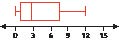
26.
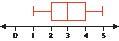
Use the comparison boxplots shown to answer Exercises 27–30.
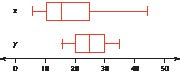
27. For the variable x:
a. Identify the shape of the distribution.
b. Use the boxplot to find the five-number summary.
28. For the variable y:
a. Identify the shape of the distribution.
b. Use the boxplot to find the five-number summary.
29. Which variable has greater variability, according to the IQR?
30. Which variable has greater variability, according to the range?
APPLYING THE CONCEPTS
Most Active Stocks. Use Table 28 for Exercises 31–38. These companies represent the 10 most actively traded stocks on the NASDAQ stock exchange as of 10:00 a.m. on July 11, 2014. The variables are the stock price and the net change in stock price, with both variables in dollars.

TABLE 28 The most active stocks on NASDAQ
|
Company |
Price |
Change |
|
|
65.28 |
10.41 |
|
Apple |
95.18 |
10.15 |
|
Cisco Systems |
25.28 |
10.14 |
|
Intel |
31.25 |
20.01 |
|
Fifth Street Finance |
9.66 |
20.36 |
|
QQQQ Trust |
94.75 |
10.09 |
|
Microsoft |
41.54 |
20.15 |
|
Sirius XM |
3.38 |
20.01 |
|
eBay |
51.43 |
11.09 |
|
Yahoo |
35.02 |
10.09 |
Source: www.nasdaq.com.
31. Find the five-number summary for price.
32. Find the interquartile range for price. Interpret what this value means.
33. Use the IQR method to investigate the presence of outliers in price.
34. Construct a boxplot for price.
35. Find the five-number summary for change.
36. Find the interquartile range for change. Interpret what this value means.
37. Use the IQR method to investigate the presence of outliers in change.
38. Construct a boxplot for change.
Dietary Supplements. Refer to Table 24 (page 170) for Exercises 39–44.

39. Find the five-number summary for usage.
40. Find the interquartile range for usage. Interpret what this value actually means, so that a nonspecialist could understand it.
41. Use the IQR method to investigate the presence of outliers in usage.
42. Construct a boxplot for usage.
43. Calculate the mean and standard deviation of usage.
44. Find the z-score for echinacea, and use it to determine whether the product is an outlier. Compare the result with that from the IQR method.
BRINGING IT ALL TOGETHER
Honda or Lexus? The following data represent the combined (city and highway) fuel efficiency in miles per gallon for independent random samples of models manufactured by Honda and Lexus. Use this data for Exercises 45–53.

|
Honda car |
mpg |
Lexus car |
mpg |
|
Accord |
24 |
GX 470 |
15 |
|
Odyssey |
18 |
LS 460 |
18 |
|
Civic Hybrid |
42 |
RX 350 |
19 |
|
Fit |
31 |
IS 350 |
20 |
|
CR-V |
23 |
GS 450 |
23 |
|
Ridgeline |
17 |
IS 250 |
24 |
|
S2000 |
21 |
45. Compute the five-number summary for each of the Honda cars and the Lexus cars.
46. Construct comparison boxplots for the Honda cars and the Lexus cars.
47. Describe the shapes of the distribution for the Honda cars and the Lexus cars.
48. Based on your descriptions in the previous exercise, would you expect the mean to be larger or smaller or about the same as the median for the Honda cars? The Lexus cars?
49. Calculate the mean for the Honda cars and the Lexus cars. Do they concur with your expectations from the previous exercise?
50. Describe the difference between the Honda cars and the Lexus cars, in terms of the location of the box. Which make of vehicle seems to have the greater overall combined mpg? Does this agree with what a comparison of the means from the previous exercise is telling you?
51. Describe the difference of the combined mpg between the Honda cars and the Lexus cars, in terms of the IQR measure of spread.
52. Based on your answer to the previous exercise, which make of car has greater variability?
53. Identify any outliers for the Honda cars and the Lexus cars, using the IQR method.
WORKING WITH LARGE DATA SETS
Nutrition. Use the data set Nutrition for Exercises 54–57.
54. Open the data set Nutrition.

a. How many observations are in the data set?
b. How many variables?
55. Use a statistical computing package (like Minitab) to explore the variable iron.
a. Find the mean and standard deviation for the amount of iron in the food.
b. Find the five-number summary, the range, and the interquartile range.
56. Which food item has the maximum amount of iron? Does this surprise you?
57. Use the computer to generate a boxplot. Also, comment on the symmetry or the skewness of the boxplot.
WORKING WITH LARGE DATA SETS

Financial Experts versus the Darts. This set of exercises uses the Darts data set from the Chapter 3 Case Study to examine the methods and techniques we have learned in this section. Open the Darts data set. Use technology to do the following in Exercises 58–63.

58. Find the five-number summary for each group.
59. Construct a comparison boxplot of all three groups. From the boxplot, which group has the greatest variability? The smallest variability?
60. Calculate the range and standard deviation for each group. Does the relative variability of the groups agree with your answer from Exercise 59?
61. For which groups are there no outliers?
62. How many outliers are there for the Darts? Verify using the IQR method that these data values are indeed outliers.
63. Check whether the outliers you found in Exercise 62 are also identified as outliers using the z-score method.
Chapter 3 Formulas and Vocabulary
SECTION 3.1
●●
Mean (p. 108)
●●
Measure of center (p. 108)
●●
Median (p. 112)
●●
Mode (p. 114)
●●
Population mean (p. 109). µ 5 x∙N.
●●
Population size (p. 109). Denoted by N.
●●
Sample mean (p. 109). x 5 x∙n.
●●
Sample size (p. 109). Denoted by n.
SECTION 3.2
●●
Chebyshev’s Rule (p. 138). The proportion of values from a data set that will fall within k standard deviations of the mean will be at least , where k . 1.
●●
Deviation (p. 128). x 2 x_.
●●
Empirical Rule (p. 136). If the data distribution is bell-shaped:
About 68% of the data values will fall within 1 standard deviation of the mean.
About 95% of the data values will fall within 2 standard deviations of the mean.
About 99.7% of the data values will fall within 3 standard deviations of the mean.
●●
Measure of variability (measure of spread, measure of dispersion) (p. 127)
●●
Population standard deviation (p. 132).
●●
Population variance (p. 130).
●●
Range (p. 127)
●●
Sample standard deviation (p. 133).
●●
Sample variance (p. 133).
●●
Standard deviation (p. 128)
SECTION 3.3
●●
Estimated mean for data grouped into a frequency distribution (p. 150).
●●
Estimated standard deviation for data grouped into a frequency distribution (p. 151).
●●
Estimated variance for data grouped into a frequency distribution (p. 151).
●●
Weighted mean (p. 149).
SECTION 3.4
●●
Finding a data value x given its z-score (p. 157)
Sample: x 5 z-score ∙ s 1 x_
Population: x 5 z-score ∙ 1 µ
●●
Interquartile range (IQR) (p. 166).
IQR 5 Q3 2 Q1
●●
Outlier (p. 158)
●●
Percentile (p. 159)
●●
Percentile rank (p. 161)
●●
Quartiles (p. 162)
●●
z-Score (p. 155)
a. Sample:
b. Population:
SECTION 3.5
●●
Boxplot (p. 173)
●●
Five-number summary (p. 172)
●●
IQR method of detecting outliers (p. 177)
Chapter 3 Review Exercises
SECTION 3.1
CDC Funding. The following table contains the funding provided by the Centers for Disease Control (CDC) to all the states in New England, in order to fight HIV/AIDS. Use the data for Exercises 1–3.
CDC funding to fight HIV/AIDS for New England states
|
State |
Funding ($ millions) |
|
Connecticut |
7.8 |
|
Maine |
1.9 |
|
Massachusetts |
14.9 |
|
New Hampshire |
1.5 |
|
Rhode Island |
2.7 |
|
Vermont |
1.6 |
Source: Centers for Disease Control and Prevention: www.cdc.gov/nchhstp/stateprofiles/usmap.htm.
1. Find the mean.
2. Calculate the median.
3. Suppose we added California, with $62.1 million in funding, to the data set. Recompute the mean and the median. Which is more affected by the presence of California? What can we say about each of the mean and the median, with respect to extreme values?
Calories in Cereal. For Exercises 4–8, refer to the calories in breakfast cereals given in Table 23 (page 169).
4. Compute the mean.
5. Calculate the median.
6. Find the mode
7. If we eliminated the cereals with 90 or less calories from the sample, which measure would not be affected at all? Why?
8. If we added 10 calories to each cereal, how would that affect the mean, median, and mode? Would it affect each of the measures equally?
SECTION 3.2
CDC Funding to Fight HIV/AIDS. Refer to the CDC funding data above for Exercises 9–14. Omit California.
9. Find the range of the data set.
10. For each state, find its deviation from the population mean.
11. Calculate the average deviation. Would the average deviation be a good measure of spread? Why or why not?
12. Compute the sum of squared deviations. Then divide by the number of states. The result is the population variance, .
13. Take the square root of the population variance to find the population standard deviation, .
14. Interpret the value for the standard deviation.
Calories in Cereal. For Exercises 14–17, refer to the calories in breakfast cereals given in Table 23 (page 169).
15. Calculate the standard deviation of the sample.
16. Suppose we consider the cereals in Table 23 to be representative of all breakfast cereals. Use the mean from Exercise 4 and the standard deviation from Exercise 15, along with Chebyshev’s Rule, to find two values between which at least 75% of cereal calories will fall.
17. Refer to the previous exercise. Now further assume the data distribution is bell-shaped. Find two values between which about 95% of cereal calories will fall.
Common Syllables in English. Refer to the table shown here of some common syllables in English for Exercises 18–21.

|
Syllable |
Frequency |
|
an |
462 |
|
bi |
621 |
|
sit |
104 |
|
ed |
907 |
|
its |
293 |
|
est |
186 |
|
wil |
470 |
|
tiv |
136 |
|
en |
675 |
|
biz |
114 |
18. Find the mean and the range of the syllable frequencies.
19. Would you say that a typical distance from the mean for the frequencies is about 900, about 500, about 300, or about 100?
20. What is your best guesstimate of the value of a typical distance from the mean for the syllable frequencies?
21. Find the sample variance and the sample standard deviation of syllable frequencies.
a.
How far is each from your estimate of the typical deviation earlier?
b.
Interpret the meaning of this value for the standard deviation so that someone who has never studied statistics would understand it.
SECTION 3.3
Age Distribution of Twenty-Somethings. The following table shows the number of Americans (in millions) between 20 and 29 years old in 2011. Use this data for Exercises 22–25.
22. Find the estimated mean age of twenty-somethings.
23. Calculate the estimated standard deviation of Americans in their 20s.
24. Use the Empirical Rule to find two age values between which fall about 68% of all American twenty-somethings.
25. Compare your answer in the previous exercise to the actual proportion of twenty-somethings whose ages lie between the values found in the previous exercise. What does this discrepancy mean, regarding the distribution of ages in the table?

|
Age |
Number (millions) |
|
20 |
4.5 |
|
21 |
4.4 |
|
22 |
4.3 |
|
23 |
4.2 |
|
24 |
4.2 |
|
25 |
4.3 |
|
26 |
4.2 |
|
27 |
4.2 |
|
28 |
4.2 |
|
29 |
4.2 |
Source: U.S. Census Bureau.
SECTION 3.4
Ragweed Pollen. Use the table of ragweed pollen index in New York localities for Exercises 26–41. Are you allergic to ragweed pollen? You are not alone. The American Academy of Allergy maintains the ragweed pollen index, which details the severity of the pollen problem for hundreds of communities across the nation. The following table contains the ragweed pollen index on a particular day for 10 localities in New York State.

|
Locality |
Ragweed pollen index |
|
Albany |
48 |
|
Binghamton |
31 |
|
Buffalo |
59 |
|
Elmira |
43 |
|
Manhattan |
25 |
|
Rochester |
60 |
|
Syracuse |
25 |
|
Tupper Lake |
8 |
|
Utica |
26 |
|
Yonkers |
38 |
Find the following percentiles of total ragweed pollen index.
26. 10th percentile
27. 50th percentile
28. 90th percentile
For Exercises 29–31, find the z-scores for the following localities for the ragweed pollen index.
29. Albany
30. Rochester
31. Tupper Lake
32. Identify any outliers or moderately unusual observations in the ragweed pollen index.
For Exercises 33–35, find the percentile rank for the given ragweed pollen index.
33. 25
34. 59
35. 48
36. Find the first, second, and third quartiles of the ragweed pollen index.
37. Find the interquartile range. Interpret what this value means.
38. Detect any outliers using the IQR method.
SECTION 3.5
39. Let’s draw a boxplot of the ragweed pollen index.
a.
What is the five-number summary?
b.
By hand, draw a boxplot.
c.
Is the data set left-skewed, right-skewed, or symmetric?
d.
What should the symmetry or skewness mean in terms of the relative values of the mean and median?
e.
Find the mean and standard deviation. Is your prediction in (d) supported?
40. Detect any outliers using the IQR method. Compare with Exercise 32. Do the two methods concur or disagree?
41. Suppose the ragweed pollen index in Rochester were 600 instead of 60. How would this outlier affect the quartiles and the IQR? What property of these measures is this behavior an example of?
TRUE OR FALSE
1. True or false: If two data sets have the same mean, median, and mode, then the two data sets are identical.
2. True or false: The variance is the square root of the standard deviation.
3. True or false: The Empirical Rule applies for any data set.
FILL IN THE BLANK
4. A(n) __________ is an extremely large or extremely small data value relative to the rest of the data set.
5. The mean can be viewed as the __________ point of the data.
6. The measure of center that is sensitive to the presence of extreme values is the __________.
SHORT ANSWER
7. What do we call summary descriptive measures that are not sensitive to the presence of outliers?
8. Which of the mean, median, and mode may be used for categorical data?
9. For any data set, what is the average of the deviations?
10. What do we use to estimate the mean for each class in a frequency distribution?
CALCULATIONS AND INTERPRETATIONS
11. Calculating a Grade Point Average. At a certain college in Texas, student grade point averages are calculated as follows. For each credit hour, an A is worth 4.0 quality points, an A2 is worth 3.7 quality points, a B1 is worth 3.3 quality points, a B is worth 3.0, a B2 is worth 2.7, a C1 is worth 2.3, and so on. To find the grade point average, the number of credits for each course is multiplied by the quality points earned for that course; the results are added together; and the sum is divided by the number of credits. This semester, Angelita’s grades are as follows. She got an A in her four-credit honors biology course, an A2 in her three-credit calculus course, a B1 in her three-credit English course, a B2 in her three-credit anthropology course, and a C1 in her two-credit physical education course. Calculate Angelita’s grade point average for this semester.
12. A sample of 30 Americans yielded a sample mean consumption of carbonated beverages this year of 60 gallons, with a sample standard deviation of 40 gallons. Find the z-scores for the following amounts of carbonated beverage consumption.
a.
120 gallons
b.
20 gallons
c.
100 gallons
d.
0 gallons
e.
60 gallons
13. Refer to the information in Exercise 12. Assume the distribution is bell-shaped. (Hint: Use your knowledge about the Empirical Rule to give a range for the proportions in parts (b) and (d)).
a.
Find the 50th percentile.
b.
Estimate the proportion of Americans who drink between 20 and 100 gallons per year.
c.
Discuss whether we could find the estimate in (b) without assuming that the distribution is bell-shaped.
d.
Estimate the proportion of Americans who drink more than 100 gallons per year.
Use the following SAT 1 Math score for Exercises 14−18.
510, 515, 523, 514, 521, 501, 502, 499

14. Find the following quartiles for SAT 1 Math score:
a.
Q1
b.
Q2
c.
Q3
15. Find the interquartile range of SAT 1 Math score.
16. Find the five-number summary for SAT 1 Math score.
17. Use robust methods to investigate the presence of outliers.
18. Construct a boxplot for SAT 1 Math score.
1
z-Scores
Our first measure of relative position is the z-score. Recall that the standard deviation is a common measure of the variability, or spread, of a data set. The z-score indicates how many standard deviations a particular data value is from the mean. If the z-score is positive, then the data value is above the mean. If the z-score is negative, then the data value is below the mean.
Recall that the standard deviation is a common measure of the variability, or spread, of a data set, and its value is interpreted as a typical deviation from the mean.
z-Score
The z-score for a particular data value from a sample is
where is the sample mean, and s is the sample standard deviation.
The z-score for a particular data value from a population is
where is the population mean, and is the population standard deviation.
z-scores can be positive or negative.
● A positive z-score indicates that the data value, x, lies above the mean.
● A negative z-score implies that x lies below the mean.
● A z-score equal to zero indicates that x equals the mean.
In this section, we will use the sample z-score unless otherwise indicated.
EXAMPLE 21 Calculating z-scores, given data values
People thinking about applying for a loan should take care that they maintain a healthy credit score, which comes from paying monthly bills on time and paying off previous loans without any problems. Figure 22 shows a histogram of the credit scores of over 150,000 loan applicants (Source: Data Mining and Predictive Analytics, by Daniel Larose and Chantal Larose, Wiley, 2015). The mean of this population of credit scores is µ 5 670, with a standard deviation of σ 5 70. Calculate and interpret the z-scores for the following loan applicants:
a. Jasmine has been taking care to pay all her bills on time, so she has a healthy credit score of 740.
b. Jeremy was laid off, defaulted on a previous loan, and so has a credit rating of 439.
c. May-Chang always pays her bills on time and has already paid off several loans. Her credit score is 817.
Solution
Note that here we have population values, with µ 5 670 and σ 5 70.
a. Jasmine’s credit score is x 5 740. Her z-score is
We interpret Jasmine’s z-score of 1 to mean that her credit score of 740 lies 1 standard deviation above the mean µ 5 670. See Figure 22.
b. The z-score for Jeremy’s credit score of 439 is
Jeremy’s credit score lies 3.3 standard deviations below the mean.
c. The z-score for May-Chang’s credit score of 817 is
May-Chang’s credit score lies 2.1 standard deviations above the mean.
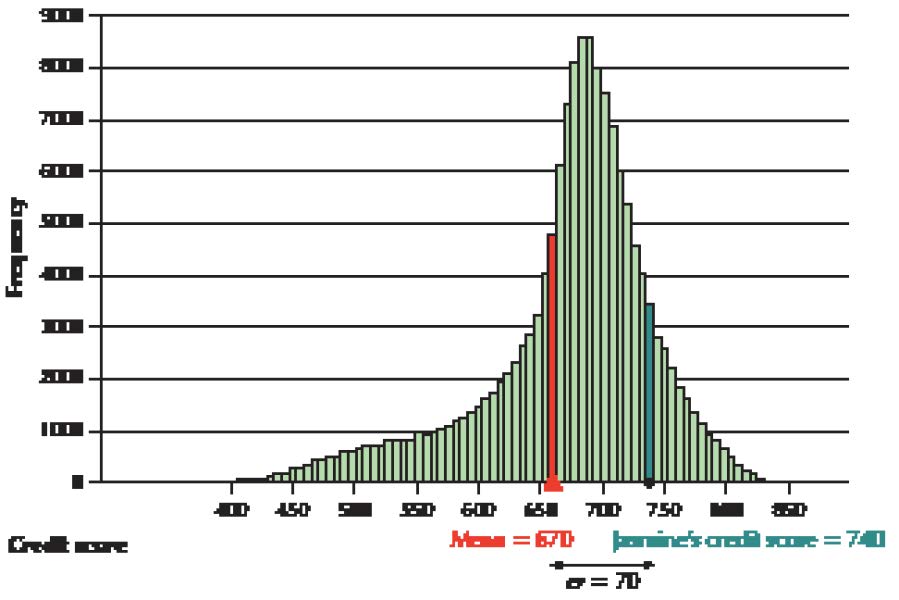
FIGURE 22 Jasmine’s z-score of 1 places her 1 standard deviation above the mean.
NOW YOU CAN DO
Exercises 7–18.
The IBM Digital Analytics Benchmark reports that tablet users (for tablets such as the iPad) spent a mean of $96 per order for their 2013 online holiday shopping. Assume that the standard deviation is $40. Find the z-scores for the following tablet-using holiday shoppers:
1. Austin spent $136 on video games.
2. Brian spent $16 on music downloads.
3. Courtney spent $256 on gifts for her friends.
(The solutions are shown in Appendix A.)
YOUR TURN
#11
Given a z-score, to find its associated data value x:
For a sample:
For a population:
where is the population mean, is the sample mean, is the population standard deviation, and s is the sample standard deviation.
Note: We arrive at these formulas simply by taking the z-score formula and using algebra to solve for x.
NOW YOU CAN DO
Exercises 19–30.
Continuing the online holiday shopping example from Your Turn #11 on page 156, find the spending amounts associated with the following z-scores.
1. David’s z-score was 21.5. How much did he spend?
2. Emily had a z-score of 2.5. What was her spending amount?
3. Frances had a z-score of zero. What did she spend?
(The solutions are shown in Appendix A.)
YOUR TURN
#12
EXAMPLE 23 Using the z-score to compare data from different data sets
Andrew is bragging to his friend Brittany that he did better than she did on the last statistics test. Andrew got a 90, while Brittany got an 80. Andrew’s class mean was 80, with a standard deviation of 10. Brittany’s class mean was 60, with a standard deviation of 10. The professors in both classes grade “on a curve” using z-scores. Who did better relative to his or her class?
Solution
Brittany can use z-scores to show that she did better relative to her class. Figure 23 shows comparative dotplots of the scores in the two classes. The red dots represent Brittany’s and Andrew’s scores. Brittany found her z-score by subtracting her class mean from her score of 80 and then dividing by the standard deviation s 5 10:
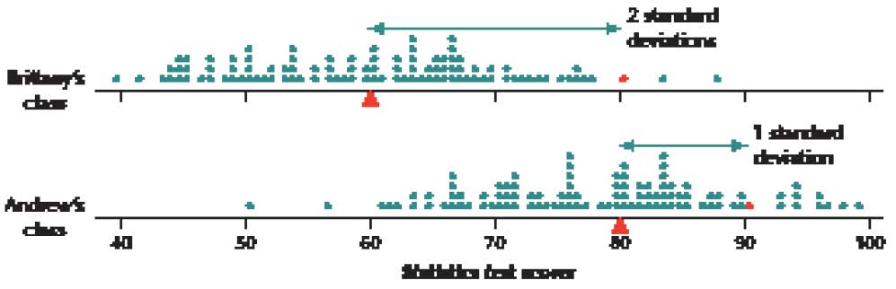
FIGURE 23 Brittany actually did better relative to her class.
z-Scores enable the data analyst to compare data values from two different distributions.
NOW YOU CAN DO
Exercises 31 and 32.
YOUR TURN
#13
Note: If an outlier is detected, it does not automatically follow that it should be discarded. Outliers often indicate the presence of something interesting going on in the data that would call for further investigation. On the other hand, it could simply be a typo. The analyst should check with the data source.
NOW YOU CAN DO
Exercises 33–44.
YOUR TURN
#14
Some analysts prefer to define the pth percentile to be a data value at which at least p percent of the values in the data set are less than or equal to this value, and at least (1 – p) percent of the values are greater than or equal to this value.
Percentile
Let p be any integer between 0 and 100. The pth percentile of a data set is the data value at which p percent of the values in the data set are less than or equal to this value.
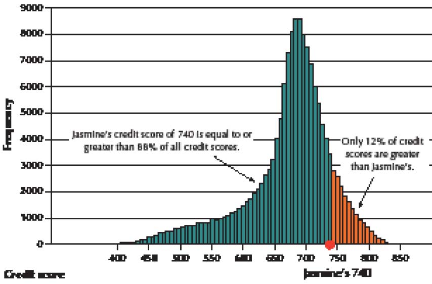
FIGURE 24 Jasmine’s credit score of 740 represents the 88th percentile. The 88th percentile is the score with 88% of the data values at or below its value.
Step 1 Sort the data into ascending order (from smallest to largest).
Step 2 Calculate
where p is the particular percentile you wish to calculate, and n is the sample size.
Step 3
a. If i is an integer (a whole number with no decimal part), the pth percentile is the mean of the data values in positions i and i 1 1.
b. If i is not an integer, round up to the next integer and use the value in this position.
These steps do not give the value of the pth percentile itself, but rather the position of the pth percentile in the data set when the data set is in ascending order.

CAUTION
!
Table 22 Exports for 12 states
|
State |
VA |
NC |
NJ |
GA |
PA |
OH |
MI |
FL |
LA |
IL |
WA |
NY |
|
Exports ($ millions) |
1.6 |
2.7 |
3.3 |
3.5 |
3.5 |
4.6 |
4.7 |
4.8 |
5.0 |
5.8 |
7.5 |
7.7 |
stateexports
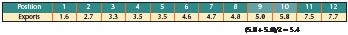
NOW YOU CAN DO
Exercises 45–56.
Jason is doing a class project on some of the lowest-rated movies on the movie database IMDB. He will use movies whose ratings are in the 20th percentile or lower. A sample of movie ratings follows. Calculate the 20th percentile rating.
8.7 5.4 7.1 3.6 1.9 5.7 4.2 9.3 2.5
(The solution is shown in Appendix A.)
YOUR TURN
#15
Remember: A percentile is a data value, whereas a percentile rank is a percentage.
The percentile rank of a data value, x, equals the percentage of values in the data set that are less than or equal to x. In other words:
For the state export data in the previous example, calculate the percentile ranks for the following export values:
a. $5.4 million
b. $3.4 million
Solution
a. Here, x 5 5.4. Nine states have x-values at or below 5.4, so the percentile rank of a state with $5.4 million in exports is
NOW YOU CAN DO
Exercises 57–68.
YOUR TURN
#16
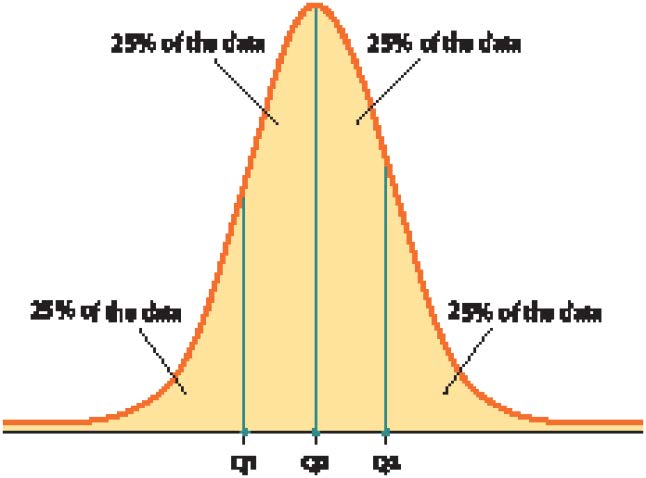
FIGURE 25 The quartiles Q1, Q2, and Q3 divide the data set into four quarters.
The Quartiles
The quartiles of a data set divide the data set into four parts, each containing 25% of the data.
● The first quartile (Q1) is the 25th percentile.
● The second quartile (Q2) is the 50th percentile, that is, the median.
● The third quartile (Q3) is the 75th percentile.
For small data sets, the division may be into four parts of only approximately equal size.
Note: It may be helpful to note that the phrase third quartile is akin to the phrase three quarters, which is 75%, representing the 75th percentile. Also, the phrase first quartile is akin to the phrase one quarter, which is 25%, representing the 25th percentile.
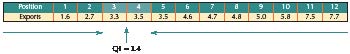
FIGURE 26 The 25th percentile splits the difference between 3.3 and 3.5.
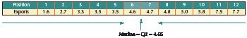
The quartiles may be found on the TI-83/84 by using the instructions for descriptive statistics shown on page 117.
FIGURE 27 The 50th percentile splits the difference between 4.6 and 4.7.
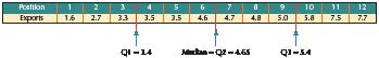
NOW YOU CAN DO
Exercises 69–76.
FIGURE 28 The quartiles for the export data.
As a follow-up to his project, Jason is dividing movie ratings into Great (at or above Q3), Good (from Q2 to Q3), Mediocre (from Q1 to Q2), and Awful (lower than Q1). Find Q1, Q2, and Q3 from the following sample of movie ratings.
8.7 5.4 7.1 3.6 1.9 5.7 4.2 9.3 2.5
(The solution is shown in Appendix A.)
YOUR TURN
#17
nutrition
Note: Minitab uses a different way to calculate the quartiles than the way we have learned, which results in different values than our hand-calculation methods. However, for large data sets, the difference is minimal.
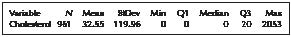
FIGURE 29 Descriptive statistics for the cholesterol data.
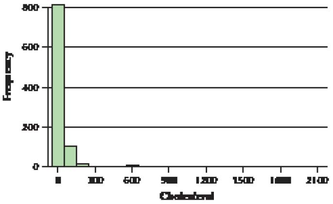
FIGURE 30 Cholesterol content (mg) of 961 foods.
The Mean Is Not Always Representative
Note that the median is 0 mg of cholesterol, meaning that at least half of the food items tested by the U.S. Department of Agriculture in this data set had no cholesterol at all. We are intrigued by this result and ask Minitab to provide us with a frequency distribution for the cholesterol content, along with the cumulative percentages (“CumPct”). Figure 31 provides a portion of this frequency distribution, with the following results:
● 61.91% of the food items have no cholesterol at all, which explains why Q1 and the median are both zero.
● The 75th percentile, Q3, is verified as 20 mg cholesterol.
● The 81st percentile of the data set is 32 mg cholesterol.
Think about these results for a moment. We found that the 81st percentile is 32 mg cholesterol. In other words, 81% of the food items have a cholesterol content of 32 mg or less. And yet, this 32 mg is still less than the mean cholesterol content, reported by Minitab to be 32.55 mg. In other words, the mean of this data set is larger than 81% of the data values in the data set.
It seems clear, therefore, that the mean 32.55 mg cannot be considered as typical or representative of the data set. Its value has been exaggerated by the presence of the outliers, to such an extent that it is now larger than 81% of the data. We need another, more robust measure of center—one that is resistant to the undue influence of outliers, such as the median. Here, the value of the median is 0 mg cholesterol. An argument may certainly be made that this is indeed typical and representative of the data set, because 61.91% of the food items have no cholesterol content at all.
Developing Your Statistical Sense
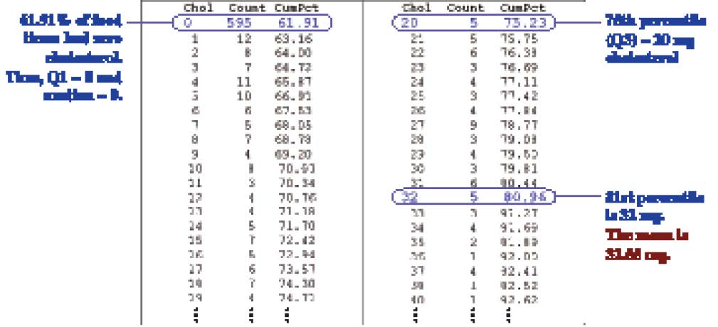
FIGURE 31 Partial frequency distribution of cholesterol content.
Interquartile Range
The interquartile range (IQR) is a robust measure of variability. It is calculated as
IQR 5 Q3 2 Q1.
The interquartile range is interpreted to be the spread of the middle 50% of the data.

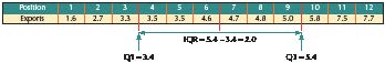
NOW YOU CAN DO
Exercises 77 and 78.
FIGURE 32 The interquartile range for the exports data.
Find the interquartile range for Jason’s follow-up movie ratings project.
8.7 5.4 7.1 3.6 1.9 5.7 4.2 9.3 2.5
(The solution is shown in Appendix A.)
YOUR TURN
#18
167
3.4 Measures of Relative Position and Outliers
STEP-BY-STEP TECHNOLOGY GUIDE: Percentiles and Quartiles
TI-83/84
The quartiles are provided using the instructions for descriptive statistics shown on page 117.
EXCEL
Step 1 Enter the data into column A.
Step 2 Select Data > Data Analysis.
Step 3 Select Rank and Percentile and click OK.
Step 4 Click in the Input Range cell. Then highlight the data in column A. If the variable name is in the column, select Labels in First Row. Click OK.
SPSS
Step 1 Enter the data in the first column.
Step 2 Click Analyze > Descriptive Statistics > Frequencies….
Step 3 Click the column name and the arrow to move it to the Variable(s) box.
Step 4 Click Statistics…. For quartiles, select Quartiles. For other percentiles, select Percentile(s), type in the desired percentile in the small box, and click Add. Click Continue, then OK.
MINITAB
The quartiles are provided using the instructions for descriptive statistics shown on page 117.
JMP
Step 1 Click File > New > DataTable. Enter the data in Column 1.
Step 2 Click Tables > Summary.
Step 3 Click the variable name under Select Columns. For each desired percentile, enter its value in the For quantile statistics, enter value (%) box. Then select Quantiles from the Statistics drop-down menu. After all have been entered, click OK.
CRUNCHIT!
We will use the data from Example 26 (page 160).
Step 1 Click File, then highlight Load from Larose, Discostat3e > Chapter 3, and click Example 03_26.
Step 2 Click Statistics and select Descriptive statistics. For Columns, select Exports.
Step 3 In the Percentiles (comma-separated) cell, enter the percentiles that you would like to find. For example, to find the 5th and 95th percentiles, enter 5, 95.
Step 4 Click Calculate.
Section 3.4 Summary
1. In this section, we learned about measures of relative position, which tell us the position that a particular data value holds relative to the rest of the data set. The z-score indicates how many standard deviations a particular data value is from the mean. The z-score equals the data value minus the mean, divided by the standard deviation. We may also calculate a data value, given its z-score.
2. An outlier is a value that is very much greater than or less than the mean. An outlier can be identified when its z-score is less than 23 or greater than 3.
3. The pth percentile of a data set is the value at which p percent of the values in the data set are less than or equal to this value. The percentile rank of a data value equals the percentage of values in the data set that are less than or equal to that value.
4. Quartiles divide the data set into approximately equal quarters. The interquartile range (IQR) is a measure of spread found by subtracting the first quartile from the third quartile.
Section 3.4 Exercises
CLARIFYING THE CONCEPTS
1. What does it mean for a z-score to be positive? Negative? Zero? (p. 155)
2. Explain in your own words what the 95th percentile of a data set means. (p. 160)
3. Why doesn’t it make sense for there to be a 120th percentile of a data set? (p. 159)
4. Is it possible for the 1st percentile of a data set to equal the 99th percentile? Explain when this would happen. (p. 159)
5. Explain the difference between a percentile and a percentile rank. (p. 161)
6. True or false: The IQR is sensitive to the presence of outliers. (p. 165)
3.4 Measures of Relative Position and Outliers
171
3.4 Measures of Relative Position and Outliers
|
3.5 |
Five-Number Summary and Boxplots |
|
OBJECTIVES By the end of this section, I will be able to . . .
1
Calculate the five-number summary of a data set.
2
Construct and interpret a boxplot for a given data set.
3
Detect outliers using the IQR method. |
The five-number summary consists of the following set of statistics:
1. Minimum; the smallest value in the data set
2. First quartile, Q1
3. Median, Q2
4. Third quartile, Q3
5. Maximum; the largest value in the data set
Table 26 State export data, in millions of dollars, June 2014
|
State |
VA |
NC |
NJ |
GA |
PA |
OH |
MI |
FL |
LA |
IL |
WA |
NY |
|
Exports ($ millions) |
1.6 |
2.7 |
3.3 |
3.5 |
3.5 |
4.6 |
4.7 |
4.8 |
5.0 |
5.8 |
7.5 |
7.7 |
stateexports
NOW YOU CAN DO
Exercises 7−8, 13−14, and 19−20.
Jason is analyzing the movie ratings in the accompanying sample. Find the five-number summary of movie ratings.
8.7 5.4 7.1 3.6 1.9 5.7 4.2 9.3 2.5
(The solution is shown in Appendix A.)
YOUR TURN
#19
nutrition
FIGURE 33 Descriptive statistics for the cholesterol data.
2
The Boxplot
The boxplot (sometimes called a box-and-whisker plot) is a convenient graphical display of the five-number summary of a data set. The boxplot allows the data analyst to evaluate the symmetry or skewness of a data set.
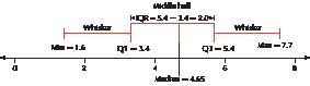
FIGURE 34 Boxplot of the state export data.
Constructing a Boxplot by Hand
1. The lower and upper fences (represented by brackets in Figure 35b below) represent limits, beyond which data values are considered outliers. Determine the lower and upper fences as follows:
a. Lower fence 5 Q1 2 1.5(IQR)
b. Upper fence 5 Q3 1 1.5(IQR), where IQR 5 Q3 2 Q1
2. Draw a horizontal number line that encompasses the range of your data, including the fences. Above the number line, draw vertical lines at Q1, the median, and Q3. Connect the lines for Q1 and Q3 to each other so as to form a box.
3. Temporarily indicate the fences as brackets ([ and ]) above the number line.
4. Draw a horizontal line from Q1 to the smallest data value greater than the lower fence. This is the lower whisker. Draw a horizontal line from Q3 to the largest data value smaller than the upper fence. This is the upper whisker.
5. Indicate any data values smaller than the lower fence or larger than the upper fence using an asterisk (*). These data values are outliers. Remove the temporary brackets.
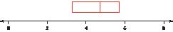
FIGURE 35A Constructing a boxplot by hand: Steps 1 and 2.
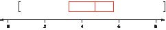
FIGURE 35B Constructing a boxplot by hand: Step 3.
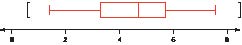
FIGURE 35C Constructing a boxplot by hand: Step 4.
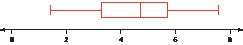
NOW YOU CAN DO
Exercises 9−10, 15−16, and 21−22.
FIGURE 35D The completed boxplot.
Previously, you found the five-number summary for Jason’s movie ratings. Use the five-number summary to construct a boxplot of the data.
8.7 5.4 7.1 3.6 1.9 5.7 4.2 9.3 2.5
(The solution is shown in Appendix A.)
YOUR TURN
#20
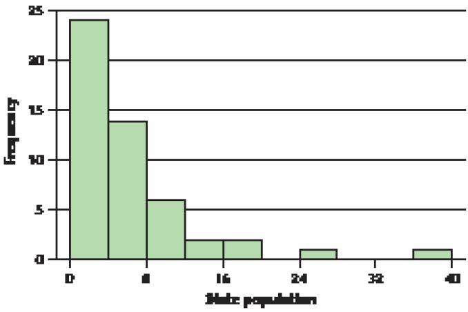
FIGURE 36 State population is right-skewed.
FIGURE 37 TI-83/84 boxplot of state population: right-skewed.
FIGURE 38 Histogram of exam scores.
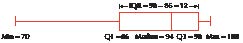
NOW YOU CAN DO
Exercises 25 and 26.
FIGURE 39 TI-83/84 boxplot of the exam scores.
Symmetric Data and Boxplots
So, can you now predict how a boxplot of symmetric data will look? The median will be about the same distance from Q1 (lower hinge) and Q3 (upper hinge). And the upper and lower whiskers will be about the same length. An example of a boxplot of symmetric data is shown in Figure 40.
What Results Might We Expect?
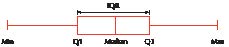
FIGURE 40 Boxplot of symmetric data.
3
Detecting Outliers Using the IQR Method
When using the mean and standard deviation as your summary measures, in most cases, outliers occur more than 3 standard deviations from the mean. However, due to the sensitivity of these measures to the outliers themselves, we often use a more robust method of detecting outliers. Earlier, we mentioned that, when constructing a boxplot, data values lower than the lower fence and higher than the upper fence are considered outliers. We can use this method to detect outliers without constructing a boxplot.
IQR Method to Detect Outliers
A data value is an outlier if
a. it is located 1.5(IQR) or more below Q1, or
b. it is located 1.5(IQR) or more above Q3.
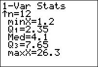
FIGURE 41 Five-number summary.
NOW YOU CAN DO
Exercises 11−12, 17−18, and 23−24.
Use the IQR method to determine whether any outliers exist in the movie review data.
8.7 5.4 7.1 3.6 1.9 5.7 4.2 9.3 2.5
(The solution is shown in Appendix A.)
YOUR TURN
#21
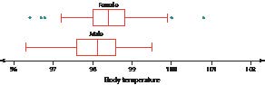
FIGURE 42 Comparison of boxplots of female and male body temperatures.
We will formally test whether a difference exists in the true mean body temperature between women and men in Chapter 10.
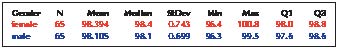
FIGURE 43 Descriptive statistics for body temperature, by gender.
NOW YOU CAN DO
Exercises 27−30.
When Measures of Spread Disagree
Two measures of spread that are sensitive to the presence of extreme values—range and standard deviation—find that the female body temperatures are more variable. The measure of spread that is resistant to the effects of extreme values—IQR—finds that the male body temperatures are more variable. How do we resolve this apparent inconsistency? What appears to be happening is that, for the middle 50% of each data set, the men are more variable, but as we move toward the tails, the women are more spread out.
Note that outliers exist for the women but not for the men. In part, this may be because the IQR for the women is smaller, and thus the distance 1.5(IQR) is also smaller. For example, the woman whose body temperature is 100 degrees is identified as an outlier because 100 is the same as the outlier threshold Q3 1 1.5(IQR) 5 98.8 1 1.5(0.8) 5 100. The same temperature in a man would not be classified as an outlier, even though the male temperatures are lower overall (and Q3, specifically, is lower). This is because the temperature of 100 is not higher than Q3 1 1.5(IQR) 5 98.6 1 1.5(1.0) 5 100.1, which is the male outlier threshold. Thus, the measures of spread that are sensitive to outliers indicate that women have greater variability, whereas the measure of spread that is not sensitive to outliers indicates that men have greater variability.
Developing Your Statistical Sense
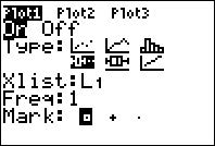
FIGURE 44
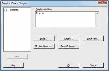
FIGURE 45
180
Chapter 3 Describing Data Numerically
181
3.5 Five-Number Summary and Boxplots
182
Chapter 3 Describing Data Numerically
183
Chapter 3 Review Exercises
185
Chapter 3 Quiz
Chapter 3 QUIZ