Aggregate Supply
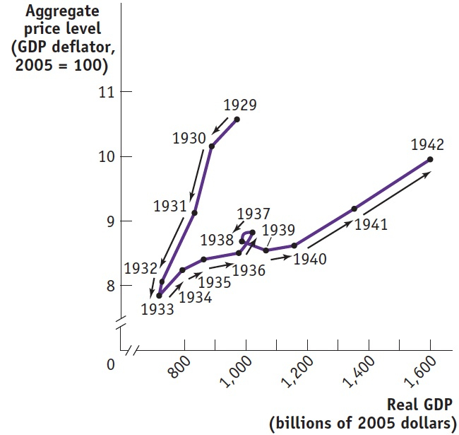
Between 1929 and 1933, there was a sharp fall in aggregate demand—a reduction in the quantity of goods and services demanded at any given price level. One consequence of the economy-wide decline in demand was a fall in the prices of most goods and services. By 1933, the GDP deflator (one of the price indexes) was 26% below its 1929 level, and other indexes were down by similar amounts. A second consequence was a decline in the output of most goods and services: by 1933, real GDP was 27% below its 1929 level. A third consequence, closely tied to the fall in real GDP, was a surge in the unemployment rate from 3% to 25%.
The aggregate supply curve shows the relationship between the aggregate price level and the quantity of aggregate output supplied in the economy.
The association between the plunge in real GDP and the plunge in prices wasn’t an accident. Between 1929 and 1933, the U.S. economy was moving down its aggregate supply curve, which shows the relationship between the economy’s aggregate price level (the overall price level of final goods and services in the economy) and the total quantity of final goods and services, or aggregate output, producers are willing to supply. (As you will recall, we use real GDP to measure aggregate output, and we’ll often use the two terms interchangeably.) More specifically, between 1929 and 1933, the U.S. economy moved down its short-run aggregate supply curve.
The Short-Run Aggregate Supply Curve
The period from 1929 to 1933 demonstrated that there is a positive relationship in the short run between the aggregate price level and the quantity of aggregate output supplied. That is, a rise in the aggregate price level is associated with a rise in the quantity of aggregate output supplied, other things equal; a fall in the aggregate price level is associated with a fall in the quantity of aggregate output supplied, other things equal. To understand why this positive relationship exists, consider the most basic question facing a producer: is producing a unit of output profitable or not? Let’s define profit per unit:
(18-1) Profit per unit of output =Price per unit of output − Production cost per unit of output
Thus, the answer to the question depends on whether the price the producer receives for a unit of output is greater or less than the cost of producing that unit of output. At any given point in time, many of the costs producers face are fixed per unit of output and can’t be changed for an extended period of time. Typically, the largest source of inflexible production cost is the wages paid to workers. Wages here refers to all forms of worker compensation, including employer-paid health care and retirement benefits in addition to earnings.
The nominal wage is the dollar amount of the wage paid.
Sticky wages are nominal wages that are slow to fall even in the face of high unemployment and slow to rise even in the face of labor shortages.
Wages are typically an inflexible production cost because the dollar amount of any given wage paid, called the nominal wage, is often determined by contracts that were signed some time ago. And even when there are no formal contracts, there are often informal agreements between management and workers, making companies reluctant to change wages in response to economic conditions. For example, companies usually will not reduce wages during poor economic times—unless the downturn has been particularly long and severe—for fear of generating worker resentment. Correspondingly, they typically won’t raise wages during better economic times—until they are at risk of losing workers to competitors—because they don’t want to encourage workers to routinely demand higher wages. As a result of both formal and informal agreements, then, the economy is characterized by sticky wages: nominal wages that are slow to fall even in the face of high unemployment and slow to rise even in the face of labor shortages. It’s important to note, however, that nominal wages cannot be sticky forever: ultimately, formal contracts and informal agreements will be renegotiated to take into account changed economic circumstances. How long it takes for nominal wages to become flexible is an integral component of what distinguishes the short run from the long run.

istockphoto
AP® Exam Tip
Because wages are “sticky,” they fall very slowly even when the unemployment rate is high. This is important to know when you look at how the economy reacts with no government involvement.
To understand how the fact that many costs are fixed in nominal terms gives rise to an upward-sloping short-run aggregate supply curve, it’s helpful to know that prices are set somewhat differently in different kinds of markets. In perfectly competitive markets, producers take prices as given; in imperfectly competitive markets, producers have some ability to choose the prices they charge. In both kinds of markets, there is a positive relationship between prices and output in the short run, but for slightly different reasons.
Let’s start with the behavior of producers in perfectly competitive markets; remember, they take the price as given. Imagine that, for some reason, the aggregate price level falls, which means that the price received by the typical producer of a final good or service falls. Because many production costs are fixed in the short run, the production cost per unit of output doesn’t fall in proportion to the price of output. So the profit per unit of output declines, leading perfectly competitive producers to reduce the quantity supplied in the short run.
On the other hand, suppose that for some reason the aggregate price level rises. As a result, the typical producer receives a higher price for its final good or service. Again, many production costs are fixed in the short run, so the production cost per unit of output doesn’t rise in proportion to the rise in the price of a unit. And since the typical perfectly competitive producer takes the price as given, profit per unit of output rises and output increases.
Now consider an imperfectly competitive producer that is able to set its own price. If there is a rise in the demand for this producer’s product, it will be able to sell more at any given price. Given stronger demand for its products, it will probably choose to increase its prices as well as its output, as a way of increasing profit per unit of output. In fact, industry analysts often talk about variations in an industry’s “pricing power”: when demand is strong, firms with pricing power are able to raise prices—and they do.
Conversely, if there is a fall in demand, firms will normally try to limit the fall in their sales by cutting prices.
The short-run aggregate supply curve shows the relationship between the aggregate price level and the quantity of aggregate output supplied that exists in the short run, the time period when many production costs can be taken as fixed.
Both the responses of firms in perfectly competitive industries and those of firms in imperfectly competitive industries lead to an upward-sloping relationship between aggregate output and the aggregate price level. The positive relationship between the aggregate price level and the quantity of aggregate output producers are willing to supply during the time period when many production costs, particularly nominal wages, can be taken as fixed is illustrated by the short-run aggregate supply curve. The positive relationship between the aggregate price level and aggregate output in the short run gives the short-run aggregate supply curve its upward slope. Figure 18.1 shows a hypothetical short-run aggregate supply curve, SRAS, that matches actual U.S. data for 1929 and 1933. On the horizontal axis is aggregate output (or, equivalently, real GDP)—the total quantity of final goods and services supplied in the economy—measured in 2005 dollars. On the vertical axis is the aggregate price level as measured by the GDP deflator, with the value for the year 2005 equal to 100. In 1929, the aggregate price level was 10.6 and real GDP was $977 billion. In 1933, the aggregate price level was 7.9 and real GDP was only $716 billion. The movement down the SRAS curve corresponds to the deflation and fall in aggregate output experienced over those years.
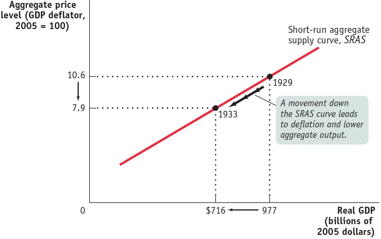
Figure 18.1: The Short-Run Aggregate Supply CurveThe short-run aggregate supply curve shows the relationship between the aggregate price level and the quantity of aggregate output supplied in the short run, the period in which many production costs such as nominal wages are fixed. It is upward sloping because a higher aggregate price level leads to higher profit per unit of output and higher aggregate output given fixed nominal wages. Here we show numbers corresponding to the Great Depression, from 1929 to 1933: when deflation occurred and the aggregate price level fell from 10.6 (in 1929) to 7.9 (in 1933), firms responded by reducing the quantity of aggregate output supplied from $977 billion to $716 billion measured in 2005 dollars.
Shifts of the Short-Run Aggregate Supply Curve
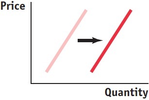
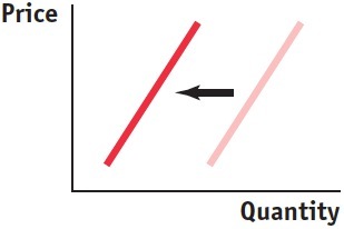
Figure 18.1 shows a movement along the short-run aggregate supply curve, as the aggregate price level and aggregate output fell from 1929 to 1933. But there can also be shifts of the short-run aggregate supply curve, as shown in Figure 18.2. Panel (a) shows a decrease in short-run aggregate supply—a leftward shift of the short-run aggregate supply curve. Aggregate supply decreases when producers reduce the quantity of aggregate output they are willing to supply at any given aggregate price level. Panel (b) shows an increase in short-run aggregate supply—a rightward shift of the short-run aggregate supply curve. Aggregate supply increases when producers increase the quantity of aggregate output they are willing to supply at any given aggregate price level.
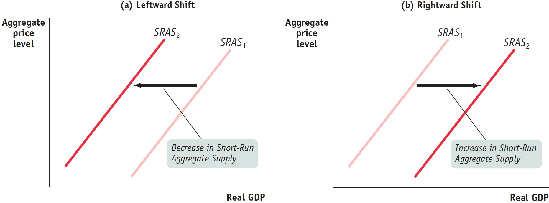
Figure 18.2: Shifts of the Short-Run Aggregate Supply CurvePanel (a) shows a decrease in short-run aggregate supply: the short-run aggregate supply curve shifts leftward from SRAS1 to SRAS2, and the quantity of aggregate output supplied at any given aggregate price level falls. Panel (b) shows an increase in short-run aggregate supply: the short-run aggregate supply curve shifts rightward from SRAS1 to SRAS2, and the quantity of aggregate output supplied at any given aggregate price level rises.
AP® Exam Tip
Remember, left is less and right is more. Shifting SRAS can be confusing because it appears as if left would be more because the line is higher on the graph. Look at the horizontal axis to see the resulting change in quantity to help you get this right.
To understand why the short-run aggregate supply curve can shift, it’s important to recall that producers make output decisions based on their profit per unit of output. The short-run aggregate supply curve illustrates the relationship between the aggregate price level and aggregate output: because some production costs are fixed in the short run, a change in the aggregate price level leads to a change in producers’ profit per unit of output and, in turn, leads to a change in aggregate output. But other factors besides the aggregate price level can affect profit per unit and, in turn, aggregate output. It is changes in these other factors that will shift the short-run aggregate supply curve.
To develop some intuition, suppose something happens that raises production costs—say, an increase in the price of oil. At any given price of output, a producer now earns a smaller profit per unit of output. As a result, producers reduce the quantity supplied at any given aggregate price level, and the short-run aggregate supply curve shifts to the left. If, by contrast, something happens that lowers production costs—say, a fall in the nominal wage—a producer now earns a higher profit per unit of output at any given price of output. This leads producers to increase the quantity of aggregate output supplied at any given aggregate price level, and the short-run aggregate supply curve shifts to the right.
Now we’ll look more closely at the link between important factors that affect producers’ profit per unit and shifts in the short-run aggregate supply curve.
Changes in Commodity Prices A surge in the price of oil caused problems for the U.S. economy in the 1970s and in early 2008. Oil is a commodity, a standardized input bought and sold in bulk quantities. An increase in the price of a commodity—in this case, oil—raised production costs across the economy and reduced the quantity of aggregate output supplied at any given aggregate price level, shifting the short-run aggregate supply curve to the left. Conversely, a decline in commodity prices reduces production costs, leading to an increase in the quantity supplied at any given aggregate price level and a rightward shift of the short-run aggregate supply curve.

Signs of the times: high oil prices caused high gasoline prices in 2008.
Keri Oberly/Getty Images
Why isn’t the influence of commodity prices already captured by the short-run aggregate supply curve? Because commodities—unlike, say, soft drinks—are not a final good, their prices are not included in the calculation of the aggregate price level. Furthermore, commodities represent a significant cost of production to most suppliers, just like nominal wages do. So changes in commodity prices have large impacts on production costs. And in contrast to noncommodities, the prices of commodities can sometimes change drastically due to industry-specific shocks to supply—such as wars in the Middle East or rising Chinese demand that leaves less oil for the United States.
AP® Exam Tip
Think of a PEAR to remember the factors that shift SRAS:
Expectations about inflation
Actions by the government (business taxes and subsidies)
Resource (input) prices like wages and commodities
Changes in Nominal Wages At any given point in time, the dollar wages of many workers are fixed because they are set by contracts or informal agreements made in the past. Nominal wages can change, however, once enough time has passed for contracts and informal agreements to be renegotiated. Suppose, for example, that there is an economy-wide rise in the cost of health care insurance premiums paid by employers as part of employees’ wages. From the employers’ perspective, this is equivalent to a rise in nominal wages because it is an increase in employer-paid compensation. So this rise in nominal wages increases production costs and shifts the short-run aggregate supply curve to the left. Conversely, suppose there is an economy-wide fall in the cost of such premiums. This is equivalent to a fall in nominal wages from the point of view of employers; it reduces production costs and shifts the short-run aggregate supply curve to the right.
An important historical fact is that during the 1970s, the surge in the price of oil had the indirect effect of also raising nominal wages. This “knock-on” effect occurred because many wage contracts included cost-of-living allowances that automatically raised the nominal wage when consumer prices increased. Through this channel, the surge in the price of oil—which led to an increase in overall consumer prices—ultimately caused a rise in nominal wages. So the economy, in the end, experienced two leftward shifts of the aggregate supply curve: the first generated by the initial surge in the price of oil and the second generated by the induced increase in nominal wages. The negative effect on the economy of rising oil prices was greatly magnified through the cost-of-living allowances in wage contracts. Today, cost-of-living allowances in wage contracts are rare.

Almost every good purchased today has a UPC bar code on it, which allows stores to scan and track merchandise with great speed.
Shutterstock
Changes in Productivity An increase in productivity means that a worker can produce more units of output with the same quantity of inputs. For example, the introduction of bar-code scanners in retail stores greatly increased the ability of a single worker to stock, inventory, and resupply store shelves. As a result, the cost to a store of “producing” a dollar of sales fell and profit rose. And, correspondingly, the quantity supplied increased. (Think of Walmart and the increase in the number of its stores as an increase in aggregate supply.) So a rise in productivity, whatever the source, increases producers’ profits and shifts the short-run aggregate supply curve to the right. Conversely, a fall in productivity—say, due to new regulations that require workers to spend more time filling out forms—reduces the number of units of output a worker can produce with the same quantity of inputs. Consequently, the cost per unit of output rises, profit falls, and quantity supplied falls. This shifts the short-run aggregate supply curve to the left.
Changes in Expectations about Inflation If inflation is expected to be higher than previously thought, workers will seek higher nominal wages to keep pace with the higher prices. Suppose you saw prices rising more rapidly than in the recent past. You might expect a particularly high inflation rate over the coming year. To prevent the expected inflation from eroding your real wages, you and other workers would pressure employers to raise nominal wages. As we’ve discussed, nominal wages are temporarily inflexible due to wage contracts, but when contracts are renewed and nominal wages rise, the short-run aggregate supply curve shifts to the left. Likewise, if inflation is expected to be lower than previously thought, workers will accept lower nominal wages and the short-run aggregate supply curve will shift to the right.
For a summary of the factors that shift the short-run aggregate supply curve, see Table 18.1.
Table 18.1 Factors that Shift the Short-Run Aggregate Supply Curve
| When this happens, . . . |
. . . short-run aggregate supply increases: |
But when this happens, . . . |
. . . short-run aggregate supply decreases: |
| Changes in commodity prices: |
| When commodity prices fall, . . . |
. . . short-run aggregate supply increases.
|
When commodity prices rise, . . . |
. . . short-run aggregate supply decreases.
|
| Changes in nominal wages: |
| When nominal wages fall, . . . |
. . . short-run aggregate supply increases.
|
When nominal wages rise, . . . |
. . . short-run aggregate supply decreases.
|
| Changes in productivity: |
| When workers become more productive, . . . |
. . . short-run aggregate supply increases.
|
When workers become less productive, . . . |
. . . short-run aggregate supply decreases.
|
| Changes in expectations about inflation: |
| If inflation is expected to be lower, . . . |
. . . short-run aggregate supply increases.
|
If inflation is expected to be higher, . . . |
. . . short-run aggregate supply decreases.
|
Table 18.1: Table 18.1 Factors that Shift the Short-Run Aggregate Supply Curve
The Long-Run Aggregate Supply Curve
We’ve just seen that in the short run, a fall in the aggregate price level leads to a decline in the quantity of aggregate output supplied. This is the result of nominal wages that are sticky in the short run. But as we mentioned earlier, contracts and informal agreements are renegotiated in the long run. So in the long run, nominal wages—like the aggregate price level—are flexible, not sticky. Wage flexibility greatly alters the long-run relationship between the aggregate price level and aggregate supply. In fact, in the long run the aggregate price level has no effect on the quantity of aggregate output supplied.
To see why, let’s conduct a thought experiment. Imagine that you could wave a magic wand—or maybe a magic bar-code scanner—and cut all prices in the economy in half at the same time. By “all prices” we mean the prices of all inputs, including nominal wages, as well as the prices of final goods and services. What would happen to aggregate output, given that the aggregate price level has been halved and all input prices, including nominal wages, have been halved?
The answer is: nothing. Consider Equation 18-1 again: each producer would receive a lower price for its product, but costs would fall by the same proportion. As a result, every unit of output that was profitable to produce before the change in prices would still be profitable to produce after the change in prices. So a halving of all prices in the economy has no effect on the economy’s aggregate output. In other words, changes in the aggregate price level now have no effect on the quantity of aggregate output supplied.
In reality, of course, no one can change all prices by the same proportion at the same time. But now, we’ll consider the long run, the period of time over which all prices are fully flexible. In the long run, inflation or deflation has the same effect as someone changing all prices by the same proportion. As a result, changes in the aggregate price level do not change the quantity of aggregate output supplied in the long run. That’s because changes in the aggregate price level, in the long run, will be accompanied by equal proportional changes in all input prices, including nominal wages.
The long-run aggregate supply curve shows the relationship between the aggregate price level and the quantity of aggregate output supplied that would exist if all prices, including nominal wages, were fully flexible.
The long-run aggregate supply curve, illustrated in Figure 18.3 by the curve LRAS, shows the relationship between the aggregate price level and the quantity of aggregate output supplied that would exist if all prices, including nominal wages, were fully flexible. The long-run aggregate supply curve is vertical because changes in the aggregate price level have no effect on aggregate output in the long run. At an aggregate price level of 15.0, the quantity of aggregate output supplied is $800 billion in 2005 dollars. If the aggregate price level falls by 50% to 7.5, the quantity of aggregate output supplied is unchanged in the long run at $800 billion in 2005 dollars.
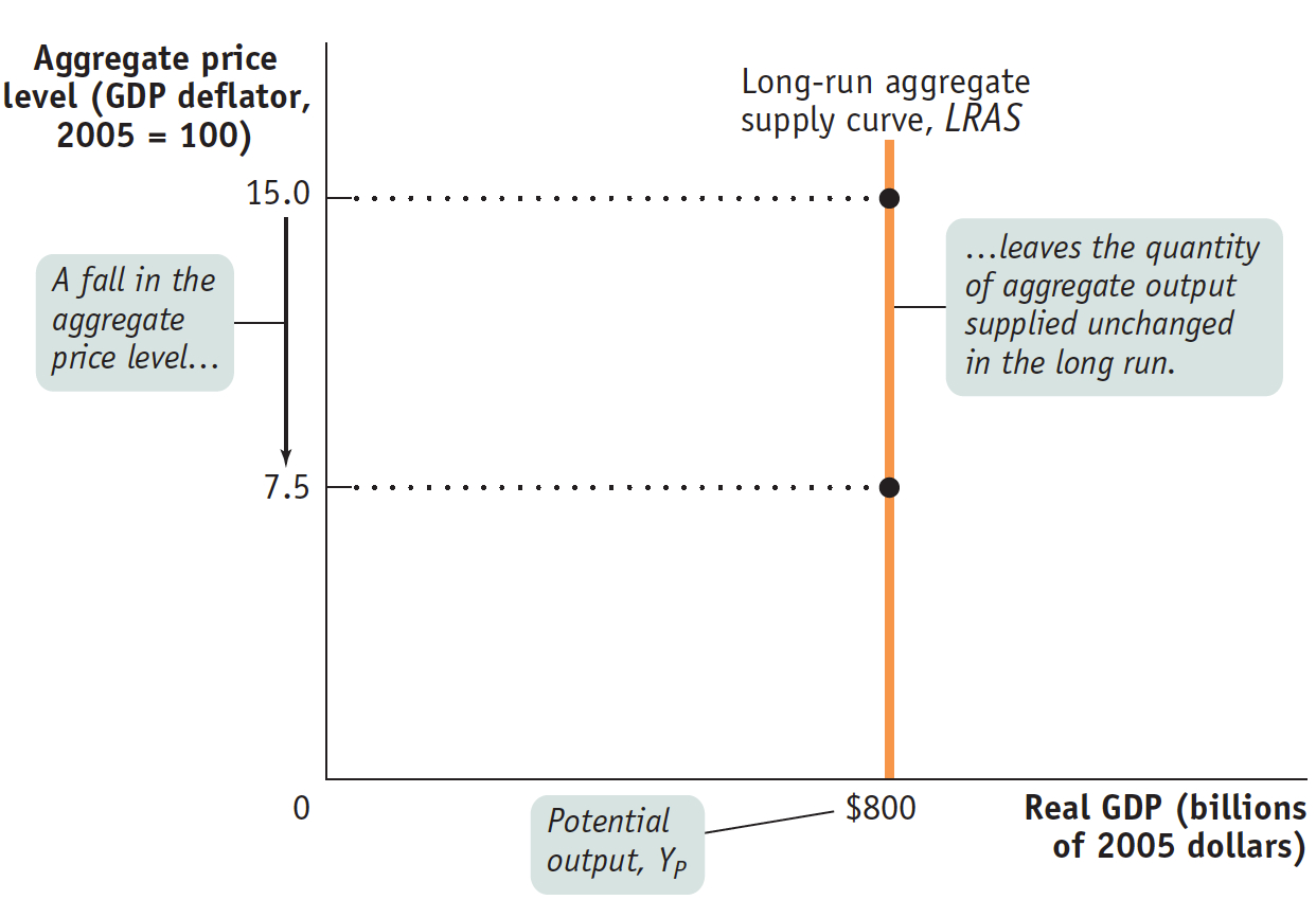
Figure 18.3: The Long -Run Aggregate Supply CurveThe long-run aggregate supply curve shows the quantity of aggregate output supplied when all prices, including nominal wages, are flexible. It is vertical at potential output, YP, because in the long run a change in the aggregate price level has no effect on the quantity of aggregate output supplied.
Potential output is the level of real GDP the economy would produce if all prices, including nominal wages, were fully flexible.
It’s important to understand not only that the LRAS curve is vertical but also that its position along the horizontal axis marks an important benchmark for output. The horizontal intercept in Figure 18.3, where LRAS touches the horizontal axis ($800 billion in 2005 dollars), is the economy’s potential output, YP: the level of real GDP the economy would produce if all prices, including nominal wages, were fully flexible.
In reality, the actual level of real GDP is almost always either above or below potential output. We’ll see why later, when we discuss the AD–AS model. Still, an economy’s potential output is an important number because it defines the trend around which actual aggregate output fluctuates from year to year.
In the United States, the Congressional Budget Office (CBO) estimates annual potential output for the purpose of federal budget analysis. In Figure 18.4, the CBO’s estimates of U.S. potential output from 1989 to 2013 are represented by the orange line and the actual values of U.S. real GDP over the same period are represented by the blue line. Years shaded purple on the horizontal axis correspond to periods in which actual aggregate output fell short of potential output, while years shaded green correspond to periods in which actual aggregate output exceeded potential output.
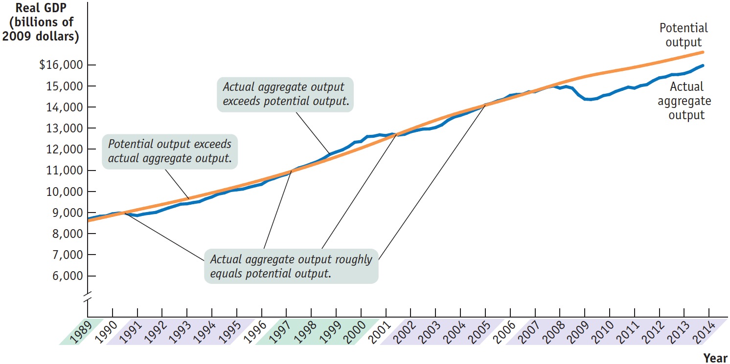
Figure 18.4: Actual and Potential Output from 1989 to 2013This figure shows the performance of actual and potential output in the United States from 1989 to 2013. The orange line shows estimates, produced by the Congressional Budget Office, of U.S. potential output, and the blue line shows actual aggregate output. The purple-shaded years are periods in which actual aggregate output fell below potential output, while the green-shaded years are periods in which actual aggregate output exceeded potential output. As shown, significant shortfalls occurred in the recessions of the early 1990s and after 2000—particularly during the recession that began in 2007. Actual aggregate output was significantly above potential output in the boom of the late 1990s.
Source: Congressional Budget Office; Bureau of Economic Analysis.
As you can see, U.S. potential output has risen steadily over time—implying a series of rightward shifts of the LRAS curve. What has caused these rightward shifts? The answer lies in the factors related to long-run growth:
increases in the quantity of resources, including land, labor, capital, and entrepreneurship
increases in the quality of resources, such as a better-educated workforce
-
Over the long run, as the size of the labor force and the productivity of labor both rise, for example, the level of real GDP that the economy is capable of producing also rises. Indeed, one way to think about economic growth is that it is the growth in the economy’s potential output. We generally think of the long-run aggregate supply curve as shifting to the right over time as an economy experiences long-run growth.
From the Short Run to the Long Run
As you can see in Figure 18.4, the economy normally produces more or less than potential output: actual aggregate output was below potential output in the early 1990s, above potential output in the late 1990s, and below potential output for most of the 2000s. So the economy is normally operating at a point on its short-run aggregate supply curve—but not at a point on its long-run aggregate supply curve. Why, then, is the long-run curve relevant? Does the economy ever move from the short run to the long run? And if so, how?
The first step to answering these questions is to understand that the economy is always in one of only two states with respect to the short-run and long-run aggregate supply curves. It can be on both curves simultaneously by being at a point where the curves cross (as in the few years in Figure 18.4 in which actual aggregate output and potential output roughly coincided). Or it can be on the short-run aggregate supply curve but not the long-run aggregate supply curve (as in the years in which actual aggregate output and potential output did not coincide). But that is not the end of the story. If the economy is on the short-run but not the long-run aggregate supply curve, the short-run aggregate supply curve will shift over time until the economy is at a point where both curves cross—a point where actual aggregate output is equal to potential output.
Figure 18.5 illustrates how this process works. In both panels LRAS is the long-run aggregate supply curve, SRAS1 is the initial short-run aggregate supply curve, and the aggregate price level is at P1. In panel (a) the economy starts at the initial production point, A1, which corresponds to a quantity of aggregate output supplied, Y1, that is higher than potential output, YP. Producing an aggregate output level (such as Y1) that is higher than potential output (YP) is possible only because nominal wages have not yet fully adjusted upward. Until this upward adjustment in nominal wages occurs, producers are earning high profits and producing a high level of output. But a level of aggregate output higher than potential output means a low level of unemployment. Because jobs are abundant and workers are scarce, nominal wages will rise over time, gradually shifting the short-run aggregate supply curve leftward. Eventually, it will be in a new position, such as SRAS2. (Later, we’ll show where the short-run aggregate supply curve ends up. As we’ll see, that depends on the aggregate demand curve as well.)
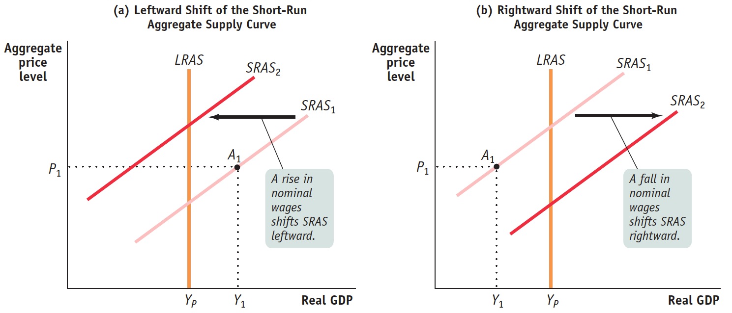
Figure 18.5: From the Short Run to the Long RunIn panel (a), the initial short-run aggregate supply curve is SRAS1. At the aggregate price level, P1, the quantity of aggregate output supplied, Y1, exceeds potential output, YP. Eventually, low unemployment will cause nominal wages to rise, leading to a leftward shift of the short-run aggregate supply curve from SRAS1 to SRAS2. In panel (b), the reverse happens: at the aggregate price level, P1, the quantity of aggregate output supplied is less than potential output. High unemployment eventually leads to a fall in nominal wages over time and a rightward shift of the short-run aggregate supply curve.
In panel (b), the initial production point, A1, corresponds to an aggregate output level, Y1, that is lower than potential output, YP. Producing an aggregate output level (such as Y1) that is lower than potential output (YP) is possible only because nominal wages have not yet fully adjusted downward. Until this downward adjustment occurs, producers are earning low (or negative) profits and producing a low level of output. An aggregate output level lower than potential output means high unemployment. Because workers are abundant and jobs are scarce, nominal wages will fall over time, shifting the short-run aggregate supply curve gradually to the right. Eventually, it will be in a new position, such as SRAS2.
We’ll see shortly that these shifts of the short-run aggregate supply curve will return the economy to potential output in the long run.
Prices and Output During the Great Depression
The figure shows the actual track of the aggregate price level, as measured by the GDP deflator, and real GDP, from 1929 to 1942. As you can see, aggregate output and the aggregate price level fell together from 1929 to 1933 and rose together from 1933 to 1937. This is what we’d expect to see if the economy were moving down the short-run aggregate supply curve from 1929 to 1933 and moving up it (with a brief reversal in 1937–1938) thereafter.
But even in 1942 the aggregate price level was still lower than it was in 1929; yet real GDP was much higher. What happened?
The answer is that the short-run aggregate supply curve shifted to the right over time. This shift partly reflected rising productivity—a rightward shift of the underlying long-run aggregate supply curve. But since the U.S. economy was producing below potential output and had high unemployment during this period, the rightward shift of the short-run aggregate supply curve also reflected the adjustment process shown in panel (b) of Figure 18.5. So the movement of aggregate output from 1929 to 1942 reflected both movements along and shifts of the short-run aggregate supply curve.