Producer Surplus and the Supply Curve
Just as some buyers of a good would have been willing to pay more for their purchase than the price they actually pay, some sellers of a good would have been willing to sell it for less than the price they actually receive. We can therefore carry out an analysis of producer surplus and the supply curve that is almost exactly parallel to that of consumer surplus and the demand curve.
Cost and Producer Surplus
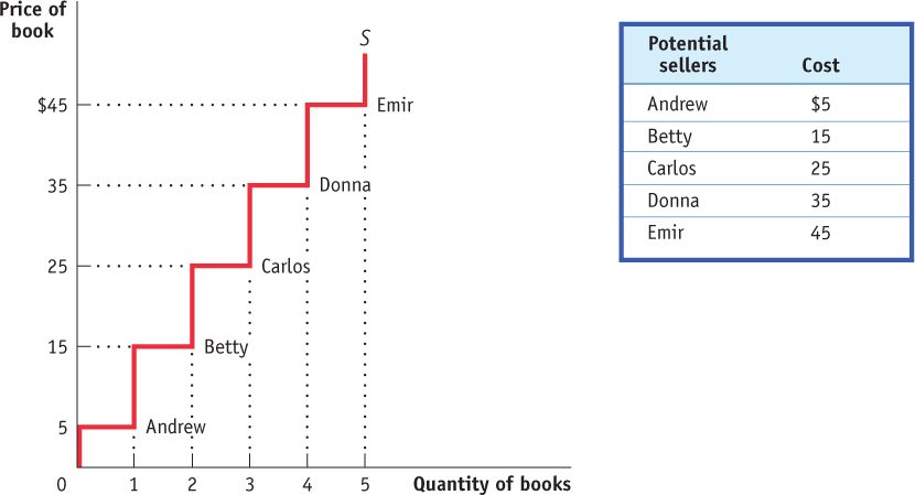
Consider a group of students who are potential sellers of used textbooks. Because they have different preferences, the various potential sellers differ in regard to the lowest price they would accept for their books. The table in Figure 49.6 shows the prices at which several different students would be willing to sell. Andrew is willing to sell the book as long as he can get at least $5; Betty won’t sell unless she can get at least $15; Carlos requires $25; Donna requires $35; Emir $45.
493
A seller’s cost is the lowest price at which he or she is willing to sell a good.
The lowest price at which a potential seller is willing to sell is called the seller’s cost. So Andrew’s cost is $5, Betty’s is $15, and so on.
Using the term cost, which people normally associate with the monetary cost of producing a good, may sound a little strange when applied to sellers of used textbooks. The students don’t have to manufacture the books, so it doesn’t cost the student who sells a book anything to make that book available for sale, does it?
Yes, it does. A student who sells a book won’t have it later, as part of his or her personal collection. So there is an opportunity cost to selling a textbook, even if the owner has completed the course for which it was required. And remember that one of the basic principles of economics is that the true measure of the cost of doing something is always its opportunity cost. That is, the real cost of something is what you must give up to get it.
So it is good economics to talk of the minimum price at which someone will sell a good as the “cost” of selling that good, even if he or she doesn’t spend any money to make the good available for sale. Of course, in most real-
Individual producer surplus is the net gain to an individual seller from selling a good. It is equal to the difference between the price received and the seller’s cost.
Getting back to the example, suppose that Andrew sells his book for $30. Clearly he has gained from the transaction: he would have been willing to sell for only $5, so he has gained $25. This net gain, the difference between the price he actually gets and his cost—
Just as we derived the demand curve from the willingness to pay of different consumers, we can derive the supply curve from the cost of different producers. The step-
Total producer surplus in a market is the sum of the individual producer surpluses of all the sellers of a good in a market. Economists use the term producer surplus to refer both to individual and to total producer surplus.
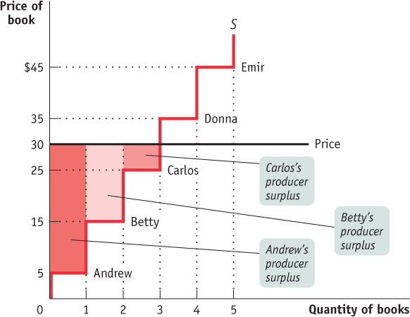
As in the case of consumer surplus, we can add the individual producer surpluses of sellers to calculate the total producer surplus, the total net gain to all sellers in the market. Economists use the term producer surplus to refer to either total or individual producer surplus. Table 49.2 shows the net gain to each of the students who would sell a used book at a price of $30: $25 for Andrew, $15 for Betty, and $5 for Carlos. The total producer surplus is $25 + $15 + $5 = $45.
Table 49.2Producer Surplus When the Price of a Used Textbook Is $30
| Potential seller | Cost | Price received | Individual producer surplus = Price received – Cost |
| Andrew | $5 | $30 | $25 |
| Betty | 15 | 30 | 15 |
| Carlos | 25 | 30 | 5 |
| Donna | 35 | – | – |
| Emir | 45 | – | – |
| All sellers | Total producer surplus = $45 |
As with consumer surplus, the producer surplus gained by those who sell books can be represented graphically. Figure 49.7 reproduces the supply curve from Figure 49.6. Each step in that supply curve has a width that represents one book from one seller. The height of Andrew’s step is $5, his cost. This forms the bottom of a rectangle, with $30, the price he actually receives for his book, forming the top. The area of this rectangle, ($30 – $5) × 1 = $25, is his producer surplus. So the producer surplus Andrew gains from selling his book is the area of the dark red rectangle shown in the figure.
494
Let’s assume that the campus bookstore is willing to buy all the used copies of this book that students are willing to sell at a price of $30. Then, in addition to Andrew, Betty and Carlos will also sell their books. They will also benefit from their sales, though not as much as Andrew, because they have higher costs. Andrew, as we have seen, gains $25. Betty gains a smaller amount: since her cost is $15, she gains only $15. Carlos gains even less, only $5.
Again, as with consumer surplus, we have a general rule for determining the total producer surplus from sales of a good: The total producer surplus from sales of a good at a given price is the area above the supply curve but below that price.
This rule applies both to examples like the one shown in Figure 49.7, where there are a small number of producers and a step-
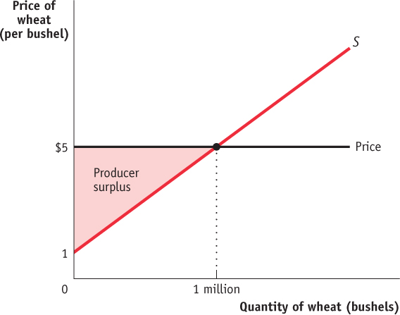
Consider, for example, the supply of wheat. Figure 49.8 shows how producer surplus depends on the price per bushel. Suppose that, as shown in the figure, the price is $5 per bushel and farmers supply 1 million bushels. What is the benefit to the farmers from selling their wheat at a price of $5? Their producer surplus is equal to the shaded area above the supply curve but below the price of $5 per bushel: ½ × 1 million × $4 = $2 million.
How Changing Prices Affect Producer Surplus
As in the case of consumer surplus, a change in price alters producer surplus. However, although a fall in price increases consumer surplus, it reduces producer surplus. Similarly, a rise in price reduces consumer surplus but increases producer surplus.
AP® Exam Tip
The area on a graph that represents producer surplus is bounded by the supply curve, the price line, and the vertical axis.
To see this, let’s first consider a rise in the price of the good. Producers of the good will experience an increase in producer surplus, though not all producers gain the same amount. Some producers would have produced the good even at the original price; they will gain the entire price increase on every unit they produce. Other producers will enter the market because of the higher price; they will gain only the difference between the new price and their cost.
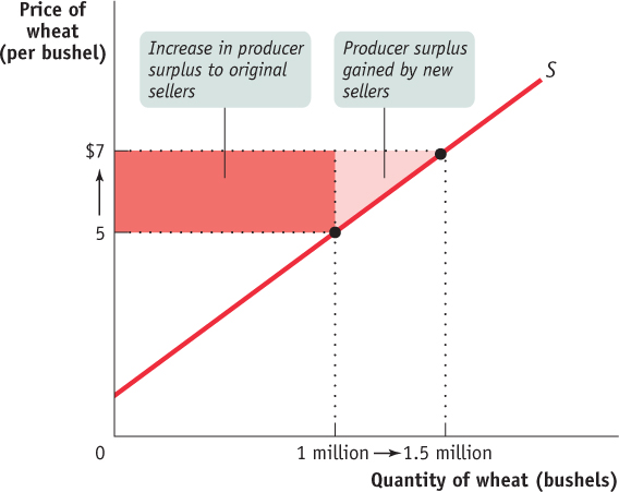
Figure 49.9 is the supply counterpart of Figure 49.5. It shows the effect on producer surplus of a rise in the price of wheat from $5 to $7 per bushel. The increase in producer surplus is the sum of the shaded areas, which consists of two parts. First, there is a dark red rectangle corresponding to the gains to those farmers who would have supplied wheat even at the original $5 price. The area of the dark red triangle is 1 million × $2 = $2 million. Second, there is an additional light red triangle that corresponds to the gains to those farmers who would not have supplied wheat at the original price but are drawn into the market by the higher price. The area of the light red triangle is ½ × 0.5 million × $2 = $500,000. So the total gain in producer surplus is $2 million + $500,000 = $2.5 million.
495
496
If the price were to fall from $7 to $5 per bushel, the story would run in reverse. The sum of the shaded areas would now be the decline in producer surplus, the decrease in the area above the supply curve but below the price. The loss would consist of two parts, the loss to farmers who would still grow wheat at a price of $5 (the dark red rectangle) and the loss to farmers who decide to no longer grow wheat because of the lower price (the light red triangle).