The Long-Run Industry Supply Curve
Suppose that in addition to the 100 farms currently in the organic tomato business, there are many other potential organic tomato farms. Suppose also that each of these potential farms would have the same cost curves as existing farms, like the one owned by Jennifer and Jason, upon entering the industry.
When will additional farms enter the industry? Whenever existing farms are making a profit—that is, whenever the market price is above the break-even price of $14 per bushel, the minimum average total cost of production. For example, at a price of $18 per bushel, new farms will enter the industry.
What will happen as additional farms enter the industry? Clearly, the quantity supplied at any given price will increase. The short-run industry supply curve will shift to the right. This will alter the market equilibrium in turn and result in a lower market price. Existing farms will respond to the lower market price by reducing their output, but the total industry output will increase because of the larger number of farms in the industry.
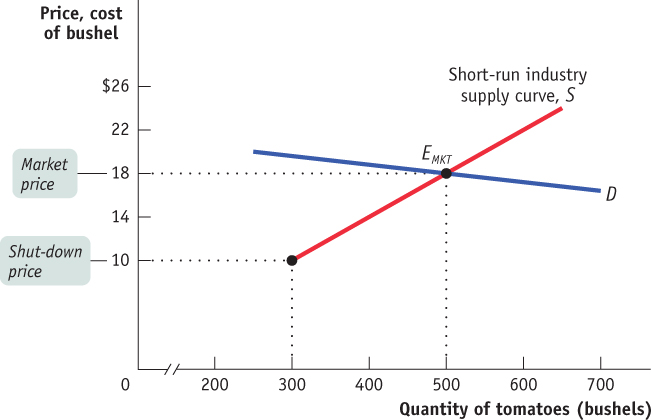
Figure 60.2 illustrates the effects of this chain of events on an existing farm and on the market; panel (a) shows how the market responds to entry, and panel (b) shows how an individual existing farm responds to entry. (Note that these two graphs have been rescaled in comparison to Figures 59.2 and 60.1 to better illustrate how profit changes in response to price.) In panel (a), S1 is the initial short-run industry supply curve, based on the existence of 100 producers. The initial short-run market equilibrium is at EMKT, with an equilibrium market price of $18 and a quantity of 500 bushels. At this price existing farms are profitable, which is reflected in panel (b): an existing farm makes a total profit represented by the green shaded rectangle labeled A when the market price is $18.
This profit will induce new producers to enter the industry, shifting the short-run industry supply curve to the right. For example, the short-run industry supply curve when the number of farms has increased to 167 is S2. Corresponding to this supply curve is a new short-run market equilibrium labeled DMKT, with a market price of $16 and a quantity of 750 bushels. At $16, each farm produces 4.5 bushels, so that industry output is 167 × 4.5 = 750 bushels (rounded). From panel (b) you can see the effect of the entry of 67 new farms on an existing farm: the fall in price causes it to reduce its output, and its profit falls to the area represented by the striped rectangle labeled B.
Although diminished, the profit of existing farms at DMKT means that entry will continue and the number of farms will continue to rise. If the number of farms rises to 250, the short-run industry supply curve shifts out again to S3, and the market equilibrium is at CMKT, with a quantity supplied and demanded of 1,000 bushels and a market price of $14 per bushel.
AP® Exam Tip
Draw dotted lines taking the equilibrium price from the market graph over to the firm graph to show your understanding that the firm is a price-taker.
A market is in long-run market equilibrium when the quantity supplied equals the quantity demanded, given that sufficient time has elapsed for entry into and exit from the industry to occur.
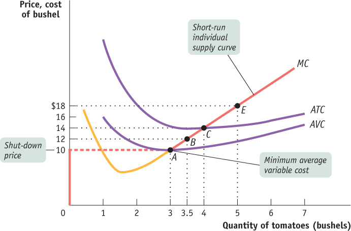
Like EMKT and DMKT, CMKT is a short-run equilibrium. But it is also something more. Because the price of $14 is each farm’s break-even price, an existing producer makes zero economic profit—neither a profit nor a loss, earning only the opportunity cost of the resources used in production—when producing its profit-maximizing output of 4 bushels. At this price there is no incentive either for potential producers to enter or for existing producers to exit the industry. So CMKT corresponds to a long-run market equilibrium—a situation in which the quantity supplied equals the quantity demanded, given that sufficient time has elapsed for producers to either enter or exit the industry. In a long-run market equilibrium, all existing and potential producers have fully adjusted to their optimal long-run choices; as a result, no producer has an incentive to either enter or exit the industry.
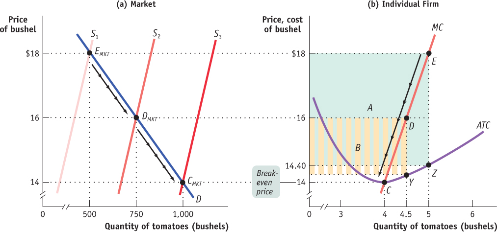
Figure 60.3: The Long-Run Market EquilibriumPoint EMKT of panel (a) shows the initial short-run market equilibrium. Each of the 100 existing producers makes an economic profit, illustrated in panel (b) by the green rectangle labeled A, the profit of an existing firm. Profit induces entry by additional producers, shifting the short-run industry supply curve outward from S1 to S2 in panel (a), resulting in a new short-run equilibrium at point DMKT, at a lower market price of $16 and higher industry output. Existing firms reduce output and profit falls to the area given by the striped rectangle labeled B in panel (b). Entry continues to shift out the short-run industry supply curve, as price falls and industry output increases yet again. Entry ceases at point CMKT on supply curve S3 in panel (a). Here market price is equal to the break-even price; existing producers make zero economic profit and there is no incentive for entry or exit. Therefore CMKT is also a long-run market equilibrium.
To explore further the difference between short-run and long-run equilibrium, consider the effect of an increase in demand on an industry with free entry that is initially in long-run equilibrium. Panel (b) in Figure 60.3 shows the market adjustment; panels (a) and (c) show how an existing individual firm behaves during the process.
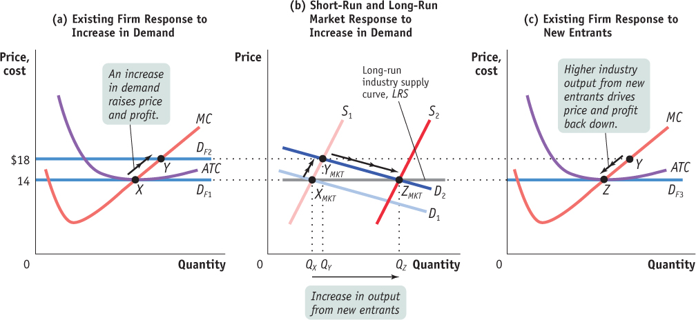
Figure 60.4: The Effect of an Increase in Demand in the Short Run and the Long Run for a Constant-Cost IndustryPanel (b) shows how an industry adjusts in the short and long run to an increase in demand; panels (a) and (c) show the corresponding adjustments by an existing firm. Initially the market is at point XMKT in panel (b), a short-run and long-run equilibrium at a price of $14 and industry output of QX. An existing firm makes zero economic profit, operating at point X in panel (a) at minimum average total cost. Demand increases as D1 shifts rightward to D2, in panel (b), raising the market price to $18. Existing firms increase their output, and industry output moves along the short-run industry supply curve S1 to a short-run equilibrium at YMKT. Correspondingly, the existing firm in panel (a) moves from point X to point Y as its demand rises from DF1 to DF2. But at a price of $18 existing firms are profitable. As shown in panel (b), in the long run new entrants arrive and the short-run industry supply curve shifts rightward, from S1 to S2. There is a new equilibrium at point ZMKT, at a lower price of $14 and higher industry output of QZ. An existing firm responds to the decrease in its demand to DF3 by moving from Y to Z in panel (c), returning to its initial output level and zero economic profit. Production by new entrants accounts for the total increase in industry output, QZ − QX. Like XMKT, ZMKT is also a short-run and long-run equilibrium: with existing firms earning zero economic profit, there is no incentive for any firms to enter or exit the industry. The horizontal line passing through XMKT and ZMKT, LRS, is the long-run industry supply curve: at the break-even price of $14, producers will produce any amount that consumers demand in the long run.
In panel (b) of Figure 60.3, D1 is the initial demand curve and S1 is the initial short-run industry supply curve. Their intersection at point XMKT is both a short-run and a long-run market equilibrium because the equilibrium price of $14 leads to zero economic profit—and therefore neither entry nor exit. It corresponds to point X in panel (a), where an individual existing firm is operating at the minimum of its average total cost curve.
Now suppose that the demand curve shifts out for some reason to D2. As shown in panel (b), in the short run, industry output moves along the short-run industry supply curve, S1, to the new short-run market equilibrium at YMKT, the intersection of S1 and D2. The market price rises to $18 per bushel, and industry output increases from QX to QY. This corresponds to an existing firm’s movement from X to Y in panel (a) as the firm increases its output in response to the rise in its demand curve (which also represents price and marginal revenue) from DF1 to DF2.
But we know that YMKT is not a long-run equilibrium because $18 is higher than minimum average total cost, so existing firms are making economic profit. This will lead additional firms to enter the industry. Over time entry will cause the short-run industry supply curve to shift to the right. In the long run, the short-run industry supply curve will have shifted out to S2, and the equilibrium will be at ZMKT—with the price falling back to $14 per bushel and industry output increasing yet again, from QY to QZ. Like XMKT before the increase in demand, ZMKT is both a short-run and a long-run market equilibrium.
AP® Exam Tip
Approach changes that have long-run repercussions one small step at a time. First show the initial change on your graph. Then analyze the short-run effects of that change. Finally, focus on the adjustments that lead to long-run equilibrium.
The effect of entry on an existing firm is illustrated in panel (c), in the movement from Y to Z along the firm’s individual supply curve. The firm reduces its output in response to the fall in the market price, which lowers the firm’s demand curve from DF2 to DF3. The firm ultimately arrives back at its original output quantity, corresponding to the minimum of its average total cost curve. In fact, every firm that is now in the industry—the initial set of firms and the new entrants—will operate at the minimum of its average total cost curve, at point Z. This means that the entire increase in industry output, from QX to QZ, comes from production by new entrants.
The long-run industry supply curve shows how the quantity supplied responds to the price once producers have had time to enter or exit the industry.
A constant-cost industry is one with a horizontal (perfectly elastic) long-run supply curve.
The line LRS that passes through XMKT and ZMKT in panel (b) is the long-run industry supply curve. It shows how the quantity supplied by an industry responds to the price, given that firms have had time to enter or exit the industry.
In this particular case, the long-run industry supply curve is horizontal at $14. In other words, in this industry supply is perfectly elastic in the long run: given time to enter or exit, firms will supply any quantity that consumers demand at a price of $14. Perfectly elastic long-run supply is characteristic of a constant-cost industry. In a constant-cost industry, the firms’ cost curves are unaffected by changes in the size of the industry, either because there is a perfectly elastic supply of inputs, or because the industry’s input demand is too small relative to the overall input market to influence the input price. For example, the wooden pencil industry can expand without causing a significant increase in the price of wood.
An increasing-cost industry is one with an upward-sloping long-run supply curve.
In an increasing-cost industry, even the long-run industry supply curve slopes upward. The usual reason for this is that producers must use a significant amount of an input that is in limited supply (that is, their supply is at least somewhat inelastic). As the industry expands, the price of that input is driven up. Consequently, the cost structure for firms becomes higher than it was when the industry was smaller. An example is the cotton clothing industry, an expansion in which could drive up the price of cotton. Figure 60.4 illustrates the short-run and long-run effects of an increase in demand in an increasing-cost industry. In panel (b), D1 is the initial demand curve for cotton pants and S1 is the initial short-run industry supply curve. The market equilibrium at point XMKT corresponds to point X in panel (a), where an individual firm is operating at the minimum of its average total cost curve.
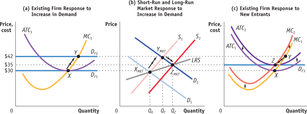
Figure 60.5: The Effect of an Increase in Demand in the Short Run and the Long Run in an Increasing-Cost IndustryIn an increasing-cost industry, an increase in demand leads to a higher price both in the short run and in the long run. Suppose demand increases from D1 to D2 as shown in panel (b). This raises the market price to $42. Existing firms increase their output, and industry output expands along the short-run industry supply curve, S1, to a short-run equilibrium at YMKT. The increase in output from QX to QY is the result of existing firms increasing their output as shown for a representative firm by the move from point X to point Y in panel (a). Because the new price is above the minimum of average total cost, economic profit attracts new entrants in the long run, shifting the short-run industry supply curve rightward and lowering the market price. Meanwhile, industry expansion drives up the cost of inputs and shifts the firms’ cost curves upward as shown in panel (c). This continues until the falling equilibrium price meets the rising minimum of average total cost. As shown in panel (b), that occurs at equilibrium point ZMKT with a price of $35 and an industry output of QZ. Assuming that the higher input prices raise the cost of making each unit by the same amount, the firms’ cost curves shift straight up. In the long run, an existing firm moves from Y to Z in panel (c), returning to its initial output level and earning zero economic profit. The upward-sloping line passing through XMKT and ZMKT, labeled LRS, is the long-run industry supply curve.
Now suppose that the demand curve shifts out to D2. As shown in panel (b), in the short run, industry output expands along the short-run industry supply curve, S1, to the new short-run market equilibrium at YMKT, the intersection of S1 and D2. The market price rises from $30 to $42 per pair, and industry output increases from QX to QY. This corresponds to an existing firm’s movement from X to Y in panel (a), as it increases its output in response to the increase in its demand curve from DF1 to DF2.
At the new market price, existing firms earn economic profit, so additional firms enter the industry. Entry shifts the short-run industry supply curve to the right and lowers the price of pants. At the same time, increasing demand for cotton drives up the cost of this input. The resulting rise in input costs shifts the marginal and average total cost curves upward for firms. This process continues until the falling market price and the rising minimum average total cost meet somewhere in between the initial price of $30 and the short-run price of $42. In Figure 60.4, that occurs at a price of $35, after the short-run supply curve has shifted out to S2 and the cost of making each pair of pants has risen by $5.

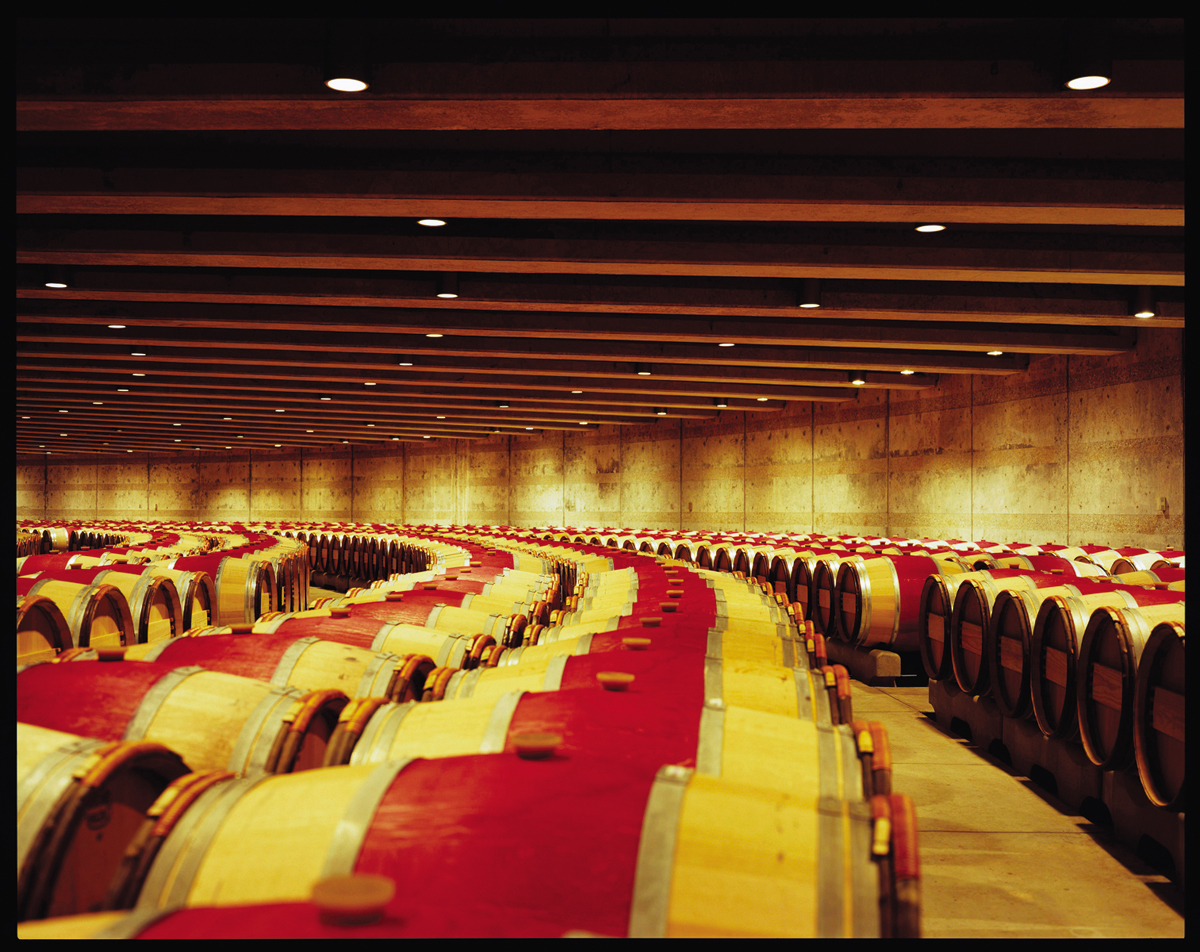
An expansion in the cotton clothing industry drives up the price of cotton.
Shutterstock
When the market reaches long-run equilibrium at ZMKT, each firm faces a demand curve of DF3 as shown in panel (c). Firms earn zero economic profit and there is no incentive for additional entry. Assuming that the cost increase is the same for each unit of output, each firm (that is not new) ends up making the same quantity of output as it did before the increase in demand. If the cost increase is not the same for each unit of output, the cost curves will not shift straight up as they did here, so the new profit-maximizing quantity of output could be more or less than before. The upward-sloping line LRS that passes through XMKT and ZMKT in panel (b) is the long-run industry supply curve for this increasing-cost industry.
A decrease in demand triggers the same process in reverse: the lower market price causes losses and the exit of firms, which lowers the cost of inputs and shifts the cost curves down until the falling minimum of average total cost meets the rising market price.
Finally, it is possible for the long-run industry supply curve to slope downward, a condition that occurs when the cost structure for firms becomes lower as the industry expands. This is the case in industries such as the electric car industry, in which increased output allows for economies of scale in the production of lithium batteries and other specialized inputs, and thus lower input prices.
A decreasing-cost industry is one with a downward-sloping long-run supply curve.
A downward-sloping industry supply curve indicates a decreasing-cost industry. Figure 60.5 illustrates the short-run and long-run effects of an increase in demand in a decreasing-cost industry. In panel (b), D1 is the initial demand curve for electric cars and S1 is the initial short-run industry supply curve. If the demand curve shifts out to D2, the new short-run market equilibrium is YMKT. The market price rises from $40,000 to $49,000 per electric car, and industry output increases from QX to QY. This corresponds to an existing firm’s movement from X to Y in panel (a), caused by the increase in its demand curve from DF1 to DF2.
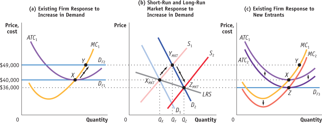
Figure 60.6: The Effect of an Increase in Demand in the Short Run and the Long Run in a Decreasing-Cost IndustryIn a decreasing-cost industry, an increase in demand leads to a higher price in the short run and a lower price in the long run. Suppose demand increases from D1 to D2 as shown in panel (b). This raises the market price from $40,000 to $49,000. Existing firms increase their output, and industry output expands along the short-run industry supply curve, S1, to a short-run equilibrium at YMKT. Economic profit attracts new entrants in the long run, shifting the short-run industry supply curve rightward and lowering the market price. Meanwhile, industry expansion lowers the cost of inputs and shifts the firms’ cost curves downward as shown in panel (c). This continues until the falling equilibrium price catches up to the falling minimum of average total cost. As shown in panel (b), that occurs at equilibrium point ZMKT with a price of $36,000 and an industry output of QZ. Assuming that the lower input cost decreases the cost of making each unit by the same amount, the firms’ cost curves shift straight down. In the long run, an existing firm moves from Y to Z in panel (c), returning to its initial output level and earning zero economic profit. The downward-sloping line passing through XMKT and ZMKT, labeled LRS, is the long-run industry supply curve.
At the new market price, economic profit attracts additional firms. Entry shifts the short-run industry supply curve to the right and lowers the price of electric cars. At the same time, increasing demand for lithium batteries allows for economies of scale in battery production, and lowers the cost of this input. The resulting decrease in input costs shifts the marginal and average total cost curves downward for firms. This process continues until the falling market price catches up to the falling minimum average total cost somewhere below the initial price of $40,000. In Figure 60.5, that occurs at a price of $36,000, after the short-run supply curve has shifted out to S2 in panel (b).
At the long-run equilibrium of ZMKT, each firm faces a demand curve of DF3 as shown in panel (c). Firms earn zero economic profit and there is no incentive for additional entry. Assuming that the cost decrease is the same for each car produced, each firm ends up making the same quantity of cars as it did before the increase in demand. The downward-sloping line LRS that passes through XMKT and ZMKT in panel (b) is the long-run industry supply curve for this decreasing-cost industry.
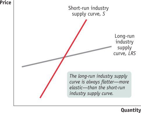
Figure 60.7: Comparing the Short-Run and Long-Run Industry Supply CurvesThe long-run industry supply curve may slope upward, but it is always flatter—more elastic—than the short-run industry supply curve. This is because of entry and exit: a higher price attracts new entrants in the long run, resulting in a rise in industry output and a fall in price; a lower price induces existing producers to exit in the long run, generating a fall in industry output and a rise in price.
Regardless of whether the long-run industry supply curve is horizontal, upward-sloping, or downward-sloping, the long-run price elasticity of supply is higher than the short-run price elasticity whenever there is free entry and exit. As shown in Figure 60.6, the long-run industry supply curve is always flatter than the short-run industry supply curve. The reason is entry and exit: a high price caused by an increase in demand attracts entry by new firms, resulting in a rise in industry output and an eventual fall in price; a low price caused by a decrease in demand induces existing firms to exit, leading to a fall in industry output and an eventual increase in price.
The distinction between the short-run industry supply curve and the long-run industry supply curve is very important in practice. We often see a sequence of events like those shown in Figures 60.3, 60.4, and 60.5: an increase in demand initially leads to a large price increase, but prices return to a more moderate level once new firms have entered the industry. Or we see the sequence in reverse: a fall in demand reduces prices considerably in the short run, but they return to a more moderate level as producers exit the industry.