12.2 Aggregate Supply
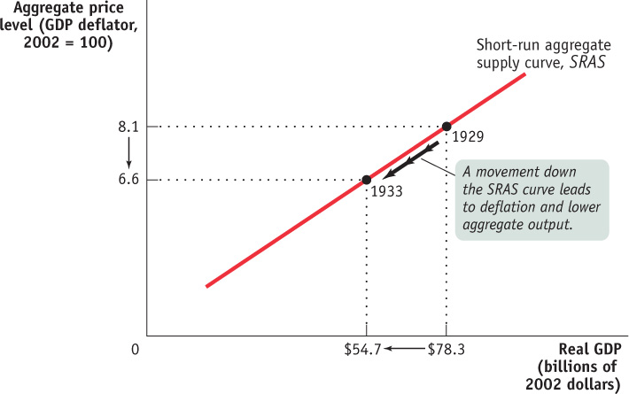
Between 1929 and 1933, there was a sharp fall in aggregate demand—
The aggregate supply curve shows the relationship between the aggregate price level and the quantity of aggregate output supplied in the economy.
The association between the plunge in real GDP and the plunge in prices wasn’t an accident. Between 1929 and 1933, the Canadian economy was moving down its aggregate supply curve, which shows the relationship between the economy’s aggregate price level (the overall price level of final goods and services in the economy) and the total quantity of final goods and services, or aggregate output, producers are willing to supply. (As you will recall, we use real GDP to measure aggregate output. So we’ll often use the two terms interchangeably.) More specifically, between 1929 and 1933, as a result of a leftward shift of aggregate demand, the economy moved down its (upward-
The Short-Run Aggregate Supply Curve
The period from 1929 to 1933 demonstrated that there is a positive relationship in the short run between the aggregate price level and the quantity of aggregate output supplied. That is, a rise in the aggregate price level is associated with a rise in the quantity of aggregate output supplied, other things equal; a fall in the aggregate price level is associated with a fall in the quantity of aggregate output supplied, other things equal. To understand why this positive relationship exists, consider the most basic question facing a producer: is producing a unit of output profitable or not? Let’s define profit per unit:
(12-2) Profit per unit of output = Price per unit of output − Production cost per unit of output
Thus, the answer to the question depends on whether the price the producer receives for a unit of output is greater or less than the cost of producing that unit of output. At any given point in time, many of the costs producers face are fixed per unit of output and can’t be changed for an extended period of time. Typically, the largest source of inflexible production cost is the wages paid to workers. Wages here refers to all forms of worker compensation, such as employer-
The nominal wage is the dollar amount of the wage paid.
Wages are typically an inflexible production cost because the dollar amount of any given wage paid, called the nominal wage, in the short run, is often determined by contracts that were signed some time ago. And even when there are no formal contracts, there are often informal agreements between management and workers, making companies reluctant to change wages in response to economic conditions. For example, companies usually will not reduce wages during poor economic times—
Sticky wages are nominal wages that are slow to fall even in the face of high unemployment and slow to rise even in the face of labour shortages.
As a result of both formal and informal agreements, then, the economy is characterized by sticky wages: nominal wages that are slow to fall even in the face of high unemployment and slow to rise even in the face of labour shortages. It’s important to note, however, that nominal wages cannot be sticky forever: ultimately, formal contracts and informal agreements will be renegotiated to take into account changed economic circumstances. As the Pitfalls at the end of this section explains, how long it takes for nominal wages to become flexible is an integral component of what distinguishes the short run from the long run.
To understand how the fact that many costs are fixed in nominal terms gives rise to an upward-
Let’s start with the behaviour of producers in perfectly competitive markets; remember, they take the price as given. Imagine that, for some reason, the aggregate price level falls, which means that the price received by the typical producer of a final good or service falls. Because many production costs are fixed in the short run, production cost per unit of output doesn’t fall by the same proportion as the fall in the price of output. So the profit per unit of output declines, inducing perfectly competitive producers to look for ways to alter their production plans so as to limit this decline. Since land, capital, and technology costs cannot be lowered, because they are fixed in the short run, the only way to reduce cost is to reduce the cost of labour. And if wages are fixed, this can be done only by reducing the (profit-
But layoffs also reduce the level of output, causing a lower short-
On the other hand, suppose that for some reason the aggregate price level rises. As a result, the typical producer receives a higher price for its final good or service. Again, many production costs are fixed in the short run, so production cost per unit of output doesn’t rise by the same proportion as the rise in the price of a unit. And since the typical perfectly competitive producer takes the price as given, profit per unit of output rises and producers respond by either hiring workers or increasing the number of hours worked by the existing workers (i.e., more overtime), thus raising the level of output supplied.
Now consider an imperfectly competitive producer that is able to set its own price. If there is a rise in the demand for this producer’s product, it will be able to sell more at any given price. Given stronger demand for its products, it will probably choose to increase its prices as well as its output, as a way of increasing profit per unit of output. In fact, industry analysts often talk about variations in an industry’s “pricing power”: when demand is strong, firms with pricing power are able to raise prices—
Conversely, if there is a fall in demand, firms will normally try to limit the fall in their sales by cutting prices.
The short-run aggregate supply curve shows the relationship between the aggregate price level and the quantity of aggregate output supplied that exists in the short run, the time period when many production costs can be taken as fixed.
Both the responses of firms in perfectly competitive industries and those of firms in imperfectly competitive industries lead to an upward-
Figure 12-5 shows a hypothetical short-
WHAT’S TRULY FLEXIBLE, WHAT’S TRULY STICKY
Most macroeconomists agree that the basic picture shown in Figure 12-5 is correct: there is, other things equal, a positive short-
So far we’ve stressed a difference in the behaviour of the aggregate price level and the behaviour of nominal wages. That is, we’ve said that the aggregate price level is more flexible than nominal wages, which are sticky in the short run. Although this assumption is a good way to explain why the short-
On one side, some nominal wages are in fact flexible even in the short run because some workers are not covered by a contract or informal agreement with their employers. Since some nominal wages are sticky but others are flexible, we observe that the average nominal wage—
On the other side, some prices of final goods and services are sticky rather than flexible. For example, some firms, particularly the makers of luxury or name-
These complications, as we’ve said, don’t change the basic picture. When the aggregate price level falls, some producers cut output because the nominal wages they pay are sticky. And some producers don’t cut their prices in the face of a falling aggregate price level, preferring instead to reduce their output. In both cases, the positive relationship between the aggregate price level and aggregate output is maintained. So, in the end, the short-
Shifts of the Short-Run Aggregate Supply Curve
Figure 12-5 shows a movement along the short-
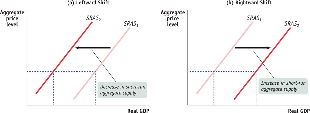
To understand why the short-
To develop some intuition, suppose that something happens that raises production costs—
Now we’ll discuss some of the important factors that affect producers’ profit per unit and so can lead to shifts of the short-
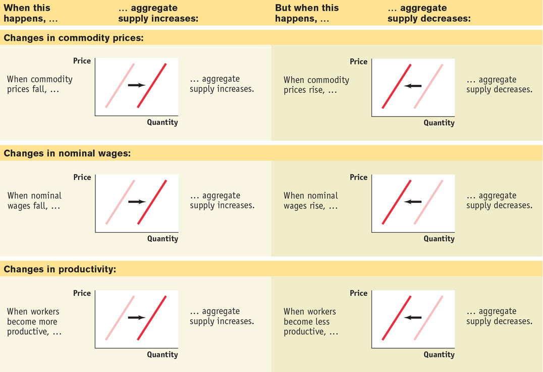
Changes in Commodity Prices In this chapter’s opening story, we described how a surge in the price of oil caused problems for the Canadian economy in the 1970s, early in 2008, and again in 2011. Oil is a commodity, a standardized input bought and sold in bulk quantities. An increase in the price of a commodity—
Why isn’t the influence of commodity prices already captured by the short-
Changes in Nominal Wages At any given point in time, the dollar wages of many workers are fixed because they are set by contracts or informal agreements made in the past. Nominal wages can change, however, once enough time has passed for contracts and informal agreements to be renegotiated. Suppose, for example, that there is an economy-
An important historical fact is that during the 1970s the surge in the price of oil had the indirect effect of also raising nominal wages. This “knock-
Changes in Productivity An increase in productivity means that a worker can produce more units of output with the same quantity of inputs. For example, the introduction of bar-
For a summary of the factors that shift the short-
The Long-Run Aggregate Supply Curve
We’ve just seen that in the short run a fall in the aggregate price level leads to a decline in the quantity of aggregate output supplied because nominal wages are sticky in the short run. But, as we mentioned earlier, contracts and informal agreements are renegotiated in the long run. So in the long run, nominal wages—
To see why, let’s conduct a thought experiment. Imagine that you could wave a magic wand—
The answer is: nothing. Consider Equation 12-2 again: each producer would receive a lower price for its product, but costs would fall by the same proportion. As a result, every unit of output profitable to produce before the change in prices would still be profitable to produce after the change in prices. So a halving of all prices in the economy has no effect on the economy’s aggregate real level of output. In other words, in the long-
In reality, of course, no one can change all prices by the same proportion at the same time. But now, we’ll consider the long run, the period of time over which all prices are perfectly, or fully, flexible. In the long run, inflation or deflation has the same effect as someone changing all prices by the same proportion. As a result, changes in the aggregate price level do not change the real quantity of aggregate output supplied in the long run. That’s because changes in the aggregate price level will, in the long run, be accompanied by equal proportional changes in all input prices, including nominal wages.
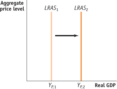
The long-run aggregate supply curve, illustrated in Figure 12-7 by the LRAS curve, shows the relationship between the aggregate price level and the quantity of aggregate output supplied that would exist if all prices, including nominal wages, were perfectly flexible. The long-
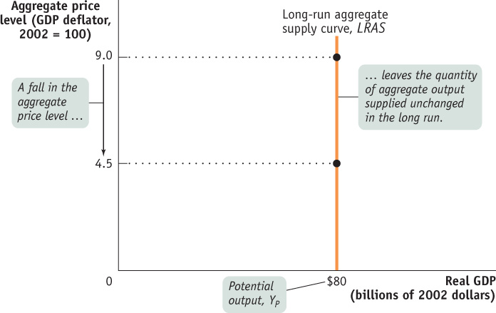
The long-run aggregate supply curve shows the relationship between the aggregate price level and the quantity of aggregate output supplied that would exist if all prices, including nominal wages, were fully flexible.
Potential output is the level of real GDP the economy would produce if all prices, including nominal wages, were perfectly, or fully, flexible.
It’s important to understand not only that the LRAS curve is vertical but also that its position along the horizontal axis represents a significant measure. The horizontal intercept in Figure 12-7, where LRAS touches the horizontal axis ($80 billion in 2002 dollars), is the economy’s potential output, YP: the level of real GDP the economy would produce if all prices, including nominal wages, were perfectly, or fully, flexible.1
In reality, the actual level of real GDP is almost always either above or below potential output. We’ll see why later in this chapter, when we discuss the AD-
In Canada, the office of the Parliamentary Budget Officer, or PBO, estimates annual potential output for the purpose of federal budget analysis.2 In Figure 12-8, the PBO’s estimates of Canadian potential output from 1980 to 2011 are represented by the orange line and the actual values of Canadian real GDP over the same period are represented by the blue line. Years shaded purple on the horizontal axis correspond to periods in which actual aggregate output fell short of potential output, while years shaded green correspond to periods in which actual aggregate output exceeded potential output.
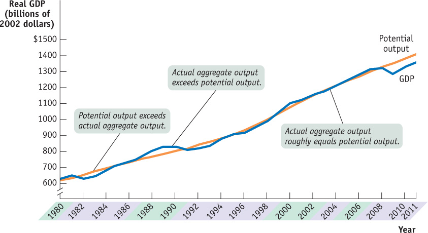
Sources: Parliamentary Budget Officer (PBO); Statistics Canada.
Output gap is the difference between real GDP and potential GDP, often given as a percentage of potential GDP.
The PBO is not the only entity to forecast Canada’s potential GDP: the Bank of Canada, the Federal Department of Finance, the OECD, the International Monetary Fund (IMF), and many private sector forecasters, such as the Royal Bank, do likewise. These forecasts are used for several purposes, including the measurement of the output gap. The output gap is the actual real (measured) GDP minus potential GDP, often calculated and presented as a percentage of potential GDP.
The output gap helps agents gauge the performance of the economy relative to the long-
In 2010, the PBO used its estimates of potential GDP and the associated output gap along with similar estimates calculated by the IMF to conclude that the severity of the 2008-2009 recession in Canada was in line with the experiences of other G-
As you can see, Canadian potential output has risen steadily over time—
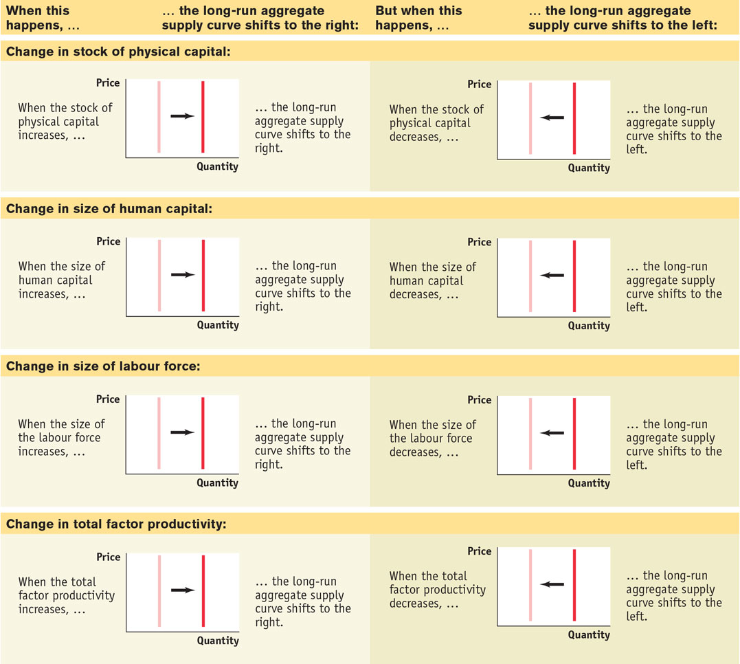
For a summary of the factors that shift the long-
From the Short Run to the Long Run
As you can see in Figure 12-8, the economy normally produces more or less than potential output: actual aggregate output was significantly below potential output in the recessions of the early 1980s and the early 1990s, significantly above potential output in the boom of the late 1980s and in 2000, and significantly below potential output after the recession of 2008-2009. So the economy is normally on its short-run aggregate supply curve—but not on its long-run aggregate supply curve. So why is the long-run curve relevant? Does the economy ever move from the short run to the long run? And if so, how?
The first step to answering these questions is to understand that the economy is always in one of only two states with respect to the short-run and long-run aggregate supply curves. It can be on both curves simultaneously by being at a point where the curves cross (as in the few years in Figure 12-8 in which actual aggregate output and potential output roughly coincided). Or it can be on the short-run aggregate supply curve but not the long-run aggregate supply curve (as in the years in which actual aggregate output and potential output did not coincide). But that is not the end of the story. If the economy is on the short-run but not the long-run aggregate supply curve, the short-run aggregate supply curve will shift over time until the economy is at a point where both curves cross—a point where actual aggregate output is equal to potential output.
Figure 12-10 illustrates how this process works. In both panels LRAS is the long-run aggregate supply curve, SRAS1 is the initial short-run aggregate supply curve, and the aggregate price level is at P1. In panel (a) the economy starts at the initial production point, A1, which corresponds to a quantity of aggregate output supplied, Y1, that is higher than potential output, YP. Producing an aggregate output level (such as Y1) that is higher than potential output (YP) is possible only because nominal wages haven’t yet fully adjusted upward. Until this upward adjustment in nominal wages occurs, producers are earning high profits and producing a high level of output. But a level of aggregate output higher than potential output means a low level of unemployment. Because jobs are abundant and workers are scarce, nominal wages will rise over time, gradually shifting the short-run aggregate supply curve leftward. Eventually it will be in a new position, such as SRAS2. (Later in this chapter, we’ll show where the short-run aggregate supply curve ends up. As we’ll see, that depends on the aggregate demand curve as well.)
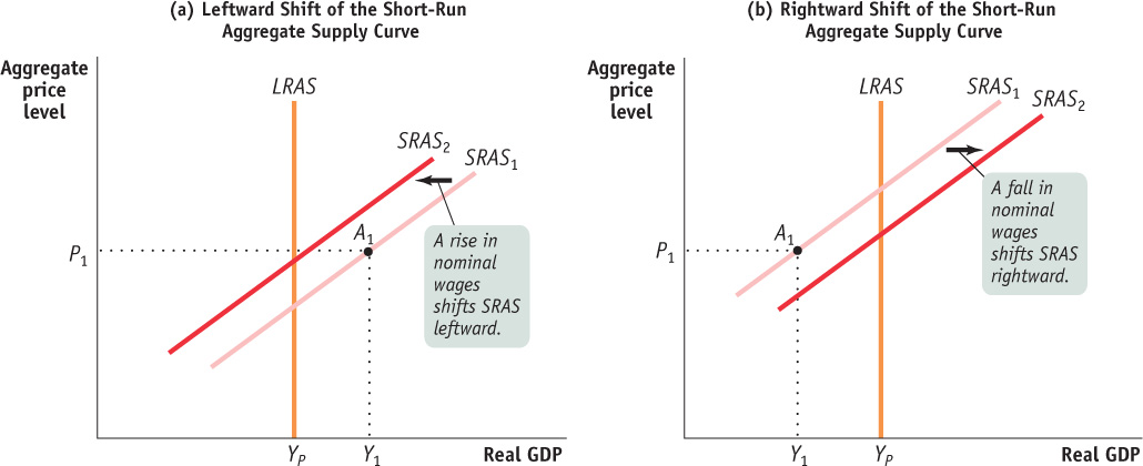
In panel (b), the initial production point, A1, corresponds to an aggregate output level, Y1, that is lower than potential output, YP. Producing an aggregate output level (such as Y1) that is lower than potential output (YP) is possible only because nominal wages haven’t yet fully adjusted downward. Until this downward adjustment occurs, producers are earning low (or negative) profits and producing a low level of output. An aggregate output level lower than potential output means high unemployment. Because workers are abundant and jobs are scarce, nominal wages will fall over time, shifting the short-run aggregate supply curve gradually to the right. Eventually it will be in a new position, such as SRAS2.
We’ll see shortly that these shifts of the short-run aggregate supply curve will return the economy to potential output in the long run.
ARE WE THERE YET? WHAT THE LONG RUN REALLY MEANS
We’ve used the term long run in two different contexts. In an earlier chapter we focused on long-run economic growth: growth that takes place over decades. In this chapter we introduced the long-run aggregate supply curve, which depicts the economy’s potential output: the level of aggregate output that the economy would produce if all prices, including nominal wages, were perfectly or fully flexible. It might seem that we’re using the same term, long run, for two different concepts. But we aren’t: these two concepts are really the same thing.
Because the economy always tends to return to potential output in the long run, actual aggregate output fluctuates around potential output, rarely getting too far from it. As a result, the economy’s rate of growth over long periods of time—say, decades—is very close to the rate of growth of potential output. And potential output growth is determined by the factors we analyzed in the chapter on long-run economic growth (i.e., inputs and technology). So that means that the “long run” of long-run growth and the “long run” of the long-run aggregate supply curve coincide.
PRICES AND OUTPUT DURING THE GREAT DEPRESSION AND WORLD WAR II
Figure 12-11 shows the actual track of the aggregate price level, as measured by the GDP deflator, and real GDP, from 1929 to 1945. As you can see, aggregate output and the aggregate price level fell together from 1929 to 1933 and generally rose together from 1933 to 1937. This is what we’d expect to see if the economy was moving down the short-run aggregate supply curve from 1929 to 1933 and moving up it (with a brief stall in the growth of real output in 1938) thereafter.
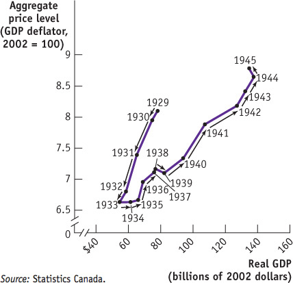
But even in 1941, with the Second World War raging, the aggregate price level was still lower than it was in 1929; yet real GDP was much higher. What happened? The answer is that the short-run aggregate supply curve shifted to the right over time. This shift partly reflected rising productivity—a rightward shift of the underlying long-run aggregate supply curve. But since the Canadian economy was producing below potential output and had high unemployment during this period, the rightward shift of the short-run aggregate supply curve also reflected the adjustment process shown in panel (b) of Figure 12-10. It was not until 1942 that the GDP deflator and the unemployment rate both returned to their 1929 levels. So the movement of aggregate output from 1929 to 1945 reflected both movements along and shifts of the short-run aggregate supply curve.

Quick Review
The aggregate supply curve illustrates the relationship between the aggregate price level and the quantity of aggregate output supplied.
The short-run aggregate supply curve is upward sloping: a higher aggregate price level leads to higher aggregate output given that nominal wages are sticky.
Changes in commodity prices, nominal wages, and productivity shift the short-run aggregate supply curve.
In the long run, all prices are flexible, and changes in the aggregate price level have no effect on aggregate output. The long-run aggregate supply curve is vertical at potential output.
Changes in the stock of physical capital, the stock of human capital, the size of the labour force, and productivity shift the long-run aggregate supply curve.
The output gap measures the difference between actual or measured level of real GDP and potential GDP (output gap = Y − YP). It is often presented as percentage of potential GDP. A larger gap implies more inflationary pressure, and a smaller gap implies less.
If actual aggregate output exceeds potential output, nominal wages eventually rise and the short-run aggregate supply curve shifts leftward. If potential output exceeds actual aggregate output, nominal wages eventually fall and the short-run aggregate supply curve shifts rightward.
Check Your Understanding 12-2
CHECK YOUR UNDERSTANDING 12-2
Question 12.2
Determine the effect on short-run aggregate supply of each of the following events. Explain whether it represents a movement along the SRAS curve or a shift of the SRAS curve.
A rise in the consumer price index (CPI) leads producers to increase output.
A fall in the price of oil leads producers to increase output.
A rise in legally mandated retirement benefits paid to workers leads producers to reduce output.
This represents a movement along the SRAS curve because the CPI—like the GDP deflator—is a measure of the aggregate price level, the overall price level of final goods and services in the economy.
This represents a shift of the SRAS curve because oil is a commodity. The SRAS curve will shift to the right because production costs are now lower, leading to a higher quantity of aggregate output supplied at any given aggregate price level.
This represents a shift of the SRAS curve because it involves a change in nominal wages. An increase in legally mandated benefits to workers is equivalent to an increase in nominal wages. As a result, the SRAS curve will shift leftward because production costs are now higher, leading to a lower quantity of aggregate output supplied at any given aggregate price level.
Question 12.3
Suppose the economy is initially at potential output and the quantity of aggregate output supplied increases. What information would you need to determine whether this was due to a movement along the SRAS curve or a shift of the LRAS curve?
You would need to know what happened to the aggregate price level. If the increase in the quantity of aggregate output supplied was due to a movement along the SRAS curve, the aggregate price level would have increased at the same time as the quantity of aggregate output supplied increased. If the increase in the quantity of aggregate output supplied was due to a rightward shift of the LRAS curve, the aggregate price level might not rise. Alternatively, you could make the determination by observing what happened to aggregate output in the long run. If it fell back to its initial level in the long run, then the temporary increase in aggregate output was due to a movement along the SRAS curve. If it stayed at the higher level in the long run, the increase in aggregate output was due to a rightward shift of the LRAS curve.