Aggregate Demand
The aggregate demand curve shows the relationship between the aggregate price level and the quantity of aggregate output demanded by households, businesses, the government, and the rest of the world.
The Great Depression, the great majority of economists agree, was the result of a massive negative demand shock. What does that mean? In Chapter 3 we explained that when economists talk about a fall in the demand for a particular good or service, they’re referring to a leftward shift of the demand curve. Similarly, when economists talk about a negative demand shock to the economy as a whole, they’re referring to a leftward shift of the aggregate demand curve, a curve that shows the relationship between the aggregate price level and the quantity of aggregate output demanded by households, firms, the government, and the rest of the world.
Figure 12-1 shows what the aggregate demand curve may have looked like in 1933, at the end of the 1929–
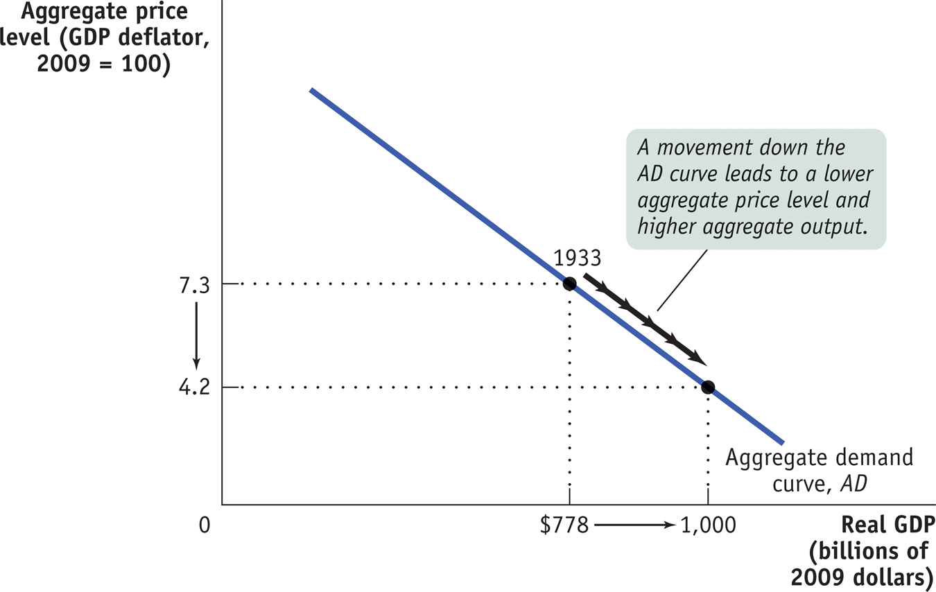
As drawn in Figure 12-1, the aggregate demand curve is downward sloping, indicating a negative relationship between the aggregate price level and the quantity of aggregate output demanded. A higher aggregate price level, other things equal, reduces the quantity of aggregate output demanded; a lower aggregate price level, other things equal, increases the quantity of aggregate output demanded. According to Figure 12-1, if the price level in 1933 had been 4.2 instead of 7.3, the total quantity of domestic final goods and services demanded would have been $1,000 billion in 2009 dollars instead of $778 billion.
The first key question about the aggregate demand curve is: why should the curve be downward sloping?