1.1 Module 28: Monopoly in Practice

WHAT YOU WILL LEARN
 How a monopolist determines the profit-
maximizing price and quantity  How to determine whether a monopoly is earning a profit or a loss
In this module we turn to monopoly, the market structure at the opposite end of the spectrum from perfect competition. A monopolist’s profit-
The Monopolist’s Demand Curve and Marginal Revenue
Recall the firm’s optimal output rule: a profit-
Although the optimal output rule holds for all firms, decisions about price and the quantity of output differ between monopolies and perfectly competitive industries due to differences in the demand curves faced by monopolists and perfectly competitive firms.
We have learned that even though the market demand curve always slopes downward, each of the firms that make up a perfectly competitive industry faces a horizontal, perfectly elastic demand curve, like DC in panel (a) of Figure 28-1. Any attempt by an individual firm in a perfectly competitive industry to charge more than the going market price will cause the firm to lose all its sales. It can, however, sell as much as it likes at the market price.

We saw that the marginal revenue of a perfectly competitive firm is simply the market price. As a result, the price-
A monopolist, in contrast, is the sole supplier of its good. So its demand curve is simply the market demand curve, which slopes downward, like DM in panel (b) of Figure 28-1. This downward slope creates a “wedge” between the price of the good and the marginal revenue of the good.
Table 28-1 shows how this wedge develops. The first two columns of Table 28-1 show a hypothetical demand schedule for De Beers diamonds. For the sake of simplicity, we assume that all diamonds are exactly alike. And to make the arithmetic easy, we suppose that the number of diamonds sold is far smaller than is actually the case. For instance, at a price of $500 per diamond, we assume that only 10 diamonds are sold. The demand curve implied by this schedule is shown in panel (a) of Figure 28-2.


The third column of Table 28-1 shows De Beers’s total revenue from selling each quantity of diamonds—
Clearly, after the first diamond, the marginal revenue a monopolist receives from selling one more unit is less than the price at which that unit is sold. For example, if De Beers sells 10 diamonds, the price at which the 10th diamond is sold is $500. But the marginal revenue—
Why is the marginal revenue from that 10th diamond less than the price? Because an increase in production by a monopolist has two opposing effects on revenue:
- A quantity effect. One more unit is sold, increasing total revenue by the price at which the unit is sold (in this case, +$500).
- A price effect. In order to sell that last unit, the monopolist must cut the market price on all units sold. This decreases total revenue (in this case, by 9 × (−$50) = −$450).
The quantity effect and the price effect are illustrated by the two shaded areas in panel (a) of Figure 28-2. Increasing diamond sales from 9 to 10 means moving down the demand curve from A to B, reducing the price per diamond from $550 to $500. The green-
Point C lies on the monopolist’s marginal revenue curve, labeled MR in panel (a) of Figure 28-2 and taken from the last column of Table 28-1. The crucial point about the monopolist’s marginal revenue curve is that it is always below the demand curve. That’s because of the price effect, which means that a monopolist’s marginal revenue from selling an additional unit is always less than the price the monopolist receives for that unit. It is the price effect that creates the wedge between the monopolist’s marginal revenue curve and the demand curve: in order to sell an additional diamond, De Beers must cut the market price on all units sold.
In fact, this wedge exists for any firm that possesses market power, such as an oligopolist. Having market power means that the firm faces a downward-
Take a moment to compare the monopolist’s marginal revenue curve with the marginal revenue curve for a perfectly competitive firm, which has no market power. For such a firm there is no price effect from an increase in output: its marginal revenue curve is simply its horizontal demand curve. So for a perfectly competitive firm, market price and marginal revenue are always equal.
To emphasize how the quantity and price effects offset each other for a firm with market power, De Beers’s total revenue curve is shown in panel (b) of Figure 28-2. Notice that it is hill-
The Monopolist’s Profit-Maximizing Output and Price
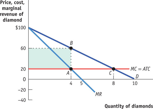
To complete the story of how a monopolist maximizes profit, we now bring in the monopolist’s marginal cost. Let’s assume that there is no fixed cost of production; we’ll also assume that the marginal cost of producing an additional diamond is constant at $200, no matter how many diamonds De Beers produces. Then marginal cost will always equal average total cost, and the marginal cost curve (and the average total cost curve) is a horizontal line at $200, as shown in Figure 28-3.

To maximize profit, the monopolist compares marginal cost with marginal revenue. If marginal revenue exceeds marginal cost, De Beers increases profit by producing more; if marginal revenue is less than marginal cost, De Beers increases profit by producing less. So the monopolist maximizes its profit by using the optimal output rule:

The monopolist’s optimal point is shown in Figure 28-3. At A, the marginal cost curve, MC, crosses the marginal revenue curve, MR. The corresponding output level, 8 diamonds, is the monopolist’s profit-
Monopoly versus Perfect Competition
In the 1880s, when Cecil Rhodes consolidated many independent diamond producers into the company he founded, De Beers, he converted a perfectly competitive industry into a monopoly. We can now use our analysis to see the effects of such a consolidation.
Let’s look again at Figure 28-3 and ask how this same market would work if, instead of being a monopoly, the industry were perfectly competitive. We will continue to assume that there is no fixed cost and that marginal cost is constant, so average total cost and marginal cost are equal.
If the diamond industry consists of many perfectly competitive firms, each of those producers takes the market price as given. That is, each producer acts as if its marginal revenue is equal to the market price. So each firm within the industry uses the price-

In Figure 28-3, this would correspond to producing at C, where the price per diamond, PC, is $200, equal to the marginal cost of production. So the profit-
But does the perfectly competitive industry earn any profit at C? No: the price of $200 is equal to the average total cost per diamond. So there is no economic profit for this industry when it produces at the perfectly competitive output level.
We’ve already seen that once the industry is consolidated into a monopoly, the result is very different. The monopolist’s marginal revenue is influenced by the price effect, so that marginal revenue is less than the price. That is,

As shown in Figure 28-3, the monopolist produces less than the competitive industry—
So, we can see that compared with a competitive industry, a monopolist does the following:
- produces a smaller quantity: QM < QC
- charges a higher price: PM > PC
- earns a profit
Monopoly: The General Picture
Figure 28-3 involved specific numbers and assumed that marginal cost was constant, there was no fixed cost, and therefore, that the average total cost curve was a horizontal line. Figure 28-4 shows a more general picture of monopoly in action: D is the market demand curve; MR, the marginal revenue curve; MC, the marginal cost curve; and ATC, the average total cost curve. Here we return to the usual assumption that the marginal cost curve has a “swoosh” shape and the average total cost curve is U-

Applying the optimal output rule, we see that the profit-
Profit is equal to the difference between total revenue and total cost. So we have
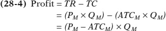
Profit is equal to the area of the shaded rectangle in Figure 28-4, with a height of PM − ATCM and a width of QM.
We learned that a perfectly competitive industry can have profits in the short run but not in the long run. In the short run, price can exceed average total cost, allowing a perfectly competitive firm to make a profit. But we also know that this cannot persist. In the long run, any profit in a perfectly competitive industry will be competed away as new firms enter the market. In contrast, while a monopoly can earn a profit or a loss in the short run, barriers to entry make it possible for a monopolist to make positive profits in the long run.
!world_eia!SHOCKED BY THE HIGH PRICE OF ELECTRICITY
Historically, electric utilities were recognized as natural monopolies. As you’ll recall, these are monopolies that are created and sustained by economies of scale. A utility serviced a defined geographical area, owning the plants that generated electricity as well as the transmission lines that delivered it to retail customers. The rates charged customers were regulated by the government, set at a level to cover the utility’s cost of operation plus a modest return on capital to its shareholders.
In the late 1990s, however, there was a move toward deregulation, based on the belief that competition would result in lower retail electricity prices. Competition was introduced at two junctures in the channel from power generation to retail customers: (1) distributors would compete to sell electricity to retail customers, and (2) power generators would compete to supply power to the distributors.
That was the theory, at least. According to one detailed report, 92% of households in states claiming to have retail choice actually cannot choose an alternative supplier of electricity because their wholesale market is still dominated by one power generator.
What proponents of deregulation failed to realize is that the bulk of power generation still entails large up-
In addition, deregulation and the lack of genuine competition enabled power generators to engage in market manipulation—

The most shocking case occurred during the California energy crisis of 2000–
According to a Michigan State University study, from 2002 to 2006, average retail electricity prices rose 21% in regulated states versus 36% in fully deregulated states. Another study found that from 1999 to 2007, the difference between prices charged to industrial retail customers in deregulated states and regulated states tripled. And data through 2011 indicate that customers in deregulated states continue to pay more for electricity than those in regulated states.
Angry customers have prompted several states to change the way they regulate their industries, slow down the process of deregulation, or move to reregulate their industries. California has gone so far as to mandate that its electricity distributors re-
Module 28 Review
Solutions appear at the back of the book.
Check Your Understanding
1. Use the accompanying total revenue schedule of Emerald, Inc., a monopoly producer of 10-
| Quantity of emeralds demanded | Total revenue |
|---|---|
| 1 | $100 |
| 2 | 186 |
| 3 | 252 |
| 4 | 280 |
| 5 | 250 |
-
a. the demand schedule (Hint: the average revenue at each quantity indicates the price at which that quantity would be demanded.)
-
b. the marginal revenue schedule
-
c. the quantity effect component of marginal revenue at each output level
-
d. the price effect component of marginal revenue at each output level
-
e. What additional information is needed to determine Emerald, Inc.’s profit-
maximizing output?
2. Using the price, quantity, and marginal revenue information from Table 28-1, and a marginal cost of $200, replicate Figure 28-3. Let the marginal cost of diamond production rise to $400. On your graph, show what happens to each of the following:
-
a. the marginal cost curve
-
b. the profit-
maximizing price and quantity -
c. the profit of the monopolist
-
d. the quantity that would be produced if the diamond industry were perfectly competitive, and the associated profit
Multiple-
Refer to the graph provided for questions 1–
Question
XSHqEZV9dSpkgzNoMo48pydJLYOEJZb/93F5uPJhVUl1+VbDnECzpLsgPWsiye8oER99VnT1lWGQ44xB/YwpDqIe9Tdwn9m+Sw/DdhrB2g4VVBxHSUxcnJZS6afuqEPSOUHE9HItLU5F0qAMXkt80/VYw7NGzR6+3dkl5eTUGtn2ksiAEvGZ0V6x/oBEnPhzY3yEbTSxuTnszMiAjDtrrQaVC8Cm9cesFNLCUzY+fztdre5bRt7xNAgOWmD+b+wiL/IQF0Q8Qv0=Question
98VfwMVZ9/3VKM50AAZc7dxVgJnXeJ3ni8gYnXVlz0ffUEtk6nn05TWOS1/mfq82zg+RAJA1MWZoxJdGDc4+sX2RYSUtCSkSg9+V8ETBHe7yH5B+tFONpbDFhmrDNVHD/IB0G+WRNGyN0gDfreAJc47CFdvKKuCrqLelW08I6KoT6aM+uUOOHsG/XcJwn1u1sGkiTJjdhzxSqGSsDKz1pA==Question
hnYZPa6V2yJYuSO0GKszhnSl6ZsqL5/vYU8wf79ypz5aZhCiAKJrUjdPCiy5M3T+qFG4UOUlndfRTmk/mLnMYqo01J7fwIkC/9WB/m3Q2Y8KVYxzXC7MjcT3zBTRzG4Tq3DDUhkB5s70/E9bkgvR5HBzAcc1JqzDGFPkqVz06vUQFkJCsL/9inCZys3ERlJHudbujd6UeW5Eqc9LQuestion
Pdo/DZFVP/qR0jU7gyCXIzlngU21N4qw4cDGbuYGQT8RBm6UqCypF1NknuS6PtNihSMPRJajoSeRrs3AMR6YTe2IhANf9FdNJlftZ85DrgpAFmvF6/7neXlfM03O3yQyYk4vVAGr/Q/qK+dZPnsanej3F0vFU5yLWmxwlUQ6/4KMT5uM2u7cEUWvVnFbYZ5a1WY1PRZqA2TWC7ymRnf6tg==Question
JT2LFK1lBZjCy/E6xsk8aC4w/VV0vm0WJjW5tAaQv31UJI6F4qCYIu2aA77OgIUBMxwEAu84sGyyqAFSA0XGrAboywpD6lmX5gU5osjyNw7AfBS2XfE2Y1l81TnHZ8V5e34ItBsE8YPf558BXe+Sg+LRzeQM6qKZW1BEmmoApX4aTQY5TFpswHYMtEyKIXpOIEvGeGK90pR3nVGRu4dw2ieg3EyL25LGnZg6nOJOJDzhjo3I822Q4MrOQ1BE9wwKw7d0JnUIojuC1xf54adaE1/flNJ/UErcQ+kvl9xpOUHL2fbiowFgzh85fCV00G1Pk9uB3HJYdej4+PVS7ySwj9bBkJMlFGZErc95E+kE7TkYxnmZxEiN1Q11kSkke4CpYAUCMJov0N1gEY8q3MXTfqiPGdun2RJFaT9pQJAnQxBMhR4BdwaStnUKj8kepY3imseqbbmpH1/H/ip6GB92kgWqQUXaj4osMF8ys8KoCl7zurWoGsatlKS8LEyQ2YlSPJOZjChFXUKwEVXGcr6bcXzAPIo+fGtKVSveDA==Critical-
1. Draw a graph showing a monopoly earning zero economic profit in the short run.
2. Can a monopoly earn zero economic profit in the long run? Explain.
PITFALLS: IS THERE A MONOPOLY SUPPLY CURVE?
IS THERE A MONOPOLY SUPPLY CURVE?
 Given that a monopolist applies its optimal output rule in the same way as a perfectly competitive industry, can we then conclude that a monopolist’s supply curve can be calculated in the same way as the supply curve for the industry in perfect competition?
 No, because monopolists don’t have supply curves! Remember that a supply curve shows the quantity that producers are willing to supply for any given market price. A monopolist, however, does not take the price as given; it chooses a profit-
To learn more, see pages 302–
