1.1 Module 11: Consumer and Producer Surplus
WHAT YOU WILL LEARN
 The meaning of consumer surplus and its relationship to the demand curve
 The meaning of producer surplus and its relationship to the supply curve
Consumer Surplus and the Demand Curve
First-
The ability to purchase used textbooks at the start of the semester and to sell back used textbooks at the end of the semester is beneficial to students on a budget. In fact, the market for used textbooks is a big business in terms of dollars and cents—
So let’s begin by looking at the market for used textbooks, starting with the buyers. The key point, as we’ll see in a minute, is that the demand curve is derived from their tastes or preferences—
Willingness to Pay and the Demand Curve
A used book is not as good as a new book—
A consumer’s willingness to pay for a good is the maximum price at which he or she would buy that good.
Let’s define a potential buyer’s willingness to pay as the maximum price at which he or she would buy a good, in this case a used textbook. An individual won’t buy the good if it costs more than this amount but is eager to do so if it costs less. If the price is just equal to an individual’s willingness to pay, he or she is indifferent between buying and not buying. For the sake of simplicity, we’ll assume that the individual buys the good in this case.
The table in Figure 11-1 shows five potential buyers of a used book that costs $100 new, listed in order of their willingness to pay. At one extreme is Aleisha, who will buy a second-

How many of these five students will actually buy a used book? It depends on the price. If the price of a used book is $55, only Aleisha buys one; if the price is $40, Aleisha and Brad both buy used books, and so on. So the information in the table can be used to construct the demand schedule for used textbooks.
We can use this demand schedule to derive the market demand curve shown in Figure 11-1. Because we are considering only a small number of consumers, this curve doesn’t look like the smooth demand curves we have seen previously, for markets that contained hundreds or thousands of consumers. This demand curve is step-
Willingness to Pay and Consumer Surplus
Suppose that the campus bookstore makes used textbooks available at a price of $30. In that case Aleisha, Brad, and Claudia will buy used books. Do they gain from their purchases, and if so, how much?
The answer, shown in Table 11-1, is that each student who purchases a used book does achieve a net gain but that the amount of the gain differs among students.
| Potential buyer | Willingness to pay | Price paid | Individual consumer surplus = Willingness to pay − Price paid |
|---|---|---|---|
| Aleisha | $59 | $30 | $29 |
| Brad | 45 | 30 | 15 |
| Claudia | 35 | 30 | 5 |
| Darren | 25 | — | — |
| Edwina | 10 | — | — |
| All buyers | Total consumer surplus = $49 |
Aleisha would have been willing to pay $59, so her net gain is $59 − $30 = $29. Brad would have been willing to pay $45, so his net gain is $45 − $30 = $15. Claudia would have been willing to pay $35, so her net gain is $35 − $30 = $5. Darren and Edwina, however, won’t be willing to buy a used book at a price of $30, so they neither gain nor lose.
Individual consumer surplus is the net gain to an individual buyer from the purchase of a good. It is equal to the difference between the buyer’s willingness to pay and the price paid.
The net gain that a buyer achieves from the purchase of a good is called that buyer’s individual consumer surplus. What we learn from this example is that whenever a buyer pays a price less than his or her willingness to pay, the buyer achieves some individual consumer surplus.
Total consumer surplus is the sum of the individual consumer surpluses of all the buyers of a good in a market.
The sum of the individual consumer surpluses achieved by all the buyers of a good is known as the total consumer surplus achieved in the market. In Table 11-1, the total consumer surplus is the sum of the individual consumer surpluses achieved by Aleisha, Brad, and Claudia: $29 + $15 + $5 = $49.
The term consumer surplus is often used to refer to both individual and to total consumer surplus.
Economists often use the term consumer surplus to refer to both individual and total consumer surplus. We will follow this practice; it will always be clear in context whether we are referring to the consumer surplus achieved by an individual or by all buyers.
Total consumer surplus can be represented graphically. Figure 11-2 reproduces the demand curve from Figure 11-1. Each step in that demand curve is one book wide and represents one consumer. For example, the height of Aleisha’s step is $59, her willingness to pay. This step forms the top of a rectangle, with $30—

In addition to Aleisha, Brad and Claudia will also each buy a book when the price is $30. Like Aleisha, they benefit from their purchases, though not as much, because they each have a lower willingness to pay. Figure 11-2 also shows the consumer surplus gained by Brad and Claudia; again, this can be measured by the areas of the appropriate rectangles. Darren and Edwina, because they do not buy books at a price of $30, receive no consumer surplus.
The total consumer surplus achieved in this market is just the sum of the individual consumer surpluses received by Aleisha, Brad, and Claudia. So total consumer surplus is equal to the combined area of the three rectangles—
This is worth repeating as a general principle: The total consumer surplus generated by purchases of a good at a given price is equal to the area below the demand curve but above that price. The same principle applies regardless of the number of consumers.
When we consider large markets, this graphical representation becomes particularly helpful. Consider, for example, the sales of iPads to millions of potential buyers. Each potential buyer has a maximum price that he or she is willing to pay. With so many potential buyers, the demand curve will be smooth, like the one shown in Figure 11-3.

Suppose that at a price of $500 per iPad a total of 1 million iPads are purchased. How much do consumers gain from being able to buy those 1 million iPads? We could answer that question by calculating the individual consumer surplus of each buyer and then adding these numbers up to arrive at a total. But it is much easier just to look at Figure 11-3 and use the fact that total consumer surplus is equal to the shaded area below the demand curve but above the price.
How Changing Prices Affect Consumer Surplus
It is often important to know how price changes affect consumer surplus. For example, we may want to know how much consumers are hurt if a flood in Pakistan drives up cotton prices or how much consumers’ gain from the introduction of fish farming that makes salmon steaks less expensive. The same approach we have used to derive consumer surplus can be used to answer questions about how changes in prices affect consumers.
Let’s return to the example of the market for used textbooks. Suppose that the bookstore decided to sell used textbooks for $20 instead of $30. By how much would this fall in price increase consumer surplus?
The answer is illustrated in Figure 11-4. As shown in the figure, there are two parts to the increase in consumer surplus. The first part, shaded dark blue, is the gain of those who would have bought books even at the higher price of $30. Each of the students who would have bought a book at $30—
The second part, shaded light blue, is the gain to those who would not have bought a book at $30 but are willing to pay more than $20. In this case that gain goes to Darren, who would not have bought a book at $30 but does buy one at $20. He gains $5—
The total increase in consumer surplus is the sum of the shaded areas, $35. Likewise, a rise in price from $20 to $30 would decrease consumer surplus by an amount equal to the sum of the shaded areas.
Figure 11-4 illustrates that when the price of a good falls, the area under the demand curve but above the price—


As in the used-
As before, the total gain in consumer surplus is the sum of the shaded areas, the increase in the area under the demand curve but above the price.
What would happen if the price of a good were to rise instead of fall? We would do the same analysis in reverse. Suppose, for example, that for some reason the price of iPads rises from $500 to $2,000. This would lead to a fall in consumer surplus equal to the sum of the shaded areas in Figure 11-5. This loss consists of two parts. The dark blue rectangle represents the loss to consumers who would still buy an iPad, even at a price of $2,000. The light blue triangle represents the loss to consumers who decide not to buy an iPad at the higher price.
A MATTER OF LIFE AND DEATH
Each year about 4,000 people in the United States die while waiting for a kidney transplant. In 2013, over 90,000 were wait listed. Since the number of those in need of a kidney far exceeds availability, what is the best way to allocate available organs? A market isn’t feasible. For understandable reasons, the sale of human body parts is illegal in this country. So the task of establishing a protocol for these situations has fallen to the nonprofit group United Network for Organ Sharing (UNOS).
At one time, UNOS guidelines stipulated that a donated kidney went to the person waiting the longest. An available kidney would go to a 75-
To address this issue, in 2013 UNOS adopted a new set of guidelines based on a concept it called “net survival benefit.” According to these guidelines, kidneys are ranked according to how long they are likely to last; similarly, recipients are ranked according to how long they are likely to live with the transplanted organ. Each kidney is then matched to the person expected to achieve the greatest survival time from it.

A kidney expected to last many decades will be allocated to a younger person, while older recipients will receive kidneys expected to last for fewer years. This way, UNOS tries to avoid situations in which (1) recipients outlive their transplants, creating the need for another transplant and reducing the pool of kidneys available and (2) a kidney “outlives” its recipient, thereby wasting years of kidney function that could have benefited someone else.
What does this have to do with consumer surplus? As you may have guessed, the UNOS concept of “net survival benefit” is a lot like individual consumer surplus—
Producer Surplus and the Supply Curve
Just as some buyers of a good would have been willing to pay more for their purchase than the price they actually pay, some sellers of a good would have been willing to sell it for less than the price they actually receive. We can therefore carry out an analysis of producer surplus and the supply curve that is almost exactly parallel to that of consumer surplus and the demand curve.
Cost and Producer Surplus
Consider a group of students who are potential sellers of used textbooks. Because they have different preferences, the various potential sellers differ in the price at which they are willing to sell their books. The table in Figure 11-6 shows the prices at which several different students would be willing to sell. Andrew is willing to sell the book as long as he can get at least $5; Betty won’t sell unless she can get at least $15; Carlos requires $25; Donna requires $35; Engelbert $45.
A seller’s cost is the lowest price at which he or she is willing to sell a good.
The lowest price at which a potential seller is willing to sell is called the seller’s cost. So Andrew’s cost is $5, Betty’s is $15, and so on.
Using the term cost, which people normally associate with the monetary cost of producing a good, may sound a little strange when applied to sellers of used textbooks. The students don’t have to manufacture the books, so it doesn’t cost the student who sells a book anything to make that book available for sale, does it?
Yes, it does. A student who sells a book won’t have it later, as part of his or her personal collection. So there is an opportunity cost to selling a textbook, even if the owner has completed the course for which it was required. And remember that one of the basic principles of economics is that the true measure of the cost of doing something is always its opportunity cost. That is, the real cost of something is what you must give up to get it.
So it is good economics to talk of the minimum price at which someone will sell a good as the “cost” of selling that good, even if he or she doesn’t spend any money to make the good available for sale. Of course, in most real-
Individual producer surplus is the net gain to an individual seller from selling a good. It is equal to the difference between the price received and the seller’s cost.
Getting back to the example, suppose that Andrew sells his book for $30. Clearly he has gained from the transaction: he would have been willing to sell for only $5, so he has gained $25. This net gain, the difference between the price he actually gets and his cost—
Just as we derived the demand curve from the willingness to pay of different consumers, we can derive the supply curve from the cost of different producers. The step-

Total producer surplus in a market is the sum of the individual producer surpluses of all the sellers of a good in a market.
Economists use the term producer surplus to refer both to individual and to total producer surplus.
As in the case of consumer surplus, we can add the individual producer surpluses of sellers to calculate the total producer surplus, the total net gain to all sellers in the market. Economists use the term producer surplus to refer to either total or individual producer surplus. Table 11-2 shows the net gain to each of the students who would sell a used book at a price of $30: $25 for Andrew, $15 for Betty, and $5 for Carlos. The total producer surplus is $25 + $15 + $5 = $45.
| Potential seller | Cost | Price received | Individual producer surplus = Price received − Price Cost |
|---|---|---|---|
| Andrew | $ 5 | $30 | $25 |
| Betty | 15 | 30 | 15 |
| Carlos | 25 | 30 | 5 |
| Donna | 35 | — | — |
| Engelbert | 45 | — | — |
| All sellers | Total producer surplus = $45 |
As with consumer surplus, the producer surplus gained by those who sell books can be represented graphically. Figure 11-7 reproduces the supply curve from Figure 11-6. Each step in that supply curve is one book wide and represents one seller. The height of Andrew’s step is $5, his cost. This forms the bottom of a rectangle, with $30, the price he actually receives for his book, forming the top. The area of this rectangle, ($30 − $5) × 1 = $25, is his producer surplus. So the producer surplus Andrew gains from selling his book is the area of the dark red rectangle shown in the figure.

Let’s assume that the campus bookstore is willing to buy all the used copies of this book that students are willing to sell at a price of $30. Then, in addition to Andrew, Betty and Carlos will also sell their books. They will also benefit from their sales, though not as much as Andrew, because they have higher costs. Andrew, as we have seen, gains $25. Betty gains a smaller amount: since her cost is $15, she gains only $15. Carlos gains even less, only $5.
Again, as with consumer surplus, we have a general rule for determining the total producer surplus from sales of a good: The total producer surplus from sales of a good at a given price is the area above the supply curve but below that price.
This rule applies both to examples like the one shown in Figure 11-7, where there are a small number of producers and a step-
Consider, for example, the supply of wheat. Figure 11-8 shows how producer surplus depends on the price per bushel. Suppose that, as shown in the figure, the price is $5 per bushel and farmers supply 1 million bushels. What is the benefit to the farmers from selling their wheat at a price of $5? Their producer surplus is equal to the shaded area in the figure—

How Changing Prices Affect Producer Surplus
As in the case of consumer surplus, a change in price alters producer surplus. However, although a fall in price increases consumer surplus, it reduces producer surplus. Similarly, a rise in price reduces consumer surplus but increases producer surplus.

To see this, let’s first consider a rise in the price of the good. Producers of the good will experience an increase in producer surplus, though not all producers gain the same amount. Some producers would have produced the good even at the original price; they will gain the entire price increase on every unit they produce. Other producers will enter the market because of the higher price; they will gain only the difference between the new price and their cost.
Figure 11-9 is the supply counterpart of Figure 11-5. It shows the effect on producer surplus of a rise in the price of wheat from $5 to $7 per bushel. The increase in producer surplus is the sum of the shaded areas, which consists of two parts. First, there is a red rectangle corresponding to the gains to those farmers who would have supplied wheat even at the original $5 price. Second, there is an additional pink triangle that corresponds to the gains to those farmers who would not have supplied wheat at the original price but are drawn into the market by the higher price.

If the price were to fall from $7 to $5 per bushel, the story would run in reverse. The sum of the shaded areas would now be the decline in producer surplus, the decrease in the area above the supply curve but below the price. The loss would consist of two parts, the loss to farmers who would still grow wheat at a price of $5 (the red rectangle) and the loss to farmers who decide to no longer grow wheat because of the lower price (the pink triangle).
Module 11 Review
Solutions appear at the back of the book.
Check Your Understanding
1. Consider the market for cheese-
| Quantity of peppers | Casey’s willingness to pay | Josey’s willingness to pay |
|---|---|---|
| 1st pepper | $0.90 | $0.80 |
| 2nd pepper | 0.70 | 0.60 |
| 3rd pepper | 0.50 | 0.40 |
| 4th pepper | 0.30 | 0.30 |
2. Again consider the market for cheese-
| Quantity of peppers | Cara’s cost | Jamie’s cost |
|---|---|---|
| 1st pepper | $0.10 | $0.30 |
| 2nd pepper | 0.10 | 0.50 |
| 3rd pepper | 0.40 | 0.70 |
| 4th pepper | 0.60 | 0.90 |
Multiple-
Question
oVUQozsR5E9cNL/sRzqnnDmw0u48sA/PqH9egG78zqkDOimlWoVFHXdcjt6yLMIOPtDRedwhooM7M4bTKTflYEBp7mlxUHted33Jx+55BbPRdr16jB3M6a4r+D94nuwNGHucuj/ag00juH/WHoPxMlNbtbvsF5idnI24heXFMXpD3xhpZXx92nUsimXRSgV3bXZe+wYVamKp5RM9tIowOS3MO49/NCSPfyJiXjXilNEYHicW0QyNZAJkBMVcj+56yjTnPRvKleYn5Qvx4ly5vTiH+noOOomdClPy4g==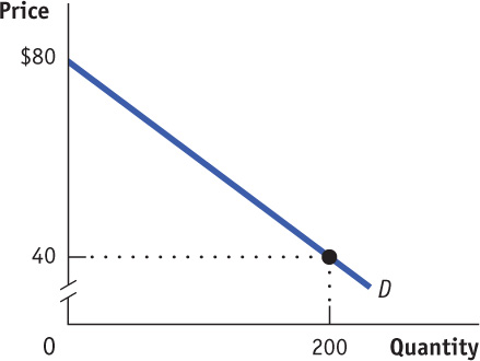
Question
Y+f/jK2Omv7z9hNBNFlGDDzisBiwp3LPrJcBLdAQjUAKb83ovj8zgBP6TX2/pJlEDVhZJirb8/FWBDY7sUixh0IzTjPQtNTOC4e58HqWDHu0Yj6tJNoBb4uLvnXwFQABTA9nOLs8UYgxNUookb6Yu0QUZ68ZwDwy00MvB0RPM0I3jfiOicDMEv0RoJpqzNBfMN15CX9WTqUccz2Yqt6vJwdRkxfzlNeF17qQDqCVEwM9d2ldBiExArj1BweuzjTx5ldyCC0lc7zp0iUixlXaUa/IUe97rugU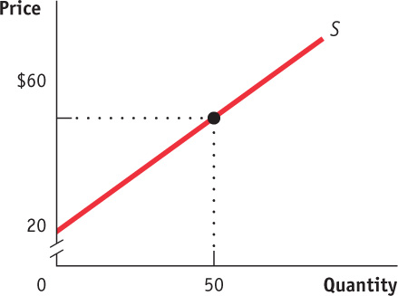
Question
asph6lX+FmrxYG31CCTLA67qNW4Mlreut5zlFimwkM2KZzSsymbKaognRpYLv0Qagnm+Kz/Vz8fKc36nXsrrG7Fc0W/H90AdXG5MzAxKuwfG4Qsez6IM4dEvwDDtNI7vT+dAEexPFkP4OCAecN0J1Sfpo7eTbKBxA9Wac17UGmywWk1ZONwFOt15eN69wY67eRZKPc81jdr/9rB8HdH9nJGR3hu/36FeEQrSR8k0Vg694WvVjWCA6Jv6edBkeUZ87GhByJbLTr5a/ElBbjLrblsJKAbYvHbSl+fxpADC7GvG/GX3R/2gCSrtp71eIbMeZ7Ex+cyOzPlnNriZ6s1lZ5wQMdLyKQY6/HT8ZY6igFHJSZdpPUA9Pp4pVevum81QNPIMSZv17DdTGuwzKIwt+WjStr+ThX4/wc2rdsZxw9pX5bszMmFzJgdKnfnXypaSPmRBP+IOoXosu7Tr9wzynmEEizRClGSMJDVNDgiK/7YzkCX9z8u7bYDNCJSXHuwu/U/gJ26pmD+pvcYdxESn3tlT7ocTR+BTVuxGdMqeT1EBRYr6aMrCOM+nCF9mYTW34HlMbzsEVa2625A4tGV72VeqKpI=Question
YWrr/Ojiqm69tTV3rhi/clHFIwGipIQxj4Z6bhCkWwXjWbdBuqzRIa3BcwJ9MbUVdhesW2zyx20cbjlarcAaSHJ4a0T5fQbLUXbZfm54uWlbMhNMEkuC+a140FertLRdZHyyNZsK08+AxbL9vJMxzWwBPJ49qlKgDnWdzrc4cee3lZbQQJamGCwEvTpILyAlFIoHtJf9HoTkvcNu83CUTCTekRTTclce+VHFGXvb2GL84HYs1vxnEDOt692ZWDxeKGCx8UGWzq7Dm/XgEdBHr78AffaB8fwKfBFsDTKS7qdio439WPDQeiwx7GjwxiD3AvL9G9y7Gh74TB4Swipg5mj2aZOjOIks/81RV68fghAe25IaRS10JHk++VttkvO6/T/MukUqfc9AN0jbyz6V9lbOwJuSYB65gaVeAWY40Z26LHnM9OIza/QLRgKWAhiv6DL5CS7Q52RwhOZUskrv00plouc=Question
gk0AKfN1RpwqJ2DGxzj0MJeOuJjdW0rrGA9ZjiagbqPmibaZOYQb03V6u8Hs+UwddiDGHm8yEnl5JlGuBXGgAvJ4OSSYr4vv9Np2PCis1QR5thnYQHsi9uiBOgWb9d5SF0dSvry9b8KsD4by9ZIfK4EiWUzNN6HYqicWYh6pQ2kujT4LeXtAf/lwha6q0OvK9S2oXQcPie7PEydMeee6C43JqveMY8rN7NQfX0mf5z0UfKb0mw+bFexSK8BaNDbyEjsvKrPv8JoLfRM7b2g6TM6hwsYrnyWRISp/Sa9Z14DDhajWlE4dRZ2ngHzjmRIHOJrFFcr2k7xiadr0L8ZZiLt2eMnTGuXo+gE3jKivveXom0ti8GIGuBW/DLQIUWaWNMR/RH+ywVfmEeQpqmBfvJ59/vnTflDzQImQ7rt3mdpZznyq6np6anw09d8=Critical-
Draw a correctly labeled graph showing a competitive market in equilibrium. On your graph, clearly indicate and label the area of consumer surplus and the area of producer surplus.