The Monopolist’s Demand Curve and Marginal Revenue
In Chapter 12 we derived the firm’s optimal output rule: a profit-
Although the optimal output rule holds for all firms, we will see shortly that its application leads to different profit-
In addition to the optimal output rule, we also learned that even though the market demand curve always slopes downward, each of the firms that make up a perfectly competitive industry faces a perfectly elastic demand curve that is horizontal at the market price, like DC in panel (a) of Figure 13-4. Any attempt by an individual firm in a perfectly competitive industry to charge more than the going market price will cause it to lose all its sales. It can, however, sell as much as it likes at the market price.
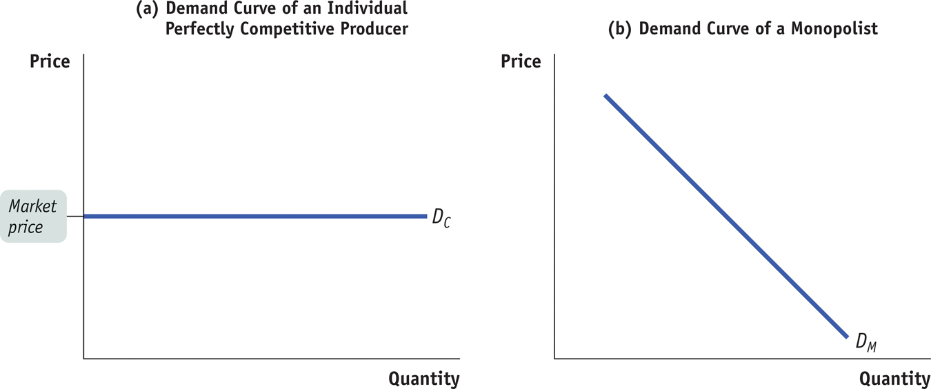
As we saw in Chapter 12, the marginal revenue of a perfectly competitive producer is simply the market price. As a result, the price-
A monopolist, in contrast, is the sole supplier of its good. So its demand curve is simply the market demand curve, which slopes downward, like DM in panel (b) of Figure 13-4. This downward slope creates a “wedge” between the price of the good and the marginal revenue of the good—
Table 13-1 shows this wedge between price and marginal revenue for a monopolist, by calculating the monopolist’s total revenue and marginal revenue schedules from its demand schedule.
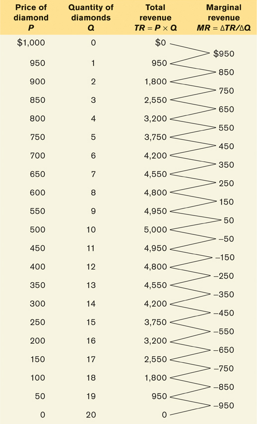
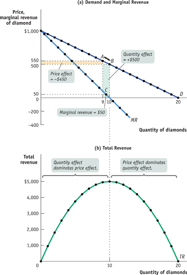
The first two columns of Table 13-1 show a hypothetical demand schedule for De Beers diamonds. For the sake of simplicity, we assume that all diamonds are exactly alike. And to make the arithmetic easy, we suppose that the number of diamonds sold is far smaller than is actually the case. For instance, at a price of $500 per diamond, we assume that only 10 diamonds are sold. The demand curve implied by this schedule is shown in panel (a) of Figure 13-5.
The third column of Table 13-1 shows De Beers’s total revenue from selling each quantity of diamonds—
Clearly, after the 1st diamond, the marginal revenue a monopolist receives from selling one more unit is less than the price at which that unit is sold. For example, if De Beers sells 10 diamonds, the price at which the 10th diamond is sold is $500. But the marginal revenue—
Why is the marginal revenue from that 10th diamond less than the price? It is less than the price because an increase in production by a monopolist has two opposing effects on revenue:
A quantity effect. One more unit is sold, increasing total revenue by the price at which the unit is sold.
A price effect. In order to sell the last unit, the monopolist must cut the market price on all units sold. This decreases total revenue.
The quantity effect and the price effect when the monopolist goes from selling 9 diamonds to 10 diamonds are illustrated by the two shaded areas in panel (a) of Figure 13-5. Increasing diamond sales from 9 to 10 means moving down the demand curve from A to B, reducing the price per diamond from $550 to $500. The green-
Point C lies on the monopolist’s marginal revenue curve, labeled MR in panel (a) of Figure 13-5 and taken from the last column of Table 13-1. The crucial point about the monopolist’s marginal revenue curve is that it is always below the demand curve. That’s because of the price effect: a monopolist’s marginal revenue from selling an additional unit is always less than the price the monopolist receives for the previous unit. It is the price effect that creates the wedge between the monopolist’s marginal revenue curve and the demand curve: in order to sell an additional diamond, De Beers must cut the market price on all units sold.
In fact, this wedge exists for any firm that possesses market power, such as an oligopolist as well as a monopolist. Having market power means that the firm faces a downward-
Take a moment to compare the monopolist’s marginal revenue curve with the marginal revenue curve for a perfectly competitive firm, one without market power. For such a firm there is no price effect from an increase in output: its marginal revenue curve is simply its horizontal demand curve. So for a perfectly competitive firm, market price and marginal revenue are always equal.
To emphasize how the quantity and price effects offset each other for a firm with market power, De Beers’s total revenue curve is shown in panel (b) of Figure 13-5. Notice that it is hill-
Correspondingly, the marginal revenue curve lies below zero at output levels above 10 diamonds. For example, an increase in diamond production from 11 to 12 yields only $400 for the 12th diamond, simultaneously reducing the revenue from diamonds 1 through 11 by $550. As a result, the marginal revenue of the 12th diamond is −$150.