Economic Inequality
The United States is a rich country. In 2007, before the recession hit, the average U.S. household had an income (in 2012 prices) of $74,869, far exceeding the poverty threshold. Even after a devastating recession followed by a sluggish recovery, average household income in 2013 was $72,641. How is it possible, then, that so many Americans still live in poverty? The answer is that income is unequally distributed, with many households earning much less than the average and others earning much more.
Table 18-2 shows the distribution of pre-
|
Income group |
Income range |
Average income |
Percent of total income |
|---|---|---|---|
|
Bottom quintile |
Less than $20,900 |
$11,657 |
3.2% |
|
Second quintile |
$20,900 to $40,187 |
30,127 |
8.3 |
|
Third quintile |
$40,187 to $65,501 |
51,933 |
14.4 |
|
Fourth quintile |
$65,501 to $105,910 |
83,291 |
23.0 |
|
Top quintile |
More than $105,910 |
184,548 |
51.0 |
|
Top 5% |
More than $196,000 |
322,674 |
22.2 |
|
Mean income = $72,641 |
Median income = $51,939 |
||
|
Source: U.S. Census Bureau. |
|||
For each group, Table 18-2 shows three numbers. The second column shows the income ranges that define the group. For example, in 2013, the bottom quintile consisted of households with annual incomes of less than $20,900, the next quintile of households had incomes between $20,900 and $40,187, and so on. The third column shows the average income in each group, ranging from $11,657 for the bottom fifth to $322,674 for the top 5%. The fourth column shows the percentage of total U.S. income received by each group.
Mean household income is the average income across all households.
Mean versus Median Household Income At the bottom of Table 18-2 are two useful numbers for thinking about the incomes of American households. Mean household income, also called average household income, is the total income of all U.S. households divided by the number of households. Median household income is the income of a household in the exact middle of the income distribution—
Median household income is the income of the household lying at the exact middle of the income distribution.
Economists often illustrate the difference by asking people first to imagine a room containing several dozen more or less ordinary wage-
This example helps explain why economists generally regard median income as a better guide to the economic status of typical American families than mean income: mean income is strongly affected by the incomes of a relatively small number of very-
What we learn from Table 18-2 is that income in the United States is quite unequally distributed. The average income of the poorest fifth of families is less than a quarter of the average income of families in the middle, and the richest fifth have an average income more than three times that of families in the middle. The incomes of the richest fifth of the population are, on average, about 15 times as high as those of the poorest fifth. In fact, the distribution of income in America has become more unequal since 1980, rising to a level that has made it a significant political issue. The upcoming Economics in Action discusses long-
The Gini coefficient is a number that summarizes a country’s level of income inequality based on how unequally income is distributed across quintiles.
The Gini Coefficient It’s often convenient to have a single number that summarizes a country’s level of income inequality. The Gini coefficient, the most widely used measure of inequality, is based on how disparately income is distributed across the quintiles (as we learned in the preceding Global Comparison). A country with a perfectly equal distribution of income—
One way to get a sense of what Gini coefficients mean in practice is to look at international comparisons. Figure 18-2 shows recent estimates of the Gini coefficient for many of the world’s countries. Aside from a few countries in Africa, the highest levels of income inequality are found in Latin America, especially Colombia; countries with a high degree of inequality have Gini coefficients close to 0.6. The most equal distributions of income are in Europe, especially in Scandinavia; countries with very equal income distributions, such as Sweden, have Gini coefficients around 0.25. Compared to other wealthy countries, as of 2012 the United States, with a Gini coefficient of 0.47, has unusually high inequality, though it isn’t as unequal as in Latin America.
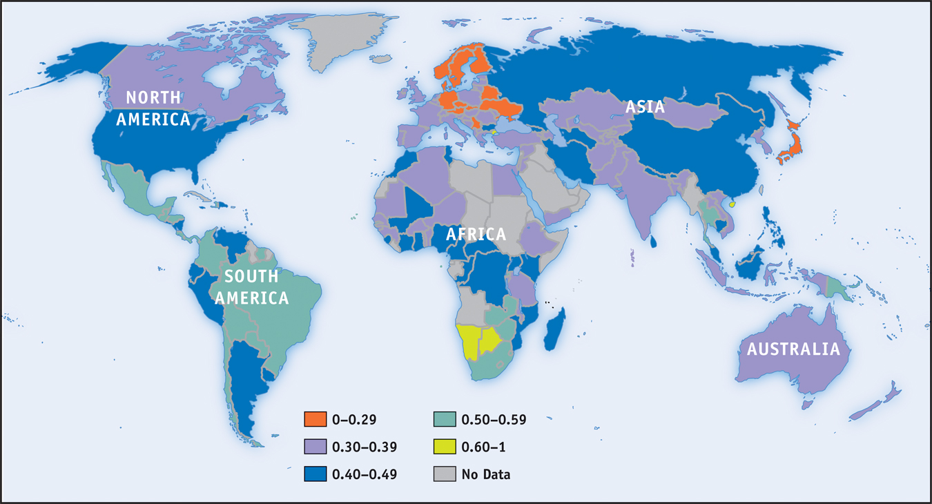
How serious an issue is income inequality? In a direct sense, high income inequality means that some people don’t share in a nation’s overall prosperity. As we’ve seen, rising inequality explains how it’s possible that the U.S. poverty rate has failed to fall for the past 40 years even though the country as a whole has become considerably richer. Also, extreme inequality, as found in Latin America, is often associated with political instability because of tension between a wealthy minority and the rest of the population.
It’s important to realize, however, that the data shown in Table 18-2 overstate the true degree of inequality in America, for several reasons. One is that the data represent a snapshot for a single year, whereas the incomes of many individual families fluctuate over time. That is, many of those near the bottom in any given year are having an unusually bad year and many of those at the top are having an unusually good one. Over time, their incomes will revert to a more normal level. So a table showing average incomes within quintiles over a longer period, such as a decade, would not show as much inequality.
Furthermore, a family’s income tends to vary over its life cycle: most people earn considerably less in their early working years than they will later in life, then experience a considerable drop in income when they retire. Consequently, the numbers in Table 18-2, which combine young workers, mature workers, and retirees, show more inequality than would a table that compares families of similar ages.
Despite these qualifications, there is a considerable amount of genuine inequality in the United States. In fact, inequality not only persists for long periods of time for individuals, it extends across generations. The children of poor parents are much more likely to be poor than the children of affluent parents, and vice versa—
Economic Insecurity As we stated earlier, although the rationale for the welfare state rests in part on the social benefits of reducing poverty and inequality, it also rests in part on the benefits of reducing economic insecurity, which afflicts even relatively well-
One form economic insecurity takes is the risk of a sudden loss of income, which usually happens when a family member loses a job and either spends an extended period without work or is forced to take a new job that pays considerably less. In a given year, according to recent estimates, about one in six American families will see their income cut in half from the previous year. Related estimates show that the percentage of people who find themselves below the poverty threshold for at least one year over the course of a decade is several times higher than the percentage of people below the poverty threshold in any given year.
Even if a family doesn’t face a loss in income, it can face a surge in expenses. Until implementation of the Affordable Care Act in 2014, the most common reason for such surges was a medical problem that required expensive treatment, such as heart disease or cancer. In fact, in 2013 it was estimated that 60 percent of the personal bankruptcies of Americans were due to medical expenses. The rise in medical-
ECONOMICS in Action: Long-
Long-
Does inequality tend to rise, fall, or stay the same over time? The answer is yes—
Detailed U.S. data on income by quintiles, as shown in Table 18-2, are only available starting in 1947. Panel (a) of Figure 18-3 shows the annual rate of growth of income, adjusted for inflation, for each quintile over two periods: from 1947 to 1980, and from 1980 to 2013. There’s a clear difference between the two periods. In the first period, income within each group grew at about the same rate—
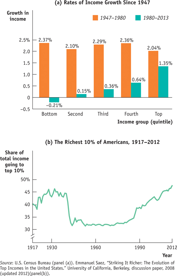
After 1980, however, incomes grew much more quickly at the top than in the middle, and more quickly in the middle than at the bottom. So inequality has increased substantially since 1980. Overall, inflation-
Although detailed data on income distribution aren’t available before 1947, economists have instead used other information like income tax data to estimate the share of income going to the top 10% of the population all the way back to 1917. Panel (b) of Figure 18-3 shows this measure from 1917 to 2012. These data, like the more detailed data available since 1947, show that American inequality was more or less stable between 1947 and the late 1970s but has risen substantially since.
The longer-
The Great Compression roughly coincided with World War II, a period during which the U.S. government imposed special controls on wages and prices. Evidence indicates that these controls were applied in ways that reduced inequality—
Since the 1970s, as we’ve already seen, inequality has increased substantially. In fact, pre-
There is intense debate among economists about the causes of this widening inequality. The most popular explanation is rapid technological change, which has increased the demand for highly skilled or talented workers more rapidly than the demand for other workers, leading to a rise in the wage gap between the highly skilled and other workers. Growing international trade may also have contributed by allowing the United States to import labor-
All these explanations, however, fail to account for one key feature: much of the rise in inequality doesn’t reflect a rising gap between highly educated workers and those with less education but rather growing differences among highly educated workers themselves. For example, schoolteachers and top business executives have similarly high levels of education, but executive paychecks have risen dramatically and teachers’ salaries have not. For some reason, a few “superstars”—a group that includes literal superstars in the entertainment world but also such groups as Wall Street traders and top corporate executives—
Quick Review
Welfare state programs, which include government transfers, absorb a large share of government spending in wealthy countries.
The ability-
to- pay principle explains one rationale for the welfare state: alleviating income inequality. Poverty programs do this by aiding the poor. Social insurance programs address the second rationale: alleviating economic insecurity. The external benefits to society of poverty reduction and access to health care, especially for children, is a third rationale for the welfare state. The official U.S. poverty threshold is adjusted yearly to reflect changes in the cost of living but not in the average standard of living. But even though average income has risen significantly, the U.S. poverty rate is no lower than it was 30 years ago.
The causes of poverty can include lack of education, the legacy of racial and gender discrimination, and bad luck. The consequences of poverty are dire for children.
Median household income is a better indicator of typical household income than mean household income. Comparisons of Gini coefficients across countries shows that the United States has less income inequality than poor countries but more than all other rich countries.
The United States has seen declining and increasing income inequality. Since 1980, income inequality has increased substantially, largely due to increased inequality among highly educated workers.
18-1
Question 18.1
Indicate whether each of the following programs is a poverty program or a social insurance program.
A pension guarantee program, which provides pensions for retirees if they have lost their employment-
based pension due to their employer’s bankruptcy The federal program known as SCHIP, which provides health care for children in families that are above the poverty threshold but still have relatively low income
The Section 8 housing program, which provides housing subsidies for low-
income households The federal flood program, which provides financial help to communities hit by major floods
Question 18.2
Recall that the poverty threshold is not adjusted to reflect changes in the standard of living. As a result, is the poverty threshold a relative or an absolute measure of poverty? That is, does it define poverty according to how poor someone is relative to others or according to some fixed measure that doesn’t change over time? Explain.
Question 18.3
The accompanying table gives the distribution of income for a very small economy.
Income
Sephora
$39,000
Kelly
17,500
Raul
900,000
Vijay
15,000
Oskar
28,000
What is the mean income? What is the median income? Which measure is more representative of the income of the average person in the economy? Why?
What income range defines the first quintile? The third quintile?
Question 18.4
Which of the following statements more accurately reflects the principal source of rising inequality in the United States today?
The salary of the manager of the local branch of Sunrise Bank has risen relative to the salary of the neighborhood gas station attendant.
The salary of the CEO of Sunrise Bank has risen relative to the salary of the local branch bank manager, although the two have similar education levels.
Solutions appear at back of book.