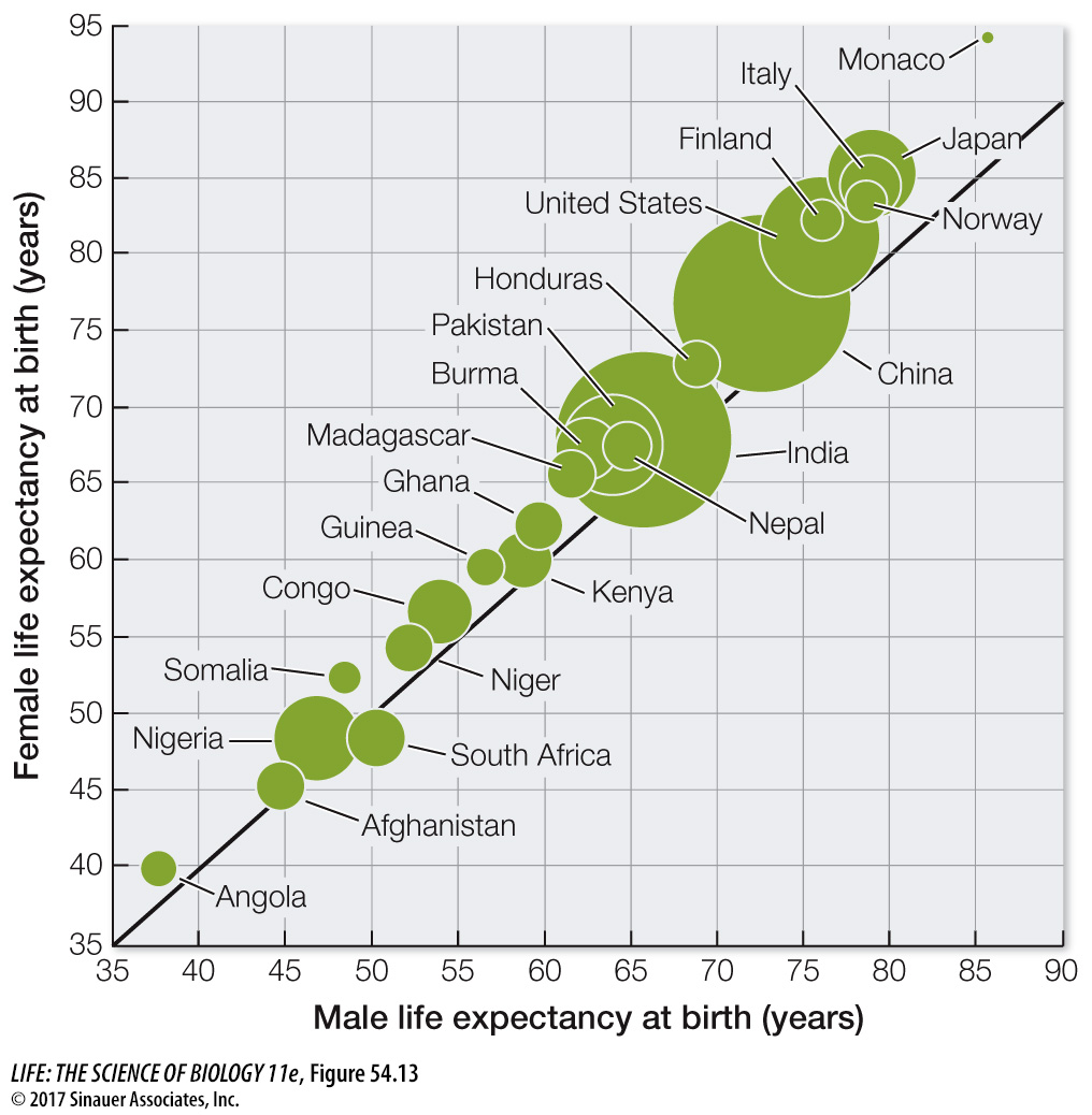
Figure 54.13 Human Life Expectancy around the World Comparison of male and female life expectancy at birth for a variety of countries in 2016. The solid black line corresponds to equal female and male life expectancy. The sizes of the bubbles are linearly proportional to the population of the country.