Step 3: Organize and Visualize the Data
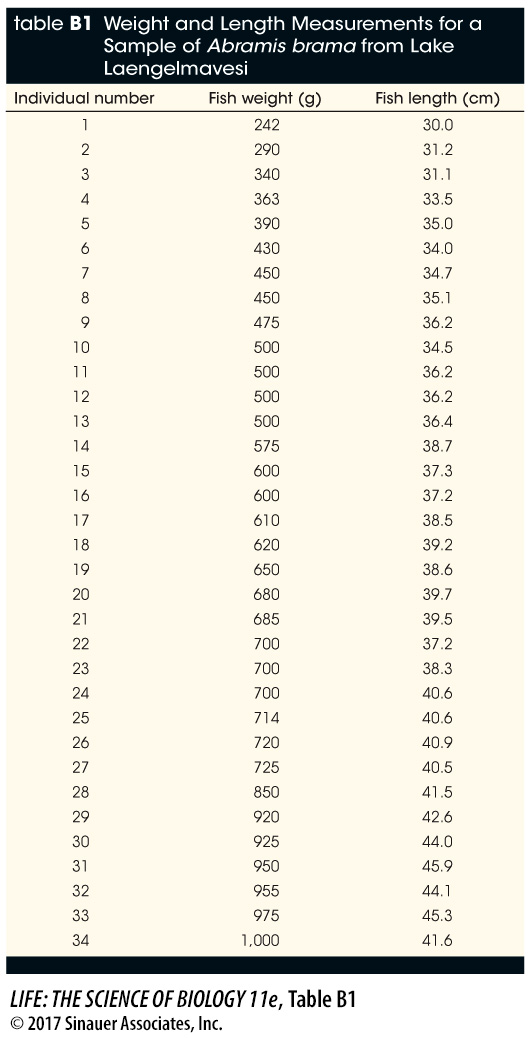
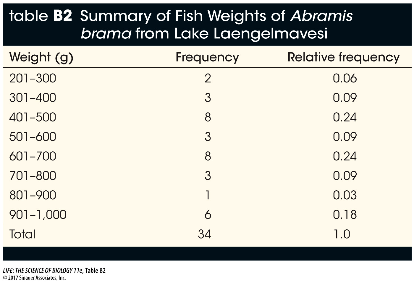
Your data consist of a series of values of the variable or variables of interest, each from a separate observation. For example, Table B1 shows the weight and length of 34 fish (Abramis brama) from Lake Laengelmavesi in Finland. From this list of numbers, it’s hard to get a sense of how big the fish in the lake are, or how variable they are in size. It’s much easier to gain intuition about your data if you organize them. One way to do this is to group (or bin) your data into classes, and count up the number of observations that fall into each class. The result is a frequency distribution. Table B2 shows the fish weight data as a frequency distribution. For each 100-
1280
Media Clip B1 Interpreting Frequency Distributions
www.life11e.com/
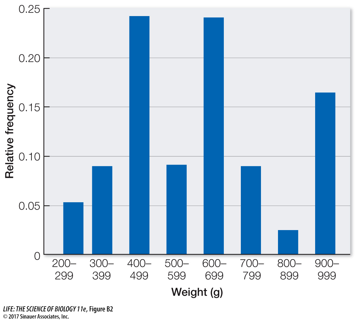
It is even easier to visualize the frequency distribution of fish weights if we graph them in the form of a histogram such as the one in Figure B2. When grouping quantitative data, it is necessary to decide how many classes to include. It is often useful to look at multiple histograms before deciding which grouping offers the best representation of the data.
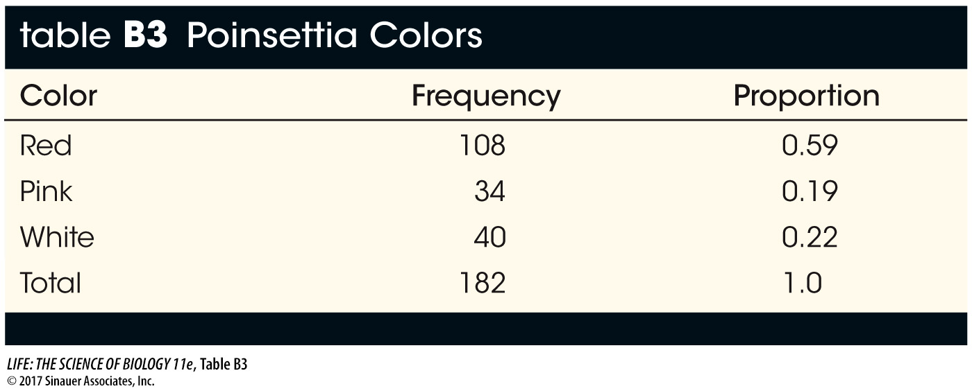
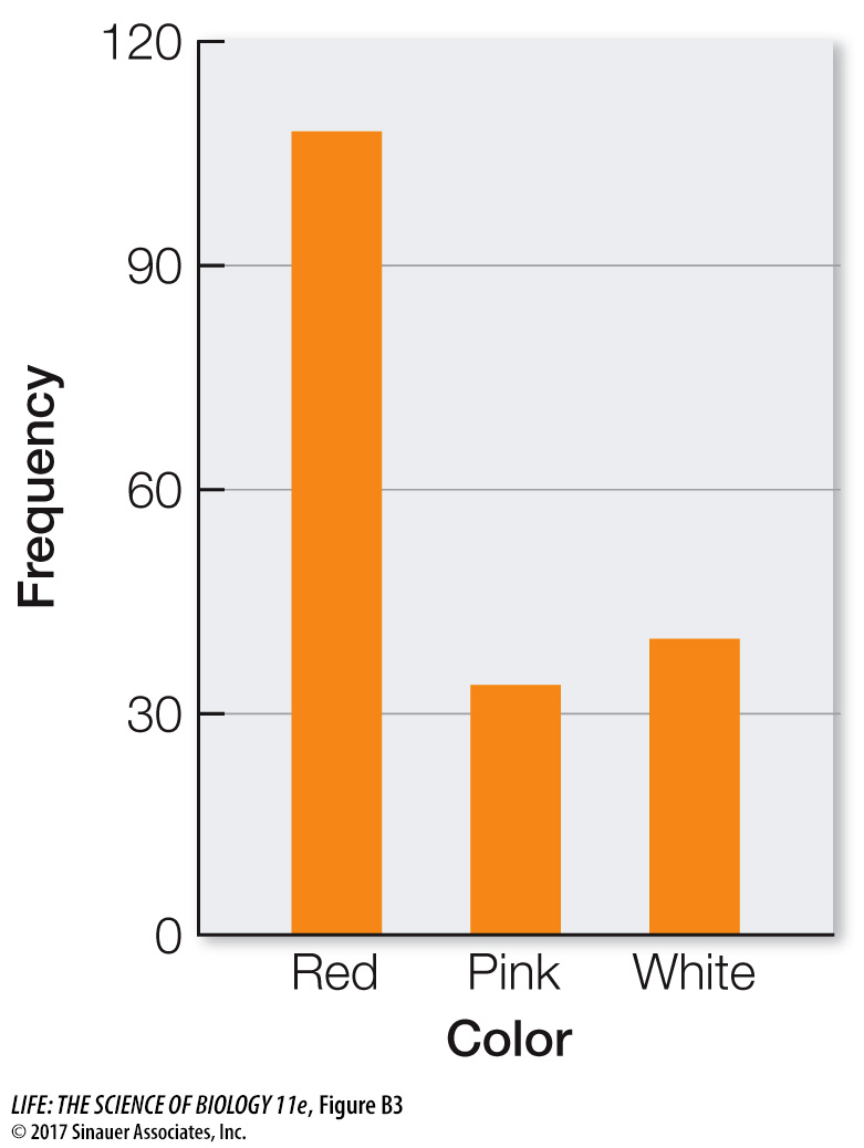
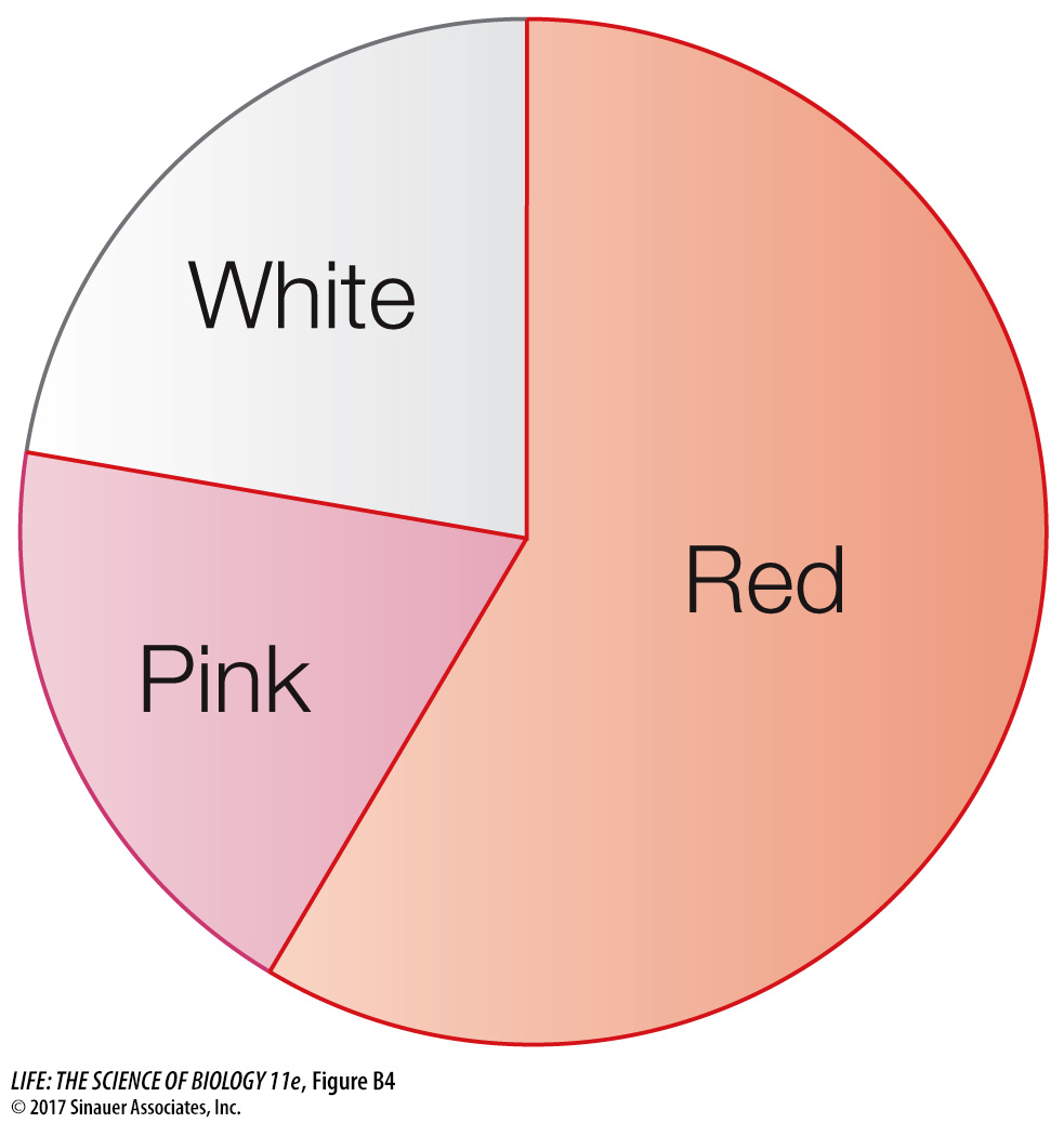
Frequency distributions are also useful ways of summarizing categorical data. Table B3 shows a frequency distribution of the colors of 182 poinsettia plants (red, pink, or white) resulting from an experimental cross between two parent plants. Notice that, as with the fish example, the table is a much more compact way to present the data than a list of 182 color observations would be. For categorical data, the possible values of the variable are the categories themselves, and the frequencies are the number of observations in each category. We can visualize frequency distributions of categorical data like this by constructing a bar chart. The heights of the bars indicate the number of observations in each category (Figure B3). Another way to display the same data is in a pie chart, which shows the proportion of each category represented like pieces of a pie (Figure B4).
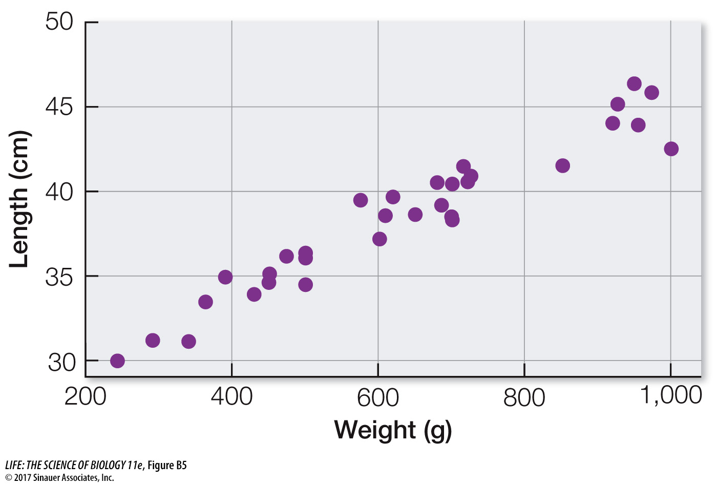
Sometimes we wish to compare two quantitative variables. For example, the researchers at Lake Laengelmavesi investigated the relationship between fish weight and length, from the data presented in Table B1. We can visualize this relationship using a scatter plot, in which the combination of the weight and length of each fish is represented as a single point (Figure B5). These two variables have a positive relationship since the slope of a line drawn through the points is positive. As the length of a fish increases, its weight tends to increase in an approximately linear manner.
Tables and graphs are critical to interpreting and communicating data, and thus should be as self-