Step 4: Summarize the Data
1281
A statistic is a numerical quantity calculated from data, whereas descriptive statistics are quantities that describe general patterns in data. Descriptive statistics allow us to make straightforward comparisons among different data sets and concisely communicate basic features of our data.
DESCRIBING CATEGORICAL DATA For categorical variables, we typically use proportions to describe our data. That is, we construct tables containing the proportions of observations in each category. For example, the third column in Table B3 provides the proportions of poinsettia plants in each color category, and the pie chart in Figure B4 provides a visual representation of those proportions.
DESCRIBING QUANTITATIVE DATA For quantitative data, we often start by calculating measures of center, quantities that roughly tell us where the center of our data lies. There are three commonly used measures of center:
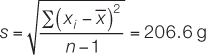
The mean, or average value, of our sample is simply the sum of all the values in the sample divided by the number of observations in our sample (Figure B6).
The median is the value at which there are equal numbers of smaller and larger observations.
The mode is the most frequent value in the sample.
research tools
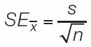
Figure B6 Descriptive Statistics for Quantitative Data Below are the equations used to calculate the descriptive statistics we discuss in this appendix. You can calculate these statistics yourself, or use free internet resources to help you make your calculations.
Notation:
x1, x2, x3, . . .xn are the n observations of variable X in the sample.
is the sum of all of the observations. (The Greek letter sigma, Σ, is used to denote “sum of.”)
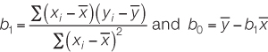
In regression, the independent variable is X, and the dependent variable is Y. b0 is the vertical intercept of a regression line. b1 is the slope of a regression line.
Equations
1. Mean:

2. Standard deviation:
3. Correlation coefficient:
4. Least-
where
5. Standard error of the mean:
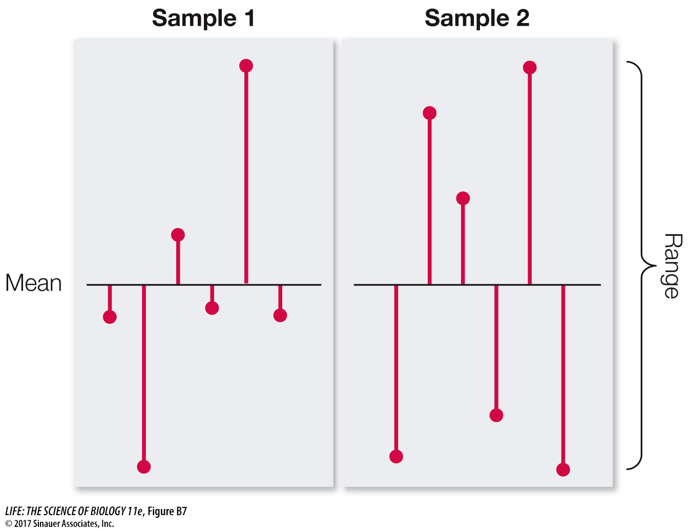
It is often just as important to quantify the variation in the data as it is to calculate its center. There are several statistics that tell us how much the values differ from one another. We call these measures of dispersion. The easiest one to understand and calculate is the range, which is simply the largest value in the sample minus the smallest value. The most commonly used measure of dispersion is the standard deviation, which calculates the extent to which the data are spread out from the mean. A deviation is the difference between an observation and the mean of the sample. The standard deviation is a measure of how far the average observation in the sample is from the sample mean. Two samples can have the same range, but very different standard deviations if observations in one are clustered closer to the mean than in the other. In Figure B7, for example, sample 1 has a smaller standard deviation than does sample 2, even though the two samples have the same means and ranges.
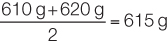
To demonstrate these descriptive statistics, let’s return to the Lake Laengelmavesi study (see the data in Table B1). The mean weight of the 34 fish (see equation 1 in Figure B6) is:

Since there is an even number of observations in the sample, then the median weight is the value halfway between the two middle values:
The mode of the sample is 500 g, which appears four times. The standard deviation (see equation 2 in Figure B6) is:
and the range is 1,000 g – 242 g = 758 g.
1282
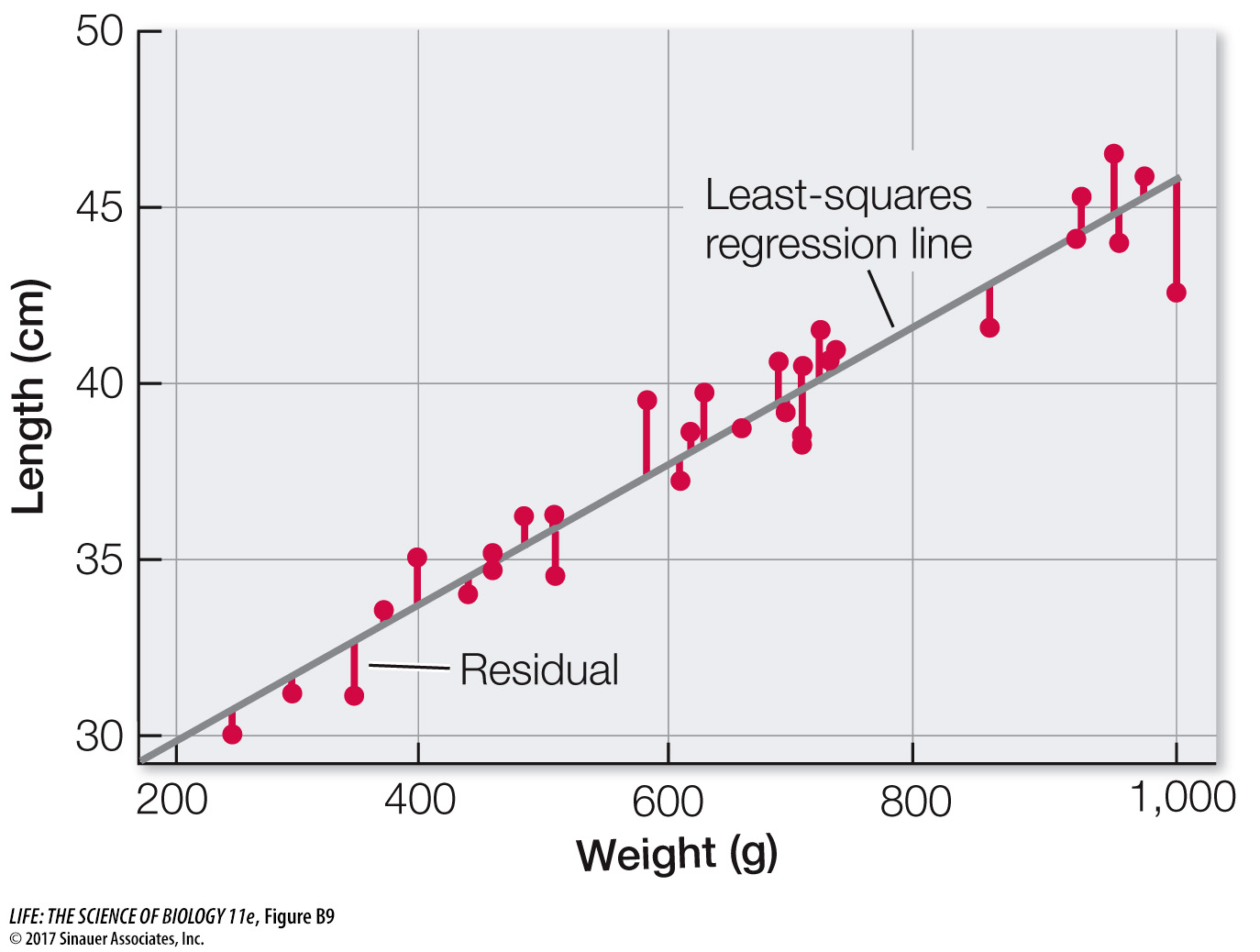
DESCRIBING THE RELATIONSHIP BETWEEN TWO QUANTITATIVE VARIABLES Biologists are often interested in understanding the relationship between two different quantitative variables: How does the height of an organism relate to its weight? How does air pollution relate to the prevalence of asthma? How does lichen abundance relate to levels of air pollution? Recall that scatter plots visually represent such relationships.
We can quantify the strength of the relationship between two quantitative variables using a single value called the Pearson product–
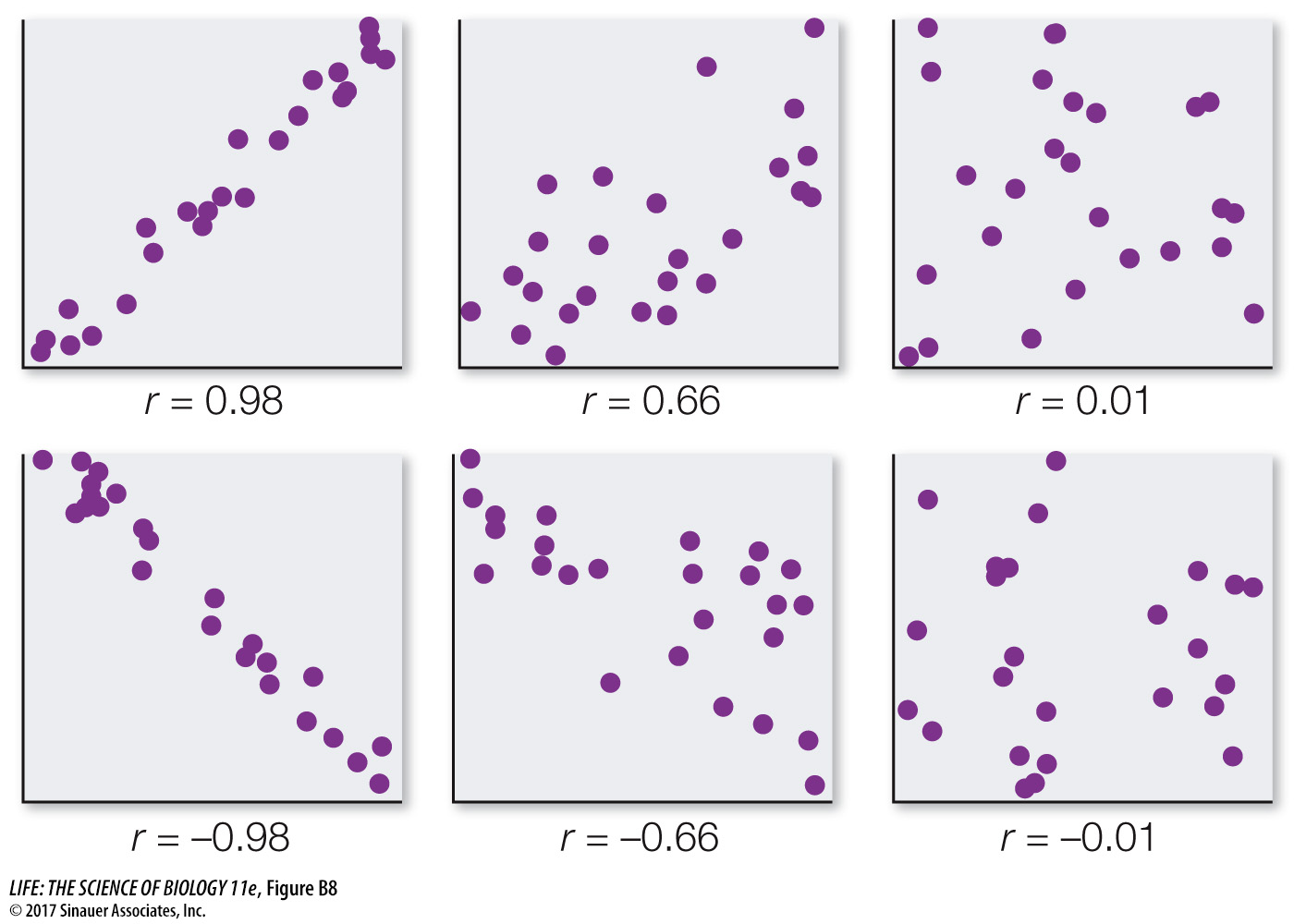
One must always keep in mind that correlation does not mean causation. Two variables can be closely related without one causing the other. For example, the number of cavities in a child’s mouth correlates positively with the size of his or her feet. Clearly cavities do not enhance foot growth; nor does foot growth cause tooth decay. Instead the correlation exists because both quantities tend to increase with age.
Intuitively, the straight line that tracks the cluster of points on a scatter plot tells us something about the typical relationship between the two variables. Statisticians do not, however, simply eyeball the data and draw a line by hand. They often use a method called least-