FIGURE 4-1
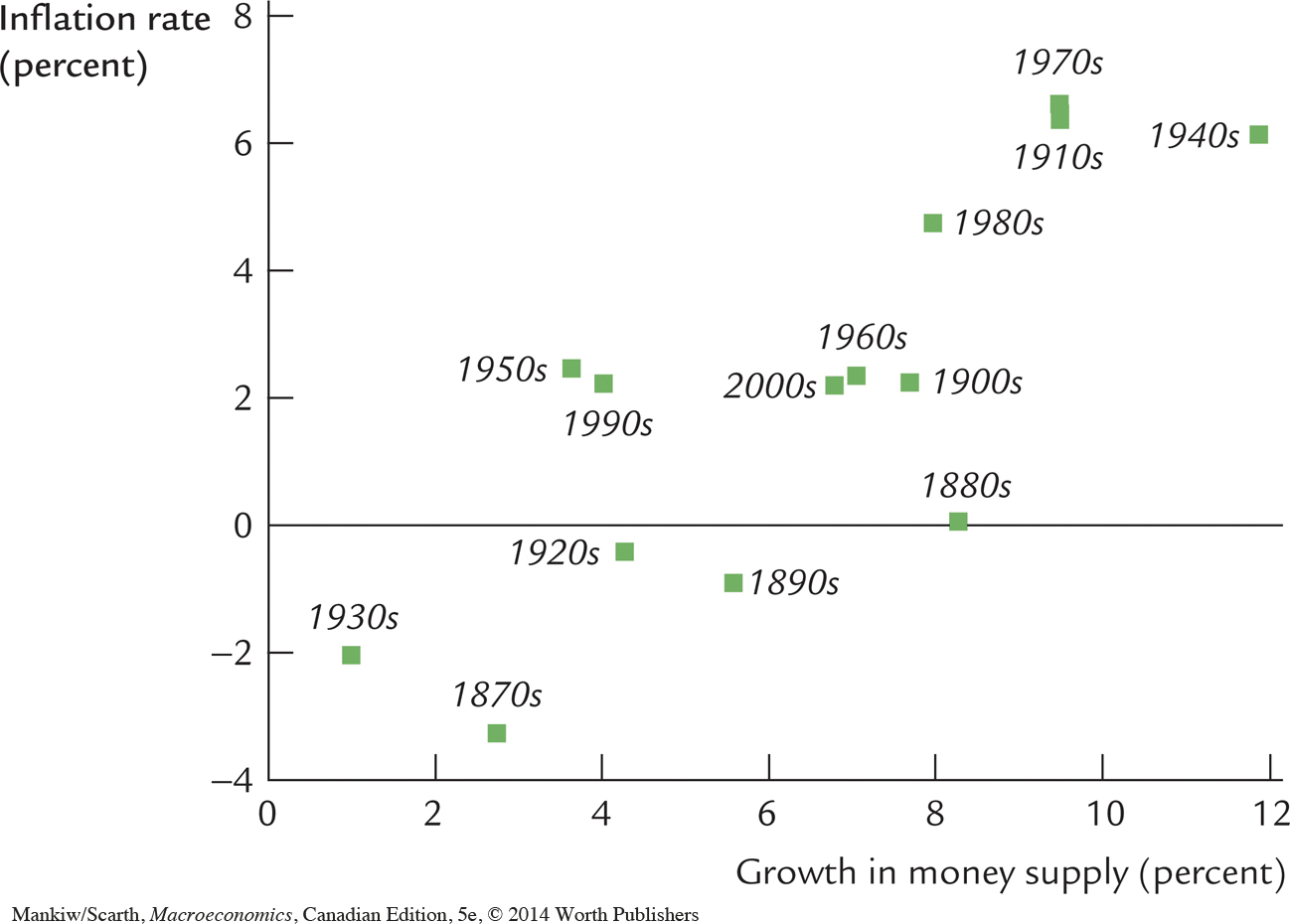 Historical Data on U.S. Inflation and Money Growth In this scatterplot of money growth and inflation, each point represents a decade. The horizontal axis shows the average growth in the money supply (as measured by M2) over the decade, and the vertical axis shows the average rate of inflation (as measured by the GDP deflator). The positive correlation between money growth and inflation is evidence for the quantity theory’s prediction that high money growth leads to high inflation.
Source: For the data through the 1960s: Milton Friedman and Anna J. Schwartz, Monetary Trends in the United States and the United Kingdom: Their Relation to Income, Prices, and Interest Rates 1867–1975 (Chicago: University of Chicago Press, 1982). For recent data: U.S. Department of Commerce, Federal Reserve Board. The data point for the 2000s includes only the first half of the decade.