FIGURE 5-14
 Inflation Differentials and the Exchange Rate This scatterplot shows the relationship between inflation and the nominal exchange rate. The horizontal axis shows the country’s average inflation rate minus the U.S. average inflation rate over the period 1972–2007. The vertical axis is the average percentage change in the country’s exchange rate (per U.S. dollar) over that period. This figure shows that countries with relatively high inflation tend to have depreciating currencies, and that countries with relatively low inflation tend to have appreciating currencies.
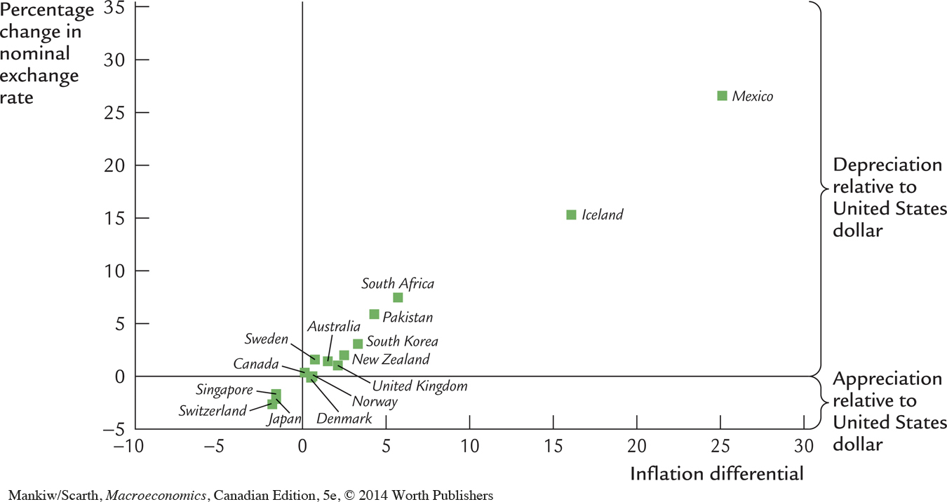
 Source: International Monetary Fund.