4.1 Describing Data
4-
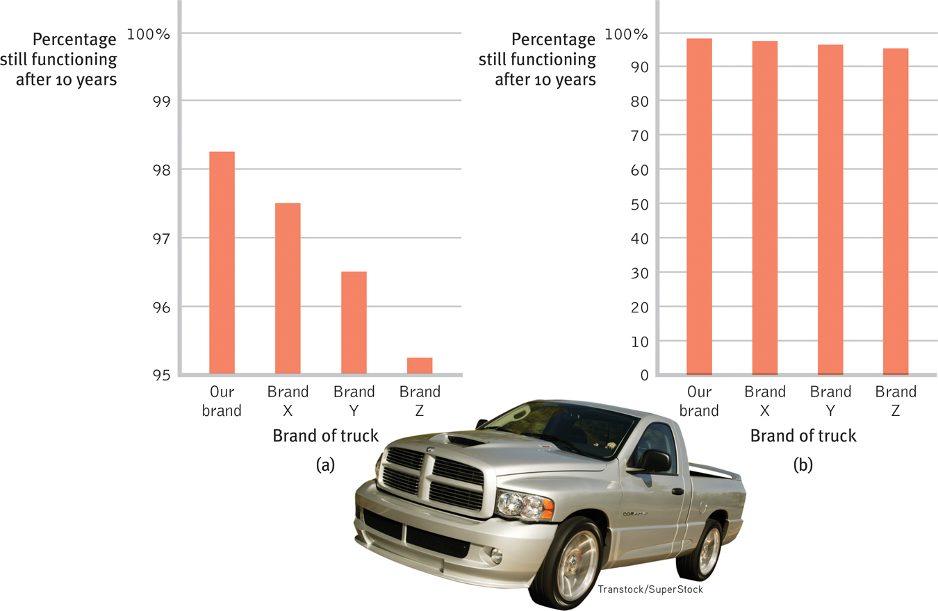
Once researchers have gathered their data, they may use descriptive statistics to organize that data meaningfully. One way to do this is to convert the data into a simple bar graph, as in FIGURE 4.1, which displays a distribution of different brands of trucks still on the road after a decade. When reading statistical graphs such as this, take care. It’s easy to design a graph to make a difference look big (Figure 4.1a) or small (Figure 4.1b). The secret lies in how you label the vertical scale (the y-axis).
RETRIEVAL PRACTICE
Read the scale labels
- An American truck manufacturer offered graph (a)—with actual brand names included—to suggest the much greater durability of its trucks. What does graph (b) make clear about the varying durability, and how is this accomplished?
Note how the y-axis of each graph is labeled. The range for the y-axis label in graph (a) is only from 95 to 100. The range for graph (b) is from 0 to 100. All the trucks rank as 95% and up, so almost all are still functioning after 10 years, which graph (b) makes clear.
The point to remember: Think smart. When viewing graphs, read the scale labels and note their range.
Measures of Central Tendency
The next step is to summarize the data using some measure of central tendency, a single score that represents a whole set of scores. The simplest measure is the mode, the most frequently occurring score or scores. The most familiar is the mean, or arithmetic average—
Measures of central tendency neatly summarize data. But consider what happens to the mean when a distribution is lopsided, when it’s skewed by a few way-
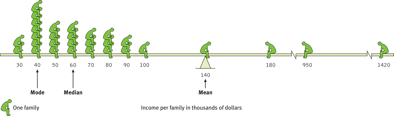
A skewed distribution This graphic representation of the distribution of a village’s incomes illustrates the three measures of central tendency—
44
The average person has one ovary and one testicle.
The point to remember: Always note which measure of central tendency is reported. If it is a mean, consider whether a few atypical scores could be distorting it.
Measures of Variation
Knowing the value of an appropriate measure of central tendency can tell us a great deal. But the single number omits other information. It helps to know something about the amount of variation in the data—
45
The range of scores—
The more useful standard for measuring how much scores deviate from one another is the standard deviation. It better gauges whether scores are packed together or dispersed, because it uses information from each score. The computation (see TABLE 4.1 for an example) assembles information about how much individual scores differ from the mean. If your college or university attracts students of a certain ability level, their intelligence scores will have a relatively small standard deviation compared with the more diverse community population outside your school.
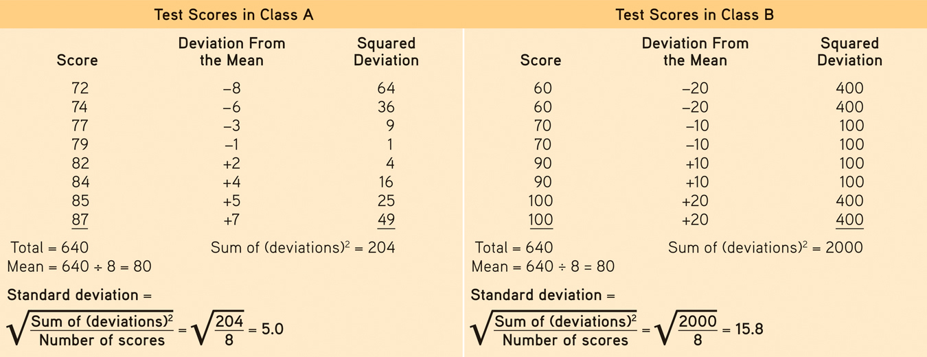
Standard Deviation Is Much More Informative Than Mean Alone
Note that the test scores in Class A and Class B have the same mean (80), but very different standard deviations, which tell us more about how the students in each class are really faring.
You can grasp the meaning of the standard deviation if you consider how scores tend to be distributed in nature. Large numbers of data—
As FIGURE 4.3 shows, a useful property of the normal curve is that roughly 68 percent of the cases fall within one standard deviation on either side of the mean. About 95 percent of cases fall within two standard deviations. Thus, about 68 percent of any group of people taking an intelligence test will score within ±15 points of 100. About 95 percent will score within ±30 points.
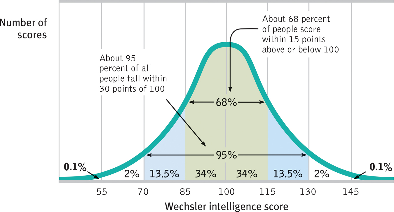
The normal curve Scores on aptitude tests tend to form a normal, or bell-
46
 For an interactive tutorial on these statistical concepts, visit LaunchPad’s PsychSim 6: Descriptive Statistics.
RETRIEVAL PRACTICE
- The average of a distribution of scores is the ___________. The score that shows up most often is the __________. The score right in the middle of a distribution (half the scores above it; half below) is the ___________. We determine how much scores vary around the average in a way that includes information about the __________ of scores (difference between highest and lowest) by using the __________ __________ formula.
mean; mode; median; range; standard deviation