22.1 BUILDING BETTER GRAPHS USING EXCEL

BUILDING BETTER GRAPHS USING EXCEL
G-
In terms of default settings, there is no graphing software that adheres specifically to all of the APA guidelines; however, you can learn to use software to adapt the default graph into a clear and useful visualization of data. For example, Microsoft Excel is a program that is used in many settings to create graphs. Like other graphing software, Excel software changes with every application revision, so you might encounter slight variations from the instructions that follow.
This Appendix Demonstrates how to create a simple, clean-
Remember, the purpose of a graph is to let the data speak. You can introduce insight (rather than confusion) into an Excel graph by following the specific dos and don’ts in Chapter 3. In APA style, various kinds of visual displays of data are all referred to as “Figures.” For example, Figure G-1 displays two nominal independent variables and one scale dependent variable in a spreadsheet that Excel refers to as a “workbook.”
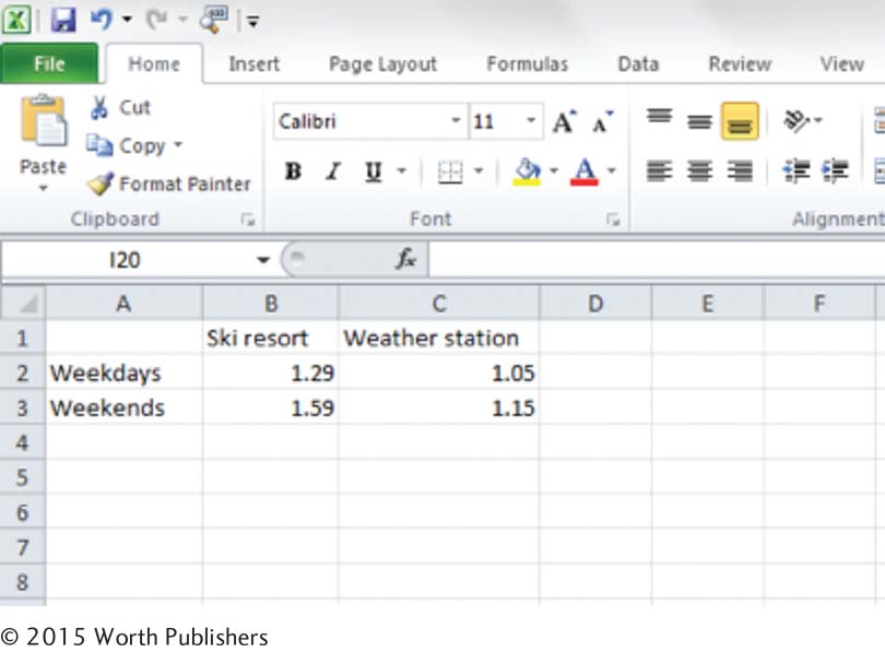
Step 1. Identify the independent and dependent variables, and determine which type of observation each is. In the snowfall example, the dependent variable is a scale variable, and the independent variables are nominal variables. Specifically, snowfall in inches is the scale dependent variable; the source of the snow report (levels: ski resort, weather station) is a nominal independent variable; and time of the week (levels: weekdays, weekends) is a second independent variable. (Think of these particular independent variables as predictor variables because they cannot be manipulated by the experimenter.)
Step 2. Enter the summary data (the averages of the dependent variable within each cell) in the Excel spreadsheet, as shown in Figure G-2. Then highlight the data and labels, and select the type of figure you want to create. To do this, click “Insert,” “Column,” and under “2-
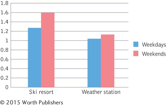
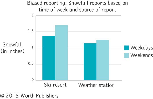
Step 3. Change the defaults so that the graph adheres to the graphing checklist from Chapter 3. If you click on the graph and then look at “Chart Tools” along the top of the Excel toolbar, you’ll see a number of options for changing the graph. We modified the chart by using the tools in the “Layout” menu and by entering information directly into the text boxes that are part of the chart. For instance, in Step 2, we had selected a chart that included a title; we then put the cursor in the title box and retitled the chart to what you can see in Figure G-3 is “Biased reporting: Snowfall reports based on time of week and source of report.” We then used the “Horizontal Title” option in the “Axis Titles” menu to add the y-axis label—
G-
We right-
Know your audience. A figure designed for submission to a scholarly journal will look a little different than a PowerPoint presentation to a class, just as a presentation at a sales meeting will look different than a research report submitted to your boss. Focus on clarity rather than gimmicks. Remember: Let the data speak.