14.5 SPSS®
The most common form of regression analysis in SPSS uses at least two scale variables: an independent variable (predictor) and a dependent variable (the variable being predicted). Let’s use the number of absences and exam grade data as an example. Once again, begin by visualizing the data.
Request the scatterplot of the data by selecting: Graphs → Chart Builder → Gallery → Scatter/Dot. Drag the upper-
To analyze the linear regression, select: Analyze → Regression → Linear. Select “absences” as the independent (predictor) variable and “grade” as the dependent variable being predicted.
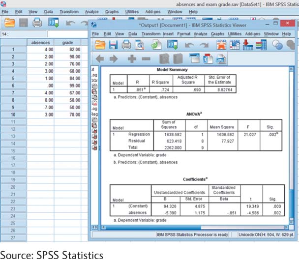
As usual, click on “OK” to see the Output screen. Part of the output is shown in the screenshot here. In the box titled “Model Summary,” we can see the correlation coefficient of .851 under “R” and the proportionate reduction of error, .724, under “R Square.” In the box titled “Coefficients,” we can look in the first column under “B” to determine the regression equation. The intercept, 94.326, is across from “(Constant),” and the slope, –5.390, is across from “Number of Absences.” (Any slight differences from the numbers we calculated earlier are due to rounding decisions.)