3.1 How to Lie with Visual Statistics
Teaching students how to lie may sound like an odd way to teach statistics, but spotting visual tricks can be empowering. We are indebted to Michael Friendly of ?York University in Toronto for collecting and managing a Web site (http:/
Graphs That Lie
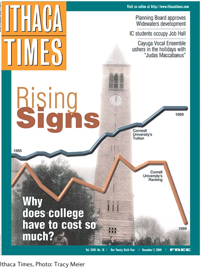
Michael Friendly describes this graph as a “spectacular example of more graphical sins than I have ever seen in one image” and possibly “the most misleading graph ever published.”
“The Most Misleading Graph Ever Published”
49
The Ithaca Times graph in Figure 3-2 appears to answer a simple question: “Why does college have to cost so much?” This graph is chock full of lies.
Lie 1: The two lines cover different periods of time. The rising line represents rising tuition costs over 35 years; the falling line represents the ranking of Cornell University over only 11 years.
Lie 2: The y-axis compares an ordinal observation (university rank) to a scale observation (tuition). These should be two different graphs.
Lie 3: Cornell’s rank arbitrarily begins at a lower point on the y-axis than tuition costs, suggesting that an institution already failing to deliver what students are paying for has become dramatically worse.
Lie 4: The graph reverses the implied meaning of up and down. A low number in the world of rankings is a good thing. Over this 11-
Techniques for Misleading with Graphs
When you learn a few statistical tricks, you will immediately become a much more critical—
The biased scale lie. New York magazine’s (see http:/
/nymag.com) reviewers use five stars to indicate that a restaurant’s food, service, and ambience are “ethereal; almost perfect”; three stars means “generally excellent”; one means “good.” So zero stars must mean bad, right? Wrong. Zero “means our critics don’t recommend you go out of your way to eat there.” Apparently, you can’t buy a bad meal in New York City if a New York magazine reviewer has eaten there. The sneaky sample lie. You might pick up some useful information from Web sites that rate professors, but be cautious. The students most likely to supply ratings are those who strongly dislike or strongly approve of a particular professor. A self-
selected sample means that the information might not apply to you. The interpolation lie. Interpolation involves assuming that some value between the data points lies on a straight line between those data points. For example, Statistics Canada reported that in 2006, Canada had its lowest rate of break-
ins (property crime) since the 1970s (Figure 3-3), but you cannot assume a gradual decline over 30 years. In the years leading up to 1991, there was a dramatic increase in property crime. Make sure that a reasonable number of in- between data points have been reported. 51
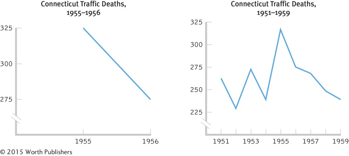
The extrapolation lie. This lie assumes that values beyond the data points will continue indefinitely. In 1976, The Complete CB Handbook assumed that elementary schools would soon have to teach students how to communicate with CB radios, their popularity then growing exponentially. They are now used mostly by long-
distance truckers. What happened? Mobile phones. Do not assume that a pattern will continue indefinitely. The inaccurate values lie. This lie tells the truth in one part of the data but visually distorts it in another place. Notice in Figure 3-4 how wide the “highway” is when the accelerating fuel-
economy savings is coming at the viewer. The proportional change in distance between the beginning and the end of the highway is many times larger than the proportional change in the size of the data.
MASTERING THE CONCEPT
3-
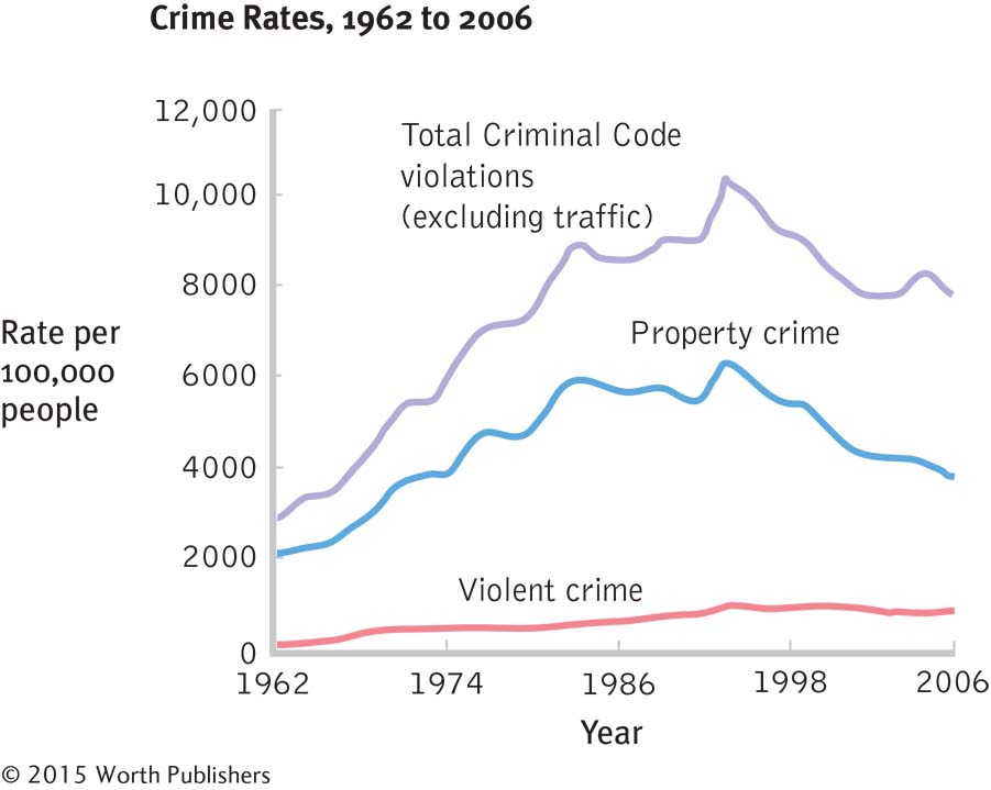
The Perils of Interpolation
Without seeing all of the data, it is easy to draw false conclusions. Although Canada’s property crime rate declined from the late 1970s through 2006, there was a peak in the middle, around 1991. If we saw only the data points for the 1970s and 2006, we might falsely conclude that there was a gradual decline during this time. You can search http:/
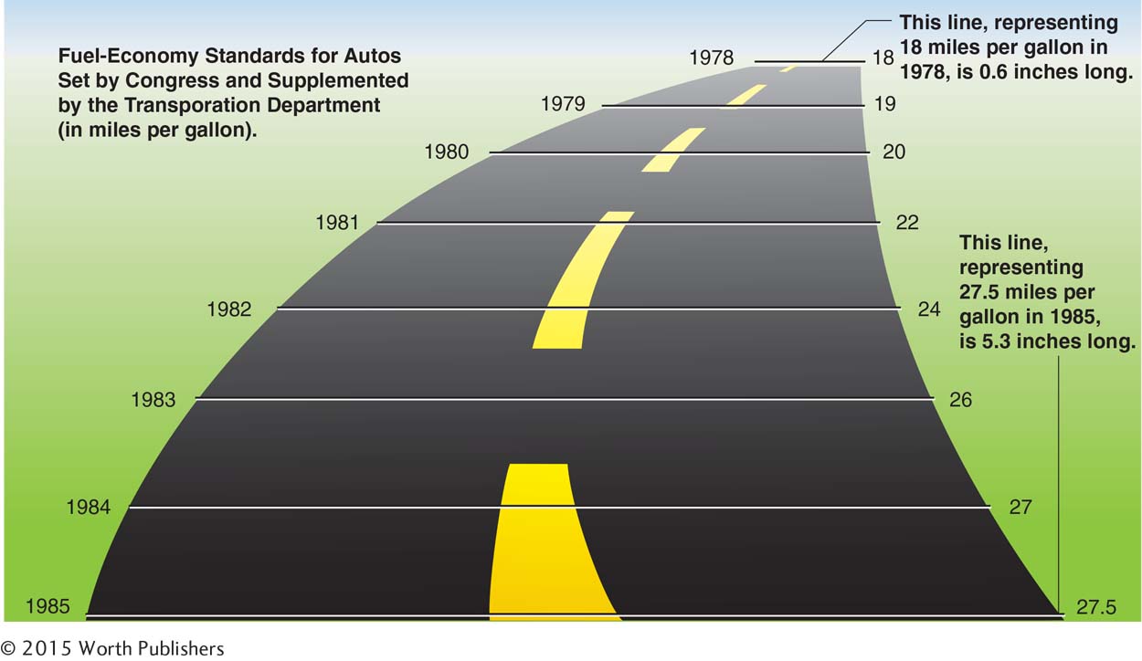
The Inaccurate Values Lie
The visual lie told here is the result of a “highway” that spreads much farther apart than the data indicate. Michael Friendly (2005) says that “this graph, from the New York Times, purports to show the mandated fuel economy standards set by the US Department of Transportation. The standard required an increase in mileage from 18 to 27.5, an increase of 53%. The magnitude of increase shown in the graph is 783%, for a whopping lie factor = (783/53) = 14.8!”
CHECK YOUR LEARNING
| Reviewing the Concepts |
|
|
| Clarifying the Concepts | 3- |
What is the purpose of a graph? |
| Calculating the Statistics | 3- |
Referring to Figure 3-4, the inaccurate values lie, calculate how much fuel- |
| Applying the Concepts | 3- |
Which of the two following graphs is misleading? Which seems to be a more accurate depiction of the data? Explain your answer. |
Solutions to these Check Your Learning questions can be found in Appendix D.