SPSS®
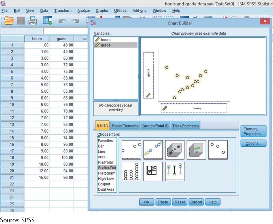
We can request visual displays of data from both the “Data View” screen and the “Variable View” screen. Most graphing is done in SPSS using the Chart Builder. This section walks you through the general steps to create a graph, using a scatterplot as an example. But first, enter the data in the screenshot for hours spent studying and exam grades that were used to create the scatterplot in Figure 3-5. You can see the data here in the screenshot.
Select Graphs → Chart Builder → Gallery. Under “Choose from” select the type of graph by clicking on it. For example, to create a scatterplot, click on “Scatter/Dot.” Drag a sample graph from the right to the large box above. Usually you’ll want the simplest graph, which tends to be the upper-
Drag the appropriate variables from the “Variables” box to the appropriate places on the sample graph (e.g., “x-axis”). For a scatterplot, drag “hours” to the x-axis and “grade” to the y-axis. Chart Builder then looks like the screenshot shown here. Click OK; SPSS then creates the graph.
Remember: You should not rely on the default choices of the software; you are the designer of the graph. Once the graph is created, you can change its appearance by double-
66