Exercises
Clarifying the Concepts
Question 3.1
| 3.1 |
What are the five techniques discussed in this chapter for misleading with graphs? |
Question 3.2
| 3.2 |
What are the steps to create a scatterplot? |
Question 3.3
| 3.3 |
How can you convert a scatterplot into a range- |
Question 3.4
| 3.4 |
What does it mean for two variables to be linearly related? |
Question 3.5
| 3.5 |
How can we tell whether two variables are linearly or nonlinearly related? |
Question 3.6
| 3.6 |
What is the difference between a line graph and a time plot? |
Question 3.7
| 3.7 |
What is the difference between a bar graph and a Pareto chart? |
Question 3.8
| 3.8 |
Bar graphs and histograms look very similar. In your own words, what is the difference between the two? |
Question 3.9
| 3.9 |
What are pictorial graphs and pie charts? |
Question 3.10
| 3.10 |
Why are bar graphs preferred over pictorial graphs and pie charts? |
Question 3.11
| 3.11 |
Why is it important to identify the independent variable and the dependent variable before creating a visual display? |
Question 3.12
| 3.12 |
Under what circumstances would the x-axis and y-axis not start at 0? |
Question 3.13
| 3.13 |
Chartjunk comes in many forms. What specifically are moiré vibrations, grids, and ducks? |
Question 3.14
| 3.14 |
Geographic information systems (GIS), such as those provided by computerized graphing technologies, are particularly powerful tools for answering what kinds of research questions? |
Question 3.15
| 3.15 |
How is a bubble graph similar to a traditional scatterplot? |
Question 3.16
| 3.16 |
How does a bubble graph differ from a traditional scatterplot? |
Calculating the Statistics
Question 3.17
| 3.17 |
Alumni giving rates, calculated as the total dollars donated per year from 2006 to 2016, represent which kind of variable— |
Question 3.18
| 3.18 |
Alumni giving rates for a number of universities, calculated as the number of alumni who donated and the number who did not donate in a given year, represent which kind of variable— |
Question 3.19
| 3.19 |
You are exploring the relation between gender and video game performance, as measured by final scores on a game.
|
69
Question 3.20
| 3.20 |
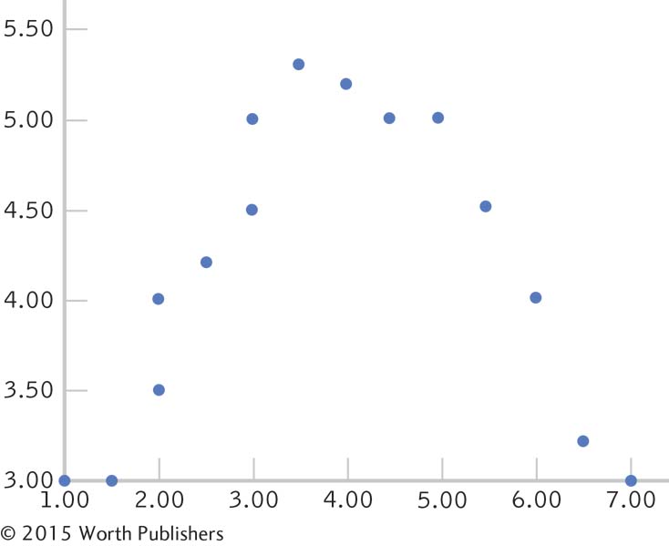
Do the data in the graph below show a linear relation, a nonlinear relation, or no relation? Explain. |
Question 3.21
| 3.21 |
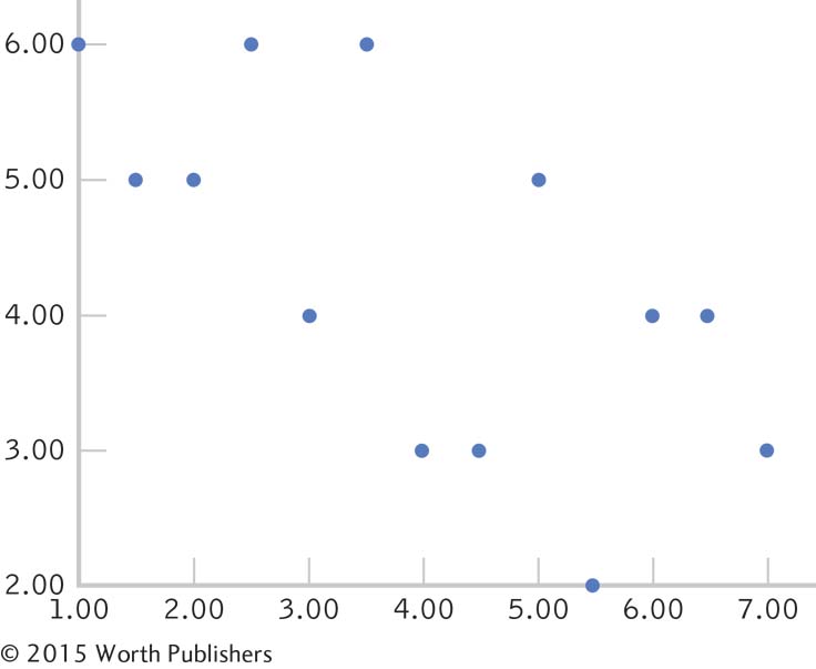
Do the data in the graph below show a linear relation, a nonlinear relation, or no relation? Explain. |
Question 3.22
| 3.22 |
What elements are missing from the graphs in Exercises 3.20 and 3.21? |
Question 3.23
| 3.23 |
The following figure presents the enrollment of graduate students at a university, across six fall terms, as a percentage of the total student population. |
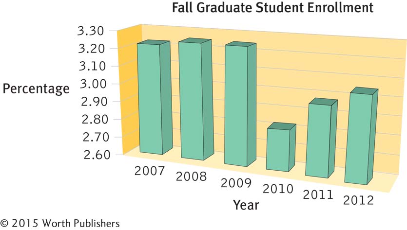
What kind of visual display is this?
What other type of visual display could have been used?
What is missing from the axes?
What chartjunk is present?
Using this graph, estimate graduate student enrollment, as a percentage of the total student population, in the fall terms of 2007, 2008, and 2010.
How would the comparisons between bars change if the y-axis started at 0?
Question 3.24
| 3.24 |
When creating a graph, we need to make a decision about the numbering of the axes. If you had the following range of data for one variable, how might you label the relevant axis? |
| 337 | 280 | 279 | 311 | 294 | 301 | 342 | 273 |
Question 3.25
| 3.25 |
If you had the following range of data for one variable, how might you label the relevant axis? |
| 0.10 | 0.31 | 0.27 | 0.04 | 0.09 | 0.22 | 0.36 | 0.18 |
Question 3.26
| 3.26 |
The scatterplot in How It Works 3.1 depicts the relation between fertility and life expectancy. Each dot represents a country (or, as in the case of Hong Kong, a special administrative region).
|
Question 3.27
| 3.27 |
Based on the data in the bubble graph in Figure 3-18, what is the relation between physical health and positive emotions? |
Question 3.28
| 3.28 |
The colors and sizes of the bubbles in the bubble graph in Figure 3-18 represent the gross domestic product (GDP) for each country. Using this information, explain what the relation is between positive emotions and GDP. |
Applying the Concepts
Question 3.29
| 3.29 |
Type of graph for the relation between height and attractiveness: A social psychologist studied the effect of height on perceived overall attractiveness. Students were recruited to come to a research laboratory in pairs. The pairs sat together in the waiting room for several minutes and then were brought to separate rooms, where their heights were measured. They also filled out a questionnaire that asked, among other things, that they rate the attractiveness of the person who had been sitting with them in the waiting room on a scale of 1 to 10. |
70
In this study, are the independent and dependent variables nominal, ordinal, or scale?
Which graph or graphs would be most appropriate to depict the data? Explain why.
If height ranged from 58 inches to 71 inches in this study, would the axis start at 0? Explain.
Question 3.30
| 3.30 |
Type of graph for the effects of cognitive-
|
Question 3.31
| 3.31 |
Type of graph for comparative suicide rates: The World Health Organization tracks suicide rates by gender across countries. For example, in 2011, the rate of suicide per 100,000 men was 17.3 in Canada, 17.7 in the United States, 44.6 in Sri Lanka, 53.9 in the Russian Federation, 1.4 in South Africa, and 2.5 in the Philippines.
|
Question 3.32
| 3.32 |
Scatterplot of daily cycling distances and type of climb: Every summer, the touring company America by Bicycle conducts the “Cross Country Challenge,” a 7- |
| Mileage | Climb | Mileage | Climb | Mileage | Climb |
|---|---|---|---|---|---|
| 83 | 600 | 69 | 2500 | 102 | 2600 |
| 57 | 600 | 63 | 5100 | 103 | 1000 |
| 51 | 2000 | 66 | 4200 | 80 | 1000 |
| 76 | 8500 | 96 | 900 | 72 | 900 |
| 51 | 4600 | 124 | 600 | 68 | 900 |
| 91 | 800 | 104 | 600 | 107 | 1900 |
| 73 | 1000 | 52 | 1300 | 105 | 4000 |
| 55 | 2000 | 85 | 600 | 90 | 1600 |
| 72 | 2500 | 64 | 300 | 87 | 1100 |
| 108 | 3900 | 65 | 300 | 94 | 4000 |
| 118 | 300 | 108 | 4200 | 64 | 1500 |
| 65 | 1800 | 97 | 3500 | 84 | 1500 |
| 76 | 4100 | 91 | 3500 | 70 | 1500 |
| 66 | 1200 | 82 | 4500 | 80 | 5200 |
| 97 | 3200 | 77 | 1000 | 63 | 5200 |
| 92 | 3900 | 53 | 2500 |
Construct a scatterplot of the cycling data, putting mileage on the x-axis. Be sure to label everything and include a title.
We haven’t yet learned to calculate inferential statistics on these data, so we can’t estimate what’s really going on, but do you think that the amount of vertical climb is related to a day’s mileage? If yes, explain the relation in your own words. If no, explain why you think there is no relation.
It turns out that inferential statistics do not support the existence of a relation between these variables and that the staff seems to be the most accurate in their appraisal. Why do you think the cyclists and organizers are wrong in opposite directions? What does this say about people’s biases and the need for data?
Question 3.33
| 3.33 |
Scatterplot of gross domestic product and education levels: The Group of Eight (G8) consists of many of the major world economic powers. It meets annually to discuss pressing world problems. In 2013, for example, the G8 met in the United Kingdom with an agenda that included international security. Decisions made by G8 nations can have a global impact; in fact, the eight nations that make up the membership reportedly account for almost two- |
| Country | GDP (in trillions of $US) | Percentage with University Degree |
|---|---|---|
| Canada | 0.98 | 19 |
| France | 2.00 | 11 |
| Germany | 2.71 | 13 |
| Italy | 1.67 | 9 |
| Japan | 4.62 | 18 |
| United Kingdom | 2.14 | 17 |
| United States | 11.67 | 27 |
71
Create a scatterplot of these data, with university degree on the x-axis. Be sure to label everything and to give it a title. Later, we’ll use statistical tools to determine the equation for the line of best fit. For now, draw a line of best fit that represents your best guess as to where it would go.
In your own words, describe the relation between the variables that you see in the scatterplot.
Education is on the x-axis, indicating that education is the independent variable. Explain why it is possible that education predicts GDP. Now reverse your explanation of the direction of prediction, explaining why it is possible that GDP predicts education.
Question 3.34
| 3.34 |
Time series plot of organ donations: The Canadian Institute for Health Information (CIHI) is a nonprofit organization that compiles data from a range of institutions— |
| Year | Donor Rate per Million People | Year | Donor Rate per Million People |
|---|---|---|---|
| 2001 | 13.4 | 2006 | 14.1 |
| 2002 | 12.9 | 2007 | 14.7 |
| 2003 | 13.3 | 2008 | 14.4 |
| 2004 | 12.9 | 2009 | 14.4 |
| 2005 | 12.7 | 2010 | 13.6 |
Construct a time series plot from these data. Be sure to label and title your graph.
What story are these data telling?
If you worked in public health and were studying the likelihood that families would agree to donate after a loved one’s death, what research question might you ask about the possible reasons for the trend suggested by these data?
Question 3.35
| 3.35 |
Bar graph of alumni donation rates at different kinds of universities: U.S. universities are concerned with increasing the percentage of alumni who donate to the school because alumni donation rate is a factor in the U.S. News & World Report’s university rankings. What role might type of university play in alumni donation rates? U.S. News & World Report ranks private national universities, public national universities, and private liberal arts colleges (http:/ |
| Top 10 Colleges and Universities in Terms of Alumni Donation | Alumni Donation Rates (%) |
|---|---|
| Princeton University (NJ) | 62.6 |
| Thomas Aquinas College (CA) | 58.9 |
| Carleton College (MN) | 58.2 |
| Williams College (MA) | 57.5 |
| Amherst College (MA) | 57.3 |
| Centre College (KY) | 54.9 |
| Middlebury College (VT) | 54.7 |
| Davidson College (NC) | 53.4 |
| College of the Holy Cross (MA) | 51.1 |
| Bowdoin College (ME) | 50.2 |
What is the independent variable in this example? Is it nominal or scale? If nominal, what are the levels? If scale, what are the units and what are the minimum and maximum values?
What is the dependent variable in this example? Is it nominal or scale? If nominal, what are the levels? If scale, what are the units and what are the minimum and maximum values?
Construct a bar graph of these data, with one bar for each of the top 10 schools, using the default options in your computer software.
Construct a second bar graph of these data, but change the defaults to satisfy the guidelines for graphs discussed in this chapter. Aim for simplicity and clarity.
72
Cite at least one research question that you might want to explore next if you worked for one of these universities. Your research question should grow out of these data.
Explain how these data could be presented as a pictorial graph. (Note that you do not have to construct such a graph.) What kind of picture could you use? What would it look like?
What are the potential pitfalls of a pictorial graph? Why is a bar chart usually a better choice?
Question 3.36
| 3.36 |
Bar graph versus Pareto chart of countries’ gross domestic product: In How It Works 3.2, we created a bar graph for the 2012 GDP, in U.S. dollars per capita, for each of the G8 nations. In How It Works 3.3, we created a Pareto chart for these same data.
|
Question 3.37
| 3.37 |
Bar graph versus time series plot of graduate school mentoring: Johnson, Koch, Fallow, and Huwe (2000) conducted a study of mentoring in two types of psychology doctoral programs: experimental and clinical. Students who graduated from the two types of programs were asked whether they had a faculty mentor while in graduate school. In response, 48.00% of clinical psychology students who graduated between 1945 and 1950 and 62.31% who graduated between 1996 and 1998 reported having had a mentor; 78.26% of experimental psychology students who graduated between 1945 and 1950 and 78.79% who graduated between 1996 and 1998 reported having had a mentor.
|
Question 3.38
| 3.38 |
Bar graph versus pie chart of student participation in community activities: The National Survey on Student Engagement (NSSE) has surveyed more than 400,000 students— |
Question 3.39
| 3.39 |
Software defaults of graphing programs that portray satisfaction with graduate advisors: The 2000 National Doctoral Program Survey asked 32,000 current and recent Ph.D. students in the United States, across all disciplines, to respond to the statement “I am satisfied with my advisor.” The researchers calculated the percentage of students who responded “agree” or “strongly agree”: current students, 87%; recent graduates, 86%; former students who left without completing the Ph.D., 48%.
|
Question 3.40
| 3.40 |
Software defaults of graphing programs for depicting the “world’s deepest” trash bin: The car company Volkswagen has sponsored a “fun theory” campaign in recent years in which ordinary behaviors are given game- |
73
Use a software program that produces graphs (e.g., Excel, SPSS, Minitab) to create a bar graph for these data.
Play with the options available to you. List aspects of the bar graph that you are able to change to make your graph meet the guidelines listed in this chapter. Be specific, and include the revised graph.
Question 3.41
| 3.41 |
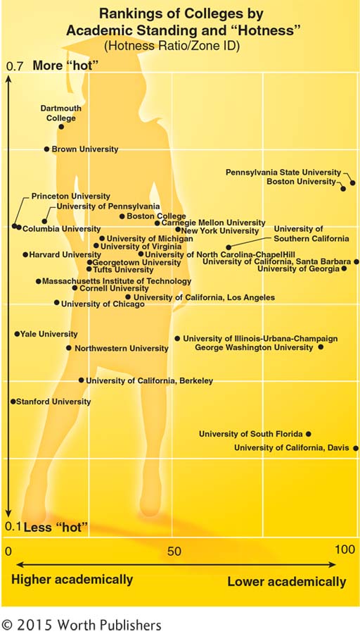
Multivariable graphs and college rankings by academics and sexiness: Buzzfeed.com published a multivariable graph that purported to rank colleges by academics and “hotness.” The data from this graph are represented here.
|
Question 3.42
| 3.42 |
Types of graph appropriate for behavioral science research: Give an example of a study—
|
Question 3.43
| 3.43 |
Creating the perfect graph: What advice would you give to the creators of each of the following graphs? Consider the basic guidelines for a clear graph, for avoiding chartjunk, and regarding the ways to mislead through statistics. Give three pieces of advice for each graph. Be specific—
|
Question 3.44
| 3.44 |
Graphs in the popular media: Find an article in the popular media (newspaper, magazine, Web site) that includes a graph in addition to the text.
|
Question 3.45
| 3.45 |
Interpreting a graph about two kinds of career regrets: The Yerkes– |
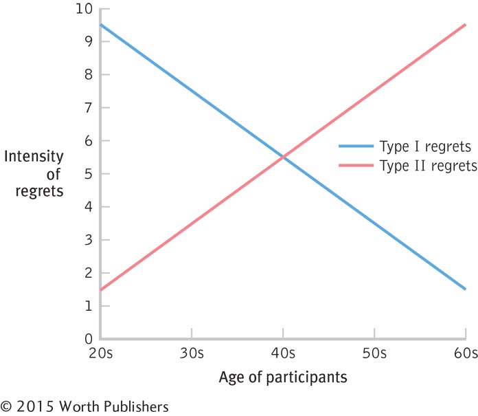
Briefly summarize the theoretical relations proposed by the graph.
What are the independent and dependent variables depicted in the graph? What kind of variables are they? If nominal or ordinal, what are the levels?
What descriptive statistics are included in the text or on the graph?
In one or two sentences, what story is the graph trying to tell?
Question 3.46
| 3.46 |
Thinking critically about a graph of the frequency of psychology degrees: The American Psychological Association (APA) compiles many statistics about training and careers in the field of psychology. The accompanying graph tracks the number of bachelor’s, master’s, and doctoral degrees conferred between the years 1970 and 2000. |
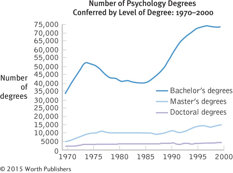
75
What kind of graph is this? Why did the researchers choose this type of graph?
Briefly summarize the overall story being told by this graph.
What are the independent and dependent variables depicted in the graph? What kind of variables are they? If nominal or ordinal, what are the levels?
List at least three things that the graph creators did well (that is, in line with the guidelines for graph construction).
List at least one thing that the graph creators should have done differently (that is, not in line with the guidelines for graph construction).
Name at least one variable other than number that might be used to track the prevalence of psychology bachelor’s, master’s, and doctoral degrees over time.
The increase in bachelor’s degrees over the years is not matched by an increase in doctoral degrees. List at least one research question that this finding suggests to you.
Question 3.47
| 3.47 |
Thinking critically about a graph about international students: Researchers surveyed Canadian students on their perceptions of the globalization of their campuses (Lambert & Usher, 2013). The 13,000 participants were domestic undergraduate and graduate students— |
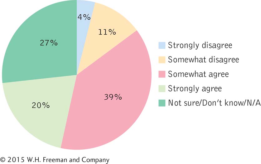
What is the story that these data are telling?
Why would a bar graph of these data tell this story better than a pie chart does?
Create a bar graph of these data, keeping the bars in the order of the labels here—
from “Strongly disagree” on the left to “Not sure/Don’t know/N/A” on the right. Why would it not make sense to create a Pareto chart in this case?
Question 3.48
| 3.48 |
Interpreting a graph about traffic flow: Go to http:/
|
Question 3.49
| 3.49 |
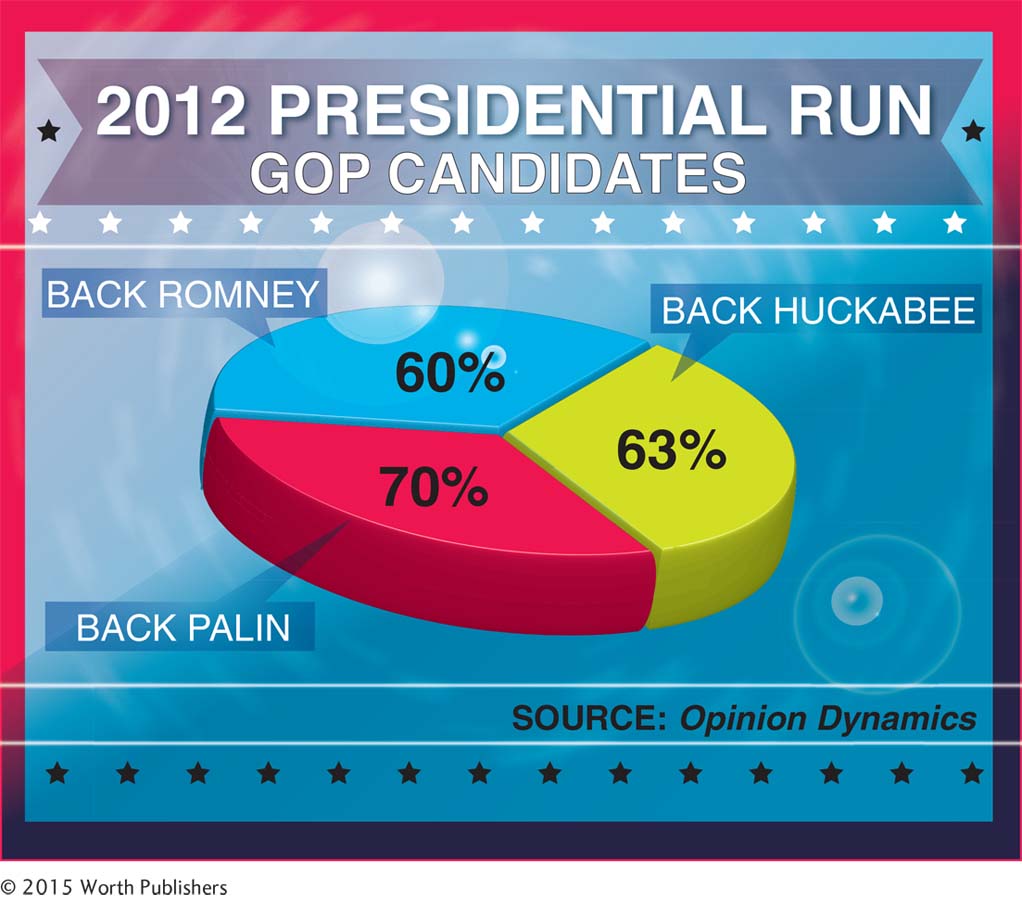
Interpreting a graph about political support: As we learned in this chapter, pie charts are often not the best choice to present data.
|
Question 3.50
| 3.50 |
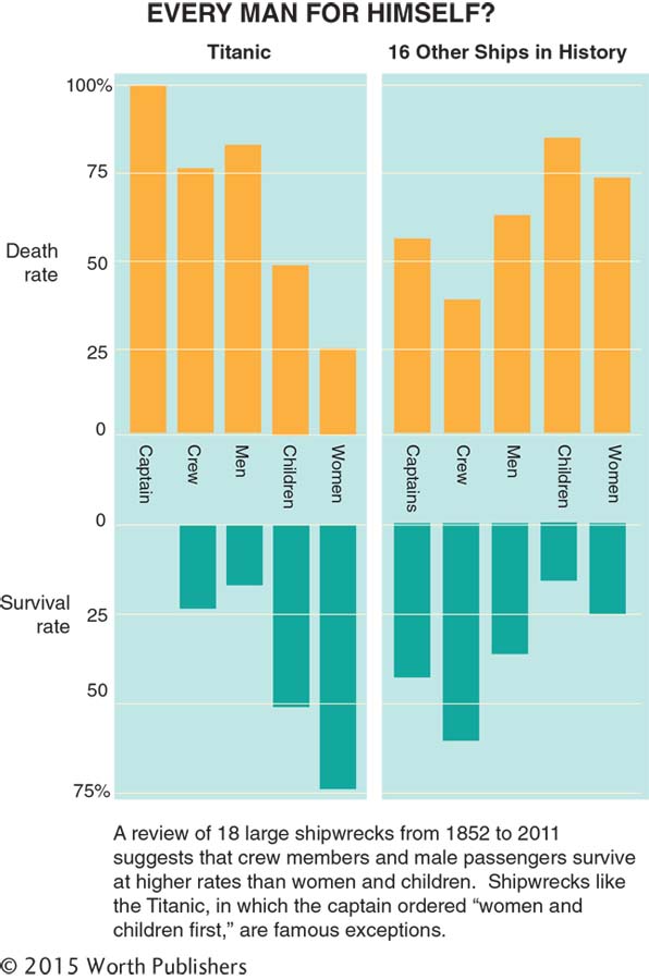
Multivariable graphs and shipwrecks: The cliché “women and children first” originated in part because of the Titanic captain’s famous directive as his ship was sinking. Yet, the cliché is not grounded in reality. See the multivariable graph on page 76.
|
76
Putting It All Together
Question 3.51
| 3.51 |
Type of graph describing the effect of romantic songs on ratings of attractiveness: Guéguen, Jacob, and Lamy (2010) wondered if listening to romantic songs would affect the dating behavior of the French heterosexual women who participated in their study. The women were randomly assigned to listen to either a romantic song (“Je l’aime à Mourir,” or “I Love Her to Death”) or a nonromantic song (“L’heure du Thé,” or “Tea Time”) while waiting for the study to begin. Later in the study, an attractive male researcher asked each participant for her phone number. Of the women who listened to the romantic song, 52.2% gave their phone number to the researcher, whereas only 27.9% of the women who listened to the nonromantic song gave their phone number to the researcher.
|
Question 3.52
| 3.52 |
Developing research questions from graphs: Graphs not only answer research questions, but can spur new ones. Figure 3-9 on page 55 depicts the pattern of changing attitudes, as expressed through Twitter.
|