Chapter 1
An Introduction to Statistics and Research Design
The Two Branches of Statistics
- Descriptive Statistics
- Inferential Statistics
- Distinguishing Between a Sample and a Population
How to Transform Observations into Variables
- Discrete Observations
- Continuous Observations
Variables and Research
- Independent, Dependent, and Confounding Variables
- Reliability and Validity
Introduction to Hypothesis Testing
- Conducting Experiments to Control for Confounding Variables
- Between-Groups Design versus Within-Groups Design
- Correlational Research
Next Steps: Outlier Analysis
BEFORE YOU GO ON
- You should be familiar with basic mathematics (see Reference for Basic Mathematics in Appendix A).
Statistics save lives.
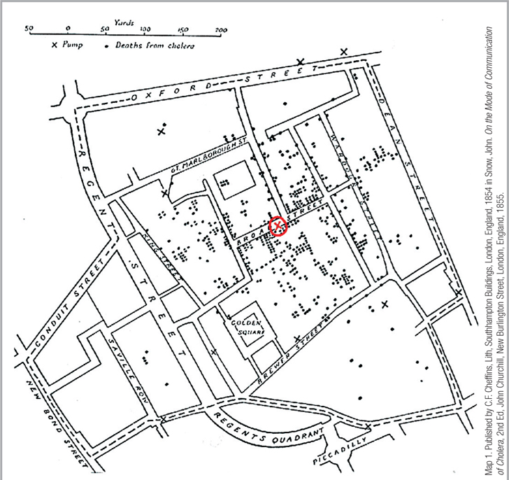
John Snow’s Famous Map Dr. John Snow solved the urgent mystery of how cholera could infect so many people so suddenly by mapping cholera deaths in relation to the Broad Street water well. The X’s are all neighborhood wells. The X in the red circle is the Broad Street well. Each dot indicates that a person living at this address died of cholera, and a cluster of cases is clearly seen around the Broad Street well (but not around the other wells). Snow was careful to include the other X’s to demonstrate that the deaths were closer to one specific source of water.
Map 1. Published by C.F. Cheffins, Lith, Southhampton Buildings, London, England, 1854 in Snow, John. On the Mode of Communication of Cholera, 2nd Ed, John Churchill, New Burlington Street, London, England, 1855.
The London cholera epidemic of 1854 hit with terrifying swiftness. Some 500 people died during the first 10 days and no one could figure out why. Everyone involved only knew that the disease dehydrated its victims in gruesome ways no matter how much water the sufferer drank. It was as if an angel of death had decided, during that late summer of 1854, to take a random stroll through London’s Golden Square neighborhood. A workhouse with 535 inmates had only a few mortalities; a nearby brewery with 70 employees was untouched by the epidemic; yet another nearby factory suffered 18 deaths.
Dr. John Snow had spent years trying to determine how cholera was communicated from one person to another (Vinten-Johansen, Brody, Paneth, Rachman, & Rip, 2003) and was searching for a pattern behind the apparent randomness. He marked the location of each cholera victim’s home on a map and then added an X for each neighborhood’s water well. The visual presentation of these data revealed…a correlation! The closer a home was to the well on Broad Street (see the red X circled in the accompanying image), the more likely it was that a death from cholera had occurred.
Snow proposed a simple solution: remove the pump handle—a health intervention that startled the Board of Guardians of St. James’s parish. But when the authorities finally removed the Broad Street pump handle, cholera deaths declined dramatically. Nevertheless, Snow still had a statistical problem: the rate of deaths from cholera had started to decline before the handle was removed! How could this happen? Did Snow’s intervention really make a difference? The answer is both disturbing and insightful. So many people had died or fled the neighborhood around the Broad Street well that there were fewer people left to be infected.