2.2 Shapes of Distributions
We learned how to organize data so that we can better understand the concept of a distribution, a major building block for statistical analysis. We can’t get a sense of the overall pattern of data by looking at a list of numbers, but we can get a sense of the pattern by looking at a frequency table. We can get an even better sense by creating a graph. Histograms and frequency polygons allow us to see the overall pattern, or shape, of the distribution of data.
The shape of a distribution provides distinctive information. For example, when the U.S.-based General Social Survey (a large data set available to the public via the Internet) asked people about the influence of children’s programming—
35
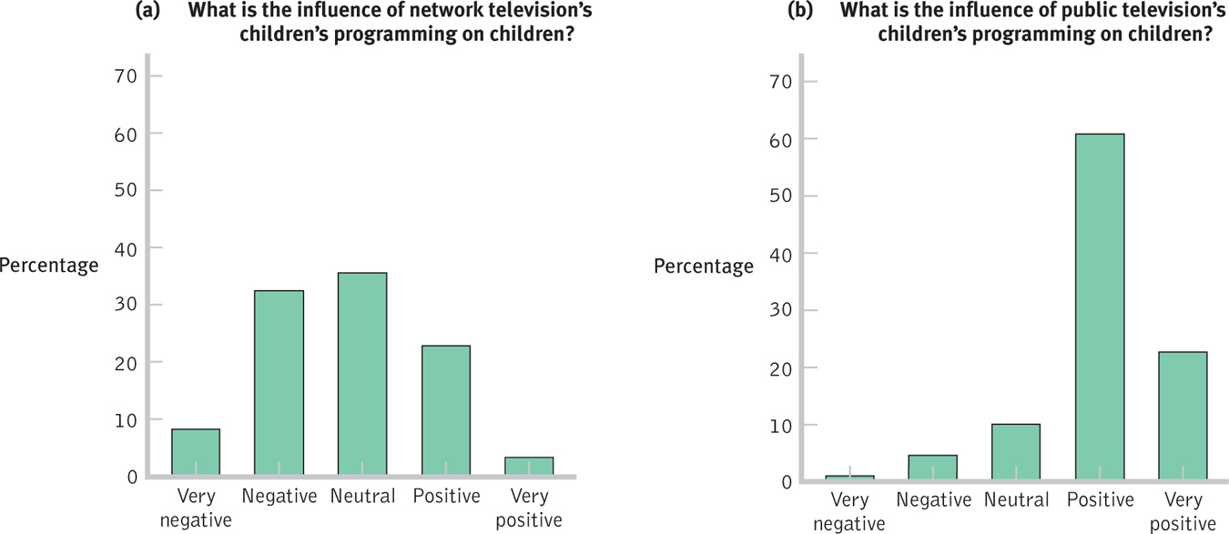
Figure 2-
Normal Distributions
A normal distribution is a specific frequency distribution that is a bell-
Many, but not all, distributions of variables form a bell-
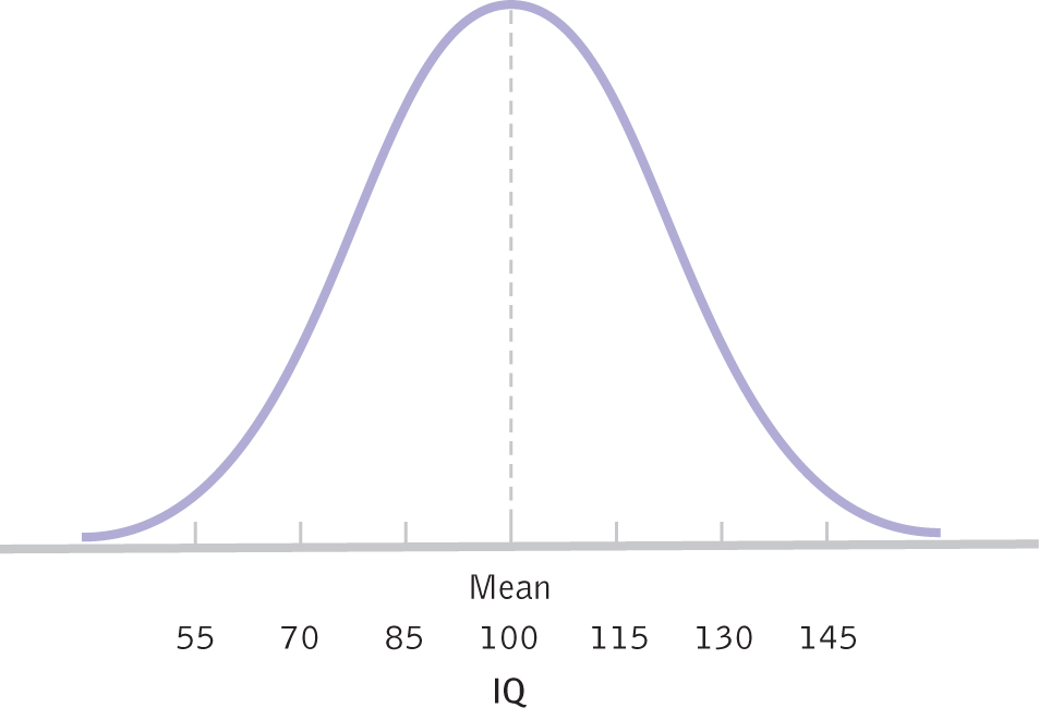
Figure 2-
Skewed Distributions
A skewed distribution is a distribution in which one of the tails of the distribution is pulled away from the center.
Reality is often—
MASTERING THE CONCEPT
2.3: If a histogram indicates that the data are symmetric and bell shaped, then the data are normally distributed. If the data are not symmetric and the tail extends to the right, the data are positively skewed; if the tail extends to the left, the data are negatively skewed.
36
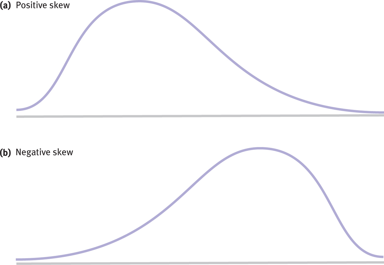
Figure 2-
With positively skewed data, the distribution’s tail extends to the right, in a positive direction.
A floor effect is a situation in which a constraint prevents a variable from taking values below a certain point.
When a distribution is positively skewed, as in Figure 2-6a, the tail of the distribution extends to the right, in a positive direction. Positive skew sometimes occurs when there is a floor effect, a situation in which a constraint prevents a variable from taking values below a certain point. For example, in the “World Cup success” data, scores indicating how many countries came in first or second in the World Cup a certain number of times is an example of a positively skewed distribution with a floor effect. Most countries never came in first or second, which means that the data were constrained at the lower end of the distribution, 0 (that is, they can’t go below 0).
Negatively skewed data have a distribution with a tail that extends to the left, in a negative direction.
A ceiling effect is a situation in which a constraint prevents a variable from taking on values above a given number.
The distribution in Figure 2-6b shows negatively skewed data, which have a distribution with a tail that extends to the left, in a negative direction. The distribution of people’s attitudes toward public television’s programming of children’s shows is favorable because it is clustered around the word positive, but we describe the shape of that distribution as negatively skewed because the thin tail is to the left side of the distribution. Not surprisingly, negative skew is sometimes the result of a ceiling effect, a situation in which a constraint prevents a variable from taking on values above a given number. If a professor gives an extremely easy quiz, then the quiz scores might show a ceiling effect. A number of students would cluster around 100, the highest possible score, with a few stragglers down in the lower end.
Next Steps
Stem-
A stem-
Histograms and frequency polygons do not let us view two groups in a single graph very easily, but the stem-
37
STEP 1: Create the stem.
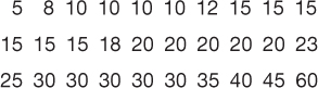
In this example, the stem will consist of the first digit for each of these numbers, arranged from highest to lowest:

Note three features of this particular stem:
- We group the digits by 10’s (0–
9, 10– 19, 20– 29, 30– 39, 40– 49, 50– 59, 60– 69). - The first digit for numbers below 10 is 0.
- Each category is represented on the stem, even if it has no leaf (e.g., no score in the category 50–
59).
STEP 2: Add the leaves.
The leaves, the last digit for each score, are added in ascending order for each part of the stem, as shown in Table 2-7. In our example, the only scores between 0 and 9 are 5 and 8, so these two leaves will be added next to 0. There are 12 scores between 10 and 19. Some, like 10 and 15, are repeated. In these cases, a 5, to represent 15, is added as a leaf for every instance of 15. There are six 15’s, so there will be six 5’s next to the stem of 1. There are no scores between 50 and 59, so the part of the stem that begins with 5 will have no leaves.
| Minutes Typically Spent in the Shower— |
|
|---|---|
| 6 | 0 |
| 5 | |
| 4 | 05 |
| 3 | 000005 |
| 2 | 0000035 |
| 1 | 000025555558 |
| 0 | 58 |
The stem-
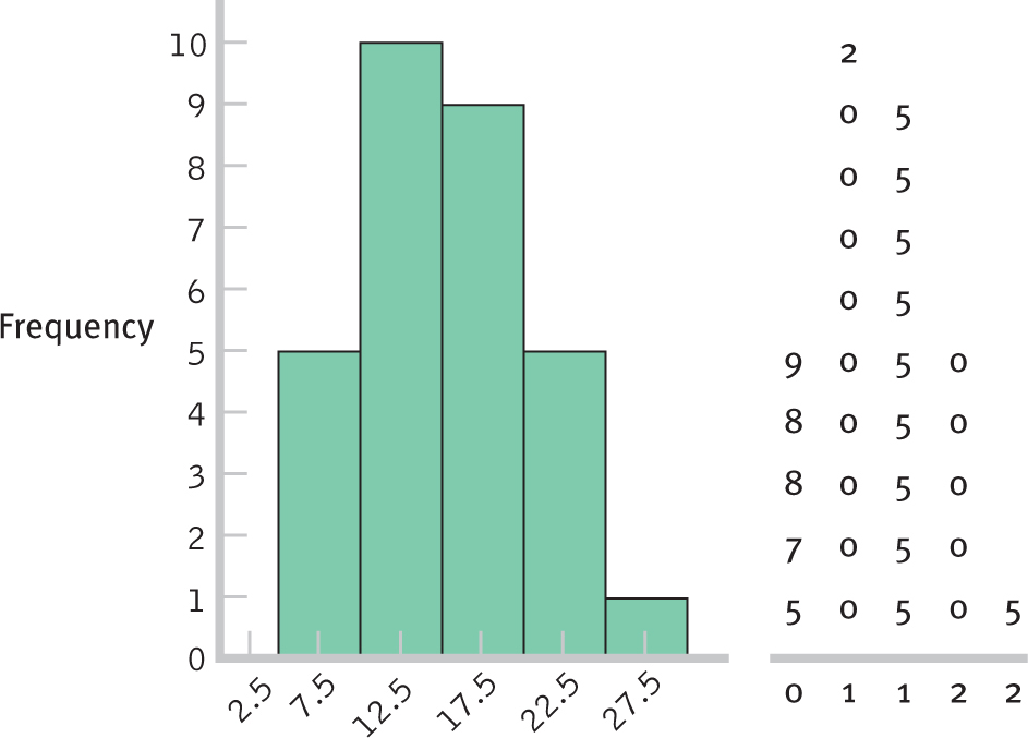
Figure 2-
We can also include a sample of men on the other side of the stem, and view two groups side by side. Here are the scores in minutes for 30 men:
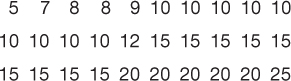
We add those scores to the left of the stem for the women, as shown in Table 2-8. We can now see, for example, that women’s scores tend to be slightly higher and more varied than men’s scores. The distribution of women’s scores is somewhat skewed to the right, and the outlier (60 minutes in the shower!) is evident.
38
| Minutes Typically Spent in the Shower: | ||
|---|---|---|
| Men | Women | |
| 6 | 0 | |
| 5 | ||
| 4 | 05 | |
| 3 | 000005 | |
| 500000 | 2 | 0000035 |
| 5555555552000000000 | 1 | 000025555558 |
| 98875 | 0 | 58 |
CHECK YOUR LEARNING
Reviewing the Concepts
- A normal distribution is a specific distribution that is unimodal, symmetric, and bell shaped.
- A skewed distribution “leans” either to the left or to the right. A tail to the right indicates positive skew; a tail to the left indicates negative skew.
- Stem-
and- leaf plots allow us to view the shape of a sample’s distribution while displaying every single data point in the sample. Stem- and- leaf plots can depict the scores of two groups side by side to allow for easy comparisons of distributions.
Clarifying the Concepts
- 2-
5 Distinguish a normal distribution from a skewed distribution. - 2-
6 When the bulk of data cluster together but the data trail off to the left, you have _________ skew; when that data trail off to the right, you have _________ skew.
Calculating the Statistics
- 2-
7 In Check Your Learning 2- 3, you constructed two visual displays of the distribution of citations per faculty at top universities around the world. How would you describe this distribution? Is there skew evident in your graphs? If yes, what kind of skew is there? - 2-
8 Alzheimer’s disease is typically diagnosed in adults above the age of 70; cases diagnosed sooner are called “early onset.” - Assuming that these early-
onset cases represent unique trailing off of data on one side, would this represent positive skew or negative skew? - Do these data represent a floor effect or ceiling effect?
- Assuming that these early-
Applying the Concepts
- 2-
9 Referring to Check Your Learning 2- 8, what implication would identifying such skew have in the screening and treatment process for Alzheimer’s disease?
Solutions to these Check Your Learning questions can be found in Appendix D.
39