Chapter 3 How it Works
3.1 CREATING A SCATTERPLOT
As mentioned in the Next Steps section, www.gapminder.org/
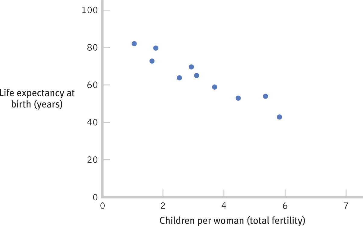
| Country | Children per woman (total fertility) |
Life expectancy at birth (years) |
|---|---|---|
| Afghanistan | 7.15 | 43.00 |
| India | 2.87 | 64.00 |
| China | 1.72 | 73.00 |
| Hong Kong | 0.96 | 82.00 |
| France | 1.89 | 80.00 |
| Bolivia | 3.59 | 65.00 |
| Ethiopia | 5.39 | 53.00 |
| Iraq | 4.38 | 59.00 |
| Mali | 6.55 | 54.00 |
| Honduras | 3.39 | 70.00 |
How can we create a scatterplot to show the relation between these two variables? To create a scatterplot, we put total fertility on the x-axis and life expectancy in years on the y-axis. We then add a dot for each country at the intersection of its fertility rate and life expectancy. The scatterplot is shown in the figure below.
3.2 CREATING A BAR GRAPH
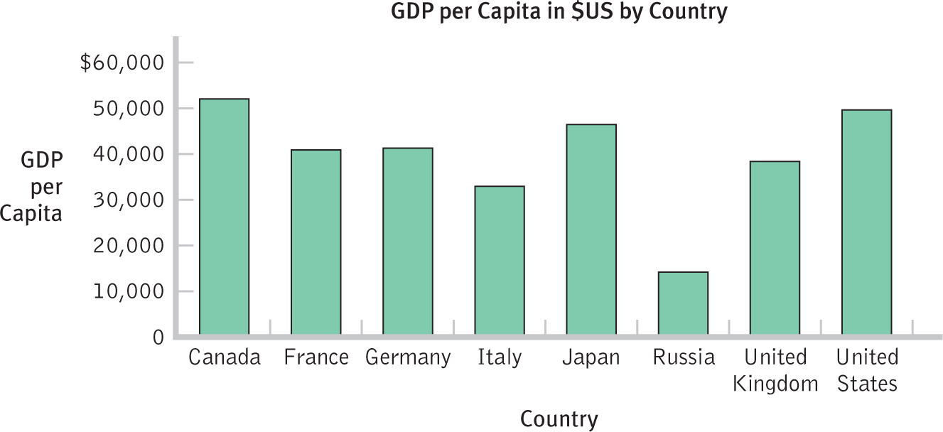
The International Monetary Fund listed the 2012 gross domestic product (GDP) per capita, in U.S. dollars, for each of the world economic powers that make up what is called the Group of Eight, or G8, nations.
How can we create a bar graph for these data? First, we put the countries on the x-axis. Then, for each country, we draw a bar in which height corresponds to the country’s GDP. The following figure shows a bar graph with bars arranged in alphabetical order by country.
68
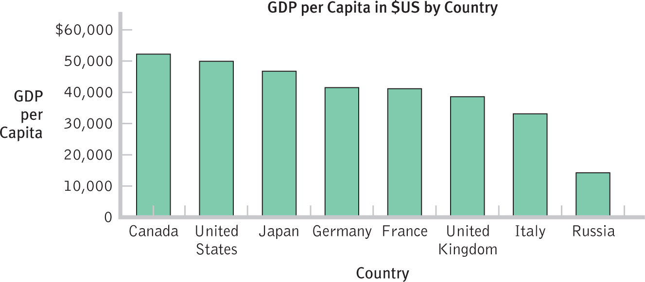
3.3 CREATING A PARETO CHART
How can we use the same G8 data as for the bar graph to create a Pareto chart? A Pareto chart is simply a bar graph in which the bars are arranged from highest value to lowest value. We would rearrange the countries so that they are ordered from the country with the highest GDP to the country with the lowest GDP. The Pareto chart is shown in the figure below.