Describing Data
A-1 How can we describe data with measures of central tendency and variation?
 Once researchers have gathered their data, they must organize them in some meaningful way. One way to do this is to convert the data into a simple bar graph, as in FIGURE A.1, which displays a distribution of different brands of trucks still on the road after a decade. When reading statistical graphs such as this, take care. It’s easy to design a graph to make a difference look big (Figure A.1a) or small (Figure A.1b). The secret lies in how you label the vertical scale (the y-axis).

RETRIEVE + REMEMBER
Question 16.1
An American truck manufacturer offered graph (a)—with actual brand names included—to suggest the much greater durability of its trucks. What does graph (b) make clear about the varying durability, and how is this accomplished?
Note how the y-axis of each graph is labeled. The range for the y-axis label in graph a is only from 95 to 100. The range for graph b is from 0 to 100. All the trucks rank as 95% and up, so almost all are still functioning after 10 years, which graph b makes clear.
A-2
The point to remember: Think smart. When viewing figures in magazines, on TV, or online, read the scale labels and note their range.
Measures of Central Tendency
The next step is to summarize the data using some measure of central tendency, a single score that represents a whole set of scores. The simplest measure is the mode, the most frequently occurring score or scores. The most familiar is the mean, or arithmetic average—the total sum of all the scores divided by the number of scores. The midpoint—the 50th percentile—is the median. On a divided highway, the median is the middle. So, too, with data: If you arrange all the scores in order from the highest to the lowest, half will be above the median and half will be below it.
The average person has one ovary and one testicle.
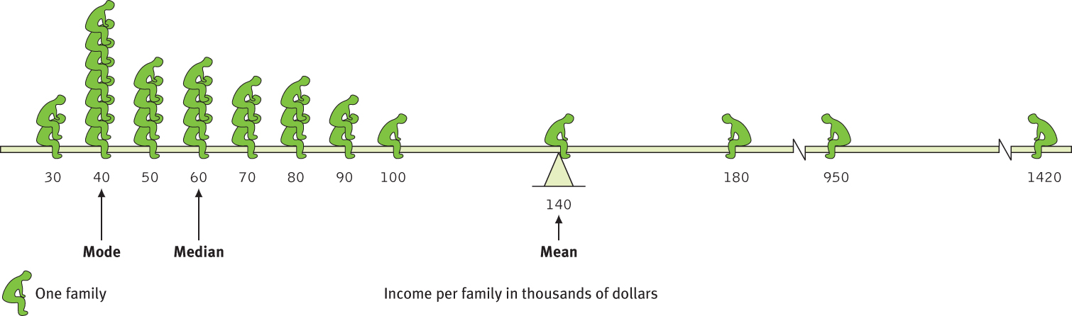
Measures of central tendency neatly summarize data. But consider what happens to the mean when a distribution is lopsided, or skewed, by a few way-out scores. With income data, for example, the mode, median, and mean often tell very different stories (FIGURE A.2). This happens because the mean is biased by a few extreme scores. When Microsoft co-founder Bill Gates sits down in an intimate café, its average (mean) customer instantly becomes a billionaire. But the median customers’ wealth remains unchanged. Understanding this, you can see how a British newspaper could accurately run the head-line “Income for 62% Is Below Average” (Waterhouse, 1993). Because the bottom half of British income earners received only a quarter of the national income cake, most British people, like most people everywhere, made less than the mean. Mean and median tell different true stories.
The point to remember: Always note which measure of central tendency is reported. If it is a mean, consider whether a few atypical scores could be distorting it.
Measures of Variation
Knowing the value of an appropriate measure of central tendency can tell us a great deal. But the single number omits other information. It helps to know something about the amount of variation in the data—how similar or diverse the scores are. Averages derived from scores with low variability are more reliable than averages based on scores with high variability. Consider a basketball player who scored between 13 and 17 points in each of the season’s first 10 games. Knowing this, we would be more confident that she would score near 15 points in her next game than if her scores had varied from 5 to 25 points.
A-3
The range of scores—the gap between the lowest and highest—provides only a crude estimate of variation. A couple of extreme scores in an otherwise uniform group, such as the $950,000 and $1,420,000 incomes in Figure A.2, will create a deceptively large range.
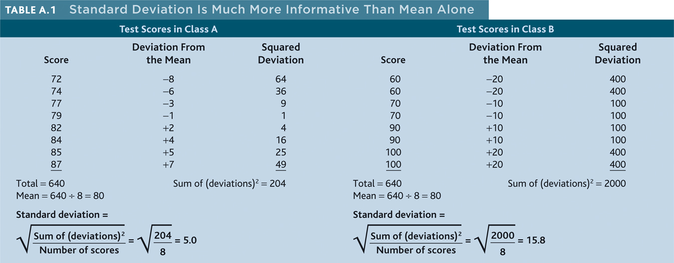
The more useful standard for measuring how much scores deviate from one another is the standard deviation. It better gauges whether scores are packed together or dispersed, because it uses information from each score. The computation (see TABLE A.1) assembles information about how much individual scores differ from the mean. Note that the test scores in Class A and Class B have the same mean (80), but very different standard deviations, which tell us more about how the students in each class are really faring. If your college or university attracts students of a certain ability level, their intelligence scores will have a relatively small standard deviation compared with the more diverse community population outside your school.
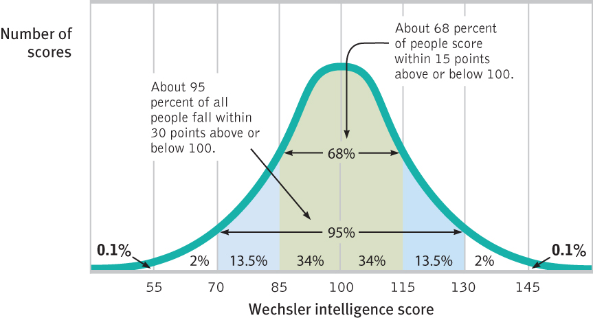
You can grasp the meaning of the standard deviation if you consider how scores tend to be distributed in nature. Large numbers of data—heights, weights, intelligence scores, grades (though not incomes)—often form a symmetrical, bell-shaped distribution. Most cases fall near the mean, and fewer cases fall near either extreme. This bell-shaped distribution is so typical that we call the curve it forms the normal curve.
A-4
As FIGURE A.3 shows, a useful property of the normal curve is that roughly 68 percent of the cases fall within one standard deviation on either side of the mean. About 95 percent of cases fall within two standard deviations. Thus, as Chapter 8 notes, about 68 percent of people taking an intelligence test will score within ±15 points of 100. About 95 percent will score within ±30 points.
RETRIEVE + REMEMBER
Question 16.2
The average of a distribution of scores is the ________. The score that shows up most often is the ________. The score right in the middle of a distribution (half the scores above it; half below) is the ________. We determine how much scores vary around the average in a way that includes information about the variability of scores (difference between highest and lowest) by calculating the ________.
mean; mode; median; standard deviation
Correlation: A Measure of Relationships
A-2 What does it mean when we say two things are correlated?
Throughout this book we often ask how strongly two things are related: For example, how closely related are the personality scores of identical twins? How well do intelligence test scores predict vocational achievement? How closely is stress related to disease?
As we saw in Chapter 1, describing behavior is a first step toward predicting it. When naturalistic observation and surveys reveal that one trait or behavior accompanies another, we say the two correlate. A correlation coefficient is a statistical measure of relationship. In such cases, scatterplots can be very revealing.
Each dot in a scatterplot represents the values of two variables. The three scatterplots in FIGURE A.4 illustrate the range of possible correlations—from a perfect positive to a perfect negative. (Perfect correlations rarely occur in the “real world.”) A correlation is positive if two sets of scores, such as height and weight, tend to rise or fall together.
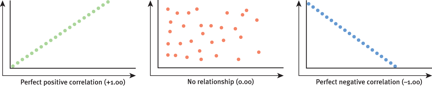
Saying that a correlation is “negative” says nothing about its strength or weakness. A correlation is negative if two sets of scores relate inversely, one set going up as the other goes down.
Statistics can help us see what the naked eye sometimes misses. To demonstrate this for yourself, try an imaginary project. Wondering if tall men are more or less easygoing, you collect two sets of scores: men’s heights and men’s temperaments. You measure the heights of 20 men, and you have someone else independently assess their temperaments (from zero for extremely calm to 100 for highly reactive).
With all the relevant data right in front of you (TABLE A.2), can you tell whether the correlation between height and reactive temperament is positive, negative, or close to zero?
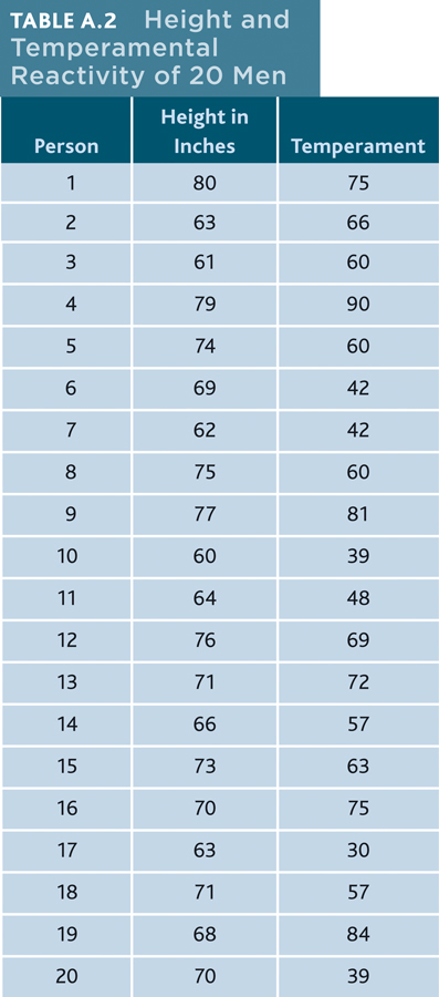
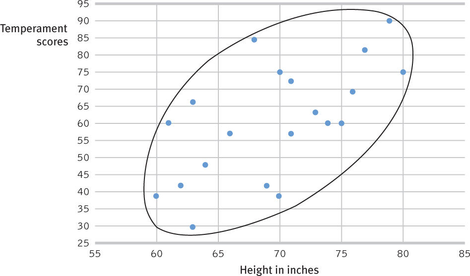
Comparing the columns in Table A.2, most people detect very little relationship between height and temperament. In fact, the correlation in this imaginary example is positive, +0.63, as we can see if we display the data as a scatterplot. In FIGURE A.5 moving from left to right, the upward, oval shaped slope of the cluster of points shows that our two imaginary sets of scores (height and temperament) tend to rise together.
If we fail to see a relationship when data are presented as systematically as in Table A.2, how much less likely are we to notice them in everyday life? To see what is right in front of us, we sometimes need statistical illumination. We can easily see evidence of gender discrimination when given statistically summarized information about job level, seniority, performance, gender, and salary. But we often see no discrimination when the same information dribbles in, case by case (Twiss et al., 1989).
The point to remember: Correlation coefficients tell us nothing about cause and effect, but they can help us see the world more clearly by revealing the extent to which two things relate.
A-5
Regression Toward the Mean
A-3 What is regression toward the mean?
Correlations not only make visible the relationships we might otherwise miss, they also restrain our “seeing” nonexistent relationships. When we believe there is a relationship between two things, we are likely to notice and recall instances that confirm our belief. If we believe that dreams are forecasts of actual events, we may notice and recall confirming instances more than disconfirming instances. The result is an illusory correlation.
Illusory correlations feed an illusion of control—that chance events are subject to our personal control. Gamblers, remembering their lucky rolls, may come to believe they can influence the roll of the dice by again throwing gently for low numbers and hard for high numbers. The illusion that uncontrollable events correlate with our actions is also fed by a statistical phenomenon called regression toward the mean. Average results are more typical than extreme results. Thus, after an unusual event, things tend to return toward their average level; extraordinary happenings tend to be followed by more ordinary ones.
A-6
The point may seem obvious, yet we regularly miss it: We sometimes attribute what may be a normal regression (the expected return to normal) to something we have done. Consider two examples:
- Students who score much lower or higher on an exam than they usually do are likely, when retested, to return to their average.
- Unusual ESP subjects who defy chance when first tested nearly always lose their “psychic powers” when retested (a phenomenon parapsychologists have called the decline effect).
“Once you become sensitized to it, you see regression everywhere.”
Psychologist Daniel Kahneman (1985)
Failure to recognize regression is the source of many superstitions and of some ineffective practices as well. When day-to-day behavior has a large element of chance fluctuation, we may notice that others’ behavior improves (regresses toward average) after we criticize them for very bad performance, and that it worsens (regresses toward average) after we warmly praise them for an exceptionally fine performance. Ironically, then, regression toward the average can mislead us into feeling rewarded for having criticized others and into feeling punished for having praised them (Tversky & Kahneman, 1974).
The point to remember: When a fluctuating behavior returns to normal, there is no need to invent fancy explanations for why it does so. Regression toward the mean is probably at work. 
RETRIEVE + REMEMBER
Question 16.3
You hear the school basketball coach telling her friend that she rescued her team’s winning streak by yelling at them after they played unusually badly in the first half of the game. What is another explanation of why the team’s performance improved?
The team’s poor performance was not their typical behavior. Their return to their normal—their winning streak—may just have been a case of regression toward the mean.