image
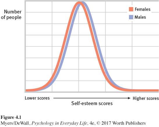
FIGURE 4.1 Different? Yes, but not by much The two bell-shaped curves in this graph show the distribution of self-esteem scores for women (red) and men (blue). These are average scores based on all available samples (Hyde, 2005). As you can see, the variation among women or among men is much greater than the difference between the average woman (highest point on red line) and the average man (highest point on blue line).