1.15–1.18: Scientific thinking can help us make wise decisions.

“Let’s look at the data.” Using points and lines and symbols and a variety of other graphic elements to display measured quantities is a powerful tool commonly used throughout the sciences. Such visual displays of data can serve a range of purposes, which relate to both the presentation of and the exploration of the data.
Whether making a point, illustrating an idea, or facilitating the testing of a hypothesis, visual displays of data typically have one feature in common: they condense large amounts of information into a more easily digested form. In doing so, they can help readers think about and compare data, ultimately helping them to synthesize the information and see useful patterns.
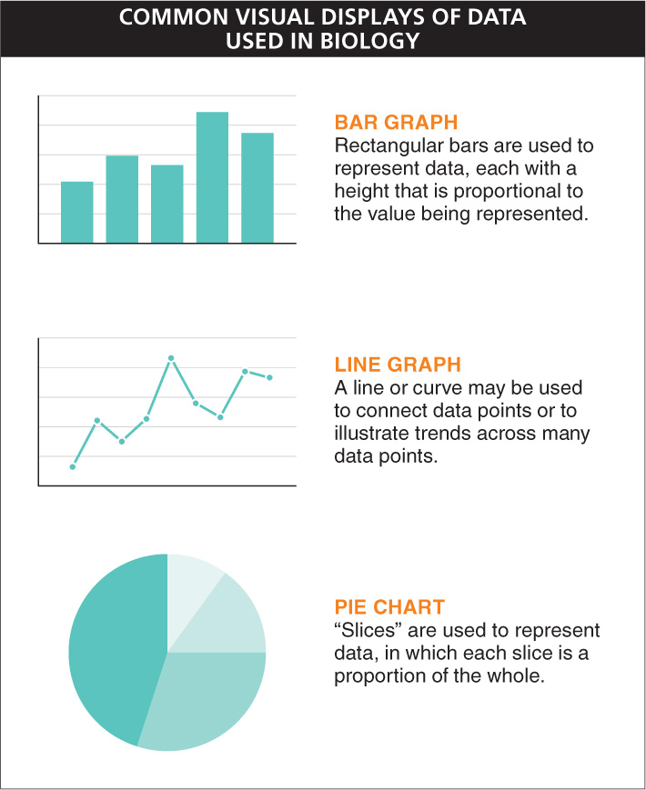
There is an almost infinite variety of ways to display data, including maps, tables, charts, and graphs. Graphs are particularly prevalent in biology, and a few forms are used most frequently. These include bar graphs, line graphs, and pie charts (FIGURE 1-18).
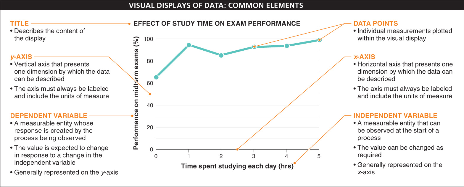
Visual displays of data generally have a few common elements. Most have a title, for example, which usually appears at the top and describes the content of the display. Bar graphs and line graphs include axes, usually a horizontal axis, also called the x-
24
The x-
Rather than displaying individual data points, a bar graph has rectangular bars, each with a height proportional to the value being represented—
One of the most common functions of visual displays of information is to present the relationship between two variables, such as in a graph. These variables may be described as independent and dependent variables. An independent variable is some entity that can be observed and measured at the start of a process, and whose value can be changed as required. A dependent variable is one that can also be observed and measured, but whose response is created by the process being observed and depends on the independent variable. The dependent variable is generally represented by the y-
Visual displays of data can be simple and straightforward, but they can also have features that reduce their effectiveness, or even cause them to be downright misleading. These difficulties can arise from ambiguity in the axis labels or scales, or incomplete information on how each data point was collected (and how the points might have varied), or biases or hidden assumptions in the presentation or grouping of the data, or unknown or unreliable sources of data, or an insufficient or inappropriate context given for the data presentation.
25
In each chapter of this book, you will see that one of the visual displays of data is labeled with the “Graphic Content” icon (you’ll have noticed this on Figure 1-
TAKE-HOME MESSAGE 1.15
Visual displays of data, which condense large amounts of information, can aid in the presentation and exploration of the data. The effectiveness of such displays is influenced by the precision and clarity of the presentation, and it can be reduced by ambiguity, biases, hidden assumptions, and other issues that reduce a viewer’s confidence in the underlying truth of the presented phenomenon.
Why would a scientist choose to visually display a relationship among data using a bar or line graph instead of a pie chart?