Chapter 17. Chapter 17 Graphic Content
Introduction
Graphic Content
true
true
You must read each slide, and complete the question on the slide, before proceeding to the next one.

Instructions
Review the information provided in the graph to answer each question below.
After submitting your answer, you will be provided feedback to check if your response is correct.
(This activity contains 6 questions.)
Question 17.1
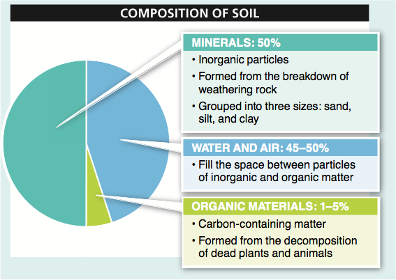
As do all pie charts, this figure attempts to show the proportion of the whole that is contributed by each of several factors. In this case, the whole pie represents all of the material from which soil is composed. The parts it is divided into are minerals; organic materials; and water and air.
Question 17.2
The source of the data presented is not given. This lack can be problematic because the reader must make several assumptions. In this figure, one important assumption is that all soil has approximately the same composition.
Question 17.3
There is no information in the pie chart suggesting that different types of soil differ significantly in their composition. In other words, whether sandy soil at the beach or moist soil around a lake, from this figure the reader must conclude that both soils are consistently 50% minerals, 1% to 5% organic materials, and 45% to 50% water and air. To the extent that different soils do differ in their compositions, the data for several different soil types could be presented in a group of pie charts, all next to each other. That would allow for quick comparison and identification for the chief ways in which they differ. Alternatively, the data could be presented in a table. Each row could be a soil type, and for each there could be three columns: minerals, organic materials, and water and air.
Question 17.4
Because there is no way to present an error bar reflecting variation in the size of a “piece” of the pie, it can be difficult to present information about the variability in a measure. For some phenomena, this can be important. In a pie chart, it is possible (but not commonly done) to show the borders between the pie pieces as fuzzy, with the size of the fuzzy region proportional to the variation in that measure. Alternatively, it is possible to draw the pie pieces precisely but in their labels to indicate the proportion that each represents, along with some measure of variation. In this pie chart, for example, the size of the water and air slice is given as 45% to 50%, although it is drawn as 45%. Similarly, the organic materials slice is drawn as 5%, but the text with the label for that slice indicates that it is 1% to 5%.
Question 17.5
The benefit to presenting these data as a pie chart rather than a bar graph with three bars is that it is immediately clear that the greatest proportion of soil is made up from minerals, with water and air making up a proportion that is just slightly less, and organic materials not contributing much to soil. It is also immediately clear that the mineral component makes up half the soil. In general, if you wish to convey proportions of a whole made up of several component parts, a pie chart is effective. If the data were presented as a bar graph, the y-axis label would probably be “proportion of the whole,” and each bar would represent a “soil component.”
Question 17.6
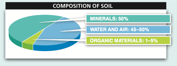
Making a pie chart three dimensional may make it more aesthetically pleasing, but it can also lead to deception. Because there are not actually three dimensions of data, the depth of the pie does not convey any actual data. A simple circle could convey exactly the same data as are shown. Moreover, by rotating the pie so that a given slice (in this chart, “water and air” and, to a lesser extent, “organic materials”) appears in the front, that slice is given more prominence because more of that slice’s color or shading is visible than for the slice or slices in the back. This can cause a reader to misjudge the size of a slice, since the proportion of each color in the chart doesn’t reflect the proportion of the whole made up from that component. In other words, it appears in this chart that the blue slice is larger than the turquoise slice because more blue is visible than turquoise. This method of data presentation can be used to mislead viewers into believing that one component is more or less significant than it actually is. The figure might then be used to persuade a reader to believe something that is not true.
Activity results are being submitted...