
Chapter 18. Chapter 18 Graphic Content
Introduction
Graphic Content
true
true
You must read each slide, and complete the question on the slide, before proceeding to the next one.
Instructions
Review the information provided in the graph to answer each question below.
After submitting your answer, you will be provided feedback to check if your response is correct.
(This activity contains 8 questions.)
1.
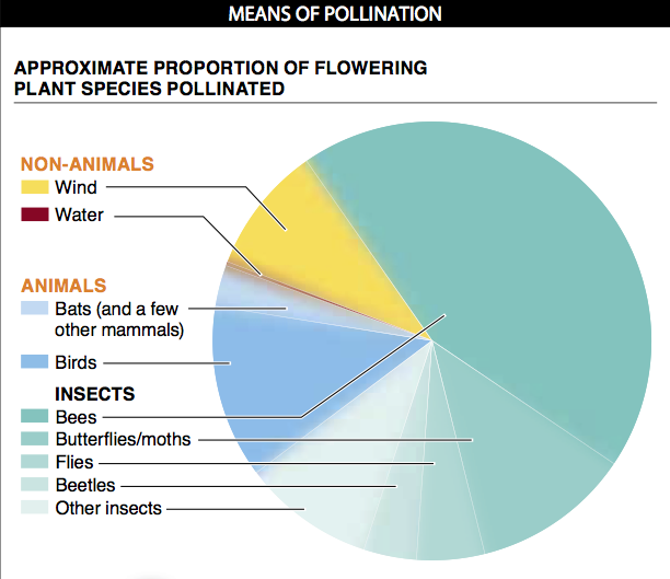
1. What idea is conveyed by the “fuzzy” borders to each slice of the pie? How else could these data (and the uncertainty associated with them) be conveyed?
The fuzzy borders of each slice of the pie are meant to convey that the exact size of each slice is not certain.There are several other ways that uncertainty or variation can be conveyed in a graph. The pieces of the pie can have sharp borders, but within the slice (or its label) there can be a numerical indication of the size of the slice (i.e., 3–7%, 20-25%, etc.). Alternatively, instead of a pie chart, a bar graph can be used, with each slice shown as a separate bar having an error bar that reflects the uncertainty or variation around the estimate. A third way would be with a bar graph having just a single bar (representing 100% of flowering plant species), with the bar divided into regions representing each type of pollinator and the borders between regions being fuzzy, to represent uncertainty. And, perhaps, the labels associated with each region could indicate the size of that region, as a range (again, such as 3-7%, 20-25%, etc.).
Activity results are being submitted...