
Chapter 25. Chapter 25 Graphic Content
Introduction
Graphic Content
true
true
You must read each slide, and complete the question on the slide, before proceeding to the next one.
Instructions
Review the information provided in the graph to answer each question below.
After submitting your answer, you will be provided feedback to check if your response is correct.
(This activity contains 7 questions.)
1.
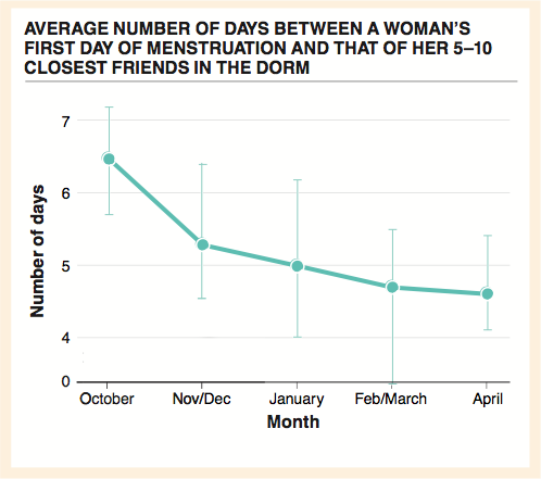
1. In October, what was the average number of days between a woman’s first day of menstruation and that of her 5–10 closest friends in the dorm? What was this number in April? By what percentage had it changed in six months?
In October, the average number of days between a woman’s “first dayof menstruation” and those of her 5-10 closest friends in her dorm was 6.5 days. In April, this number was about 4.7. This is a decrease of approximately 28%.
Activity results are being submitted...