
Chapter 5. Chapter 5 Graphic Content
Introduction
Graphic Content
true
true
You must read each slide, and complete the question on the slide, before proceeding to the next one.
Instructions
Review the information provided in the graph to answer each question below.
After submitting your answer, you will be provided feedback to check if your response is correct.
(This activity contains 6 questions.)
1.
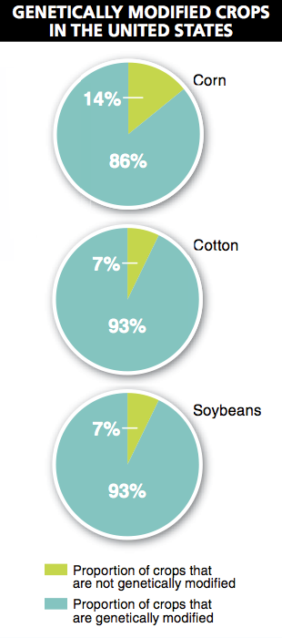
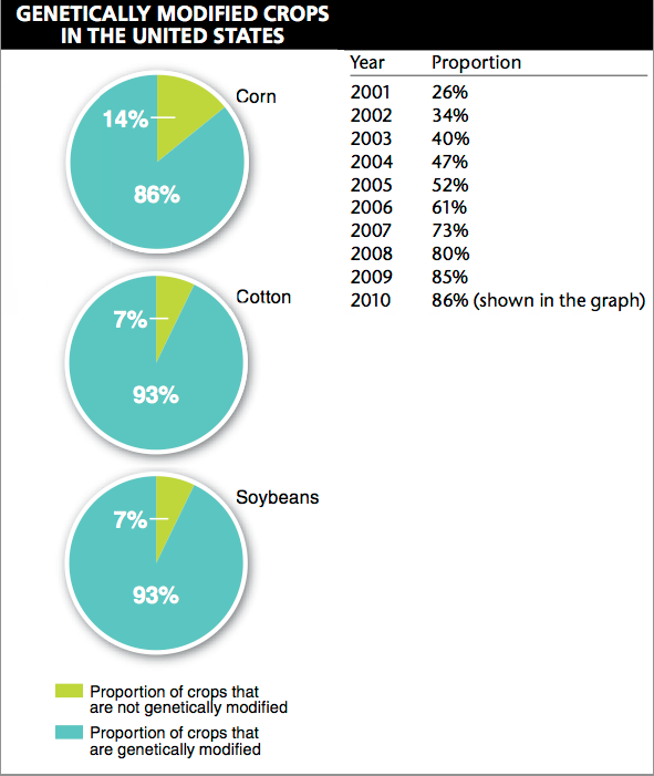
1. What proportion of corn grown in the United States is genetically modified?
In the United States, 86% of the corn is genetically modified. The legend indicates that the blue portion of each pie chart represents the proportion of the crop that is genetically modified.
Activity results are being submitted...