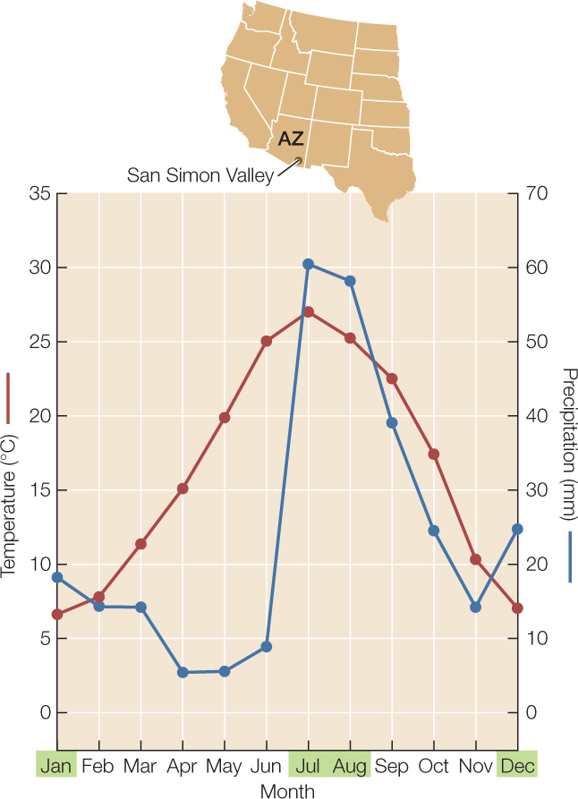
Figure 41.9: Climate Diagrams Summarize Climate in an Ecologically Relevant Way Climate diagrams traditionally combine graphs of average temperature (left axis) and average precipitation (right axis) throughout the year, as shown here for San Simon Valley near the Arizona–New Mexico border. The summer solstice at the location in question (late June in the Northern Hemisphere, late December in the Southern hemisphere) is placed at the center of the diagram. The axes are scaled such that precipitation favors plant growth when the precipitation line is above the temperature line. The months highlighted in green are typically favorable for plant growth.