Chapter 1 AppendixGetting Started with Statistical Computing
TA1-1
Most statistical analyses rely heavily on statistical software. In this Appendix, we discuss the use of Excel 2013, JMP 12, Minitab 17, SPSS 23, CrunchIt, R, and a TI-83/-84 calculator for conducting statistical analysis. As specialized statistical packages, JMP, Minitab, and SPSS are the most popular software choices both in industry and in colleges and schools of business. R is an extremely powerful statistical environment that is free to anyone; it relies heavily on members of the academic and general statistical communities for support. As an all-purpose spreadsheet program, Excel provides a limited set of statistical analysis options in comparison. However, given its pervasiveness and wide acceptance in industry and the computer world at large, we believe it is important to give Excel proper attention. It should be noted that for users who want more statistical capabilities but want to work in an Excel environment, there are a number of commercially available add-on packages (if you have JMP, for instance, it can be invoked from within Excel). Finally, instructions are provided for the TI-83/-84 calculators. While generally sufficient for an introductory course, most statistical analysis is beyond the capabilities of even the best calculator, so those seeking to continue their learning of statistics should consider learning one of the specialized statistical packages.
Even though basic guidance is provided in this and subsequent Appendices, it should be emphasized that PSBE is not bound to any of these programs. Computer output from statistical packages is very similar, so you can feel quite comfortable using any one these packages.
File Naming Conventions
Each program has its own file extensions for saving data worksheets and output. All use the typical interface to open and save (or “save as” to change a name) files from the File menu. The extensions are shown below; to access data files from the CD or website, the naming convention is YYZZZ-XXaaaaa.ext, where “xx” is the chapter number; “yy” is eg for examples, ex for exercises, or ta for tables; “zzz” is the number of the exercise, example, or table; and “aaaaa” is a short description of the topic. File extensions depend on the software:
| Data file extension | Output file extension | |
|---|---|---|

|
.xls or .xlsx |
.xls or .xlsx Excel embeds output, including graphics, into the worksheet |

|
.jmp |
.jmpprj Projects contain all data, reports, and output |

|
.mtw |
.mpj Projects contain both data and output |

|
.sav | .spv |

|
.csv R can read many formats; comma separated is typical |
.Rdata Saves the entire workspace |
Getting Help
If you encounter a question not answered in this material, most software platforms offer help (both general and contextual) in dialog boxes. To access help topics, click “Help” in the menu bar at the top of the screen; for contextual help, click “Help” in a dialog box. Several of these packages (Minitab, JMP, SPSS, and R) also have tutorials available that will help you get started. Click on the “Tutorial” option from the Help pull-down menu.
Getting Started
We assume that the reader is familiar with the basic layout and usage of Excel. As noted earlier, Excel provides a number of standard statistical analysis procedures but is not as comprehensive as a stand-alone statistical package. Therefore, for a few topics covered in this book, software support will be found only in a statistical package or in an enhanced add-on version of Excel rather than in standard Excel. Excel is the only software platform with a dynamic worksheet (meaning it updates as data are changed that impact formulas); all the other programs have the capability to compute new columns, but once computed, the data residing there are static.
Built-In Statistical Functions and Charts
Excel has a variety of built-in statistical functions that can be used to compute common descriptive statistics for a given set of data or to compute probabilities for well-known statistical distributions. To find these functions, select the “Formulas” tab found in the main menu. Click “More Functions,” which allows you to select the category “Statistical” to reveal all the statistical functions.
In addition to the built-in statistical functions, a number of graphing options are available that may prove useful for data analysis. The available charts are found by selecting the “Insert” tab found in the main menu. One then finds a variety of graphing options in the “Charts” group. A few statistical options (for example, regression fitting) can be implemented within the charts.
Installing Data Analysis ToolPak Add-In
Excel’s built-in statistical functions can be useful for isolated computations. However, attempting to do a more complete statistical analysis with a collection of “raw” functions can be a laborious and clumsy process. Excel provides an add-in known as Analysis ToolPak, which enables you to perform a more integrative statistical analysis. This add-in is not loaded with the standard installation of Excel. To install this add-in, click “File,” “Options,” “Add-ins,” and then, in the “Manage” box, choose “Excel Add-ins” and click “Go.” Select “Analysis ToolPak” and finally click “OK.”
TA1-3
Invoking Data Analysis ToolPak Procedures
Once the Data Analysis ToolPak is installed, the statistical analysis routines are found by first selecting the “Data” tab found on the main toolbar. You will then see the “Data Analysis” command in the “Analysis” group. The following figure shows a blank Excel spreadsheet with the “Data Analysis” command invoked, resulting in the appearance of the Data Analysis menu box.
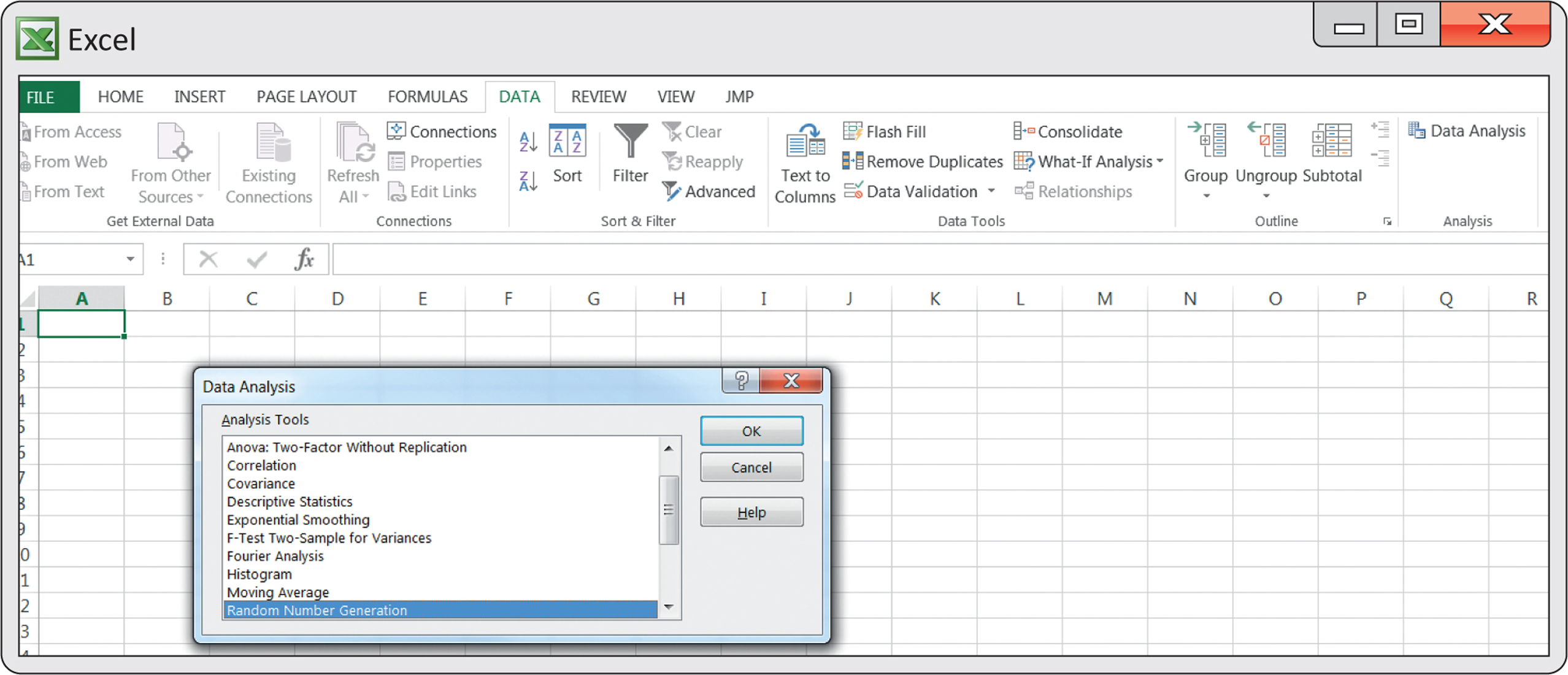
Within the Data Analysis menu box, there are 19 menu choices. When you select one of these, a box specific to the statistical routine will appear that asks for you to indicate where the data reside and where you want the output to be displayed. To indicate where the data for analysis reside, you specify the range of cells for the data in the “Input Range” box. This can be accomplished by first clicking the cursor in the “Input Range” box and then typing in the cell range, or more easily you can highlight the data by clicking and dragging the mouse over the cell range. The statistical output can be placed either in the current worksheet (placement indicated with “Output Range” box), in a new worksheet tabbed with the current workbook (“New Worksheet Ply” option), or in an entirely new workbook (“New Workbook” option).
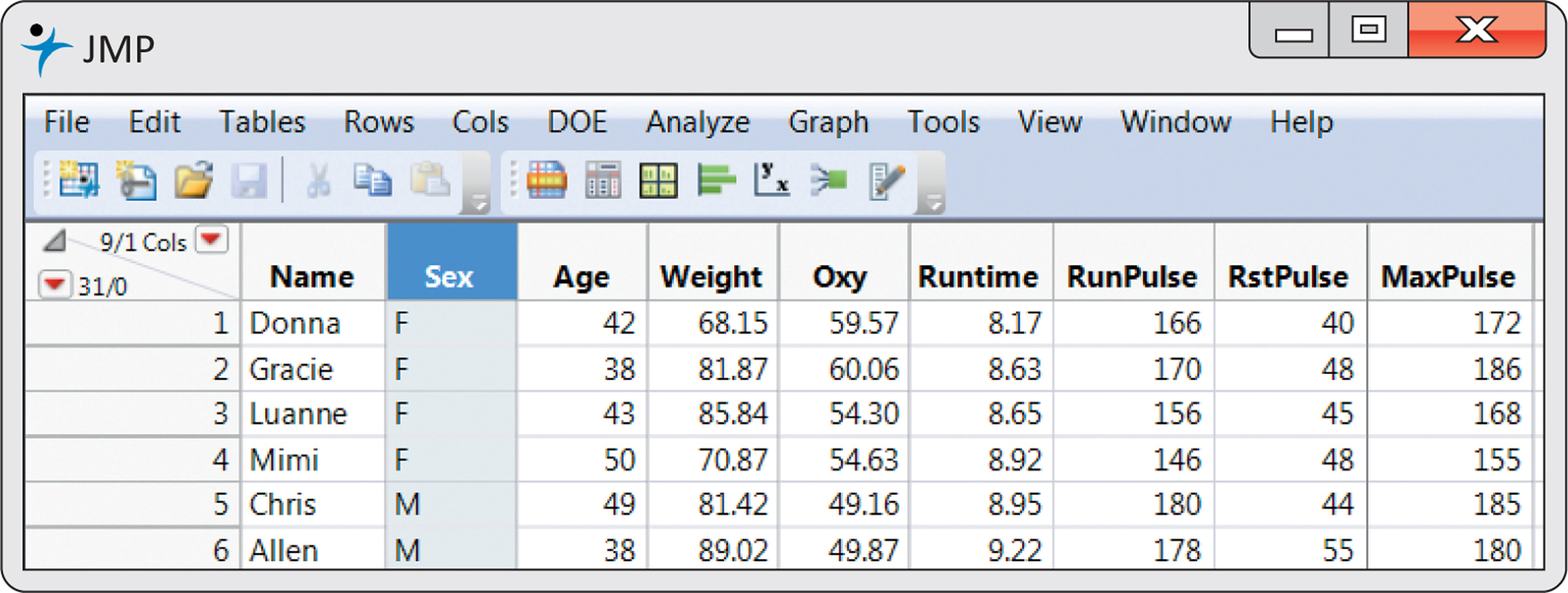
Upon entering JMP on either Mac or Windows, you will find the JMP home window, which is partitioned into four sections, including recent files and a list of open windows. Upon opening a dataset (illustrated below), a data table will be shown in a separate window.
TA1-4
Modeling Types
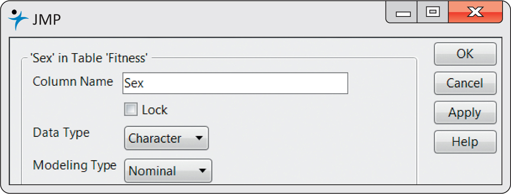
Variables in JMP take on a property called “modeling type,” which is just a classification for what measurements in a variable mean. For example, the chromosomal sex of an individual (male vs. female) is a different type of measurement than the age of an individual—one is a category, whereas the other is a numeric quantity. In JMP, variables are designated as being Nominal (categories), Ordinal (ordered categories), or Continuous (numeric measurements on a scale, like age). This designation is important, because JMP will help you produce analyses and graphical output that is appropriate for the type of variable you have. To change or set the modeling type of a variable, simply double-click on the variable name and select the data and modeling types appropriate for that variable (see figure below).
Invoking Statistical Procedures
To produce an analysis or create a graph, users can make a sequence of selections from a series of menus that all begin in the menu bar. In JMP, analyses and graphics are grouped by their context within “platforms.” For example, the “Fit Y by X” platform under the Analyze menu allows users to test hypotheses when there is one Y variable and one X variable (for instance, a two-group t test or a simple regression). Which type of analysis is returned depends on the modeling types of the variables specified (as described previously).
Once a platform is launched, additional options are available under the “Red Triangles” in the output window. These Red Triangles are special menus that show contextualized options—that is, analyses and options that make sense for the types of variables specified. In this regard, JMP is said to have a “progressive” interface: launching a platform is the first step, and once in a platform you can produce any number of analyses. If you are looking for a specific analysis, the “Statistics Index,” available under the Help menu, provides a list of all available procedures and can even launch an example for a given analysis. If you need additional help, select the question mark tool in the menu and click on any object in JMP to see the documentation for that object.
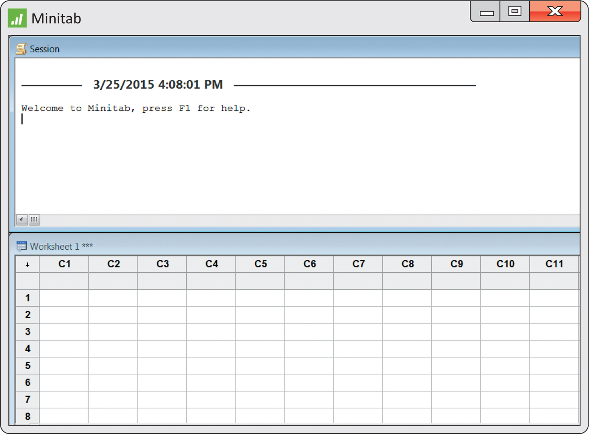
Upon entering Minitab, you will find the display partitioned into two windows, as seen in the following figure. The Session window is the area where all nongraphical statistical output and Minitab commands generating statistical output (graphical and nongraphical) are displayed. The Data Window displays a spreadsheet environment (known as a worksheet) where the data can be directly entered and edited. Each column represents a variable to be analyzed. There is a third window, which is minimized when Minitab starts (the Project Manager window); this keeps track of all the analyses that have been done in a project.
TA1-5
Invoking Statistical Procedures
There are two ways to invoke procedures:
You can type commands in the Session window. To do so, you must first enable the command language:
- Click in the Session window
- Click “Editor,” “Enable commands”
This will produce a “MTB>” prompt in the Session window. At this prompt, you can then type desired commands.
- Make a sequence of selections beginning in the toolbar menu. For example, in this chapter, we produce a graph known as a boxplot. To create this graph, you would click “Graph” and then select “Boxplot.” In this appendix, such a sequence of selections will be presented as Graph ➔ Boxplot. Once the sequence of selections has been made, dialog and/or option boxes will be encountered that allow you to indicate which variable(s) will be part of the analysis, along with other information. If further help is needed, you can click the “Help” button that appears with every dialog box. Once all appropriate information is provided, click the “OK” button to get the desired output.

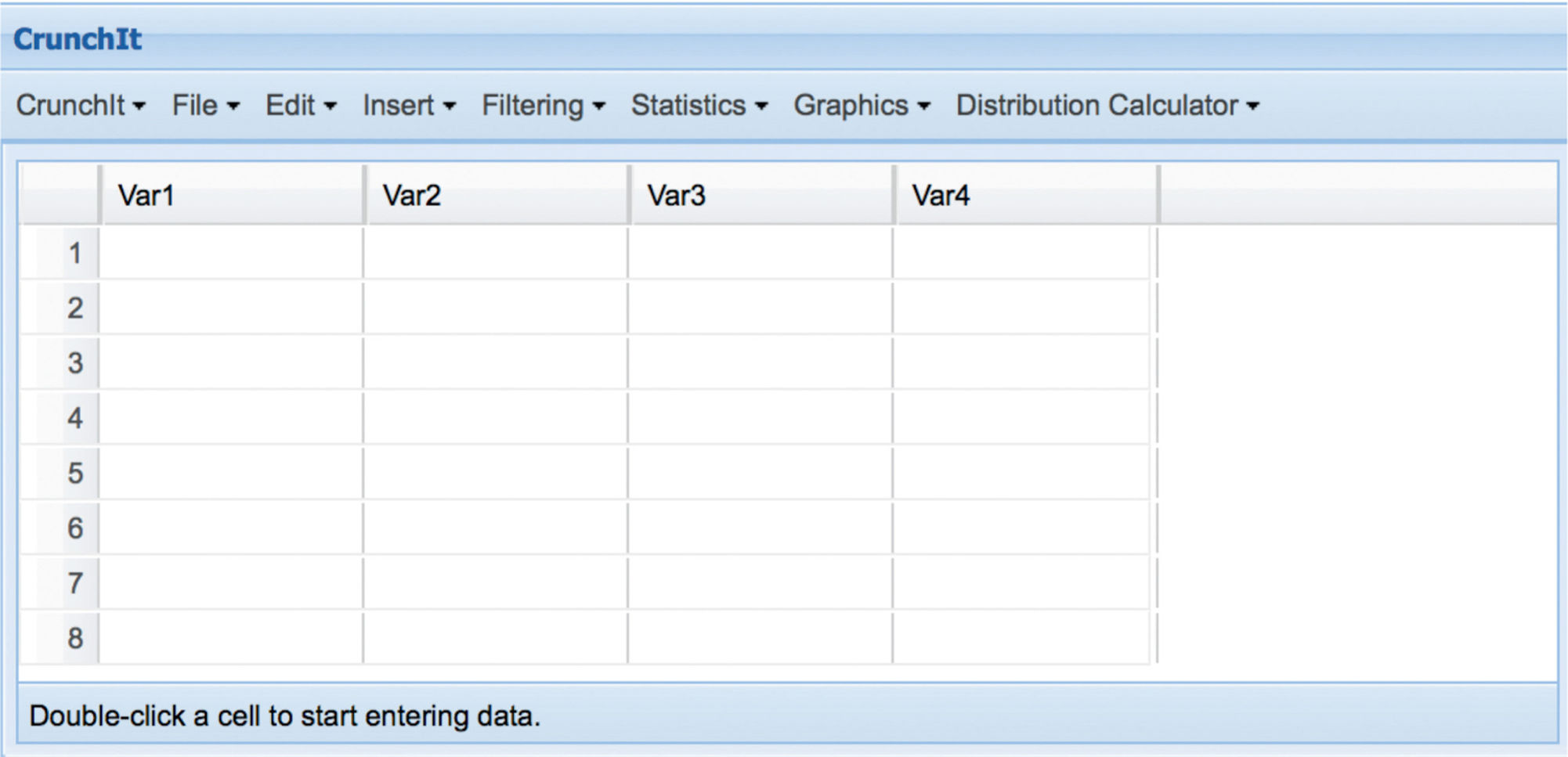
Upon entering CrunchIt you will be shown a blank dataset with rows and columns (see the figure below). To enter data, click in a cell and enter a value. To change a column name, double-click the column header and enter a new column name.
TA1-6
Invoking Statistical Procedures
Users can make a sequence of selections from a series of menus that all begin in the menu toolbar. Once the sequence of selections has been made, you will encounter dialog and/or option boxes that allow you to indicate which variable(s) will be part of the analysis, along with other information. If further help is needed, you can click the “Help” button that appears in dialog boxes. Once all appropriate information is provided, click “Calculate” to get the desired output.
CrunchIt Files
CrunchIt provides file options from the File menu, including creating a new dataset, importing data from a file or url, and exporting datasets to a file. CrunchIt also provides direct access to datasets from this book by selecting “Load from The Practice of Statistics for Business and Economics.”

In this section we provide a very basic overview, but for more instruction Texas Instruments provides getting started tutorials at education.ti.com ➔ Products ➔ Graphing calculators. Here, select your calculator and Support Resources.
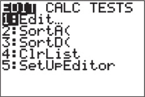
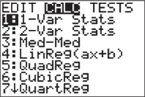
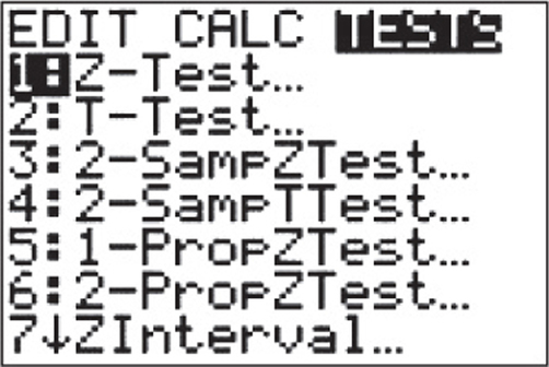
After pressing the button, you have three options: EDIT, CALC, and TESTS (shown below). Selecting “EDIT” enters the data-table editor, allowing you to type in data; “CALC” includes options for descriptive statistics as well as regression procedures; and “TESTS” includes hypothesis testing procedures.
Invoking Statistical Procedures
After entering data, statistical procedures can be selected from the “CALC” and “TEST” sections. After making the necessary selections your calculator will return the results of tests and procedures.
TA1-7
R is command-line software, although some “menu” interfaces (like R Commander) can help—especially beginners. To load R Commander, after installing the package, click Packages ➔ Load Package, and select Rcmdr. This also allows for an easier means of inputting data.
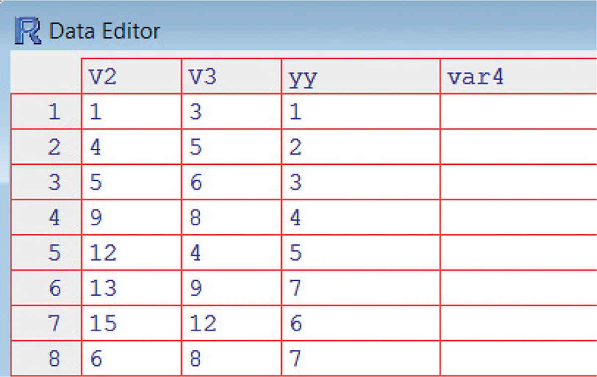
R works from data frames (a collection of variables). There are several methods of inputting data. For a small data set, you may want to directly enter the data from the command line, as in the following example that creates a data frame called mydat with variables and :
> x=c(1,2,3,4,5,6,7,8)
> y=c(10,13,8,7,9,8,4,10)
> mydat <- data.frame(x,y)
Another method evokes a spreadsheet-like input frame:
> mydata <- data.frame(num=numeric(0))
> mydata <- edit(mydata)
You can also input data by reading from a file. R can read many types, including .csv (comma separated variable) format, .xls and .xlsx (Excel), as well as others. An example command to read a .csv file that indicates the first row has variable names is given below.
> mydata <- read.csv(“file.txt”,head=T)
R commands have many possible parameters to give graphs titles, and so on. For full documentation on any command, click “Help,” select “R functions(text),” and enter the name of the command in the box.
The R Video Technology Manuals: Introduction Video would be helpful here.
Displaying Distributions with Graphs
Bar Graphs
- With pretabulated frequencies, the spreadsheet should have two columns with a column name in the top row: one column should have the category names, and the other column should have the total counts of each category.
- Select all cells, including the column names.
- Click the “Insert” tab and click “PivotTable” in the Tables group.
- Click “PivotChart” (this will create a “PivotTable Field List” box).
- Select the field(s) presented to you by clicking a checkmark next to the name(s).
- A bar graph will be created automatically.
TA1-8
Note: When you have only one column that requires summarizing, you will find that the field name appears in a section titled “Axis Fields (Categories).” You want to also have this field name in the section titled “ Values.” To do so, click and hold the field name and then drag the field from the field section into the “ Values” section. Excel will then automatically make the counts and create a corresponding bar graph.
Pie Charts
- Follow the steps for making a bar graph.
- Change the created bar graph into a pie chart by clicking the “Design” tab, then click “Change Chart Type” in the “Type” group, then select the “Pie” chart type.
Note: Alternatively, right-click on the bar graph and click “Change Chart Type” option.
Pareto Chart
- Create a bar graph, as described above.
- You will find in the spreadsheet a PivotTable report made up of two columns: (1) a column labeled “Row Labels” and (2) a column with the frequencies. Highlight the contents of the report (that is, the cells with the category names and the cells with the frequencies).
- Click the “Data” tab and then click “Sort” in the “Sort & Filter” group.
- Choose the “Descending (Z to A)” option and select the column associated with the frequency numbers in the menu box found immediately below the option.
- To convert the counts into percent, click the field name found in the “ Values” section, select the “Value Field Setting” option, click the “Show Values As” tab, then finally select “% of total” from the Show Values As menu and click “OK.”
Histograms
- Select “Histogram” in the Data Analysis menu box and click “OK.”
- Enter the cell range of the data into the “Input Range” box. If you want Excel to automatically select the classes, leave the “Bin Range” box empty.
- Place a checkmark next to the “Chart Output” option. Click “OK.”
Note: To remove gaps between bars, right-click on any one of the bars, select the Format Data Series option, then set the gap width to 0%. With no gap it is best to border the bars with line edges. Before closing the Format Data Series box, click the Border Color option and select the Solid line option and then click Close.
If you wish to change the automatically selected classes, enter upper values for each class into the spreadsheet and input their cell range in the Bin Range box.
Stemplots
Stemplots are not available in standard Excel or with the Data Analysis ToolPak.
Time Plots
- Click and drag the mouse to highlight the cell range of the data you wish to time plot (include the column name if you wish it to appear as a chart label).
- With the cell range highlighted, click the “Insert” tab and then click “Line” in the “Charts” group.
- Within the 2-D Line choices, you can choose whether to have data symbols at the data values or not.
For videos to help with these topics, see the Excel Video Technology Manuals on Bar Chart, Pie Chart, Histogram, and Time Plot.
TA1-9
Bar Graphs
Using the Distribution Platform (does not separate bars):
- Analyze ➔ Distribution
- Select variables of interest and click “Y” to cast variables into that role.
- Click “OK.”
Note: Frequency Bar Graphs are produced for nominal and ordinal variables, and histograms are produced for continuous variables. Remember, you can change the modeling types of variables by clicking the icon next to the variable name in columns list in the dataset.
Using Graph Builder (properly separates bars):
- Graph ➔ Graph Builder
- Drag a nominal or ordinal variable of interest to the X axis.
- Click the bar chart icon in the toolbar.
Pareto Chart
- Click the red triangle next to the variable name.
- Select Order by ➔ Count descending.
Pie Chart
Using the Pareto Plot Platform:
- Analyze ➔ Quality and Process ➔ Pareto Plot
- Select nominal or ordinal variable of interest, and click “Y, Cause” to cast variables into that role.
- Click “OK.”
- Click the red triangle and select “Pie Chart.”
Using Graph Builder:
- Graph ➔ Graph Builder
- Drag a nominal or ordinal variable of interest to the X axis.
- Click the pie chart in the toolbar.
Histograms
- Analyze ➔ Distribution
- Select continuous variables of interest and click “Y” to cast variables into that role.
- Click “OK.”
- If you wish to change the automatically selected classes, use the Graph ➔ Graph Builder option; drag the variable of interest to the X axis, then select the histogram icon. Click on a value on the axis, then change the minimum, maximum, and/or the bin width (Increment) and click “OK.”
Stemplots
- Analyze ➔ Distribution
- Select continuous variables of interest and click “Y” to cast variables into that role.
- Click “OK.”
- Click the red triangle next to a variable’s name and select “Stem and Leaf.”
TA1-10
Time Plots
Using Time Series Platform:
- Analyze ➔ Modeling ➔ Time Series
- Select outcome variable, and click “Y, Time Series” to enter that variable.
- If a time variable is available, enter it into “X, Time ID” (if you do not specify a time variable, JMP will order and label the time plot by row).
- Click “OK.”
Using Graph Builder (requires a time variable for X):
- Graph ➔ Graph Builder
- Drag the time variable to the X axis.
- Drag a continuous outcome variable to the Y axis.
- Click the line chart (next to the bar chart icon) in the toolbar.
For videos to help with these topics, see the JMP Video Technology Manuals on Bar Chart, Pie Chart, Histogram, Stemplot, and Time Plot.
Bar Graphs
- Graph ➔ Bar Chart
If the frequencies have been pretabulated, select “Values from a table” from the Bars represent menu.
If the frequencies have not been tabulated, select “Counts of unique values” from the Bars represent menu. Select “Simple” for the type of bar graph, then click “OK.”
For pretabulated frequencies, click-in the data column into the “Graph” variables box and click-in the column that has the names of the categories into the “Categorical” variables box.
If the frequencies have not been pretabulated, click the column that has data on the categorical names that need to be counted into the “Categorical” variables box.
- Click “OK.”
Pareto Chart
- Follow the instructions for a bar chart.
- Click “Chart Options.”
- Check the box next to Decreasing Y.
Pie Charts
- Graph ➔ Pie Chart
If the frequencies have been pretabulated, select the “Chart values” from a table option.
If the frequencies have not been pretabulated, select “Chart counts” of unique values option.
If the frequencies have been pretabulated, click-in the data column into the Summary variables box, and click the column that has the names of the categories into the Categorical variables box.
If the frequencies have not been pretabulated, click-in the column that has data on the categorical names that need to be counted into the Categorical variables box.
- If you wish to have the pie slices labeled by categorical names and have percents reported (as in Figure 1.1(b) in your text), click “Label,” then click the “Slice Labels” tab and place checkmarks next to the desired labels.
TA1-11
Histograms
- Graph ➔ Histogram
- Select “Simple” for the type of histogram, then click “OK.”
- Click-in the data column into the “Graph Variables” box and then click “OK.”
- If you wish to change the automatically selected classes, double-click on the horizontal axis to make the “Edit Scale” box appear. Now, click the “Binning” tab and then choose the “Midpoint/Cutpoint positions” option found in the “Interval Definition” section. Depending on whether you choose the Interval type as “Midpoint” or “Cutpoint,” you then give the desired values of the midpoints (that is, the middle values of the classes) or the cutpoints (that is, lower and upper values of the classes).
Stemplots
- Graph ➔ Stem-and-Leaf
- Click-in the data column into the “Graph Variables” box and then click “OK.”
Time Plots
- Graph ➔ Time Series Plot
- Select “Simple” for the type of time series plot, then click “OK.”
- Click-in the data column into the Series box.
Note: By default Minitab will label the time periods as “1,” “2,” “3,” and so on. If you wish to label the time periods by year, as in Figure 1.12 in your text, click the “Time/Scale” button, select the “Calendar” option, select the desired time periods (for example, “Year”) from the adjacent menu and a starting value. Click “OK” to return to the main dialog. Click “OK” to produce the plot.
For videos to help with these topics, see the Minitab Video Technology Manuals on Bar Chart, Pie Chart, Histogram, Stemplot, and Time Plot.
Bar Graphs
- Analyze ➔ Descriptive Statistics ➔ Frequencies
- Select the variable of interest on the left, then click the right arrow to move the variable to the right.
- Click “Charts” and select “Bar Chart,” then click “Continue.”
- Click “OK.”
Pie Charts
- Analyze ➔ Descriptive Statistics ➔ Frequencies
- Select the variable of interest on the left, then click the right arrow to move the variable to the right.
- Click “Charts” and select “Pie Chart,” and select “Percentages” under “Chart Values.” Click “Continue.”
- Click “OK.”
Pareto Plot
- Analyze ➔ Quality Control ➔ Pareto Chart
- Select “Simple” and click “Define.”
Select the variable to plot, then click the arrow next to “Category Axis” to move the variable to the category axis section.
TA1-12
- To add a title to your plot, click the “Titles . . . ” button. A new box will appear to enter titles or subtitles. Click “Continue” to close this dialog box.
- Click “OK.”
Histograms
- Analyze ➔ Descriptive Statistics ➔ Frequencies
- Select the variable of interest on the left, then click the right arrow to move the variable to the right.
- Click “Charts” and select “Histogram.” Click “Continue” and “OK.”
- To change the binning (bar scaling), double-click in the graph for the “Chart Editor,” then click in a bar of the graph for “Properties.” Select the “Binning” tab. Move the radio button to “Custom” and enter either a number of bars (bins) or a bin width. To change the maximum or minimum X value, click on “X” in the tool bar, and then the “Scale” tab. Uncheck the box under “Automatic” next to the value you want to change and enter the new value. Click “Apply” and “Close.”
Stemplots
- Analyze ➔ Descriptive Statistics ➔ Explore
- Select the variable of interest on the left, then click the right arrow next to “Dependent List” to move the variable to that section.
- Click “OK.”
Note: This procedure also produces a box plot and descriptive statistics by default.
Time Plots
With Sequence Charts:
- Analyze ➔ Forecasting ➔ Sequence Chart
- Select the variable of interest on the left, then click the right arrow next to “Variables” to move the variable to that section.
- If you have a variable identifying time, select it and click the right arrow next to “Time Axis Labels.”
- Click “OK.”
With Scatter/Dot (requires a time variable):
- Graph ➔ Legacy Dialogs ➔ Scatter/Dot
- Select “Simple Scatter” and click “Define.”
- Select outcome variable and click the right arrow next to “Y Axis.”
- Select time variable and click the right arrow next to “X Axis.”
- Click “OK.”
- Double-click the scatterplot in the output window to open the editor.
- In the toolbar, select the “Interpolation Line.”

- Close the editor to finalize the graph.
For videos to help with these topics, see the SPSS Video Technology Manuals on Bar Chart, Pie Chart, Histogram, Stemplot, and Time Plot.
TA1-13
Bar Graphs
With summarized data:
- Graphics ➔ Bar Chart With Summarized Data
- For “Labels,” select the column identifying groups.
- For “Heights,” select the frequency variable.
- Add a title and X and Y axis labels, if desired.
- Click “Calculate.”
With raw data:
- Graphics ➔ Bar Chart With Raw Data
- For “Sample,” select the column of interest; to avoid many “short” bars, you can enter a value in Cutoff that will gather all categories with frequencies less than the specified value into an “Other” category.
- Add a title and X and Y axis labels, if desired.
- Click “Calculate.”
Pie Charts
With summarized data:
- Graphics ➔ Pie Chart With Summarized Data
- For “Labels,” select the column identifying groups.
- For “Sizes,” select the frequency variable.
- Add a title, if desired.
- Click “Calculate.”
With raw data:
- Graphics ➔ Pie Chart With Raw Data
- For “Sample,” select the column of interest; to avoid many small slices, you can enter a value in Cutoff that will gather all categories with frequencies less than the specified value into an “Other” category.
- Add a title and X and Y axis labels, if desired.
- Click “Calculate.”
Pareto Plot
Pareto plots are not available in Crunchit. To create one, the data must be entered in decreasing frequency.
Histograms
- Graphics ➔ Histogram
- For “Sample,” select the column of interest.
- If desired, specify number of bins, bin width, start point, title, and axis labels.
- Click “Calculate.”
Stemplots
- Graphics ➔ Stem and Leaf
- For “Sample,” select the column of interest.
- If desired, enter a title.
- Click “Calculate.”
TA1-14
Time Plots
- Graphics ➔ Scatter Plot
- For “X,” enter time variable which must be numeric, such as day, year, or an index (1, 2, …, n).
- For “Y,” select the variable of interest.
- In the Parameters section, change “Points” to “Lines” or “Both.”
- Click “Calculate.”
For videos to help with these topics, see the Crunchit! Help Videos on Stemplots, Histograms, and Time Plots.
TI Calculators try to graph everything they can at the same time. For that reason, before creating any statistical graph/plot, you should check to see that no functions are entered on the screen; if so, use to erase those functions. Also, make sure only one STAT PLOT is “On” at a time; use STAT PLOTS option 4: PlotsOff to turn them all off.
Bar Graphs
- Press to select “Edit.”
- In L1 enter sequential values (1, 2, 3…) up to as many categories you have.
- Enter the values associated with each category in L2.
- Press , then set the Xmin and Xmax to match the values in L1, and adjust Ymin and Ymax to be an appropriate range for your Y variable.
- Press = STAT PLOT, turn the plot “On” if needed by using the
 and pressing to move the highlight. Select the histogram
  .
. - Select L1 for Xlist and L2 for Freq.
- Press .
Pie Charts
Pie Charts are not available on a TI-83.
Pareto Plot
Pareto Plots are not explicitly available on a TI-83, but a bar chart with descending frequencies can be made by following the steps for Bar Graphs while entering categories in order of descending frequencies.
Histograms
- Press = STAT PLOT, and select the histogram.
- Select a plot (press to select Plot 1).
- Enter the name of the list that contains the data by pressing , and so on.
- Get an initial histogram by pressing .
- Adjust the windowing (if needed) using . Reset Xmin, Xmax, Xscl (the bar width), and Ymax as needed.
- Press .
Stemplots
Stemplots are not available on a TI-83.
Time Plots
TA1-15
- Press to enter the list editor.
- In L1 enter time values (or an index from 1 to n).
- In L2 enter data for outcome variable.
- Press = STAT PLOT and select the connected scatterplot

- Select L1 for Xlist, and L2 for Ylist.
- Press .
For videos to help with these topics, see the TI-83/-84 Video Technology Manuals on Histogram and Time Plot.
Bar Graphs
A basic bar graph with raw data in a variable named “cat” in the mydat data frame can be created using the command
> barplot(table(mydat$cat))
If data are already summarized into a variable named “c1,” use the command
> barplot(mydat$Freq,names.arg=mydat$c1)
Pie Charts
A pie chart with raw data in a variable named “cat” in data frame mydat can be created with the command
> pie(table(mydat$cat))
If data are already summarized, modify the command to the one below with frequencies in Frq and slice labels in c2.
> pie(mydat$Frq,names=c2)
Pareto Plot
Pareto plots are not available in R.
Histograms
A basic histogram for data stored in variable y can be created using the command
> hist(mydat$y)
To set your own bins (the example below uses bins ), modify the command to
> hist(mydat$y,breaks=c(5,10,15,20,25))
Stemplots
A basic stemplot can be created using the command
> stem(mydat$y)
Time Plots
A time series plot using an index or other variable for time can be done as a connected scatterplot. Use type=“b” to have both points and lines, or type=“l” to simply have connected lines.
> plot(mydat$x,mydat$y,type=“b”)
For videos to help with these topics, see the R Video Technology Manuals on Bar Chart, Pie Chart, Histogram, Stemplot, and Time Plot.
Describing Distributions with Numbers
TA1-16
Numeric Summaries of Distributions
- Select “Descriptive Statistics” in the Data Analysis menu box and click “OK.”
- Enter the cell range of the data into the Input Range box.
- Place a checkmark next to the “Chart Output” option. Click “OK.”
- If you wish to compute the first and third quartiles, click an empty cell in the spreadsheet and then proceed to the statistical function menu as described in the Excel overview section of this Appendix. Scroll down the list of functions and double-click on the QUARTILE function choice. In the “Array” box, input the cell range of the data. In the Quartile box, input the value “1” to get the first quartile or the value “3” to get the third quartile and then click “OK.”
Boxplots
Boxplots are not available in standard Excel, but they are available in the enhanced add-on version of Excel.
For videos to help with these topics, see the Excel Video Technology Manuals on Boxplots, Sorting Data, and Summary Statistics.
Numeric Summaries of Distributions
- Analyze ➔ Distribution
- Select variable(s) of interest and click “Y” to cast into that role.
- Click “OK.” This gives the mean, standard deviation, and five-number summary. For other statistics, click the red triangle next to “Summary Statistics” and check the ones you want.
Boxplots
Using the Distribution Platform:
- Analyze ➔ Distribution
- Select variable(s) of interest and click “Y” to cast into that role.
- Click “OK.”
A boxplot that identifies potential outliers is included with the histogram by default.
Using Graph Builder:
- Graph ➔ Graph Builder
- Drag a continuous variable of interest to the X or Y axis.
- Click the boxplot icon in the toolbar.
For videos to help with these topics, see the JMP Video Technology Manuals on Boxplots and Summary Statistics.
TA1-17
Numeric Summaries of Distributions
- Stat ➔ Basic Statistics ➔ Display Descriptive Statistics
- Click in the data column(s) for which you want numerical summaries into the Variables box.
- Click the Statistics button to select additional options, then click “OK” to close the pop-up.
- Click “OK” to have the summaries reported in the Session window.
Boxplots
- Graph ➔ Boxplot
- For a single variable, select “One Y Simple,” then click “OK.” If you have multiple boxplots that you want to display together, select “Multiple Y’s Simple” (if the variables are in separate columns), or “One Y With Groups” (if there is a column with the group identifier). Click “OK.”
- Click in the data column(s) for which you want to construct boxplots into the Graph variables box. Click “OK.”
For videos to help with these topics, see the Minitab Video Technology Manuals on Boxplots, Sorting Data, and Summary Statistics.
Numeric Summaries of Distributions
- Analyze ➔ Descriptive Statistics ➔ Explore
- Select the variable of interest on the left, then click the right arrow next to “Dependent List” to move the variable to that section.
- Click “OK.”
Boxplots
- Analyze ➔ Descriptive Statistics ➔ Explore
- Select the variable of interest on the left, then click the right arrow next to “Dependent List” to move the variable to that section.
- Click “OK.”
For videos to help with these topics, see the SPSS Video Technology Manuals on Boxplots, Sorting Data, and Summary Statistics.
Numeric Summaries of Distributions
- Statistics ➔ Descriptive Statistics
- Place a check box next to each variable of interest.
- If you want percentiles other than the standard five-number summary, enter those in the box.
- Click “Calculate.”
Boxplots
- Graphics ➔ Box Plot
- Check the box next to each variable you want to visualize.
- Enter a title and X and Y axis labels, if desired.
- Click “Calculate.”
For videos to help with these topics, see the Crunchit! Help Videos on Pictures for Quantitative Data and Descriptive Statistics.
TA1-18
Numeric Summaries of Distributions
- Enter the data in a list, using to access the list editor.
- Press , and
to CALC. Select option 1:1-Var Stats. This will add the command to the home screen.
- Enter L1 (as or the list with your data) after “1-Var Stats” and press enter.
- Press the down arrow to reveal the five-number summary.
Boxplots
- Press = STAT PLOT and select the box plot
 or
or  . The first does not identify potential outliers using the 1.5IQR criteria; the second does.
 - Enter L1 (as ) or the list with your data as Xlist.
- Press .
For videos to help with these topics, see the TI-83/-84 Video Technology Manuals on Boxplots, Sorting Data, and Summary Statistics.
Numeric Summaries of Distributions
Summary statistics for variable can be found with a command like
> numSummary(x,statistics=c(“mean”,“sd”,“IQR”,“quantiles”),
+ quantiles=c(0,.25,.5,.75,1))
The command “summary(mydat)” will find the mean and five-number summary for all variables in a data frame (or simply specify a single variable).
Boxplots
The command is simply
> boxplot(x)
For videos to help with these topics, see the R Video Technology Manuals on Boxplots, Sorting Data, and Summary Statistics.
Density Curves and the Normal Distributions
Normal Distribution Calculations
Excel does not provide a means to visualize areas under the Normal curve, but it can compute areas under the Normal curve or work backward.
- Click an empty cell in the spreadsheet, then Formulas ➔ More Functions, Statistical. Scroll down to find NORM.DIST.
- To find the area to the left of the point of interest for any Normal distribution, enter the value, the mean (), the standard deviation (), and “1” for Cumulative. Click “OK.”
- For a standard Normal (Z) distribution, use NORM.S. DIST. Enter the z-score and “1” for Cumulative. Click “OK.”
- To do backward Normal calculations, use NORM.S.INV for standard Normal (enter the probability to the left of the point, that is, ; for any Normal distribution, use NORM.INV and enter the probability to the left of the point, the mean (), and the standard deviation (). Click “OK.”
TA1-19
Normal Quantile Plots
Neither Normal quantile plots nor Normal probability plots are available as a basic function in Excel. To create these, this author recommends watching the recommended video.
For videos to help with these topics, see the Excel Video Technology Manuals on Normal Calculations and Normal Quantile Plots.
Normal Distribution Calculations
- Help ➔ Sample Data ➔ Teaching Scripts (in Teaching Resources) ➔ Interactive Teaching Modules ➔ Distribution Calculator
- Enter a mean and standard deviation if not standard Normal and click “Reset Distribution.”
- Select the type of calculation desired (input values to obtain a probability or enter a probability to obtain a value—the inverse calculation),
- Enter the value(s) type to the right, enter the value(s) of interest, and press the “Enter” key to see shading on distribution.
Note: For JMP 11 and earlier versions, the Distribution Calculator (and many other interactive simulators) can be downloaded for free from jmp.com/tools.
Normal Quantile Plot
- Analyze ➔ Distribution
- Select variables of interest and click “Y” to cast variables into that role.
- Click “OK.”
- Click the red triangle next to the variable name, then select “Normal Quantile Plot.”
Note: The option to produce Normal quantile plots is available only for continuous variables, since such a plot makes sense only for continuous variables.
For videos to help with these topics, see the JMP Video Technology Manuals on Normal Calculations and Normal Quantile Plots.
Normal Distribution Calculations
- Graph ➔ Probability Distribution Plot
- Select “View Probability” and click “OK.”
- Enter values for the mean and/or standard deviation.
- Click the “Shaded Area” tab. If you want to find the area under the curve associated with a specified value, select the “ Value” option. You can choose to find the area to the left or right of that specified value or even between two values by clicking the appropriate picture.
- Enter the specified value(s) in the “ value” box. Click “OK.”
For more precise values:
- Calc ➔ Probability Distributions ➔ Normal
- Choose the “Cumulative probability” option if you wish to find the area to the left of a specified value. Choose the “Inverse cumulative probability” option if you wish to find the value associated with a specified area to the left of that value.
- Select the “Input constant” option.
- Enter the specified value of or or enter the specified area. Click “OK” to find the results reported in the Session window.
TA1-20
Normal Quantile Plots
- Graph ➔ Probability Plot
- Select “single” (for only one variable) and “OK.”
- Click in the data column of interest into the Variable box and then click “OK.”
For videos to help with these topics, see the Minitab Video Technology Manuals on Normal Calculations and Normal Quantile Plots.
Normal Distribution Calculations
SPSS does not have a probability look up graphical interface. Cumulative probabilities can be found and inverse calculations performed using Compute Variable.
- Transform ➔ Compute Variable
- In “Target Variable” enter a name for the new variable.
- To find a cumulative probability, select “CDF and Noncentral” then “CDF.normal” (this will enter the formula in the editor). Enter the desired parameters in to the formula (quantity to look up, mean, and standard deviation). Click “OK.”
- To find a variable value given a cumulative probability, select “Inverse DF” and then “IDF.Normal.” Enter the parameters and click “OK.”
- A new column will be added to the dataset containing the result.
Normal Quantile Plots
- Analyze ➔ Descriptive Statistics ➔ Q-Q Plots
- Select the variable of interest on the left, then click the right arrow to move the variable to that section.
- Click “OK.”
For videos to help with these topics, see the SPSS Video Technology Manuals on Normal Calculations and Normal Quantile Plots.
Normal Distribution Calculations
- Distribution Calculator ➔ Normal
- Enter the mean and standard deviation (or accept defaults for standard normal),
- To look up proportions, use the probability tab; to look up a variable value given a cumulative proportion, , use the quantile tab.
- After entering value, click “Calculate.”
Normal Quantile Plots
- Graphics ➔ QQ Plot
- For “Sample,” select the column of interest.
- Click “Calculate.”
For videos to help with these topics, see the Crunchit! Help Videos on Normal Calculations and Normal Quantile Plots.
TA1-21
Normal Distribution Calculations
There are two ways to find Normal distribution probabilities: using “normalcdf” from the menu, or using “ShadeNorm” from the DRAW menu in the same location. If using ShadeNorm, be sure to use , 1:ClrDraw between calculations. Otherwise, the Normal curve will become increasingly filled in, and you won’t be able to discern the area of interest.
For probabilities such as or the upper (lower) end of the area is + (–) infinity. For the calculator, +∞ is , but practically speaking, any “very large” value will work.
To look up proportions of the Normal distribution:
- Press ➔ 2:normalcdf( and press (or just press).
- To look up proportions from a Normal distribution with a mean other than 0, and standard deviation other than 1, enter the mean and standard deviation after entering the range. For example, normcdf(90,110,100,15) will look up the proportion between 90 and 110 for a Normal distribution with a mean of 100 and a standard deviation of 15. If you are using standard Normal, there is no need to enter the mean and standard deviation.
- To use ShadeNorm, you need to size the window. An appropriate size is for the X axis. Y sizing will depend on the distribution. For standard Normal, will work well. The parameters for the command (low value, high value, , ) are the same.
To find the value in a standard Normal distribution with a particular proportion to the left:
- Press ➔ 3:invNorm(and press (or just press).
- Enter the proportion desired, a comma, the mean, the standard deviation and press . If you are using standard Normal, there is no need to enter the mean and standard deviation. For example, invNorm(.50) will return 0 (at , half of the distribution is to the left).
Normal Quantile Plots
- Enter the data in a list.
- Press = STAT PLOT, select one of the three plots, and select the Quantile plot,
 .
.
- Enter L1 (as , or the list with your data) as Xlist.
- Select a data axis (your text uses the Y axis) and a mark type for each data point.
- Press .
For videos to help with these topics, see the TI-83/-84 Video Technology Manuals on Normal Calculations and Normal Quantile Plots.
TA1-22
Normal Distribution Calculations
To find the cumulative probability, that is, , use the command
> Pnorm(x,mu,sd)
To find value in a standard Normal distribution with a particular proportion to the left, use
> qnorm(Prob,mu,sd)
Normal Quantile Plots
The command is
> qqnorm(mydat$x)
For videos to help with these topics, see the R Video Technology Manuals on Normal Calculations and Normal Quantile Plots.