SECTION 10.1 Exercises
For Exercises 10.1 and 10.2, see page 488; for 10.3 and 10.4, see page 490; for 10.5, see pages 493–494; for 10.6 to 10.8, see pages 498–499; for 10.9 and 10.10, see page 500; and for 10.11 and 10.12, see page 502.
Question 10.13
10.13 Assessment value versus sales price.
Real estate is typically reassessed annually for property tax purposes. This assessed value, however, is not necessarily the same as the fair market value of the property. Table 10.2 summarizes an SRS of 35 properties recently sold in a midwestern county.8 Both variables are measured in thousands of dollars.
hsales
- Inspect the data. How many have a selling price greater than the assessed value? Do you think this trend would be true for the larger population of all homes recently sold? Explain your answer.
- Make a scatterplot with assessed value on the horizontal axis. Briefly describe the relationship between assessed value and selling price.
- Based on the scatterplot, there is one distinctly unusual observation. State which property it is, and describe the impact you expect this observation has on the least-squares line.
- Report the least-squares regression line for predicting selling price from assessed value using all 35 properties. What is the regression standard error?
- Now remove the unusual observation and fit the data again. Report the least-squares regression line and regression standard error.
- Compare the two sets of results. Describe the impact this unusual observation has on the results.
- Do you think it is more appropriate to consider all 35 properties for linear regression analysis or just consider the 34 properties? Explain your decision.
504
| Property | Sales price |
Assessed value |
Property | Sales price |
Assessed value |
Property | Sales price |
Assessed value |
|---|---|---|---|---|---|---|---|---|
| 1 | 83.0 | 87.0 | 13 | 249.9 | 192.0 | 25 | 146.0 | 121.1 |
| 2 | 129.9 | 103.8 | 14 | 112.0 | 117.4 | 26 | 230.5 | 212.1 |
| 3 | 125.0 | 111.0 | 15 | 133.0 | 117.2 | 27 | 360.0 | 167.9 |
| 4 | 245.0 | 157.4 | 16 | 177.5 | 116.6 | 28 | 127.9 | 110.2 |
| 5 | 100.0 | 127.5 | 17 | 162.5 | 143.7 | 29 | 205.0 | 183.2 |
| 6 | 134.7 | 127.7 | 18 | 238.0 | 198.2 | 30 | 163.5 | 93.6 |
| 7 | 106.0 | 110.9 | 19 | 120.9 | 93.4 | 31 | 225.0 | 156.2 |
| 8 | 91.5 | 90.8 | 20 | 142.5 | 92.3 | 32 | 335.0 | 278.1 |
| 9 | 170.0 | 160.7 | 21 | 299.0 | 279.0 | 33 | 192.0 | 151.0 |
| 10 | 295.0 | 250.5 | 22 | 82.5 | 90.4 | 34 | 232.0 | 178.8 |
| 11 | 179.0 | 160.9 | 23 | 152.5 | 103.2 | 35 | 197.9 | 172.4 |
| 12 | 230.0 | 213.2 | 24 | 139.9 | 114.9 |
10.13
(a) 30. Generally, this may be true because the sellers might expect buyers to “lowball,” but markets will vary. (b) The relationship is linear, positive, and strong. (c) House 27 has an assessed value of 167.9 but a sales price of 360.0. This observation is likely influencing the regression somewhat. (d) . (e) . (f) The outlier has some influence on the regression; particularly, the first model that includes the outlier has a much larger standard error than when the observation is removed.
Question 10.14
10.14 Assessment value versus sales price, continued.
Refer to the previous exercise. Let’s consider linear regression analysis using just 34 properties.
hsales
- Obtain the residuals and plot them versus assessed value. Is there anything unusual to report? If so, explain.
- Do the residuals appear to be approximately Normal? Describe how you assessed this.
- Based on your answers to parts (a) and (b), do you think the assumptions for statistical inference are reasonably satisfied? Explain your answer.
- Construct a 95% confidence interval for the slope and summarize the results.
- Using the result from part (d), compare the estimated regression line with , which says that, on average, the selling price is equal to the assessed value. Is there evidence that this model is not reasonable? In other words, is the selling price typically larger or smaller than the assessed value? Explain your answer.
Question 10.15
10.15 Public university tuition: 2008 versus 2013.
Table 10.3 shows the in-state undergraduate tuition and required fees in 2008 and in-state tuition in 2013 for 33 public universities.9
tuit
| School | 2008 | 2013 | School | 2008 | 2013 | School | 2008 | 2013 |
|---|---|---|---|---|---|---|---|---|
| Penn State | 13,706 | 15,562 | Ohio State | 8,679 | 9,168 | Texas | 8,532 | 9,790 |
| Pittsburgh | 13,642 | 15,730 | Virginia | 9,300 | 9,622 | Nebraska | 6,584 | 6,480 |
| Michigan | 11,738 | 12,800 | California–Davis | 9,497 | 11,220 | Iowa | 6,544 | 6,678 |
| Rutgers | 11,540 | 10,356 | California–Berkeley | 7,656 | 11,220 | Colorado | 7,278 | 8,056 |
| Michigan State | 10,690 | 12,622 | California–Irvine | 8,046 | 11,220 | Iowa State | 5,524 | 6,648 |
| Maryland | 8,005 | 12,245 | Purdue | 7,750 | 9,208 | North arolina | 5,397 | 5,823 |
| Illinois | 12,106 | 11,636 | California–San Diego | 8,062 | 11,220 | Kansas | 7,042 | 8,790 |
| Minnesota | 10,634 | 12,060 | Oregon | 6,435 | 8,010 | Arizona | 5,542 | 9,114 |
| Missouri | 7,386 | 8,082 | Wisconsin | 7,569 | 9,273 | Florida | 3,256 | 4,425 |
| Buffalo | 6,385 | 5,570 | Washington | 6,802 | 11,305 | Georgia Tech | 6,040 | 7,718 |
| Indiana | 8,231 | 8,750 | UCLA | 8,310 | 11,220 | Texas A&M | 7,844 | 5,297 |
- Plot the data with the 2008 tuition on the axis and describe the relationship. Are there any outliers or unusual values? Does a linear relationship between the tuition in 2008 and 2013 seem reasonable?
- Run the simple linear regression and give the least-squares regression line.
505
- Obtain the residuals and plot them versus the 2008 tuition amount. Is there anything unusual in the plot?
- Do the residuals appear to be approximately Normal? Explain.
- Give the null and alternative hypotheses for examining if there is a linear relationship between 2008 and 2013 tuition amounts.
- Write down the test statistic and -value for the hypotheses stated in part (e). State your conclusions.
10.15
(a) The relationship is linear, positive, and strong. There are no outliers; a linear model seems reasonable. (b) . (c) The plot looks random and scattered, there is nothing unusual in the plot, and the assumptions appear valid. (d) The distribution is Normal. (e) . (f) . The data show a significant linear relationship between Y2013 and Y2008 tuitions.
Question 10.16
10.16 More on public university tuition.
Refer to the previous exercise.
tuit
- Construct a 95% confidence interval for the slope. What does this interval tell you about the annual percent increase in tuition between 2008 and 2013?
- What percent of the variability in 2013 tuition is explained by a linear regression model using the 2008 tuition?
- The tuition at BusStat U was $8800 in 2008. What is the predicted tuition in 2013?
- The tuition at Moneypit U was $15,700 in 2008. What is the predicted tuition in 2013?
- Discuss the appropriateness of using the fitted equation to predict tuition for each of these universities.
Question 10.17
10.17 The timing of initial public offerings (IPOs).
Initial public offerings (IPOs) have tended to group together in time and in sector of business. Some researchers hypothesize this is due to managers either speeding up or delaying the IPO process in hopes of taking advantage of a “hot” market, which will provide the firm high initial valuations of their stock.10 The researchers collected information on 196 public offerings listed on the Warsaw Stock Exchange over a six-year period. For each IPO, they obtained the length of the IPO offering period (time between the approval of the prospectus and the IPO date) and three market return rates. The first rate was for the period between the date the prospectus was approved and the “expected” IPO date. The second rate was for the period 90 days prior to the “expected” IPO date. The last rate was between the approval date and 90 days after the “expected” IPO date. The “expected” IPO date was the median length of the 196 IPO periods. They regressed the length of the offering period (in days) against each of the three rates of return. Here are the results:
| Period | -value | |||
|---|---|---|---|---|
| 1 | 48.018 | −129.391 | 0.0008 | −0.238 |
| 2 | 49.478 | −114.785 | <0.0001 | −0.414 |
| 3 | 47.613 | −41.646 | 0.0463 | −0.143 |
- What does this table tell you about the relationship between the IPO offering period and the three market return rates?
- The researchers argue that since the strongest correlation is for the second period and the lowest is for the third period, there is evidence for their hypothesis. Do you agree with this conclusion? Explain your answer.
10.17
(a) All 3 market return rates are significant predictors of the IPO offering period; however, the first 2 are much stronger predictors than the rate for the 3rd period.
Question 10.18
10.18 The relationship between log income and education level for employees.
Recall Case 10.1 (pages 485–486). The researchers also looked at the relationship between education and log income for employees. An employee was defined as a person whose main employment status is a salaried job. Based on a sample of 100 employees:
empl
- Construct a scatterplot of log income versus education. Describe the relationship between the two variables. Is a linear relationship reasonable? Explain your answer.
- Report the least-squares regression line.
- Obtain the residuals and use them to assess the assumptions needed for inference.
- In Example 10.5 (pages 497–498), we constructed a 95% confidence interval for the slope of the entrepreneur population. It was (0.0208 to 0.2044). Construct a 95% confidence interval for the slope of the employee population.
- Compare the two confidence intervals. Do you think there is a difference in the two slopes? Explain your answer.
Question 10.19
10.19 Incentive pay and job performance.
In the National Football League (NFL), incentive bonuses now account for roughly 25% of player compensation.11 Does tying a player’s salary to performance bonuses result in better individual or team success on the field? Focusing on linebackers, let’s look at the relationship between a player’s end-of-the-year production rating and the percent of his salary devoted to incentive payments in that same year.
perplay
- Use numerical and graphical methods to describe the two variables and summarize your results.
- Neither variable is Normally distributed. Does that necessarily pose a problem for performing linear regression? Explain.
- Construct a scatterplot of the data and describe the relationship. Are there any outliers or unusual values? Does a linear relationship between the percent of salary from incentive payments and player rating seem reasonable? Is it a very strong relationship? Explain.
- Run the simple linear regression and give the least-squares regression line.
- Obtain the residuals and assess whether the assumptions for the linear regression analysis are reasonable. Include all plots and numerical summaries that you used to make this assessment.
10.19
(a) Percentage is strongly right-skewed; a lot of players have a small percent of their salary devoted to incentive payments. Rating is also right-skewed. (b) Only the residuals need to be Normal; because they are somewhat right-skewed, it could pose a threat to the results. (c) The relationship is quite scattered. The direction is positive, but any linear relationship is weak. A large number of observations fall close to 0 percent. (d) . (e) The residual plot looks good, no apparent violations. The Normal quantile plot shows the violation of Normality and the right skew we saw earlier.
506
Question 10.20
10.20 Incentive pay, continued.
Refer to the previous exercise.
perplay
- Now run the simple linear regression for the variables square root of rating and percent of salary from incentive payments.
- Obtain the residuals and assess whether the assumptions for the linear regression analysis are reasonable. Include all plots and numerical summaries that you used to make this assessment.
- Construct a 95% confidence interval for the square root increase in rating given a 1% increase in the percent of salary from incentive payments.
- Consider the values 0%, 20%, 40%, 60%, and 80% salary from incentives. Compute the predicted rating for this model and for the one in Exercise 10.19. For the model in this exercise, you need to square the predicted value to get back to the original units.
- Plot the predicted values versus the percents, and connect those values from the same model. For which regions of percent do the predicted values from the two models vary the most?
- Based on your comparison of the regression models (both predicted values and residuals), which model do you prefer? Explain.
Question 10.21
10.21 Predicting public university tuition: 2000 versus 2013.
Refer to Exercise 10.15. The data file also includes the in-state undergraduate tuition and required fees for the year 2000. Repeat parts (a) through (f) of Exercise 10.15 using these data in place of the data for the year 2008.
tuit
10.21
(a) The relationship is linear, positive, and moderate. There are no outliers; a linear model seems reasonable. (b) . (c) The plot looks random and scattered, and there is one observation with a very low residual; otherwise, the assumptions appear valid. (d) There is the same outlier; otherwise, the distribution is roughly Normal. (e) . (f) . The data show a significant linear relationship between Y2013 and Y2000 tuitions.
Question 10.22
10.22 Compare the analyses.
In Exercises 10.15 and 10.21, you used two different explanatory variables to predict the tuition in 2013. Summarize the two analyses and compare the results. If you had to choose between the two, which explanatory variable would you choose? Give reasons for your answers.
Age and income. How do the incomes of working-age people change with age? Because many older women have been out of the labor force for much of their lives, we look only at men between the ages of 25 and 65. Because education strongly influences income, we look only at men who have a bachelor’s degree but no higher degree. The data file for the following exercises contains the age and income of a random sample of 5712 such men. Figure 10.11 is a scatterplot of these data. Figure 10.12 displays Excel output for regressing income on age. The line in the scatterplot is the least-squares regression line. Exercises 10.23 through 10.25 ask you to interpret this information.
Question 10.23
10.23 Looking at age and income.
The scatterplot in Figure 10.11 has a distinctive form.
- Age is recorded as of the last birthday. How does this explain the vertical stacks in the scatterplot?
- Give some reasons older men in this population might earn more than younger men. Give some reasons younger men might earn more than older men. What do the data show about the relationship between age and income in the sample? Is the relationship very strong?
- What is the equation of the least-squares line for predicting income from age? What specifically does the slope of this line tell us?
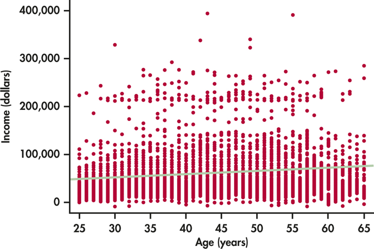
10.23
(a) All ages are reported as integers forming the stacks. (b) Answers will vary. Older men could have more experience; younger men could have more recent education. The data show that there is no relationship between age and income for men (or a very weak one). (c) . For each 1 year a man gets older, his predicted income goes up by $892.11.
inage
Question 10.24
10.24 Income increases with age.
We see that older men do, on average, earn more than younger men, but the increase is not very rapid. (Note that the regression line describes many men of different ages—data on the same men over time might show a different pattern.)
507
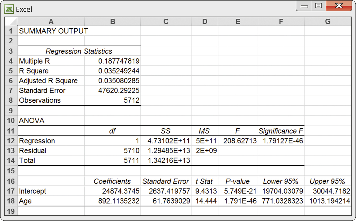
- We know even without looking at the Excel output that there is highly significant evidence that the slope of the population regression line is greater than 0. Why do we know this?
- Excel gives a 95% confidence interval for the slope of the population regression line. What is this interval?
- Give a 99% confidence interval for the slope of the population regression line.
inage
Question 10.25
10.25 Was inference justified?
You see from Figure 10.11 that the incomes of men at each age are (as expected) not Normal but right-skewed.
- How is this apparent on the plot?
- Nonetheless, your confidence interval in the previous exercise will be quite accurate even though it is based on Normal distributions. Why?
10.25
(a) For the stack at each age, there are very few with large incomes, showing the right-skew. (b) Regression inference is robust against moderate lack of Normality, especially given our large sample size.
inage
Question 10.26
10.26 Regression to the mean?
Suppose a large population of test takers take the GMAT. You fear there may have been some cheating, so you ask those people who scored in the top 10% to take the exam again.
- If their scores, on average, go down, is this evidence that there was cheating? Explain your answer.
- If these same people were asked to take the test a third time, would you expect their scores to go down even further? Explain your answer.
Question 10.27
10.27 T-bills and inflation.
Exercises 10.6 through 10.8 interpret the part of the Excel output in Figure 10.10 (page 499) that concerns the slope, the rate at which T-bill returns increase as the rate of inflation increases. Use this output to answer questions about the intercept.
- The intercept in the regression model is meaningful in this example. Explain what represents. Why should we expect to be greater than 0?
- What values does Excel give for the estimated intercept and its standard error ?
- Is there good evidence that is greater than 0?
- Write the formula for a 95% confidence interval for . Verify that hand calculation (using the Excel values for and ) agrees approximately with the output in Figure 10.10.
10.27
(a) is the return on T-bills when there is no inflation. Without inflation, we would expect a positive return on any invested money. (b) . (c) . There is significant evidence that the intercept is greater than 0. (d) Using , which gives the same answer as Excel (with rounding error).
Question 10.28
10.28 Is the correlation significant?
A study reports correlation based on a sample of size . Another study reports the same correlation based on a sample of size . For each, use Table G to test the null hypothesis that the population correlation against the one-sided alternative . Are the results significant at the 5% level? Explain why the conclusions of the two studies differ.
508
Question 10.29
10.29 Correlation between the prevalences of adult binge drinking and underage drinking.
A group of researchers compiled data on the prevalence of adult binge drinking and the prevalence of underage drinking in 42 states.12 A correlation of 0.32 was reported.
- Use Table G to test the null hypothesis that the population correlation against the alternative . Are the results significant at the 5% level?
- Explain this correlation in terms of the direction of the association and the percent of variability in the prevalence of underage drinking that is explained by the prevalence of adult binge drinking.
- The researchers collected information from 42 of 50 states, so almost all the data available was used in the analysis. Provide an argument for the use of statistical inference in this setting.
10.29
(a) , the correlation is significantly greater than 0 at the 5% level. (b) States with more adult binge drinking are more likely to have underage drinking. . 10.24% of the variation in underage drinking can be accounted for by the prevalence of adult binge drinking. (c) Even though most states were used, it is assumed that sampling took place for each state; thus, we can still infer about the true unknown correlation (had we obtained different samples from each state, we would have gotten different results).
Question 10.30
10.30 Stocks and bonds.
How is the flow of investors’ money into stock mutual funds related to the flow of money into bond mutual funds? Table 10.4 shows the net new money flowing into stock and bond mutual funds in the years 1984 to 2013, in millions of dollars.13 “Net” means that funds flowing out are subtracted from those flowing in. If more money leaves than arrives, the net flow will be negative.
flow
- Make a scatterplot with cash flow into stock funds as the explanatory variable. Find the least-squares line for predicting net bond investments from net stock investments. What do the data suggest?
- Is there statistically significant evidence that there is some straight-line relationship between the flows of cash into bond funds and stock funds? (State hypotheses, give a test statistic and its -value, and state your conclusion.)
- Generate a plot of the residuals versus year. State any unusual patterns you see in this plot.
- Given the 2008 financial crisis and its lingering effects, remove the data for the years after 2007 and refit the remaining years. Is there statistically significant evidence of a straight-line relationship?
- Compare the least-squares regression lines and regression standard errors using all the years and using only the years before 2008.
- How would you report these results in a paper? In other words, how would you handle the difference in relationship before and after 2008?
Question 10.31
10.31 Size and selling price of houses.
Table 10.5 describes a random sample of 30 houses sold in a Midwest city during a recent year.14 We examine the relationship between size and price.
hsize
- Plot the selling price versus the number of square feet. Describe the pattern. Does suggest that size is quite helpful for predicting selling price?
- Do a linear regression analysis. Give the least-squares line and the results of the significance test for the slope. What does your test tell you about the relationship between size and selling price?
10.31
(a) The relationship is linear, positive, and moderate strength. . 43.06% of the variation in house price can be attributed to house size. House size is fairly useful in determining house price.
(b) . There is a significant linear relationship between price and size. For each additional square foot, house price increases by $76.59.
Question 10.32
10.32 Are inflows into stocks and bonds correlated?
Is the correlation between net flow of money into stock mutual funds and into bond mutual funds significantly different from 0? Use the regression analysis you did in Exercise 10.30 part (b) to answer this question with no additional calculations.
flow
| Year | Stocks | Bonds | Year | Stocks | Bonds | Year | Stocks | Bonds |
|---|---|---|---|---|---|---|---|---|
| 1984 | 4,336 | 13,058 | 1994 | 114,525 | −62,470 | 2004 | 171,831 | −15,062 |
| 1985 | 6,643 | 63,127 | 1995 | 124,392 | −6,082 | 2005 | 123,718 | 25,527 |
| 1986 | 20,386 | 102,618 | 1996 | 216,937 | 2,760 | 2006 | 147,548 | 59,685 |
| 1987 | 19,231 | 6,797 | 1997 | 227,107 | 28,424 | 2007 | 73,035 | 110,889 |
| 1988 | −14,948 | −4,488 | 1998 | 156,875 | 74,610 | 2008 | −229,576 | 30,232 |
| 1989 | 6,774 | −1,226 | 1999 | 187,565 | −4,080 | 2009 | −2,019 | 371,285 |
| 1990 | 12,915 | 6,813 | 2000 | 315,742 | −50,146 | 2010 | −24,477 | 230,492 |
| 1991 | 39,888 | 59,236 | 2001 | 33,633 | 88,269 | 2011 | −129,024 | 115,107 |
| 1992 | 78,983 | 70,881 | 2002 | −29,048 | 141,587 | 2012 | −152,234 | 301,624 |
| 1993 | 127,261 | 70,559 | 2003 | 144,416 | 32,360 | 2013 | 159,784 | −80,463 |
509
Question 10.33
10.33 Do larger houses have higher prices?
We expect that there is a positive correlation between the sizes of houses in the same market and their selling prices.
hsize
- Use the data in Table 10.5 to test this hypothesis. (State hypotheses, find the sample correlation and the statistic based on it, and give an approximate -value and your conclusion.)
- How do your results in part (a) compare to the test of the slope in Exercise 10.31 part (b)?
- To what extent do you think that these results would apply to other cities in the United States?
| Price ($1000) |
Size (sq ft) |
Price ($1000) |
Size (sq ft) |
Price ($1000) |
Size (sq ft) |
|---|---|---|---|---|---|
| 268 | 1897 | 142 | 1329 | 83 | 1378 |
| 131 | 1157 | 107 | 1040 | 125 | 1668 |
| 112 | 1024 | 110 | 951 | 60 | 1248 |
| 112 | 935 | 187 | 1628 | 85 | 1229 |
| 122 | 1236 | 94 | 816 | 117 | 1308 |
| 128 | 1248 | 99 | 1060 | 57 | 892 |
| 158 | 1620 | 78 | 800 | 110 | 1981 |
| 135 | 1124 | 56 | 492 | 127 | 1098 |
| 146 | 1248 | 70 | 792 | 119 | 1858 |
| 126 | 1139 | 54 | 980 | 172 | 2010 |
10.33
(a) . There is significant evidence that the correlation is different from zero. (b) The results are identical. (c) The housing markets are likely different in other cities, so these results would not apply to them.
Question 10.34
10.34 Beer and blood alcohol.
How well does the number of beers a student drinks predict his or her blood alcohol content (BAC)? Sixteen student volunteers at Ohio State University drank a randomly assigned number of 12-ounce cans of beer. Thirty minutes later, a police officer measured their BAC.15
bac
| Student | Beers | BAC | Student | Beers | BAC |
|---|---|---|---|---|---|
| 1 | 5 | 0.10 | 9 | 3 | 0.02 |
| 2 | 2 | 0.03 | 10 | 5 | 0.05 |
| 3 | 9 | 0.19 | 11 | 4 | 0.07 |
| 4 | 8 | 0.12 | 12 | 6 | 0.10 |
| 5 | 3 | 0.04 | 13 | 5 | 0.085 |
| 6 | 7 | 0.095 | 14 | 7 | 0.09 |
| 7 | 3 | 0.07 | 15 | 1 | 0.01 |
| 8 | 5 | 0.06 | 16 | 4 | 0.05 |
The students were equally divided between men and women and differed in weight and usual drinking habits. Because of this variation, many students don’t believe that number of drinks predicts BAC well.
- Make a scatterplot of the data. Find the equation of the least-squares regression line for predicting BAC from number of beers, and add this line to your plot. What is for these data? Briefly summarize what your data analysis shows.
- Is there significant evidence that drinking more beers increases BAC on the average in the population of all students? State hypotheses, give a test statistic and -value, and state your conclusion.
Question 10.35
10.35 Influence?
Your scatterplot in Exercise 10.31 shows one house whose selling price is quite high for its size. Rerun the analysis without this outlier. Does this one house influence , the location of the least-squares line, or the statistic for the slope in a way that would change your conclusions?
hsize
10.35
With the outlier removed: goes from 43.06% to 38%, the slope decreases from 0.07659 to 0.05790, and the value goes from 4.60 to 4.07. These changes do not seem drastic, and our conclusions are the same with and without the outlier, therefore the outlier is not influential.
Question 10.36
10.36 Influence?
Your scatterplot in Exercise 10.34 shows one unusual point: Student 3, who drank nine beers.
bac
- Does Student 3 have the largest residual from the fitted line? (You can use the scatterplot to see this.) Is this observation extreme in the direction so that it may be influential?
- Do the regression again, omitting Student 3. Add the new regression line to your scatterplot. Does removing this observation greatly change predicted BAC? Does change greatly? Does the -value of your test change greatly? What do you conclude: did your work in the previous problem depend heavily on this one student?
Question 10.37
10.37 Computer memory.
The capacity of memory commonly available at retail has increased rapidly over time.16
mem
510
- Make a scatterplot of the data. Growth is much faster than linear.
- Plot the logarithm of capacity against year. Are these points closer to a straight line?
- Regress the logarithm of DRAM capacity on year. Give a 90% confidence interval for the slope of the population regression line.
- Write a brief summary describing the change in memory capacity over time using the confidence interval from part (c).
10.37
(b) The points are much closer to a straight line. (c) (0.37305, 0.43643). (d) For each year, capacity of memory (in log Kbytes) increases between 0.37305 and 0.43643 with 90% confidence.
Question 10.38
10.38 Highway MPG and CO2 Emissions.
Let’s investigate the relationship between highway miles per gallon (MPGHWY) and CO2 emissions for premium gasoline cars as reported by Natural Resources Canada.17
prem
- Make a scatterplot of the data and describe the pattern.
- Plot MPGHWY versus the logarithm of CO2 emissions. Are these points closer to a straight line?
- Regress MPGHWY by the logarithm of CO2 emissions. Give a 95% confidence interval for the slope of the population regression line. Describe what this interval tells you in terms of percent change in CO2 emissions for every one mile increase in highway mpg.