Graphs and Charts
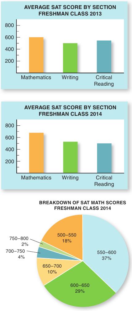
When you’re delivering a speech rich in statistics, data, and facts, visual aids can be indispensable presentation tools (see Figure 14.1). You can actually cut your presentation time drastically and increase your listeners’ interest by pointing to some figures on a graph rather than reading them aloud, number by number. Graphs take several different forms. Bar graphs show the relationship of two or more sets of figures. A figure comparing a freshman class’s average SAT scores by section, for example, is well illustrated with a bar graph. Pie charts show percentages of a circle divided proportionately; for example, a university admissions office uses a pie chart to reveal the percentage of freshman students scoring in a particular range on the SAT. A pie chart should ideally have from two to five segments; under no circumstances should it have more than eight since it will become difficult for the audience to read: if you have too many categories, you can add the smallest ones up and present them in a single segment.