The diversity of a community incorporates both the number and relative abundance of species
Species richness The number of species in a community.
To understand the processes that influence the structure and functioning of communities, we need to quantify how communities differ from place to place. In this section, we will examine patterns in species richness, which refers to the number of species in a community. We will also examine patterns in the abundance of individuals for each species and investigate how ecologists measure the diversity of species in a community in terms of richness and abundance. This is an important issue because ecologists often want to compare the diversity of species among communities or assess the effects of human activities on individual abundance and the species diversity of a community.
Patterns of Abundance Among Species
Relative abundance The proportion of individuals in a community represented by each species.
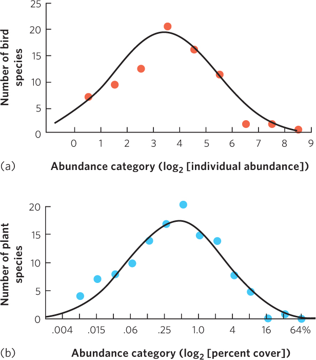
Abundance can be examined either in absolute terms or in relation to other species. Relative abundance is the proportion of individuals in a community represented by each species. When ecologists count the number of individuals of each species in a community, they frequently find that only a few species have low or high abundance whereas most species have intermediate abundance. Frank Preston developed one way to visualize this pattern in a series of classic papers in which he examined the variation in abundance of different species. For example, Preston examined the abundance of different bird species near Westerville, Ohio, and plotted their abundances, as shown in Figure 18.8a. He found that only a few species of birds in the community had fewer than 2 individuals or more than 100 individuals; most had 4 to 64 individuals.
421
Log-normal distribution A normal, or bell-shaped, distribution that uses a logarithmic scale on the x-axis.
To create these graphs, Preston used the y-axis to represent the number of species and the x-axis to represent the number of individuals that comprise each species. The key to visualizing the patterns of abundance in communities was to use categories of abundance, for example, <2, 2 to <4, 4 to <8, 8 to <16, and so on. When these categories are plotted on a log2 scale, the first value in each category translates into 0, 1, 2, 3, etc. Data plotted in this way produces a normal, or bell-shaped, distribution such that a few species have high abundance, many species have moderate abundance, and a few species have low abundance. A normal, or bell-shaped, distribution that uses a logarithmic scale of the x-axis is a log-normal distribution.
Log-normal distributions of species abundances can be found across a wide variety of communities and taxonomic groups. For instance, Robert Whittaker surveyed desert plants and measured the abundance of each species by quantifying the percent of vegetation cover that each species provided. When he plotted percent cover on a log2 scale, which you can view in Figure 18.8b, he also found a log-normal distribution of abundance. Many studies since Preston’s classical work have also observed log-normal distributions of species abundances.
Rank-Abundance Curves
Rank-abundance curve A curve that plots the relative abundance of each species in a community in rank order from the most abundant species to the least abundant species.
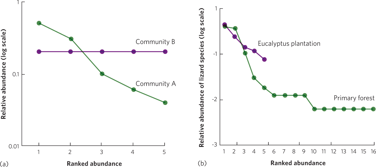
Another way to envision the relationship between the number of species and the relative abundance of each species is to use rank-abundance curves. Rank-abundance curves plot the relative abundance of each species in a community in rank order from the most abundant species to the least abundant species. Rank abundance curves are particularly helpful when we want to illustrate how communities differ in species richness and species evenness. Species evenness is a comparison of the relative abundance of each species in a community. The greatest evenness occurs when all species in a community have equal abundances, and the lowest evenness occurs when one species is abundant and the remaining species are rare. To plot a rank-abundance curve, we rank each species in terms of its abundance; the most abundant species receives a rank of 1, the next most abundant species receives a rank of 2, and so on.
Species evenness A comparison of the relative abundance of each species in a community.
Consider two hypothetical communities. Community A has five species with relative abundances of 0.5, 0.3, 0.1, 0.06, and 0.04, and Community B has five species with relative abundances of 0.2, 0.2, 0.2, 0.2, and 0.2. From these numbers, we can see that both communities have the same species richness, but Community A has lower species evenness than Community B. If we plot these data as rank-abundance curves, we create the graph shown in Figure 18.9a. Both curves extend equally far to the right, which confirms that they have the same species richness. However, the slope of Community A is considerably steeper than the slope of Community B. This steeper slope occurs because the five species in Community A range from a very high relative abundance to a very low relative abundance. In contrast, all five species in Community B have equal relative abundances, which, when plotted, produces a flat line. Rank-abundance curves allow us to determine quickly which communities have greater species richness and evenness.
422
Ecologists use rank abundance curves to determine how communities differ in richness and evenness. For example, researchers in Brazil recently examined rank-abundance curves for lizards across different forested habitats. They determined the abundance of every lizard species they could find during daytime searches. They ranked each lizard species based on abundance and plotted the ranks against the relative abundance of each species, as shown in Figure 18.9b. As you can see in this figure, the rank-abundance curve for the primary forest extends farther to the right than the curve for lizards in the eucalyptus plantation, which indicates that the primary forest contains many more species of lizards than does the eucalyptus plantation. Moreover, if we consider the slopes of the curves across the ranks that the two communities have in common—from ranks 1 to 5—we see that the primary forest has a steeper slope than the curve for the eucalyptus plantation. This indicates that the lizard community in the primary forest has a lower evenness than the community in the eucalyptus plantation.