Graphing The Data: Stacked Bar Graphs
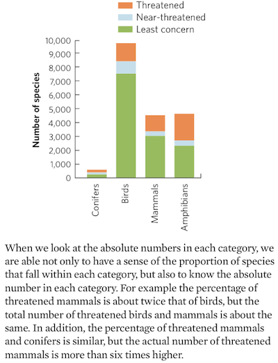
When we want to compare the distribution of categories within different groups, such as the conservation status of species of various taxa, we can either examine percentages or absolute numbers. As part of our discussion of the conservation status of conifers, birds, mammals, and amphibians, Figure 23.5 used pie charts to show differences in the percentages of species that were categorized as of least concern, near-threatened, and threatened. However, we can obtain a somewhat different perspective if we graph the absolute number in each category using a stacked bar graph, similar to Figure 23.13. A stacked bar graph allows us to display data in a way that stacks one set of data on top of another set of data within a category. This allows us to observe each category in terms of its separate and combined components.
Using the following data for the number of species of conifers, birds, mammals, and amphibians in each status category, create a stacked bar graph.
Compare your graph to the pie charts presented in Figure 23.5. What different insights do you gain by plotting the absolute numbers of species using a stacked bar graph that you could not obtain from a pie chart of proportions of species in each category?
| CONSERVATION STATUS | CONIFERS | BIRDS | MAMMALS | AMPHIBIANS |
|---|---|---|---|---|
| LEAST CONCERN | 333 | 7,677 | 3,124 | 2,392 |
| NEAR-THREATENED | 75 | 880 | 325 | 389 |
| THREATENED | 177 | 1,313 | 1,139 | 1,933 |