Appendix 1
Reading Graphs
A-1
Ecologists often find it useful to display the data they collect in graphs. Unlike a table that contains rows and columns of data, graphs help us to visualize patterns and trends in the data. These patterns help us draw conclusions from our observations. Because graphs are such a fundamental part of ecology and most other sciences, you should become familiar with the major types of graphs that ecologists use. In this section we review different types of graphs. We also discuss how to create each type of graph and how to interpret the data that are presented in the graphs.
Scientists use graphs to present data and ideas
A graph is a tool that allows scientists to visualize data or ideas. Organizing information in the form of a graph can help us understand relationships more clearly. Throughout your study of ecology you will encounter many different types of graphs. In this section we will look at the most common types of graphs that ecologists use.
Scatter Plot Graphs
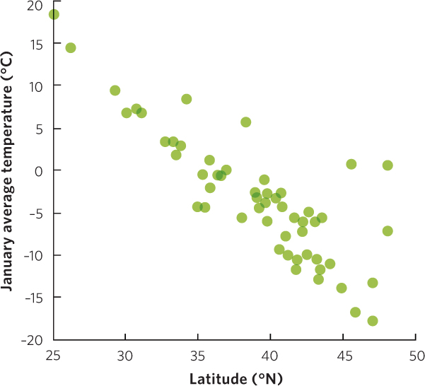
Although many of the graphs in this book may look different from each other, they all follow the same basic principles. Let’s begin with an example in which researchers measured the mean temperature during the month of January in 56 cities throughout the United States. These cities span latitudes of 25° N to 50° N. The researchers wanted to determine if there was a relationship between the latitude of a city and the mean temperature in January.
We can examine this relationship by creating a scatter plot graph, as shown in Figure A.1. In the simplest form of a scatter plot graph, researchers look at two variables; they put the values of one variable on the x axis and the values of the other variable on the y axis. In our example, the latitude of the city is on the x axis and the mean January temperature of the city is on the y axis. By convention, the units of measurement tend to get larger as we move from left to right on the x axis and from bottom to top on the y axis. Using these two axes, the researchers could plot the latitude and temperature of each city on the scatter plot graph. As you can see in the figure, there is a pattern in the graph of mean January temperature declining as one moves north into the higher latitudes of the United States.
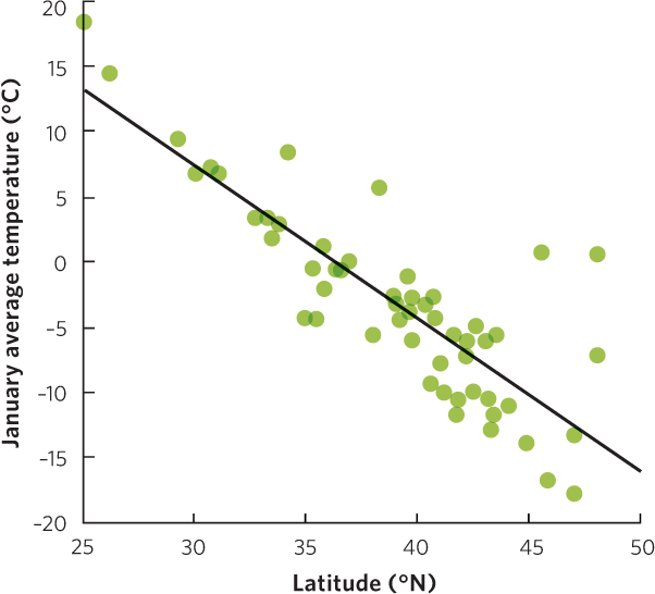
When two variables are graphed in this way, we can draw a line through the middle of the data points to describe the general trend of these points, as we have done in Figure A.2. Because such a line is drawn in a way that fits the general trend of the data, we call this the line of best fit. This line allows us to visualize a general trend. In our graph, the addition of a line of best fit makes it easier to identify a trend in the data; as we move from low to high latitudes we observe lower January temperatures. This is known as a negative relationship between the two variables because as one variable increases the other variable decreases.
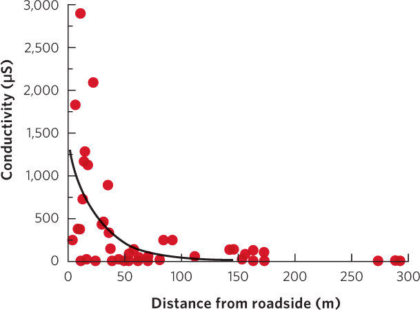
When graphing data using a scatter plot graph, the line of best fit may be either straight or curved. For example, when researchers examined the conductivity of the water in ponds near roads, which is an indicator of the amount of road salt present, they found that as they moved away from the road there was an initial rapid decrease in conductivity that eventually leveled off, as illustrated in Figure A.3. In this case, the line of best fit is a curved line.
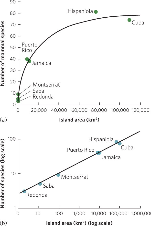
Sometimes scientists collect data that follow a curved line but they wish to view the data in terms of a straight line in order to compare the slopes and intercepts of lines produced by different sets of data. The slopes and intercepts can be calculated using the equation for a line: y=mx + b, where y is the dependent variable, x is the independent variable, m is the slope, and b is the intercept. In many cases, data that follow a curved line can be transformed to follow a straight line by using axes that contain the values arranged on a logarithmic scale. For example, when scientists examined the number of amphibian species living on islands of different sizes in the West Indies, the resulting scatter plot graph illustrated that the number of species initially increased rapidly as island area increased and then eventually leveled off, as shown in Figure A.4a. When the exact same data are plotted on a scatter plot graph using axes with a log scale, the line of best fit changes from a curved line to a straight line, as you can see in Figure A.4b.
A-2
Line Graphs
A line graph is used to display data that occur as a sequence of measurements over time or space. For example, scientists have estimated the number of humans living on Earth from 8,000 years ago through to the present time. Using all of the available data points, a line graph can be used to connect each data point over time, as shown in Figure A.5. In contrast to a line of best fit that fits a straight or curved line through the middle of all data points, a line graph connects one data point to another, so it can be straight or curved, or it can move up and down as it follows the movement of the data points.
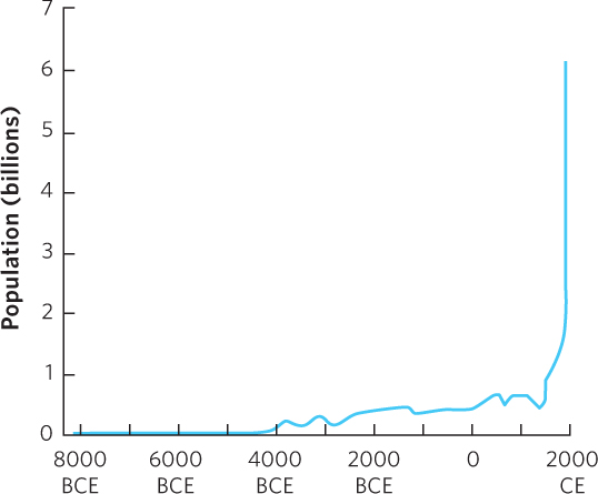
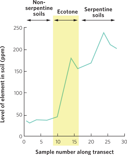
Figure A.6 is an example of a line graph displaying data measurements over space. In this example, scientists tested soil samples for the concentration of chromium as they walked from one type of soil toward another type of soil. As they approached the serpentine soil, which is characterized by high concentrations of heavy metals, the concentration of chromium sharply increased.
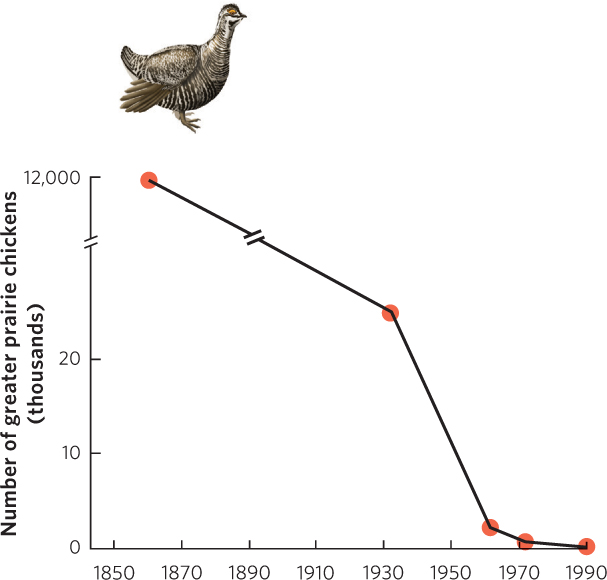
When a graph includes data points with a very large range of values, the size of the graph can become cumbersome. To keep the graph from becoming too large, we can use a break in the axis, as shown in Figure A.7. In this figure, we are examining the decline in the population of prairie chickens in Illinois from the 1860s to the 1990s. Note the double hatch marks between 25,000 and 12 million on the y axis and on the line that connects the data points. This indicates a break in the scale. As you can see, the y axis initially increases from 0 to 20,000 birds, but after the double hatch mark, the scale jumps up to 12 million (note that the axis is in units of thousands of birds). The double hatch marks indicate that we are condensing the middle part of the y axis. Inserting an axis break is especially helpful when we wish to focus on how the data change after the double hatch mark. In Figure A.7, we have no data points between 25,000 and 12 million, so we can compress the y axis in this range to better view the change in population size over time.
A-3
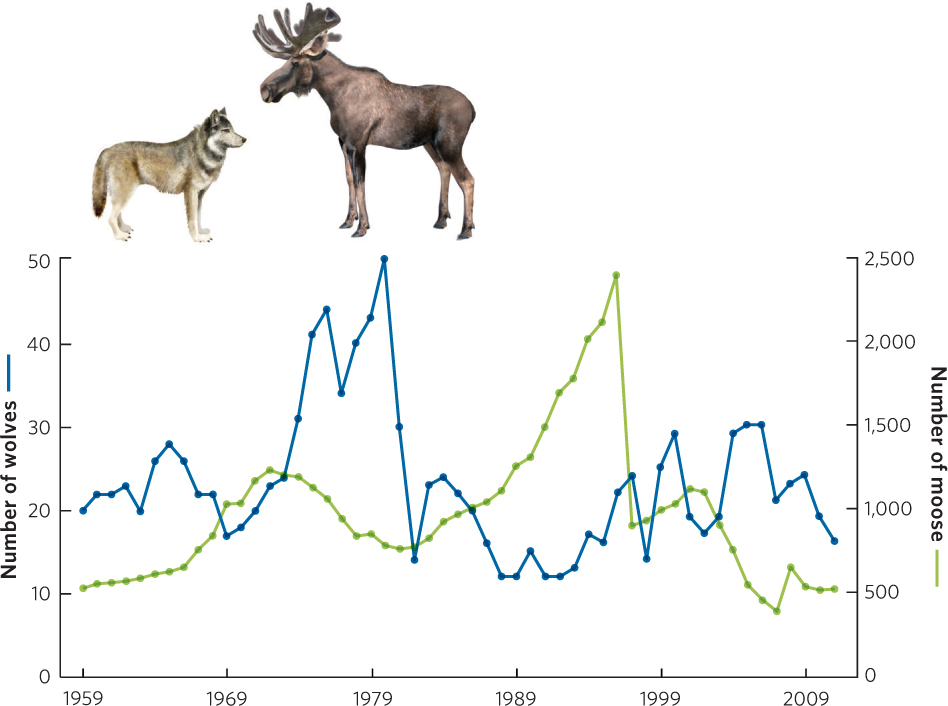
Line graphs can also illustrate how several different variables change over time. When two variables contain different units or a different range of values, we can use two y axes. For example, Figure A.8 presents data on changes in the population sizes of two different animals on Isle Royale in the years 1955 to 2011. The left y axis represents the population changes in the wolf population whereas the right y axis represents the population changes in the moose population during the same time span.
Bar Graphs
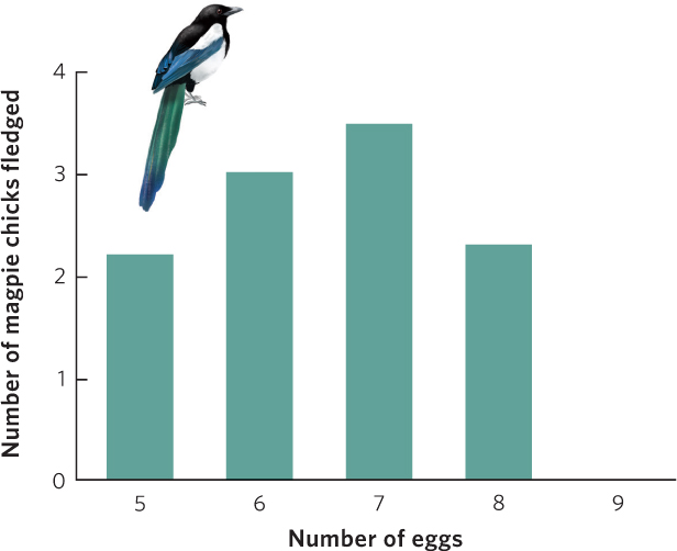
A bar graph plots numerical values that come from different categories. For example, researchers conducted an experiment on a species of bird known as the European magpie, which typically lays seven eggs. The researchers manipulated the number of eggs in a nest either by adding one or two eggs or by taking away one or two eggs. They then waited to see how many of the eggs hatched into birds that lived long enough to leave the nest as fledglings. The results of this experiment are illustrated in Figure A.9. As we can see in the figure, the researchers used the number of eggs as categories along the x axis and then plotted the number of offspring that survived to fledgling, which is represented by the y axis.
A-4
Often a bar graph is used to display mean values based on multiple observations. In such cases, scientists often like to show the amount of variation in the data that comprise each of the mean values. We can do this by adding error bars to a bar graph. As an example, researchers who were interested in the effects of inbreeding measured the number of eggs that snails laid when they had mates available compared to when they did not have mates available. Because they measured the eggs laid by several different snails in each category, they created a graph, shown in Figure A.10, that illustrates the mean number of eggs laid. However they also wanted to convey the amount of variation in eggs laid by these different individuals, so they also included error bars to each mean; in this case the error bars represent standard error of the mean.
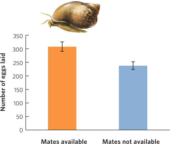
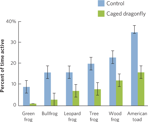
Figure A.11 shows an example of a bar graph that presents two sets of data for each category. In this example, researchers measured the activity of six species of tadpoles. They made these measurements both in the presence and in the absence of predators. To include all this information, they drew two categories for each of the six species along the x axis: control or caged predator.
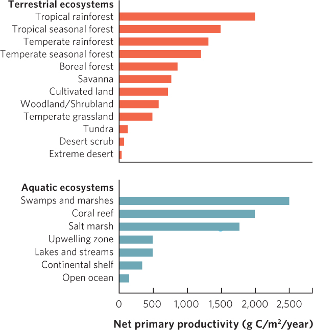
A bar graph is a very flexible tool and can be altered in several ways to accommodate data sets of different sizes or even several data sets that a researcher wishes to compare. When scientists measured the net primary productivity of different ecosystems, as shown in Figure A.12, they put the categories—various ecosystems—on the y axis and the plotted values—net primary productivity—on the x axis. This orientation makes it easier to accommodate the relatively large amount of text needed to name each ecosystem.
Pie Charts
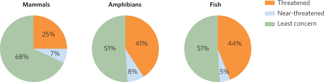
A pie chart is a graph represented by a circle with slices of various sizes representing categories within the whole pie. The entire pie represents 100 percent of the data and each slice is sized according to the percentage of the pie that it represents. For example, Figure A.13 shows the percentage of mammals, amphibians, and fish from around the world that have been categorized as threatened, near-threatened, or of least concern from a conservation point of view. For each group of animals, each slice of the pie represents the percentage of species that fall within each conservation category.
A-5
Two Special Types of Graphs Used by Ecologists
While scatter plot graphs, line graphs, bar graphs, and pie charts are used by many different types of scientists, ecologists also use two types of graphs that are not common in most other fields of science: climate diagrams and age structure diagrams. Although these two types of graphs are discussed within the text, we provide them here for review.
Climate Diagrams
Climate diagrams are used to illustrate the annual patterns of temperature and precipitation that help to determine the productivity of biomes on Earth. Figure A.14 shows two hypothetical biomes. By graphing the average monthly temperature and precipitation of a biome, we can see how conditions in a biome vary during a typical year. We can also observe the specific time period when the temperature is warm enough for plants to grow. In the biome illustrated in Figure A.14a, the growing season—indicated by the shaded region on the x axis—is mid-March through mid-October. In Figure A.14b, the growing season is mid-April through mid-September.
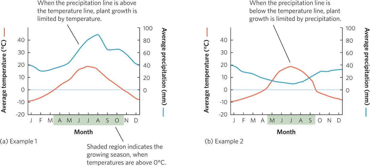
In addition to identifying the growing season, climate diagrams show the relationships among precipitation, temperature, and plant growth. In Figure A.14a, the precipitation line is above the temperature line in every month. This means that water supply exceeds demand, so plant growth is more constrained by temperature than by precipitation throughout the entire year. In Figure A.14b, the precipitation line intersects the temperature line. At this point, the amount of precipitation available to plants equals the amount of water lost by plants through evapotranspiration. When the precipitation line falls below the temperature line from May through September, water demand exceeds supply and plant growth will be constrained more by precipitation than by temperature.
Age Structure Diagrams
An age structure diagram is a visual representation of age distribution for both males and females in a country. Figure A.15 presents two examples. Each horizontal bar of the diagram represents a 5-year-age group and the length of a given bar represents the number of males or females in that age group.
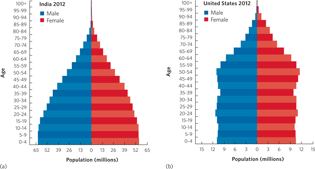
While every nation has a unique age structure, we can group countries very broadly into three categories. Figure A.15a shows a country with many more young people than older people. The age structure diagram of a country with this population will be in the shape of a pyramid, with its widest part at the bottom, moving toward the smallest at the top. Age structure diagrams with this shape are typical of countries in the developing world, such as Venezuela and India.
A country with less of a difference between the number of individuals in the younger and older age groups has an age structure diagram that looks more like a column. With fewer individuals in the younger age groups, we can deduce that the country has little or no population growth. Figure A.15b shows the age structure of the U.S. population, which is similar to the age structure of the populations of Canada, Australia, Sweden, and many other developed countries.
A-6
As you can see, we can use many different types of graphs to display data collected in ecological studies. This makes it easier to view patterns in our data and to reach the correct interpretation. With this knowledge of graph making, you should be prepared to interpret the graphs throughout the book and to do the graphing exercises at the end of each chapter.