SCIENCE LITERACY WORKING WITH DATA
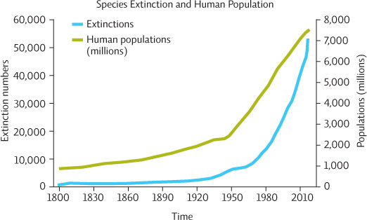
The following graph depicts the relationship between numbers of extinctions and human population size since the 19th century.
Interpretation
Question 11.15
Describe what is happening to:
the extinction rate over time.
human population growth over time.
a. Extinction rate is increasing over time; a rapid increase is seen since the early-mid part of the 20th century
b. Population growth is increasing over time; a rapid increase is seen since the early-mid part of the 20th century
Question 11.16
The two curves have been graphed together. What is the implication of presenting these data in this manner?
The implication is that the rapid increase in human population size has led to the rapid increase in the number of species that are going extinct.
Advance Your Thinking
Question 11.17
The y-axis is labeled “Extinction numbers.” What taxonomic units are being measured? What if the taxonomic unit being evaluated here had been genus (a taxonomic group that can contain more than one species) or family (a taxonomic group that can contain more than one genus)? Would you be more concerned about the trend of extinctions or less? Explain.
The taxonomic unit here is species. If it had been Genus or Family, these extinction rates would be even more concerning since a single Genus can contain many species and Families usually contain many Genera.
Question 11.18
What type of relationship is suggested by the figure: correlational or causal? What additional data would you like to see to support the graph’s main point?
The graph suggests this is a causal relationship by showing them together, but it is really a strong correlation. It would be useful to compare extinction numbers from areas heavily impacted by humans and those that are less impacted. In this case, you would have to present proportions, not raw numbers.