Watch those scales!
Because graphs speak so strongly, they can mislead the unwary. The careful reader of a line graph looks closely at the scales marked off on the axes.
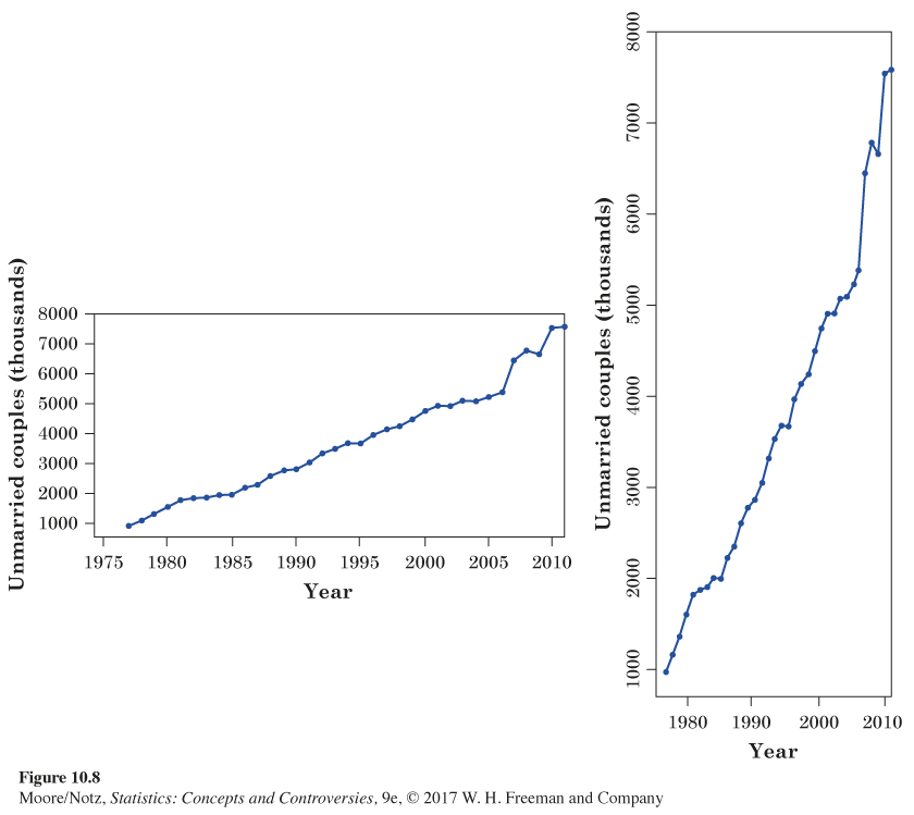
EXAMPLE 7 Living together
eg10-07
The number of unmarried couples living together has increased in recent years, to the point that some people say that cohabitation is delaying or even replacing marriage. Figure 10.8 presents two line graphs of the number of unmarried-couple households in the United States. The data once again come from the Current Population Survey. The graph on the left suggests a steady but moderate increase. The right-hand graph says that cohabitation is thundering upward.
The secret is in the scales. You can transform the left-hand graph into the right-hand graph by stretching the vertical scale, squeezing the horizontal scale, and cutting off the vertical scale just above and below the values to be plotted. Now you know how to either exaggerate or play down a trend in a line graph.
Which graph is correct? Both are accurate graphs of the data, but both have scales chosen to create a specific effect. Because there is no one “right’’ scale for a line graph, correct graphs can give different impressions by their choices of scale. Watch those scales!
Another important issue concerning scales is the following. When examining the change in the price or value of an item over time, plotting the actual increase can be misleading. It is often better to plot the percentage increase from the previous period.
227
EXAMPLE 8 Getting rich in hindsight
The end of the twentieth century saw a great bull market (a period when the value of stocks rises) in U.S. common stocks. How great? Pictures tell the tale more clearly than words.
Look first at Figure 10.9. This shows the percentage increase or decrease in stocks (measured by the Standard & Poor’s 500 index) in each year from 1971 to 2011. Until 1982, stock prices bounce up and down. Sometimes they go down a lot—stocks lost 14.7% of their value in 1973 and another 26.5% in 1974. But starting in 1982, stocks go up in 17 of the next 18 years, often by a lot. From 2000 to 2009 stocks again bounce up and down, with a large loss of 37% in the recession that began in 2008.
228
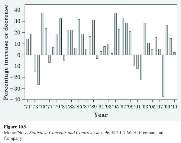
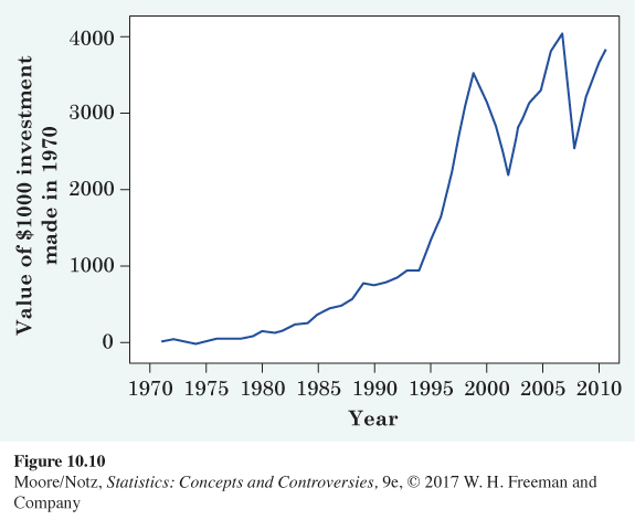
Figure 10.10 shows, in hindsight, how you could have become rich in the period from 1971 to 2011. If you had invested $1000 in stocks at the end of 1970, the graph shows how much money you would have had at the end of each of the following years. After 1974, your $1000 was down to $853, and at the end of 1981, it had grown to only $2145. That’s an increase of only 7.2% a year. Your money would have grown faster in a bank during these years. Then the great bull market begins its work. By the end of 2011, it would have turned your $1000 into $36,108. Unfortunately, over the next 10 years as a whole, stocks lost value, and by the end of 2009, your $36,108 would have declined to $32,818.
229
Figures 10.9 and 10.10 are instructive. Figure 10.10 gives the impression that increases between 1970 and 1980 were negligible but that increases between 1995 and 1999 were dramatic. While it is true that the actual value of our investment increased much more between 1995 and 1999 than it did between 1970 and 1980, it would be incorrect to conclude that investments in general increased much more dramatically between 1995 and 1999 than in any of the years between 1970 and 1980.
Figure 10.9 tells a different, and more accurate, story. For example, the percentage increase in 1975 (approximately 37%) rivaled that in any of the years between 1995 and 1999. However, in 1975 the actual value of our investment was relatively small ($1170) and a 37% increase in such a small amount is nearly imperceptible on the scale used in Figure 10.10. By 1995, the actual value of our investment was about $14,000, and a 37% increase appears much more striking.