Stemplots
Histograms are not the only graphical display of distributions. For small data sets, a stemplot (sometimes called a stem-and-leaf plot) is quicker to make and presents more detailed information.
Stemplot
To make a stemplot:
1. Separate each observation into a stem consisting of all but the final (rightmost) digit and a leaf, the final digit. Stems may have as many digits as needed, but each leaf contains only a single digit. Do not include commas or decimal points with your leaves.
2. Write the stems in a vertical column with the smallest at the top, and draw a vertical line at the right of this column.
3. Write each leaf in the row to the right of its stem, in increasing order out from the stem.
EXAMPLE 6 Stemplot of the “65 and over” data
For the “65 and over” percentages in Table 11.1, the whole-number part of the observation is the stem, and the final digit (tenths) is the leaf. The Alabama entry, 13.8, has stem 13 and leaf 8. Stems can have as many digits as needed, but each leaf must consist of only a single digit. Figure 11.6 shows the steps in making a stemplot for the data in Table 11.1. First, write the stems. Then go through the table adding a leaf for each observation. Finally, arrange the leaves in increasing order out from each stem.
254
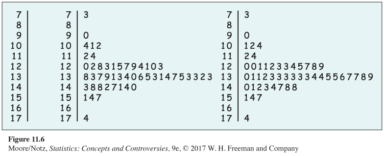
A stemplot looks like a histogram turned on end. The stemplot in Figure 11.6 is just like the histogram in Figure 11.1 because the classes chosen for the histogram are the same as the stems in the stemplot. Figure 11.7 is a stemplot of the Illinois tuition data discussed in Example 3. This stemplot has almost four times as many classes as the histogram of the same data in Figure 11.2. We interpret stemplots as we do histograms, looking for the overall pattern and for any outliers.
You can choose the classes in a histogram. The classes (the stems) of a stemplot are given to you. You can get more flexibility by rounding the data so that the final digit after rounding is suitable as a leaf. Do this when the data have too many digits. For example, the tuition charges of Illinois colleges look like
$9,500 $9,430 $7,092 $10,672 . . .
A stemplot would have too many stems if we took all but the final digit as the stem and the final digit as the leaf. To make the stemplot in Figure 11.7, we round these data to the nearest hundred dollars:
95 94 71 107 . . .
These values appear in Figure 11.7 on the stems 9, 9, 7, and 10.
The chief advantage of a stemplot is that it displays the actual values of the observations. We can see from the stemplot in Figure 11.7, but not from the histogram in Figure 11.2, that Illinois’s most expensive college charges $38,600 (rounded to the nearest hundred dollars). Stemplots are also faster to draw than histograms. A stemplot requires that we use the first digit or digits as stems. This amounts to an automatic choice of classes and can give a poor picture of the distribution. Stemplots do not work well with large data sets because the stems then have too many leaves.
255
