CHAPTER 11 EXERCISES
Question 11.8
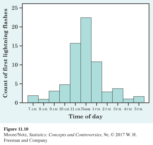
11.8 Lightning storms. Figure 11.10 comes from a study of lightning storms in Colorado. It shows the distribution of the hour of the day during which the first lightning flash for that day occurred. Describe the shape, center, and variability of this distribution. Are there any outliers?
259
ex11-09
Question 11.9
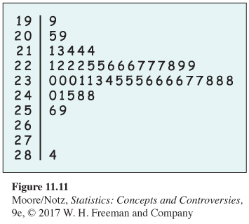
11.9 Where do 18- to 34-year-olds live? Figure 11.11 is a stemplot of the percentage of residents aged 18 to 34 in each of the 50 states in July 2008. As in Figure 11.6 (page 256) for older residents, the stems are whole percents and the leaves are tenths of a percent.
(a) Utah has the largest percentage of young adults. What is the percentage for this state?
(b) Ignoring Utah, describe the shape, center, and variability of this distribution.
(c) Is the distribution for young adults more or less variable than the distribution in Figure 11.6 for older adults?
ex11-10
Question 11.10
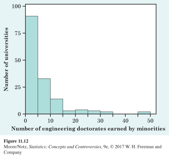
11.10 Minority students in engineering. Figure 11.12 is a histogram of the number of minority students (black, Hispanic, Native American) who earned doctorate degrees in engineering from each of 152 universities in the years 2000 through 2002. Briefly describe the shape, center, and variability of this distribution. The classes for Figure 11.12 are 1–5, 6–10, and so on.
Question 11.11
11.11 Returns on common stocks. The total return on a stock is the change in its market price plus any dividend payments made. Total return is usually expressed as a percentage of the beginning price. Figure 11.13 is a histogram of the distribution of total returns for all 1528 common stocks listed on the New York Stock Exchange in one year.
260
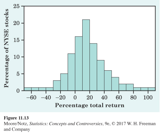
(a) Describe the overall shape of the distribution of total returns.
(b) What is the approximate center of this distribution? Approximately what were the smallest and largest total returns? (This describes the variability of the distribution.)
(c) A return less than zero means that owners of the stock lost money. About what percentage of all stocks lost money?
(d) Explain why we prefer a histogram to a stemplot for describing the returns on 1528 common stocks.
Question 11.12
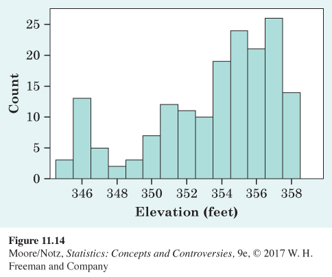
11.12 More lake levels. Figure 11.14 contains average monthly lake levels for Lake Murray in South Carolina. Describe the shape, center, and variability of the distribution of lake levels.
261
Question 11.13
11.13 Automobile fuel economy. Government regulations require automakers to give the city and highway gas mileages for each model of car. Table 11.2 gives the combined highway and city mileages (miles per gallon) for 31 model year 2015 sedans. Make a stemplot of the combined gas mileages of these cars. What can you say about the overall shape of the distribution? Where is the center (the value such that half the cars have better gas mileage and half have worse gas mileage)? Some of these cars are electric and the reported milage is the electric equivalent. These cars have far higher mileage. How many electric cars are in this data set?
ta11-02
| Model | mpg | Model | mpg |
|---|---|---|---|
| Acura RLX | 24 | Honda Accord Hybrid | 47 |
| Audi A8 | 22 | Hyundai Sonata | 37 |
| BMW 528i | 27 | Infiniti Q40 | 22 |
| Bentley Mulsanne | 13 | Jaguar XF | 18 |
| Buick LaCrosse | 21 | Kia Forte | 30 |
| Buick Regal | 22 | Lexus ES 350 | 24 |
| Cadillac CTS | 14 | Lincoln MKZ | 25 |
| Cadillac CTS AWD | 22 | Mazda 6 | 30 |
| Chevrolet Malibu | 29 | Mercedes-Benz B-Class | 84 |
| Chevrolet Sonic | 31 | Mercedez-Benz E350 | 23 |
| Dodge Challenger | 18 | Nissan Altima | 31 |
| Ford C-max Energi Plugin hybrid |
88 | Nissan Leaf Rolls Royce Wraith |
114 15 |
| Ford Fusion Energi Plug-in Hybrid |
88 | Toyota Prius Toyota Prius Plug-in Hybrid |
50 95 |
| Ford Fusion Hybrid | 42 | Volvo S80 | 22 |
| Honda Accord | 31 | ||
| Source: www.fueleconomy.gov/feg/byclass/Midsize_Cars2015.shtml. | |||
Question 11.14
11.14 The obesity epidemic. Medical authorities describe the spread of obesity in the United States as an epidemic. Table 11.3 gives the percentage of adults who were obese in each of the 50 states in 2009. Display the distribution in a graph and briefly describe its shape, center, and variability.
ta11-03
| State | Percent | State | Percent | State | Percent |
|---|---|---|---|---|---|
| Alabama | 31.0 | Louisiana | 33.0 | Ohio | 28.8 |
| Alaska | 24.8 | Maine | 25.8 | Oklahoma | 31.4 |
| Arizona | 25.5 | Maryland | 26.2 | Oregon | 23.0 |
| Arkansas | 30.5 | Massachusetts | 21.4 | Pennsylvania | 27.4 |
| California | 24.8 | Michigan | 29.6 | Rhode Island | 24.6 |
| Colorado | 18.6 | Minnesota | 24.6 | South Carolina | 29.4 |
| Connecticut | 20.6 | Mississippi | 34.4 | South Dakota | 29.6 |
| Delaware | 27.0 | Missouri | 30.0 | Tennessee | 32.3 |
| Florida | 25.2 | Montana | 23.2 | Texas | 28.7 |
| Georgia | 27.2 | Nebraska | 27.2 | Utah | 23.5 |
| Hawaii | 22.3 | Nevada | 25.8 | Vermont | 22.8 |
| Idaho | 24.5 | New Hampshire | 25.7 | Virginia | 25.0 |
| Illinois | 26.5 | New Jersey | 23.3 | Washington | 26.4 |
| Indiana | 29.5 | New Mexico | 25.1 | West Virginia | 31.1 |
| Iowa | 27.9 | New York | 24.2 | Wisconsin | 28.7 |
| Kansas | 28.1 | North Carolina | 29.3 | Wyoming | 24.6 |
| Kentucky | 31.5 | North Dakota | 27.9 | ||
| Source: National Centers for Disease Control and Prevention, www.cdc.gov/obesity/data/databases.html. | |||||
Question 11.15
11.15 Yankee money. Table 11.4 gives the salaries of the players on the New York Yankees baseball team for the 2015 season. Make a histogram of these data. Is the distribution roughly symmetric, skewed to the right, or skewed to the left? Explain.
262
ta11-04
| Player | Salary ($) | Player | Salary ($) |
|---|---|---|---|
| CC Sabathia | 24,285,714 | Nathan Eovaldi | 3,300,000 |
| Mark Teixeira | 23,125,000 | Ivan Nova | 3,300,000 |
| Masahiro Tanaka | 22,000,000 | Dustin Ackley | 2,600,000 |
| Alex Rodriguez | 22,000,000 | Chris Young | 2,500,000 |
| Jacoby Ellsbury | 21,142,857 | Brendan Ryan | 2,000,000 |
| Brian McCann | 17,000,000 | Adam Warren | 572,600 |
| Carlos Beltran | 15,000,000 | Justin Wilson | 556,000 |
| Chase Headley | 13,000,000 | Didi Gregorius | 553,900 |
| Brett Gardner | 12,500,000 | John Ryan Murphy | 518,700 |
| Andrew Miller | 9,000,000 | Chasen Shreve | 510,275 |
| Garrett Jones | 5,000,000 | Dellin Betances | 507,500 |
| Stephen Drew | 5,000,000 | ||
| Source: http://espn.go.com/mlb/team/salaries/_/name/nyy/new-york-yankees. | |||
263
ex11-16
Question 11.16
11.16 The statistics of writing style. Numerical data can distinguish different types of writing, and sometimes even individual authors. Here are data collected by students on the percentages of words of 1 to 15 letters used in articles in Popular Science magazine:
| Length: | 1 | 2 | 3 | 4 | 5 |
| Percent: | 3.6 | 14.8 | 18.7 | 16.0 | 12.5 |
| Length: | 6 | 7 | 8 | 9 | 10 |
| Percent: | 8.2 | 8.1 | 5.9 | 4.4 | 3.6 |
| Length: | 11 | 12 | 13 | 14 | 15 |
| Percent: | 2.1 | 0.9 | 0.6 | 0.4 | 0.2 |
(a) Make a histogram of this distribution. Describe its shape, center, and variability.
(b) How does the distribution of lengths of words used in Popular Science compare with the similar distribution in Figure 11.4 (page 254) for Shakespeare’s plays? Look in particular at short words (two, three, and four letters) and very long words (more than 10 letters).
Question 11.17
11.17 What’s my shape? Do you expect the distribution of the total player payroll for each of the 30 teams in Major League Baseball to be roughly symmetric, clearly skewed to the right, or clearly skewed to the left? Why?
ex11-18
Question 11.18
11.18 Asians in the eastern states. Here are the percentages of the population who are of Asian origin in each state east of the Mississippi River in 2008:
| State | Percent | State | Percent |
|---|---|---|---|
| Alabama | 1.0 | New Hampshire | 1.9 |
| Connecticut | 3.6 | New Jersey | 7.6 |
| Delaware | 2.9 | New York | 7.0 |
| Florida | 2.3 | North Carolina | 1.9 |
| Georgia | 2.9 | Ohio | 1.6 |
| Illinois | 4.3 | Pennsylvania | 2.4 |
| Indiana | 1.4 | Rhode Island | 2.8 |
| Kentucky | 1.0 | South Carolina | 1.2 |
| Maine | 0.9 | Tennessee | 1.3 |
| Maryland | 5.1 | Vermont | 1.1 |
| Massachusetts | 4.9 | Virginia | 4.9 |
| Michigan | 2.4 | West Virginia | 0.7 |
| Mississippi | 0.8 | Wisconsin | 2.0 |
Make a stemplot of these data. Describe the overall pattern of the distribution. Are there any outliers?
ex11-19
Question 11.19
11.19 How many calories does a hot dog have? Consumer Reports magazine presented the following data on the number of calories in a hot dog for each of 17 brands of meat hot dogs:
| 173 | 191 | 182 | 190 | 172 | 147 |
| 146 | 139 | 175 | 136 | 179 | 153 |
| 107 | 195 | 135 | 140 | 138 |
Make a stemplot of the distribution of calories in meat hot dogs and briefly describe the shape of the distribution. Most brands of meat hot dogs contain a mixture of beef and pork, with up to 15% poultry allowed by government regulations. The only brand with a different makeup was Eat Slim Veal Hot Dogs. Which point on your stemplot do you think represents this brand?
264
| Age group | 1950 | 2050 |
|---|---|---|
| Under 10 years | 29.3 | 56.2 |
| 10 to 19 years | 21.8 | 56.7 |
| 20 to 29 years | 24.0 | 56.2 |
| 30 to 39 years | 22.8 | 55.9 |
| 40 to 49 years | 19.3 | 52.8 |
| 50 to 59 years | 15.5 | 49.1 |
| 60 to 69 years | 11.0 | 45.0 |
| 70 to 79 years | 5.5 | 34.5 |
| 80 to 89 years | 1.6 | 23.7 |
| 90 to 99 years | 0.1 | 8.1 |
| 100 years and over | — | 0.6 |
| Total | 151.1 | 310.6 |
| Source: Statistical Abstract of the United States, www.census.gov/library/publications/2009/compendia/statab/129ed.html; and Census Bureau, www.census.gov/population/projections/. | ||
Question 11.20
11.20 The changing age distribution of the United States. The distribution of the ages of a nation’s population has a strong influence on economic and social conditions. Table 11.5 shows the age distribution of U.S. residents in 1950 and 2050, in millions of persons. The 1950 data come from that year’s census. The 2050 data are projections made by the Census Bureau.
(a) Because the total population in 2050 is much larger than the 1950 population, comparing percentages in each age group is clearer than comparing counts. Make a table of the percentage of the total population in each age group for both 1950 and 2050.
(b) Make a histogram of the 1950 age distribution (in percents). Then describe the main features of the distribution. In particular, look at the percentage of children relative to the rest of the population.
(c) Make a histogram of the projected age distribution for the year 2050. Use the same scales as in part (b) for easy comparison. What are the most important changes in the U.S. age distribution projected for the 100-year period between 1950 and 2050?
ex11-21
Question 11.21
11.21 Babe Ruth’s home runs. Here are the numbers of home runs that Babe Ruth hit in his 15 years with the New York Yankees, 1920 to 1934:
| 54 | 59 | 35 | 41 | 46 | 25 | 47 | 60 |
| 54 | 46 | 49 | 46 | 41 | 34 | 22 |
Make a stemplot of these data. Is the distribution roughly symmetric, clearly skewed, or neither? About how many home runs did Ruth hit in a typical year? Is his famous 60 home runs in 1927 an outlier?
265
ex11-22
Question 11.22
11.22 Back-to-back stemplot. The current major league single-season home run record is held by Barry Bonds of the San Francisco Giants. Here are Bonds’s home run counts for 1986 to 2007:
| 16 | 25 | 24 | 19 | 33 | 25 |
| 34 | 46 | 37 | 33 | 42 | 40 |
| 37 | 34 | 49 | 73 | 46 | 45 |
| 45 | 5 | 26 | 28 |
A back-to-back stemplot helps us compare two distributions. Write the stems as usual, but with a vertical line both to their left and to their right. On the right, put leaves for Ruth (Exercise 11.21). On the left, put leaves for Bonds. Arrange the leaves on each stem in increasing order out from the stem. Now write a brief comparison of Ruth and Bonds as home run hitters.
Question 11.23
11.23 When it rains, it pours. On July 25 to 26, 1979, 42.00 inches of rain fell on Alvin, Texas. That’s the most rain ever recorded in Texas for a 24-hour period. Table 11.6 gives the maximum precipitation ever recorded in 24 hours (through 2010) at any weather station in each state. The record amount varies a great deal from state to state—hurricanes bring extreme rains on the Atlantic coast, and the mountain West is generally dry. Make a graph to display the distribution of records for the states. Mark where your state lies in this distribution. Briefly describe the distribution.
ta11-06
| State | Precip. | State | Precip. | State | Precip. |
|---|---|---|---|---|---|
| Alabama | 32.52 | Louisiana | 22.00 | Ohio | 10.75 |
| Alaska | 15.20 | Maine | 13.32 | Oklahoma | 15.68 |
| Arizona | 11.40 | Maryland | 14.75 | Oregon | 11.77 |
| Arkansas | 14.06 | Massachusetts | 18.15 | Pennsylvania | 13.50 |
| California | 25.83 | Michigan | 9.78 | Rhode Island | 12.13 |
| Colorado | 11.08 | Minnesota | 15.10 | South Carolina | 14.80 |
| Connecticut | 12.77 | Mississippi | 15.68 | South Dakota | 8.74 |
| Delaware | 8.50 | Missouri | 18.18 | Tennessee | 13.60 |
| Florida | 23.28 | Montana | 11.50 | Texas | 42.00 |
| Georgia | 21.10 | Nebraska | 13.15 | Utah | 5.08 |
| Hawaii | 38.00 | Nevada | 7.78 | Vermont | 9.92 |
| Idaho | 7.17 | New Hampshire | 11.07 | Virginia | 14.28 |
| Illinois | 16.91 | New Jersey | 14.81 | Washington | 14.26 |
| Indiana | 10.50 | New Mexico | 11.28 | West Virginia | 12.02 |
| Iowa | 13.18 | New York | 11.15 | Wisconsin | 11.72 |
| Kansas | 13.53 | North Carolina | 22.22 | Wyoming | 6.06 |
| Kentucky | 10.40 | North Dakota | 8.10 | ||
| Source: National Oceanic and Atmospheric Administration, www.noaa.gov. | |||||
266

EXPLORING THE WEB
Follow the QR code to access exercises.