Scatterplots
317
The most common way to display the relation between two quantitative variables is a scatterplot.
eg14-01
EXAMPLE 1 The Big Bang
How did the universe begin? One popular theory is known as the “Big Bang.” The universe began with a big bang and matter expanded outward, like a balloon inflating. If the Big Bang theory is correct, galaxies farthest away from the origin of the bang must be moving faster than those closest to the origin. This also means that galaxies close to the earth must be moving at a similar speed to that of earth, and galaxies far from earth must be moving at very different speeds from earth. Hence, relative to earth, the farther away a galaxy is, the faster it appears to be moving away from earth. Are data consistent with this theory? The answer is Yes.
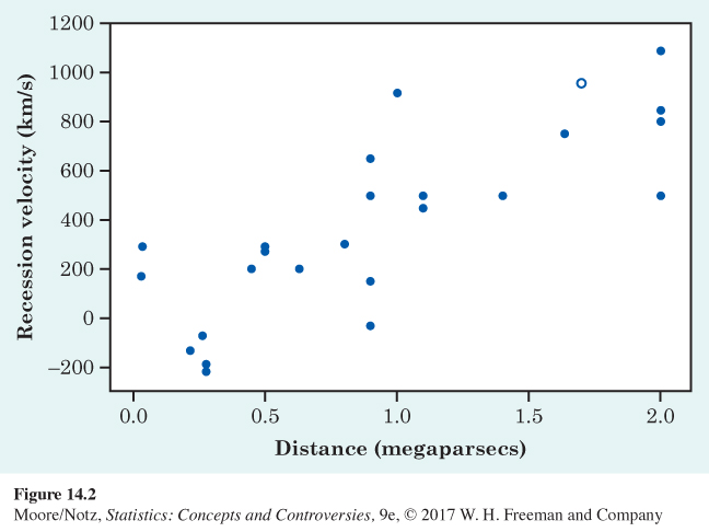
In 1929, Edwin Hubble investigated the relationship between the distance from the earth and the recession velocity (the speed at which an object is moving away from an observer) of galaxies. Using data he had collected, Hubble estimated the distance, in megaparsecs, from the earth to 24 galaxies. One parsec equals 3.26 light-years (the distance light travels in one year), and a megaparsec is one million parsecs. The recession velocities, in kilometers per second, of the galaxies were also measured. Figure 14.2 is a scatterplot that shows how recession velocity is related to distance from the earth. We think that “distance from the earth” will help explain “recession velocity.” That is, “distance from the earth” is the explanatory variable, and “recession velocity” is the response variable. We want to see how recession velocity changes when distance from the earth changes, so we put distance from the earth (the explanatory variable) on the horizontal axis. We can then see that, as distance from the earth goes up, recession velocity goes up. Each point on the plot represents one galaxy. For example, the point with a different plotting symbol corresponds to a galaxy that is 1.7 megaparsecs from the earth and that has a recession velocity of 960 kilometers per second.
Hubble’s discovery turned out to be one of the most important discoveries in all of astronomy. The data helped establish Hubble’s law, which is recession velocity = H0 × Distance, where H0 is the value known as the Hubble constant. Hubble’s law says that the apparent recession velocities of galaxies are directly proportional to their distances. This relationship is the key evidence for the idea of the expanding universe, as suggested by the Big Bang.
318
Scatterplot
A scatterplot shows the relationship between two quantitative variables measured on the same individuals. The values of one variable appear on the horizontal axis, and the values of the other variable appear on the vertical axis. Each individual in the data appears as the point in the plot fixed by the values of both variables for that individual.
Always plot the explanatory variable, if there is one, on the horizontal axis (the x axis) of a scatterplot. As a reminder, we usually call the explanatory variable x and the response variable y. If there is no explanatory-response distinction, either variable can go on the horizontal axis.
EXAMPLE 2 Health and wealth
Figure 14.3 is a scatterplot of data from the World Bank for 2010. The individuals are all the world’s nations for which data are available. The explanatory variable is a measure of how rich a country is: the gross domestic product (GDP) per capita. GDP is the total value of the goods and services produced in a country, converted into dollars. The response variable is life expectancy at birth.
We expect people in richer countries to live longer. The overall pattern of the scatterplot does show this, but the relationship has an interesting shape. Life expectancy tends to rise very quickly as GDP increases, then levels off. People in very rich countries such as the United States typically live no longer than people in poorer but not extremely poor nations. Some of these countries, such as Costa Rica, do almost as well as the United States.
319
fig14-03
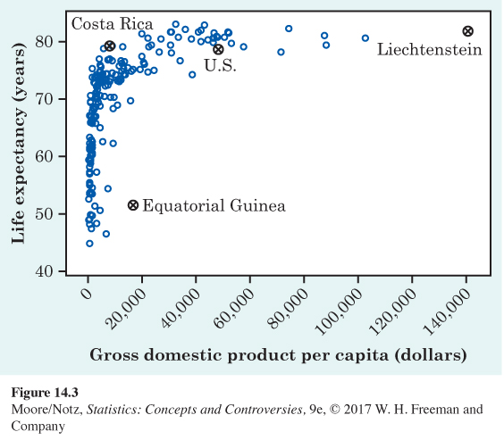
Two nations are outliers. In one, Equatorial Guinea, life expectancies are similar to those of its neighbors but its GDP is higher. Equatorial Guinea produces oil. It may be that income from mineral exports goes mainly to a few people and so pulls up GDP per capita without much effect on either the income or the life expectancy of ordinary citizens. That is, GDP per person is a mean, and we know that mean income can be much higher than median income.
The other outlier is Liechtenstein, a tiny nation bordering Switzerland and Austria. Liechtenstein has a strong financial sector and is considered a tax haven.
NOW IT’S YOUR TURN
ex14-01
Question 14.1
14.1 Brain size and intelligence. For centuries, people have associated intelligence with brain size. A recent study used magnetic resonance imaging to measure the brain size of several individuals. The IQ and brain size (in units of 10,000 pixels) of six individuals are as follows:
| Brain size: | 100 | 90 | 95 | 92 | 88 | 106 |
| IQ: | 140 | 90 | 100 | 135 | 80 | 103 |
Is there an explanatory variable? If so, what is it and what is the response variable? Make a scatterplot of these data.
14.1 The researchers are seeking to predict IQ from brain size. Thus, brain size is the explanatory variable. The response variable is IQ. The following figure is a scatterplot of the data.
