Regression lines
340
If a scatterplot shows a straight-line relationship between two quantitative variables, we would like to summarize this overall pattern by drawing a line on the graph. A regression line summarizes the relationship between two variables, but only in a specific setting: one of the variables helps explain or predict the other. That is, regression describes a relationship between an explanatory variable and a response variable.
Regression line
A regression line is a straight line that describes how a response variable y changes as an explanatory variable x changes. We often use a regression line to predict the value of y for a given value of x.
eg15-01
EXAMPLE 1 Fossil bones
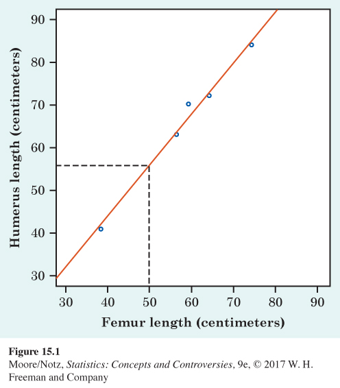
In Examples 3 and 4 in Chapter 14, we saw that the lengths of two bones in fossils of the extinct beast archaeopteryx closely follow a straight-line pattern. Figure 15.1 plots the lengths for the five available fossils. The regression line on the plot gives a quick summary of the overall pattern.
341
Another archaeopteryx fossil is incomplete. Its femur is 50 centimeters long, but the humerus is missing. Can we predict how long the humerus is? The straight-line pattern connecting humerus length to femur length is so strong that we feel quite safe in using femur length to predict humerus length. Figure 15.1 shows how: starting at the femur length (50 cm), go up to the line, then over to the humerus length axis. We predict a length of about 56 cm. This is the length the humerus would have if this fossil’s point lay exactly on the line. All the other points are close to the line, so we think the missing point would also be close to the line. That is, we think this prediction will be quite accurate.
eg15-02
EXAMPLE 2 Presidential elections, the Reagan years
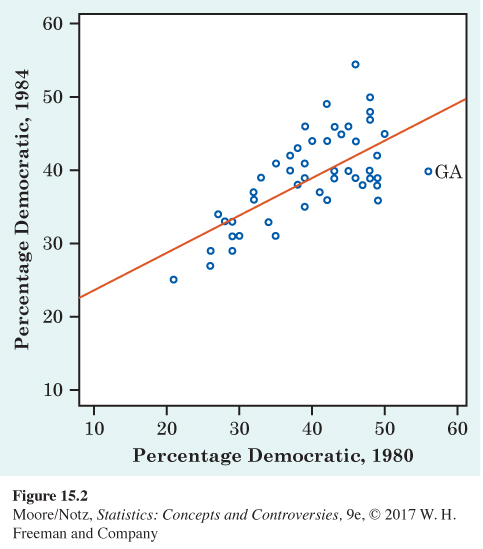
Republican Ronald Reagan was elected president twice, in 1980 and in 1984. His economic policy of tax cuts to stimulate the economy, eventually leading to increases in tax revenue, was still advocated by some Republican presidential candidates in 2015. Figure 15.2 plots the percentage of voters in each state who voted for Reagan’s Democratic opponents: Jimmy Carter in 1980 and Walter Mondale in 1984. The plot shows a positive straight-line relationship. We expect this because some states tend to vote Democratic and others tend to vote Republican. There is one outlier: Georgia, President Carter’s home state, voted 56% for the Democrat Carter in 1980 but only 40% Democratic in 1984.
342
We could use the regression line drawn in Figure 15.2 to predict a state’s 1984 vote from its 1980 vote. The points in this figure are more widely scattered about the line than are the points in the fossil bone plot in Figure 15.1. The correlations, which measure the strength of the straight-line relationships, are r = 0.994 for Figure 15.1 and r = 0.704 for Figure 15.2. The scatter of the points makes it clear that predictions of voting will be generally less accurate than predictions of bone length.