Using the CPI
For now, think of the CPI as an index number for the cost of everything that American consumers buy. That the CPI for July 2015 was 238.7 means that we must spend $238.7 in July 2015 to buy goods and services that cost $100 in the 1982 to 1984 base period. An index number for “the cost of everything” lets us compare dollar amounts from different years by converting all the amounts into dollars of the same year. You will find tables in the Statistical Abstract, for example, with headings such as “Median Household Income, in Constant (2000) Dollars.” That table has restated all incomes in dollars that will buy as much as the dollar would buy in 2000. Watch for the term constant dollars and for phrases like real income or real terms. They mean that all dollar amounts represent the same buying power even though they may describe different years.
371
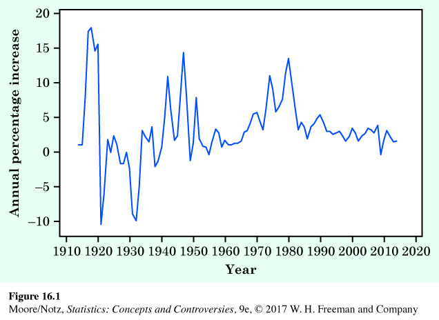
Table 16.1 gives annual average CPIs from 1915 to 2014. Figure 16.1 is a line graph of the annual percentage increase in CPI values. It shows that the periods from 1915 to 1920, the 1940s, and from 1975 to 1985 experienced high inflation. Although there is considerable variation, the annual percentage increase is positive in most years. In general, the twentieth century and the first ten years of the twenty-first century was a time of inflation. Faced with this depressing fact, it would be foolish to think about dollars without adjusting for their decline in buying power. Here is the recipe for converting dollars of one year into dollars of another year.
| Year | CPI | Year | CPI | Year | CPI |
|---|---|---|---|---|---|
| 1915 | 10.1 | 1981 | 90.9 | 1999 | 166.6 |
| 1920 | 20.0 | 1982 | 96.5 | 2000 | 172.2 |
| 1925 | 17.5 | 1983 | 99.6 | 2001 | 177.1 |
| 1930 | 16.7 | 1984 | 103.9 | 2002 | 179.9 |
| 1935 | 13.7 | 1985 | 107.6 | 2003 | 184.0 |
| 1940 | 14.0 | 1986 | 109.6 | 2004 | 188.9 |
| 1945 | 18.0 | 1987 | 113.6 | 2005 | 195.3 |
| 1950 | 24.1 | 1988 | 118.3 | 2006 | 201.6 |
| 1955 | 26.8 | 1989 | 124.0 | 2007 | 207.3 |
| 1960 | 29.6 | 1990 | 130.7 | 2008 | 215.3 |
| 1965 | 31.5 | 1991 | 136.2 | 2009 | 214.5 |
| 1970 | 38.8 | 1992 | 140.3 | 2010 | 218.1 |
| 1975 | 53.8 | 1993 | 144.5 | 2011 | 224.9 |
| 1976 | 56.9 | 1994 | 148.2 | 2012 | 229.6 |
| 1977 | 60.6 | 1995 | 152.4 | 2013 | 233.0 |
| 1978 | 65.2 | 1996 | 156.9 | 2014 | 236.7 |
| 1979 | 72.6 | 1997 | 160.5 | ||
| 1980 | 82.4 | 1998 | 163.0 | ||
| Source: Bureau of Labor Statistics. | |||||
372
Adjusting for changes in buying power
To convert an amount in dollars at time A to the amount with the same buying power at time B:
Notice that the CPI for the time you are going to appears on the top in the ratio of CPIs in this recipe. Here are some examples.
EXAMPLE 3 Salaries of professional athletes
The mean salary of Major League Baseball players rose from $329,408 in 1984 to $3,386,212 in 2015. How big was the increase in real terms? Let’s convert the 1984 average into July 2015 dollars. Table 16.1 gives the annual average CPI for 1984, and previously we mentioned that the CPI was $238.7 in July 2015.
373
That is, it took $756,782 in July 2015 to buy what $329,408 would buy in 1984.
We can now compare the 1984 mean salary of $329,408 in July 2015 dollars with the actual 2015 mean salary, $3,386,212. Today’s athletes earn much more than 1984 athletes even after adjusting for the fact that the dollar buys less now. (Of course, the mean salary is pulled up by the very high salaries paid to a few star players. The 1984 median salary was $229,750, and the 2015 median salary was $1,650,000.)
NOW IT’S YOUR TURN
Question 16.1
16.1 Baseball salaries. Refer to Example 3. Convert the 1984 median baseball salary into 2015 dollars.
EXAMPLE 4 Rising incomes?
For a more serious example, let’s leave the pampered world of professional athletes and look at the incomes of ordinary people. The median annual income of all American households was $22,415 in 1984. By 2013 (the most recent year for which data were available at the time of this writing), the median income had risen to $51,939. Dollar income more than doubled, but we know that much of that rise is an illusion because of the dollar’s declining buying power. To compare these incomes, we must express them in dollars of the same year. Let’s express the 1984 median household income in 2013 dollars:
Real household incomes rose only from $50,267 to $51,939 in the 29 years between 1984 and 2013. That’s a 3.3% increase.
The picture is different at the top. The 5% of households with the highest incomes earned $68,500 or more in 1984. In 2013 dollars, this is
In fact, the top 5% of households earned $196,600 or more in 2013. That is, the real income of the highest earners increased by 28.0%.
Finally, let’s look at the bottom. The 20% of households with the lowest incomes earned $9,500 or less in 1984. In 2013 dollars, this is
In fact, the bottom 20% of households earned $20,900 or less in 2013. That is, the real income of the lowest earners decreased by 1.9%.
374
NOW IT’S YOUR TURN
Question 16.2
16.2 Production workers. Let’s look at production workers, the traditional “working men” (and women). Their median annual earnings were $17,281 in 1984 and $31,429 in 2013. Compute the 1984 earnings in 2013 dollars. By what percentage did the real earnings of production workers change between 1984 and 2013?
![]() So you think that’s inflation? Americans were unhappy when oil price increases in 1973 set off a round of inflation that saw the Consumer Price Index almost double in the following decade. That’s nothing. In Argentina, prices rose 127% in a single month, July 1989. The Turkish lira went from 14 to the dollar in 1970 to 579,000 to the dollar in 2000. The Zimbabwe dollar went from 253 to the dollar in September 2007 to 60,623 to the dollar by December 2008. There were 65 German marks to a dollar in January 1920, and 4,200,000,000,000 marks to a dollar in November 1923. Now that’s inflation.
So you think that’s inflation? Americans were unhappy when oil price increases in 1973 set off a round of inflation that saw the Consumer Price Index almost double in the following decade. That’s nothing. In Argentina, prices rose 127% in a single month, July 1989. The Turkish lira went from 14 to the dollar in 1970 to 579,000 to the dollar in 2000. The Zimbabwe dollar went from 253 to the dollar in September 2007 to 60,623 to the dollar by December 2008. There were 65 German marks to a dollar in January 1920, and 4,200,000,000,000 marks to a dollar in November 1923. Now that’s inflation.
Example 4 illustrates how using the CPI to compare dollar amounts from different years brings out truths that are otherwise hidden. In this case, the truth is that the fruits of prosperity since the 1980s went mostly to those at the top of the income distribution and that very little real progress was made by those at the bottom. Put another way, people with the highest pay (usually those with skills and education) did much better than people with the lowest pay (usually those who lack special skills and college educations). Economists suggest several reasons: the “new economy” that rewards knowledge, high immigration leading to competition for less-skilled jobs, more competition from abroad, and so on. Exactly why incomes at the top have increased so much, and what we should do about the stagnant incomes of those at the bottom, are controversial questions.