1.3 1.2 Displaying Distributions with Graphs
When you complete this section, you will be able to:
Analyze the distribution of a categorical variable using a bar graph.
Analyze the distribution of a categorical variable using a pie chart.
Analyze the distribution of a quantitative variable using a stemplot.
Analyze the distribution of a quantitative variable using a histogram.
Examine the distribution of a quantitative variable with respect to the overall pattern of the data and deviations from that pattern.
Identify the shape, center, and spread of the distribution of a quantitative variable.
Identify and describe any outliers in the distribution of a quantitative variable.
Use a time plot to describe the distribution of a quantitative variable that is measured over time.
exploratory data analysis
Statistical tools and ideas help us examine data to describe their main features. This examination is called exploratory data analysis. Like an explorer crossing unknown lands, we want first to simply describe what we see. Here are two basic strategies that help us organize our exploration of a set of data:
9
Begin by examining each variable by itself. Then move on to study the relationships among the variables.
Begin with a graph or graphs. Then add numerical summaries of specific aspects of the data.
Categorical variables: Bar graphs and pie charts
distribution of a categorical variable
count
percent
proportion
The values of a categorical variable are labels for the categories, such as “yes” and “no.” The distribution of a categorical variable lists the categories and gives either the count or the percent of cases that fall in each category. An alternative to the percent is the proportion, the count divided by the sum of the counts. Note that the percent is simply the proportion times 100.
EXAMPLE 1.7
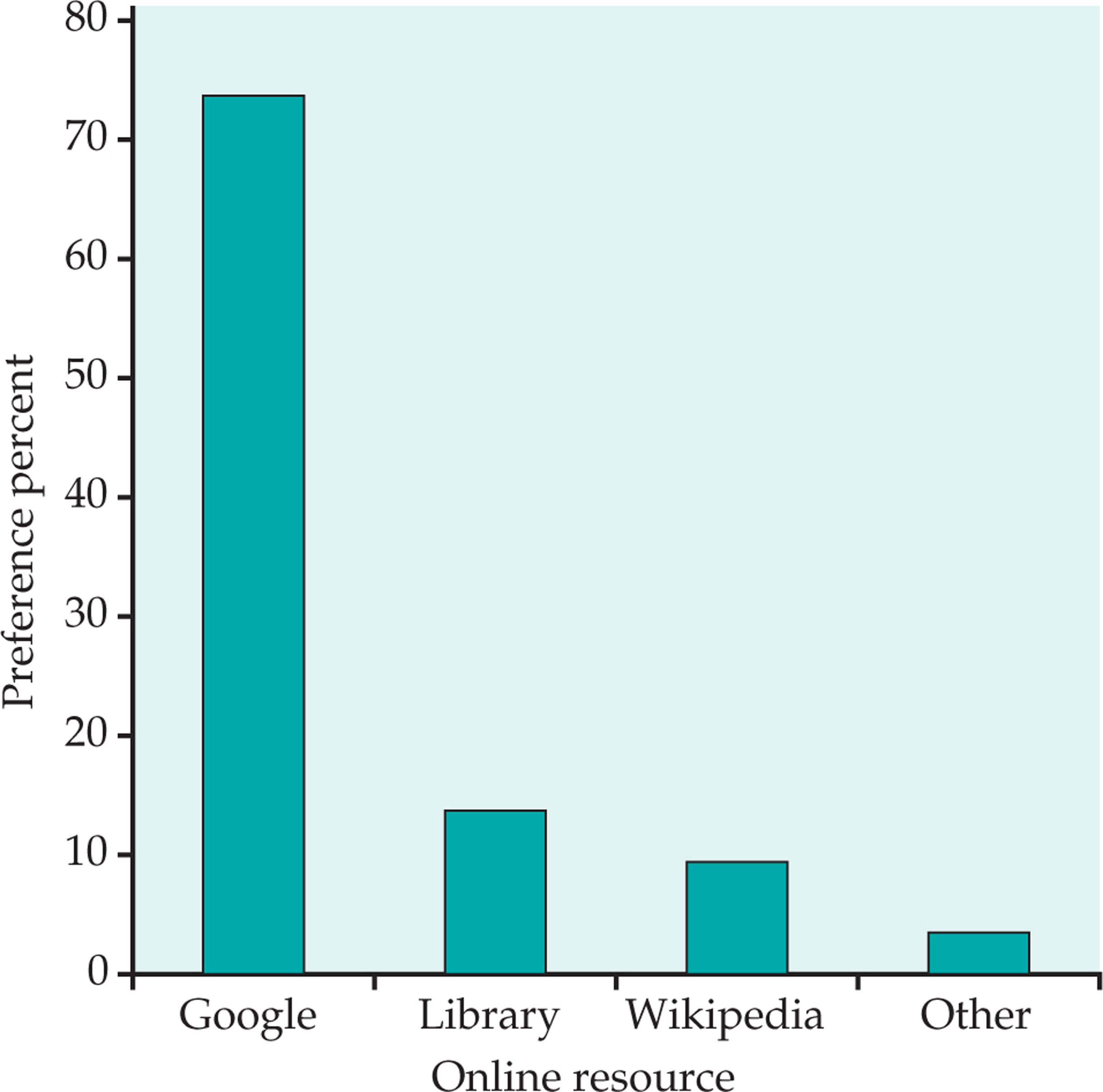
How do you do online research? A study of 552 first-year college students asked about their preferences for online resources. One question asked them to pick their favorite.3 Here are the results:
![]()

| Resource | Count (n) |
|---|---|
| Google or Google Scholar | 406 |
| Library database or website | 75 |
| Wikipedia or online encyclopedia | 52 |
| Other | 19 |
| Total | 552 |
Resource is the categorical variable in this example, and the values are the names of the online resources.
10
EXAMPLE 1.9
Bar graph for the online resource preference data. Figure 1.2 displays the online resource preference data using a bar graph. The heights of the four bars show the percents of the students who reported each of the resources as their favorite.
bar graph
![]()
12
EXAMPLE 1.11
Soluble corn fiber and calcium. Soluble corn fiber (SCF) has been promoted for various health benefits. One study examined the effect of SCF on the absorption of calcium of adolescent boys and girls. Calcium absorption is expressed as a percent of calcium in the diet. Here are the data for the condition where subjects consumed 12 grams per day (g/d) of SCF.4
![]()
| 50 | 43 | 43 | 44 | 50 | 44 | 35 | 49 | 54 | 76 | 31 | 48 |
| 61 | 70 | 62 | 47 | 42 | 45 | 43 | 59 | 53 | 53 | 73 |
To make a stemplot of these data, use the first digits as stems and the second digits as leaves. Figure 1.4 shows the steps in making the plot, We use the first digit of each value as the stem. Figure 1.4(a) shows the stems that have values 3, 4, 5, 6, and 7. The first entry in our data set is 50. This appears in Figure 1.4(b) on the 5 stem with a leaf of 0. Similarly, the second value, 43, appears in the 4 stem with a leaf of 3. The stemplot is completed in Figure 1.4(c), where the leaves are ordered from smallest to largest.
The center of the distribution is in the 40s, and the data are more stretched out toward high values than low values (the highest value is 76, while the lowest is 31). In the plot, we do not see any extreme values that lie far from the remaining data.

USE YOUR KNOWLEDGE
Use Your Knowledge
Question 1.9
1.17 Make a stemplot. Here are the scores on the first exam in an introductory statistics course for 30 students in one section of the course:
![]()
| 82 | 73 | 92 | 82 | 75 | 98 | 94 | 57 | 80 | 90 | 92 | 80 | 87 | 91 | 65 |
| 73 | 70 | 85 | 83 | 61 | 70 | 90 | 75 | 75 | 59 | 68 | 85 | 78 | 80 | 94 |
Use these data to make a stemplot. Then use the stemplot to describe the distribution of the first-exam scores for this course.
14
EXAMPLE 1.14
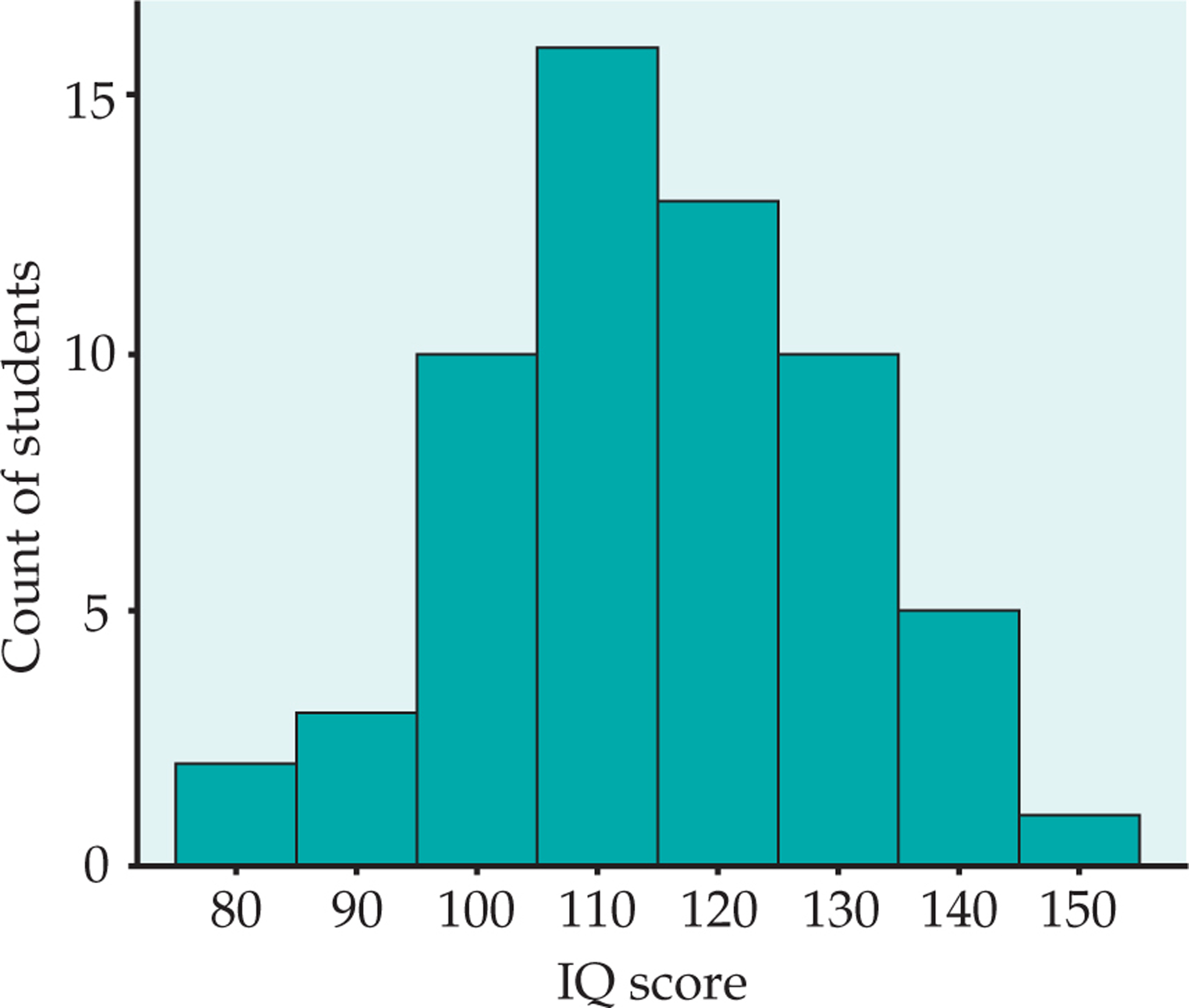
Distribution of IQ scores. You have probably heard that the distribution of scores on IQ tests is supposed to be roughly “bell-shaped.” Let’s look at some actual IQ scores. Table 1.1 displays the IQ scores of 60 fifth-grade students chosen at random from one school.
![]()
Divide the range of the data into classes of equal width. Let’s use
145 139 126 122 125 130 96 110 118 11 101 142 134 124 112 109 134 113 81 113 123 94 100 136 109 131 117 110 127 124 106 124 115 133 116 102 127 117 109 137 117 90 103 114 139 101 122 105 97 89 102 108 110 128 114 112 114 102 82 101 Table 1.4: TABLE 1.1 IQ Test Scores for 60 Randomly Chosen Fifth-Grade Students15
Be sure to specify the classes precisely so that each individual falls into exactly one class. A student with IQ 84 would fall into the first class, but IQ 85 falls into the second.
Count the number of individuals in each class. These counts are called frequencies, and a table of frequencies for all classes is a frequency table.
frequency
frequency table
Class Count Class Count 75 ≤ IQ score < 85 2 115 ≤ IQ score < 125 13 85 ≤ IQ score < 95 3 125 ≤ IQ score < 135 10 95 ≤ IQ score < 105 10 135 ≤ IQ score < 145 5 105 ≤ IQ score < 115 16 145 ≤ IQ score < 155 1 Draw the histogram. First, on the horizontal axis mark the scale for the variable whose distribution you are displaying. That’s the IQ score. The scale runs from 75 to 155 because that is the span of the classes we chose. The vertical axis contains the scale of counts. Each bar represents a class. The base of the bar covers the class, and the bar height is the class count. There is no horizontal space between the bars unless a class is empty, so its bar has height zero. Figure 1.7 is our histogram. It does look roughly “bell-shaped.”