16.1 Graphic Representations
In Chapter 2, you learned how to generate a valid operational definition, how to design a reliable and powerful instrument, and how to use that instrument while avoiding demand characteristics and observer bias. So where does that leave you? With a big page filled with numbers—
The most common kind of graphic representation is the frequency distribution, which is a graphic representation of measurements arranged by the number of times each measurement was made. FIGURE A.1 shows a pair of frequency distributions that represent the hypothetical performances of a group of men and women who took a test of fine motor skills (i.e., the ability to manipulate things with their hands). Every possible test score is shown on the horizontal axis. The number of times (or the frequency with which) each score was observed is shown on the vertical axis. Although frequency distributions can have many shapes, the shape of the frequency distribution shown below is a very common one. It is often called the bell curve, but is technically known as the Gaussian distribution or the normal distribution, which is a mathematically defined frequency distribution in which the frequency of measurements is highest in the middle and decreases symmetrically in both directions. When we say that the normal distribution is symmetrical, we mean that the left half is a mirror image of the right half.
frequency distribution
A graphical representation of measurements arranged by the number of times each measurement was made.
normal distribution
A mathematically defined distribution in which the frequency of measurements is highest in the middle and decreases symmetrically in both directions.
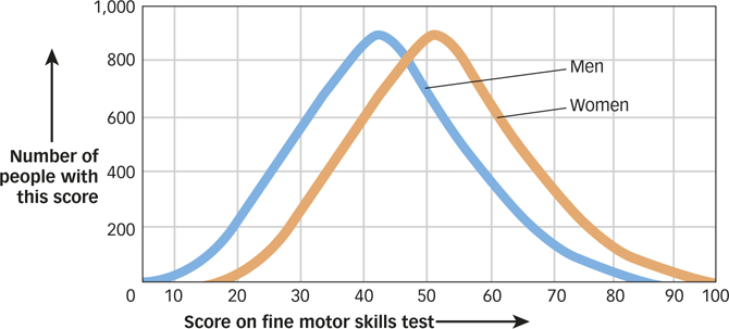
The picture in FIGURE A.1 reveals in a single optical gulp what a page full of numbers never can. For instance, the shapes of the two distributions instantly tell you that most people have moderate motor skills and that only a few have exceptionally good or exceptionally bad motor skills. You can also see that the distribution of men’s scores is to the left of the distribution of women’s scores, which instantly tells you that women tend to have better motor skills than men on average. And finally, you can see that the two distributions have a great deal of overlap, which tells you that although women tend to have better motor skills than men on average, there are still many men who have better motor skills than many women.
A-