16.2 The Presentation of Data
Conducting an experiment is a major accomplishment, but it has little impact if researchers cannot devise an effective way to present their data. If they just display their raw data in a table, others will find it difficult to draw any useful conclusions. Imagine you have collected the data presented in TABLE a.1, which represents the number of minutes of REM sleep (the dependent variable) each of your 44 participants (n = 44; n is the symbol for sample size) had during 1 night spent in your sleep lab. Looking at this table, you can barely tell which variable you have chosen to study.
| 77 | 114 | 40 | 18 | 68 | 96 | 81 | 142 | 62 | 80 | 117 |
| 81 | 98 | 76 | 22 | 71 | 35 | 85 | 49 | 105 | 99 | 49 |
| 20 | 70 | 35 | 83 | 150 | 57 | 112 | 131 | 104 | 121 | 47 |
| 31 | 47 | 39 | 92 | 73 | 122 | 68 | 58 | 100 | 52 | 101 |
A-5
Quantitative Data Displays
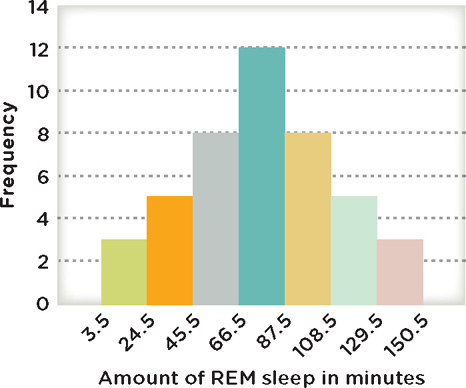
A common and simple way to present data is to use a frequency distribution, which displays how often the various values in a data set are present. In TABLE a.2, we have displayed the data in 7 classes, or groups, of equal width. The frequency for each class is tallied up and appears in the middle column. The first class goes from 4 to 24 minutes, and in our sample of 44 participants, only 3 had a total amount of REM in this class (18, 20, 22 minutes). The greatest number of participants experienced between 67 and 87 minutes. By looking at the frequency for each class, you begin to see patterns. In this case, the greatest number of participants had REM sleep within the middle of the distribution, and fewer appear on the ends. We will come back to this pattern shortly.
| No. of Minutes in REM (Class Limits) | Raw Frequency | Relative Frequency |
| 4 to 24 | 3 | .07 |
| 25 to 45 | 5 | .11 |
| 46 to 66 | 8 | .18 |
| 67 to 87 | 12 | .28 |
| 88 to 108 | 8 | .18 |
| 109 to 129 | 5 | .11 |
| 130 to 150 | 3 | .07 |
Frequency distributions can also be presented with a histogram, which displays the classes of a variable on the x-axis and the frequency of the data on the y-axis (portrayed by the height of the vertical bars). The values on the y-axis can be either the raw frequency (actual number) or the relative frequency (proportion of the whole set). The example portrayed in Figure A.1 is a histogram of the minutes of REM sleep, with the classes of the number of minutes in REM on the x-axis and the raw frequency on the y-axis. Looking at a histogram makes it easier to see how the data are distributed across classes. In this case you can see that the most frequent duration of REM is in the middle of the distribution (the 67- to 87-minute class), and that the frequency tapers off toward both ends. Histograms are often used to display quantitative variables that have a wide range of numbers that would be difficult to interpret if they weren’t grouped in classes.
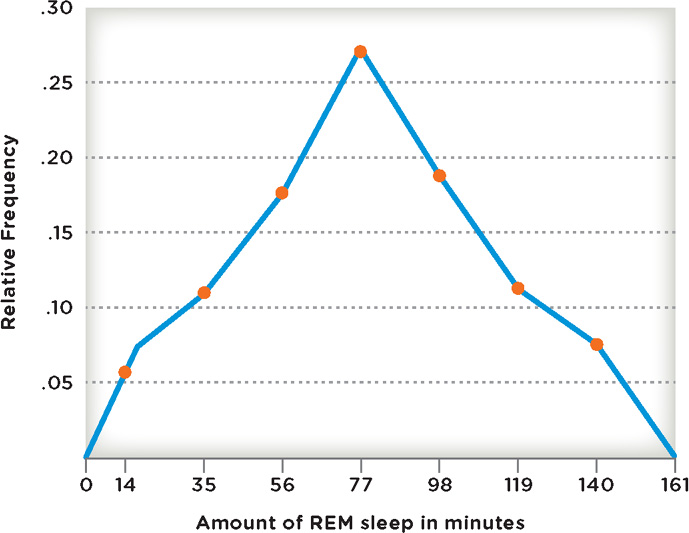
Similar to a histogram is a frequency polygon, which uses lines instead of bars to represent the frequency of the data values. The same data displayed in the histogram (Figure A.1) appear in the frequency polygon in Figure A.2 on page A-6. We see the same general pattern of the distribution shape in the frequency polygon, but in the place of raw frequency we have used the relative frequency for each of the classes. Thus instead of saying 12 participants had 67 to 86 minutes of REM sleep, we can state that the proportion of participants in this class was .27, or 27%. Relative frequencies are especially useful when comparing data sets with different sample sizes. Imagine we wanted to compare two different studies examining REM sleep: one with a sample size of 500, and the other with a sample size of 44. If the larger sample had a greater number of participants in the 67- to 86-minute group (let’s say 50 participants out of 500 [.10] versus the 12 out of the 44 participants [.27] in the smaller sample), although the raw frequency (50) of those in the larger sample is greater than the raw frequency (12) for the smaller sample, the proportion for the smaller sample is greater (smaller sample = .27 versus larger sample = .10). The relative frequency makes it easier to detect these differences in proportion.
A-6
Another common way to display quantitative data is through a stem-and-leaf plot, which uses the actual data values in its display. The stem is made up of the first digits in a number, and the leaf makes up the last digit. This allows us to group numbers by 10s, 20s, 30s, and so on. In Figure A.3, we display the REM sleep data in a stem-and-leaf plot using the first part of the number (either the 10s and/or the 100s) as the stem, and the ones column as the leaf. In the first row, for example, 8 is from the ones column of the smallest number in the data set, 18; 0 and 2 in the second row represent the ones column from the numbers 20 and 22; the 0 in the last row comes from 150.
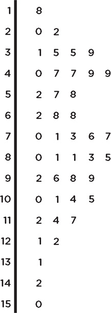
One nice feature of the stem-and-leap plot (Figure A.3) is that it displays the raw data in a graphical manner. If you turn the book sideways (counterclockwise), you can see that the shape of the data is somewhat similar to that of the histogram presenting the same data (Figure A.1). However, the larger a sample is and the wider its range of numbers, the harder it would be to use the stem-and-leaf plot.
Distribution Shapes
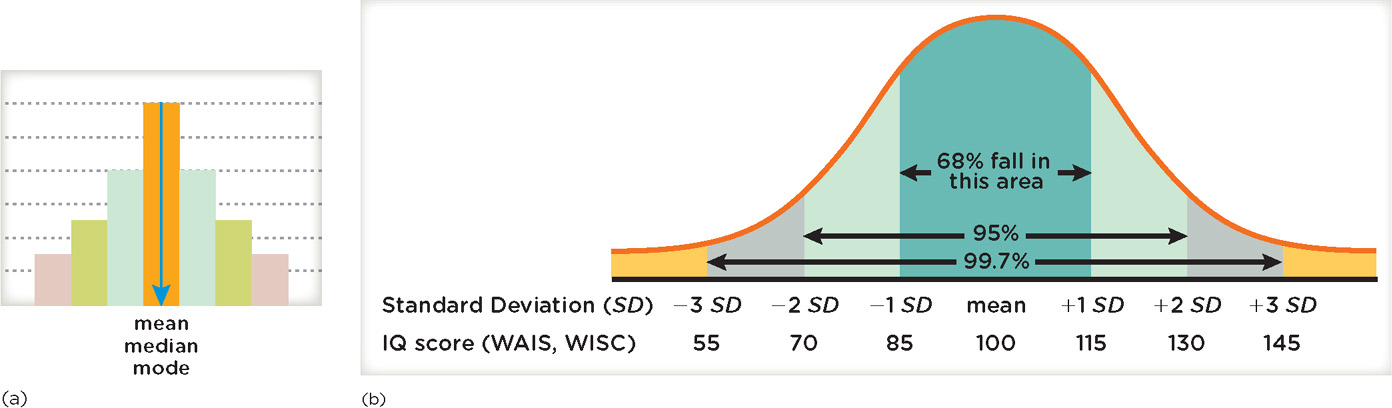
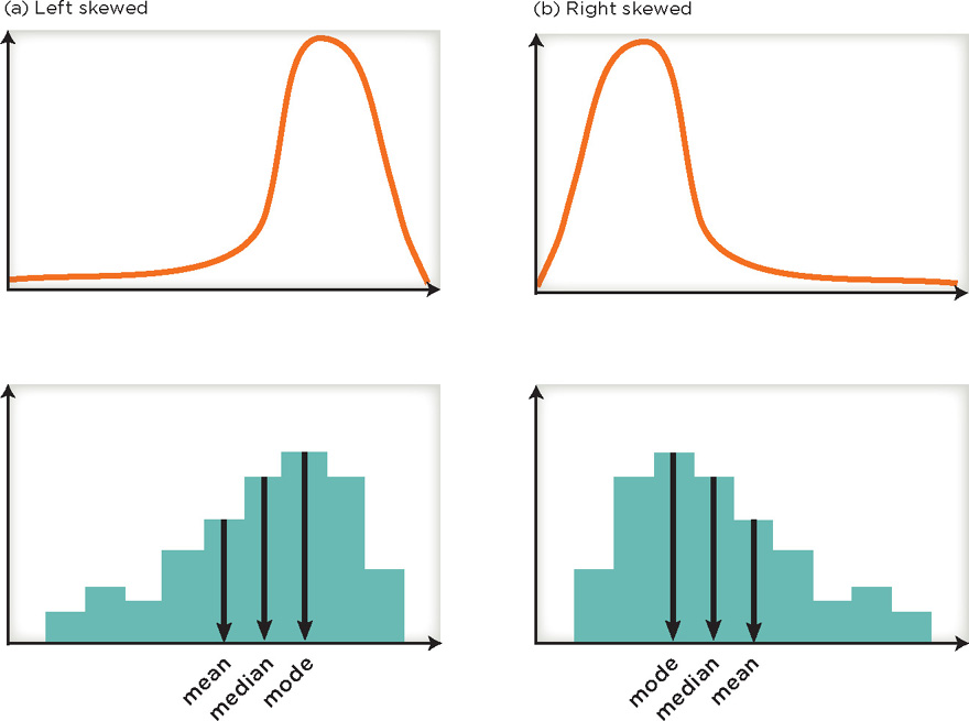
Once the data have been displayed on a graph, researchers look very closely at the distribution shape, which is just what it sounds like—how the data are spread along the x-axis (that is, the shape is based on the variable represented along the x-axis and the frequency of its values portrayed by the y-axis). A symmetric shape is apparent in the histogram in Figure A.4a, which shows a distribution for a sample that is high in the middle, but tapers off at the same rate on each end. The bell-shaped or normal curve on the right also has a symmetric shape, and this type of curve is fairly typical in psychology (curves generally represent the distribution of the entire population). Many human characteristics have this type of distribution, including cognitive abilities, personality characteristics, and a variety of physical characteristics such as height and weight. Through many years of study, we have found that measurements for the great majority of people fall in the middle of the distribution, and a smaller proportion have characteristics represented on the ends (or in the tails) of the distribution. For example, if you look at the IQ scores displayed in Figure A.4b, you can see that 68% of people have scores between 85 and 115, about 95% have scores between 70 and 130, around 99.7% fall between 55 and 145, and only a tiny percentage (0.3%) are below 55 and above 145. These percentages are true for many other characteristics.
A-7
Some data will have a skewed distribution, which is not symmetrical. As you can see in Figure A.5a, a negatively skewed or left-skewed distribution has a longer tail to the left side of the distribution. A positively skewed or right-skewed distribution (Figure A.5b) has a longer tail to the right side of the distribution. Determining whether a distribution is skewed is particularly important because it informs our decision about what type of statistical analysis to conduct. Later, we will see how certain types of data values can play a role in skewing the distribution.
Qualitative Data Displays
Thus far, we have discussed several ways to represent quantitative data. With qualitative data, a frequency distribution lists the various categories and the number of members in each. For example, if we wanted to display the college major data on 44 students interviewed at the library, we could use a frequency distribution (TABLE a.3).
| College Major | Raw Frequency | Percent |
| Biology | 3 | 7 |
| Chemistry | 5 | 11.5 |
| Culinary Arts | 8 | 18 |
| English | 5 | 11.5 |
| Nursing | 12 | 27 |
| Psychology | 3 | 7 |
| Undecided | 8 | 18 |
A-8
Another common way to display qualitative data is through a bar graph, which displays the categories of interest on the x-axis and the frequency on the y-axis. Figure A.6 shows how the data collected in the library can be presented in a bar graph. Bar graphs are useful for comparing several different populations on the same variable (for example, perhaps comparing college majors by gender or ethnicity).
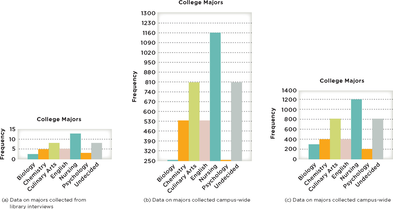
Like any type of data display, one must be on the lookout for misleading portrayals. In Figure A.6a, we display data for the 44 students interviewed in the library. In Figures A.6b and A.6c, we display data for one campus with 4,400 students. Quickly look at (b) and (c) of the figure and decide, if you were head of the psychology department, which bar chart you would prefer to use to show how strong your numbers are at the college. In (b), the department looks fairly small compared to the size of other departments, particularly relative to the size of the nursing program. But notice that the scale on the y-axis starts at 250 in (b), whereas it begins at 0 in (c). In this third bar chart, it appears that the student count for the psychology program is not far behind that for other programs like chemistry and English, for example. An important aspect of critical thinking is being able to evaluate the source of evidence, which one must consider when reading graphs and charts. (For example, does the author of the bar chart in Figure A.6b have a particular agenda to reduce funding for the psychology department?) And, one must also consider the interpretation of the material, which can be changed through manipulation in its presentation (the data on the 4,400 students are valid, but the way they are presented is not).
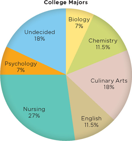
Pie charts can also be used to display qualitative data, with pie slices representing the relative proportion of each of the categories (Figure A.7). As you can see, the biggest percentage is nursing (27%), followed by culinary arts (18%), and undecided (18%). The smallest percentage is shared by biology and psychology (both 7%). Often researchers use pie charts to easily display data for which it is important to know the relative proportion of each category (for example, a psychology department trying to gain support for funding its courses might want to be able to display the relative number of psychologists in particular subfields; see Figure 1.1, page 4).
A-9