7.1 Geospatial Lab Application: GIS Layouts: QGIS Version
This lab will introduce you to the concept of taking GIS data and creating a print-quality map from it. This map should contain the following:
 The contiguous United States (48 states without Alaska and Hawaii) population per square mile, set up in an appropriate color scheme
- The data displayed in a projection with units of measurement other than decimal degrees (the default units used by the lab data are meters—be sure that the scale bar reflects this information)
- An appropriate legend (make sure your legend items have regular names, and that the legend is not called “legend”)
- An appropriate title (make sure that your map title doesn’t include the word “map” in it)
- A north arrow
- A scale bar
- Text information: your name, the date, and the sources of the data
- Appropriate borders, colors, and design layout (your map should be well designed, and not look like map elements were thrown on at random)
Important note: At the end of this lab, there is a checklist of items to aid you in making sure the map you make is complete and of the best quality possible.
Like the geospatial lab applications in Chapters 5 and 6, two versions of this lab are provided in this chapter. The first version (Geospatial Lab Application 7.1: GIS Layouts: QGIS Version) uses the free Quantum GIS (QGIS). The second version (Geospatial Lab Application 7.2: GIS Layouts: ArcGIS Version) provides the same activities for use with ArcGIS 10.1 or 10.2.
Objectives
The goals for you to take away from this lab are:
- to familiarize yourself with the map composer functions of QGIS.
- to arrange and print professional-quality maps from geographic data using the various layout elements.
Obtaining Software
The version of QGIS used in this lab is 1.8.0, and available for free download at: http://qgis.org/downloads.
216
Important note: Software and online resources sometimes change fast. This lab was designed with the most recently available version of the software at the time of writing. However, if the software or Websites have significantly changed between then and now, an updated version of this lab (using the newest versions) is available online at http://www.whfreeman.com/shellito2e.
Using Geospatial Technologies
The concepts you’ll be working with in this lab are used in a variety of real-world applications, including:
- urban planning, where GIS is used to compose maps showing data about housing and population distribution, transportation routes, land parcels, zoning information, and other matters.
- law enforcement, where agents use GIS to create maps showing the major locations of particular types of crimes, analysis of crime hot spots, and locations of 911 calls, for distribution among police officers and the community.

Lab Data
Copy the folder Chapter7QGIS—it contains a folder called “usaproject,” in which you’ll find several shapefiles that you’ll be using in this lab. This data comes courtesy of Esri, and was formerly distributed as part of their free educational GIS software package ArcExplorer Java Edition for Educators (AEJEE). For use in this lab with QGIS, it has already been projected for you to the US National Atlas Equal Area projection.
Localizing This Lab
The dataset used in this lab is Esri sample data for the entire United States, and you’ll be creating a map layout of the United States. However, the layout tools can be used to make a map of whatever dataset you desire—rather than creating a layout map of the entire United States, focus on your home state and create a layout of that instead (see Section 7.5 for how to focus the layout on one state instead of the whole United States). If you’re only going to work with one state, use the countiesproject.shp file instead of the statesproject.shp file and make a map of county population by square mile.
217
7.1 Initial Pre-Mapping Tasks and Map Projections
- Start QGIS. After QGIS opens, do the following (if needed, refer back to Geospatial Lab Application 5.1: GIS Introduction: QGIS Version for specifics on how to do these things):
- Add the statesproject shapefile from the usaproject data folder. Leave the statesproject symbology alone for now—you’ll change it in the next step.
- Pan and zoom the Map View so that the lower 48 states are shown filling up the Map View.
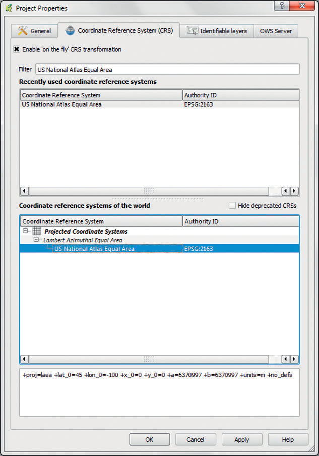
Important note: the data used in this lab application has already been projected to the US National Atlas Equal Area projection for you to use. However, there are many more projections to choose from if you desire—you can change the projection of a data layer by right-clicking on it, selecting Save As, and then choosing a projected coordinate system to change the layer into. - The last step is to set the properties of the project you’re working with so that QGIS will be able to properly render some of the map elements you’ll be working with (such as the scale bar). From the Settings pull-down menu, choose Project Properties.
 (Source: QGIS)
 - Select the Coordinate Reference System (CRS) tab.
- Place a checkmark in the Enable ‘on the fly’ CRS transformation box.
- In the box next to Filter, type: US National Atlas Equal Area. This will search through all available projections and find the one you’ll need.
- In the Coordinate reference systems of the world box, click on the US National Atlas Equal Area option, then click Apply. This has set the CRS of the project environment to the chosen projection. Click OK to close the dialog box.
7.2 Setting Graduated Symbology
- QGIS gives you the ability to change an object’s symbology from a single symbol to multiple symbols or colors, and allows for a variety of different data classification methods.
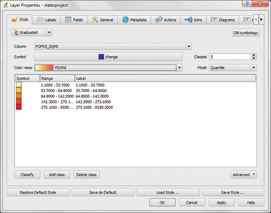
- Right-click on the statesproject shapefile in the Map Legend and select Properties. Click on the Style tab. To display the states as graduated symbols, use the following settings:
 (Source: QGIS)
 - From the pull-down menu underneath the Style tab, select Graduated.
- The Column to use (in this exercise) is the POP05_SQMI (the states’ population per square mile from the year 2005).
- Use 5 for the number of Classes.
- Use Quantile for the Mode.
- For the color scheme, select an appropriate choice for the Color ramp.
- When you have things arranged how you want them, click Apply to make the changes. Take a look at the map and make any further color changes you think are needed.
- Click OK to close the dialog box.
- Now, the symbology of the statesproject has changed in the Map View and the values that make up each one of the breaks can be seen in the Map Legend (by pressing the plus button, which you’ll find to the left of the statesproject layer).
7.3 The Composer in QGIS
To begin laying out the print-quality version of the map, you’ll need to begin working in the Composer. This mode of QGIS works like a blank canvas, allowing you to construct a map using various elements.
- To begin, from the File pull-down menu select New Print Composer.
- In the Composer, the screen represents the printed page of an 8½ × 11 piece of paper, so be careful when you’re working near the edges of the page and keep all elements of the map within that border.
- The toolbar will switch to a new set of tools—locate and examine these navigation tools.
 (Source: QGIS)
 - Starting at the left and moving right, the tools and their uses are as follows:
- The blue folder is used to open a composition.
- The disk icon is used to save a composition.
- The camera icon is used to export the composition as a graphic.
- The Adobe icon is used to export the composition as a PDF file.
- The fifth icon is used to export the composition as an SVG file.
- The printer icon is used when you’re printing (see later in the lab).
- The magnifying glass with the four arrows will zoom to the full extent.
- The plus and minus magnifying glasses are used to zoom in and out of the layout.
- The blue circle with the curved white arrow is used to refresh the view.
- Starting at the right and moving left, you’ll see more tools displayed:
- The blue and yellow boxes are used for aligning or raising map elements.
- The circle and rectangle icons are used for grouping and ungrouping map elements.
- The hand grasping the world is the move item content icon and is used for panning and adjusting the content of a particular window—for instance, for moving the position of what’s showing on the map without changing the map itself.
- The hand with the cursor icon is used to move map elements to different places in the layout.
- The other tools are used for the addition of map elements to the layout, and we’ll examine them individually.
7.4 Map Elements
- Again, think of the layout (or composition) as a blank sheet of paper that you’ll use to construct your map. There are numerous map elements that can be added, including the map canvas, scale bars, north arrows, and a legend. Each element has properties (such as creating borders, filling colors, or fixing size and position) that can be accessed by selecting the Item Properties tab on the right side of the composer:
 (Source: QGIS)
 - Map elements can be resized and moved by selecting them with the mouse and resizing like you would any object.
- Map elements can be deleted by selecting them with the cursor and pressing the delete key on your keyboard.
7.5 Inserting a Map Canvas
- The first element to add to the layout is the default map canvas. This will be an element that shows all of the visible layers in the Map Legend. Click on the Add new map icon from the toolbar:
 (Source: QGIS)
 - This will allow you to draw a box on the layout that will display the current Map View. Draw a rectangular box on the layout to create the canvas.
- Once it’s drawn, you can click and drag the canvas around the map or resize it as you see fit (using the four blue tabs at its corners), and you can treat the entire canvas as if it’s a single map element. When you’re adjusting the size, keep in mind that you’ll be adding several more map elements (such as a legend or a title), so you’ll need to adjust the size, spacing, and balance of the elements accordingly.
- You can’t manipulate individual layers (for instance, you can’t click and drag a state somewhere else), but using the move item content icon on the toolbar will allow you to drag the contents of the canvas around and alter what’s being displayed inside the canvas.
- To make further adjustments to the canvas itself (such as creating a border or altering the color of the border), select the Item Properties tab on the right side of the screen and select General options. Investigate the other choices under Item Properties (such as Map for adjusting the scale) to set up the canvas the way you’d like it to appear on the final printed map.
7.6 Inserting a Scale Bar
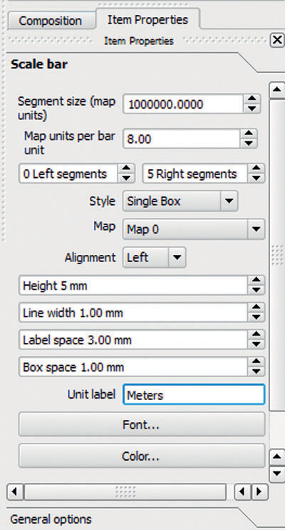
- To add a scale bar to the map, select the Add new scalebar icon from the toolbar, then click on the composition where you want the scale bar to be added.
 (Source: QGIS)
 - Once the scale bar appears, click on it so that the four blue boxes appear at the corners. In the Item Properties box on the right-hand side of the screen, you’ll see several options for altering the scale bar. Use the options to manipulate the properties of the scale bar in the following ways until it looks appropriate:
- The size of each segment on the scale bar can be changed.
- The number of map units per bar units can be changed (to even out the breakpoints on the scale bar).
- The number of segments on the left or the right side of the “0” value on the scale bar can be changed.
- The physical dimensions of the scale bar itself (height, line, width, etc.) can be changed.
- The font and color used in the scale bar can be changed.
222
 (Source: QGIS)
 - Once you have the scale bar set up how you want it, in the Item Properties, type Meters into the Unit label box, so that the map reader will be able to identify what type of units are being utilized (as the US National Atlas Equal Area projection utilizes meters).
7.7 Inserting a North Arrow
- To add a north arrow to the map, select the Add Image icon from the toolbar, then click on the composition where you want the north arrow to be added.
 (Source: QGIS)
 - An empty box will appear, and several different graphics options will appear in the Item Properties pane. The add image option allows you to add a graphic of your own to the map, or to select from several pre-made graphics, including several different north arrows. Scroll part-way down through the options in Preloaded images and you’ll see a number of options for north arrows.
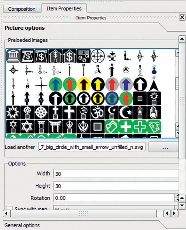 (Source: QGIS)
 - Select an appropriate north arrow and it will appear in the empty box on the composition. Use the cursor to position or resize the north arrow.
7.8 Inserting a Legend
Each layer you use in QGIS (such as statesproject) has a set of layer properties. Anything changed in the layer properties will be reflected in changes to the composition. For instance, if you change the symbology of a layer in its properties, its appearance will be transferred over to a legend in the composition. Similarly, whatever name is given to a layer in the Map Legend will carry over to a legend in the composition.
- Return to the regular QGIS window. Currently, the statesproject layer is named just that—however, you can change this name to something more descriptive before adding a legend to the composition. In the QGIS Map Legend, right-click on the name you want to change (the statesproject layer), and select Rename.
- In the Map Legend itself, you can type a new name for the layer (like “Population Per Square Mile”). Click the enter key when you’ve typed in a new name.
- Return to the composer. To add a legend to the map, select the Add new legend icon from the toolbar, then click on the composition where you want the legend to be added.
 (Source: QGIS)
 - A default legend will be added to the map, consisting of all the layers in the Map Legend with whatever names are assigned to them. Use the cursor to move and resize the legend as needed.
- To make changes to the default legend, click on the legend itself, and there will be several options available in the Item Properties. You can change the name of the legend (don’t just call your legend “Legend”), its font, symbol width, and appearance, as well as spacing between items.
 (Source: QGIS)
7.9 Adding Text to the Layout
- To add text to the map (such as a title, or any other text you may want to add), select the Add new label icon from the toolbar, then click on the composition where you want the text box to be added.
 (Source: QGIS)
 - Note that when text is added, a small box filled with the words “Quantum GIS” will be added to the composition. The lettering in the box, as well as its font, size, and color can be changed in the Item Properties.
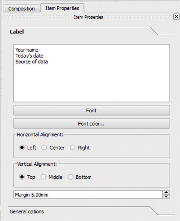 (Source: QGIS)
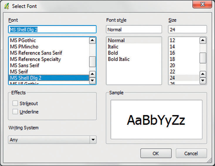
 - Type the text you want to appear in the Item Properties box under the Label heading. To alter the font, color, and other properties of the text, click the Font and Font color… options. More options will appear—note that you can alter each text box separately, create larger fonts for titles, smaller fonts for type, and so on. You can also resize each text box and move it to a new position.
 (Source: QGIS)
226
7.10 Other Map Elements
- Though they’re not used in this lab, three other map elements can be added:
- A shape—this allows you to add the outline of a shape (an ellipse, rectangle, or triangle) to the composition for additional graphics or annotation. Use this icon:
 (Source: QGIS)
 - An arrow—this allows you to add a graphic of an arrow (not a north arrow) so that you can add further annotation to your map, to point out or highlight areas. Use this icon:
 (Source: QGIS)
 - An attribute table—this allows you to add a graphic of a layer’s attribute table to the map, to enable the presentation of additional information. Use this icon:
 (Source: QGIS)
- A shape—this allows you to add the outline of a shape (an ellipse, rectangle, or triangle) to the composition for additional graphics or annotation. Use this icon:
7.11 Printing the Composition
- When you have constructed the map the way you want, choose the File pull-down menu and choose Page Setup. This will allow you to specify if you want your map printed in Landscape or Portrait format or adding margins for printing.
227
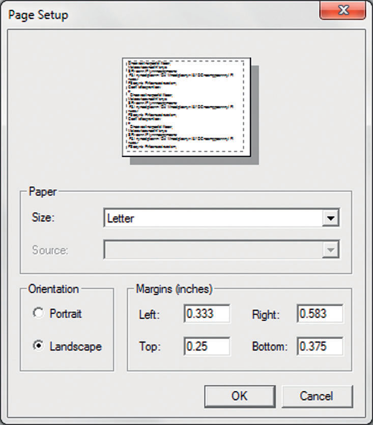 (Source: QGIS)
 - When the composition is ready, select the Print icon from the toolbar.
 (Source: QGIS)
 - In the Print dialog box, click Print and QGIS should print to your computer’s default printer.
- Close the composer and exit QGIS by selecting the File pull-down menu, and then selecting Exit.
Closing Time
The geospatial lab application in Chapter 8 will keep using QGIS for analysis. You’ll be using a Web service to take a series of addresses and plot them on a map, and then you’ll use those results in QGIS for some simple analysis.
228
Final Layout Checklist
| _____ | The contiguous 48 states (without Alaska and Hawaii) United States population per square mile, classified, and displayed with an appropriate color scheme |
| _____ | Appropriate map legend, with all items listed with normal names (the legend should not be called “legend” and should be appropriate size, font, number of columns, and so on) |
| _____ | Scale bar (with appropriate divisions and numerical breaks) |
| _____ | The proper units displayed on the scale bar |
| _____ | Appropriate title (don’t use the words “map” or “title” in your title) and appropriate size and font |
| _____ | A north arrow of appropriate size and position |
| _____ | Type (your name, the date, the source of the data) in an appropriate size and font |
| _____ | Overall map design (appropriate borders, color schemes, balance of items and placement, and so on) |
229